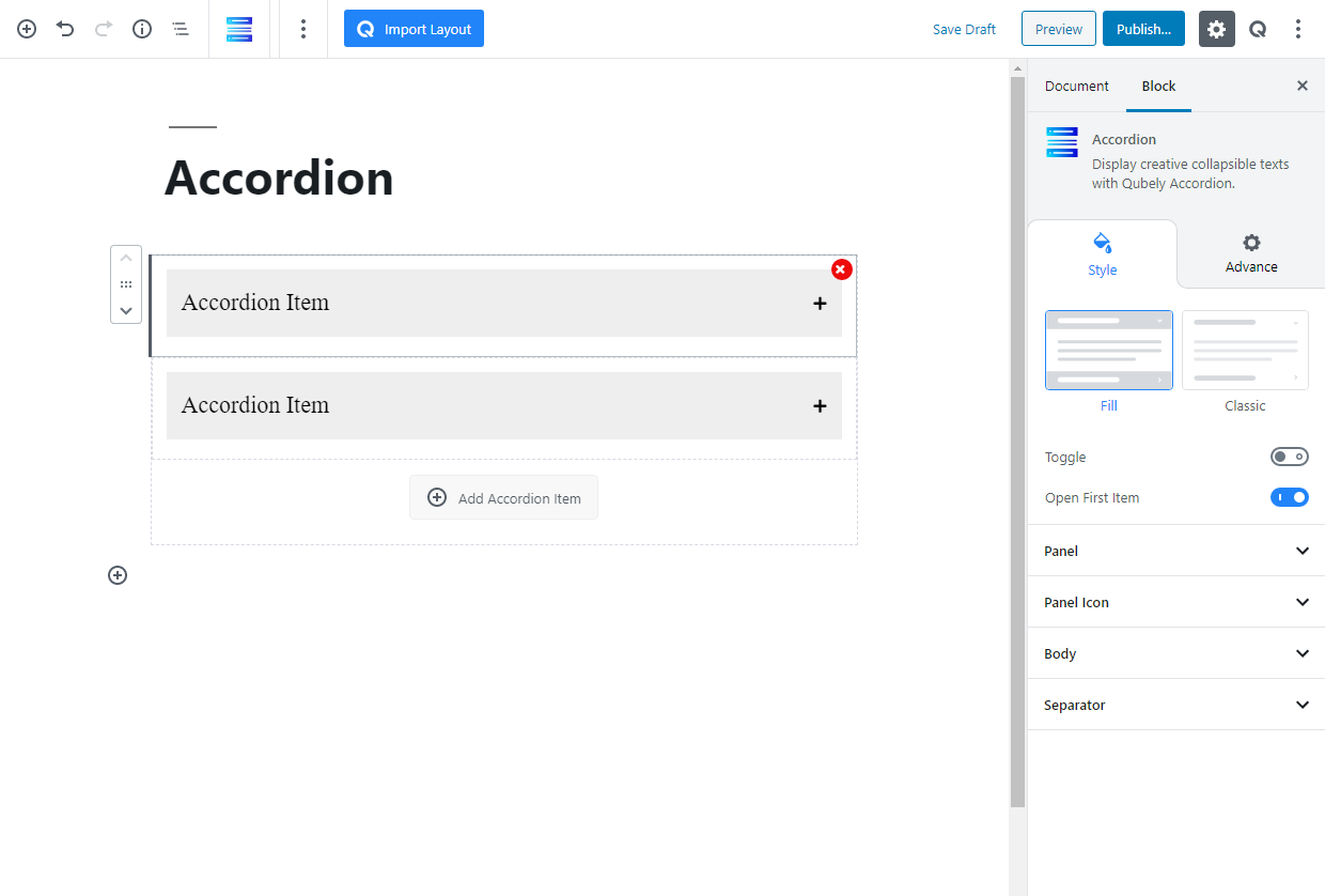
The accordion is a way of controlling the elements’ view. In the Accordion menu, the contents remain hidden and they only reveal the contents when clicked. Accordion comes in handy when you have a lot of content to show and you want to present them in a neat way. There are two layouts for you to choose from.
Style
Choose between two overall accordion styles: Fill and Classic.
Toggle: If on, the accordion block will only allow 1 open item. If it’s off, you can expand all items together.
Open First Item: If on, the first item on the accordion block will be expanded when the page is loaded.
Panel
Color: Use this RGBA color picker to pick a color for the text.
Background: Pick between fill and gradient color for the background
Fill Color: Use this RGBA color picker to pick a fill color.
Border: Pick a border type for the items
Border Color: Use this RGBA color picker to pick a border color.
Border Width: Use this slider to change the border’s width.
Box Shadow: Enable this toggle if you want a box-shadow effect around this block.
Color: Lets you choose the color of the shadow.
X: Lets you define the length of the shadow in the X-axis.
Y: Lets you define the length of the shadow in the Y-axis.
Blur: Lets you control the blurriness of the shadow.
Spread: Lets you control how far the shadow will spread.
Radius: Pick the radius on the accordion items. This will create a rounded square effect on the block. You can either pick a uniform radius or pick specific radii values for each corner. Responsiveness tabs are also present. You can choose from three different units for this slider: PX, EM, and percentage.
Typography
Typography: To change the typography of your text click on this section and you’ll have the followings:
- Font: Choose your desired font from the list.
- Weight: Set the font-weight. Normally the font-weight is the thickness of a font.
- Font Size: Define the font size.
- Line Height: It’s the line-height, adjust it the way you want to.
Letter Spacing: It’s the letter-spacing, defines the gap between letters.
Panel Icon
Select Icon: Select from 10 icons for the accordion’s expand icon
Size: Change the size of the icon
Position: Change the position of the icon
Spacing: Change the spacing between the icon and the text
Body
Padding: Pick the padding around the accordion items. You can either pick a uniform radius or edit each of them individually. Responsiveness tabs are also present. You can choose from three different units for this slider: PX, EM, and percentage.
Background: Pick between fill and gradient color for the background.
Border: Pick a border type for the items
Border Color: Use this RGBA color picker to pick a border color.
Border Width: Use this slider to change the border’s width.
Box Shadow: Enable this toggle if you want a box-shadow effect around this block.
- Color: Lets you choose the color of the shadow.
- X: Lets you define the length of the shadow in the X-axis.
- Y: Lets you define the length of the shadow in the Y-axis.
- Blur: Lets you control the blurriness of the shadow.
- Spread: Lets you control how far the shadow will spread.
Radius: Pick the radius on the entire accordion block. This will create a rounded square effect on the block. You can either pick a uniform radius or pick specific radii values for each corner. Responsiveness tabs are also present. You can choose from three different units for this slider: PX, EM, and percentage.
Separator
Spacing: Pick spacing between each item and the separator. Responsiveness tabs are also present. You can choose from three different units for this slider: PX, EM, and percentage.
Border Width: Use this slider to change the border’s width.
Border Color: Use this RGBA color picker to pick a border color.
Advanced
Animation
To make the block more interesting, you can add an animation effect. It is disabled by default, to enable this feature, choose an effect from the dropdown list. Once you choose your desired one, then start making modifications as you see fit. The units are in milliseconds. Note: Duration is how long the animation will run and Delay is the waiting time before the animation starts loading. The following effects are currently available.
- Fade: Selecting this will animate your table of contents block with a fading animation.
- Slide: Animate your table of contents block with a sliding animation.
- Bounce: If you want to animate your table of contents block with a bouncing animation then select this.
- Zoom: This option will animate your table of contents block with a Zooming animation.
- Flip: Animate your table of contents block with a Flipping animation using this option.
- Fold: Selecting this will animate your table of contents block with a sliding animation.
- Rotate: This will animate your table of contents block with a rotating animation.
Note: You can control from which direction the animation will start such as from the center, right, left, up or down. Also, control how many times the animation will repeat. You can also select the duration and the starting delay of the animation in milliseconds.
Interaction
Enable Tablet: If you want to enable the interactions for tablet users to enable this to start showing tablet users the image interactions.
Enable Mobile: If you want to enable the interactions for mobile users to enable this to start showing mobile users the image interactions.
Enable Mouse Movement: You can select the way how your interactions work with your mouse movement. There are multiple options once you enable it. You can choose the direction from Direct/Opposite, speed from a scale of 1 to 10, maximum from a scale of 5 to 75.
Live Button: This button will give you “Live experience” on how your interactions work depending on how you set it. Click on it to get an overview.
Advanced
This section lets you override the current styling of this particular block.
Enable Custom Position: If you want to set the block to a custom position then simply enable this option. After enabling you will find the following options
From X-axis: Select from the slider what position you want the image block to be in according to the X-axis. The range limits from -2000 to 2000.
From Y-axis: Select from the slider what position you want the image block to be in according to the X-axis. The range limits from -2000 to 2000.
Z – Index: If any of your blocks override another, then you can set a value here, the one with the higher value will appear before the other.
Hide on Tablet/Phone: Turn it on to hide this block in your desired device. The change will appear on the frontend.
Block Row CSS: In case you need to override current block settings, you can write down your own code followed by {{QUBELY}} to override the current settings.Additional CSS Class: You might need to name a block in order to make custom modifications in the future, this is the field where you define the name.