The advanced list feature lets you customize the bullet icons without writing CSS code. You can select from a vast range of icons included in the Font Awesome library.
Style
Options
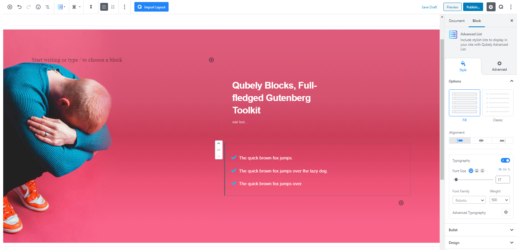
Change the overall look of the advanced list block from the two preset options
Fill: This option will add a background color to the items on the list. It will also unlock border and box-shadow options for the block
Classic: This minimal option will have a transparent background with the list of items in the block.
Alignment
Pick an alignment option for the items inside the advanced list block.
Typography
Typography: To change the typography of your text click on this section and you’ll have the followings:
Font: Choose your desired font from the list.
Weight: Set the font-weight. Normally the font-weight is the thickness of a font.
Font Size: Define the font size.
Line Height: Use this slider to change the height of each line
Letter Spacing: Use this slider to change the gap between each letter in the text
Text Transform: Use this to make sure the text is formatted uniformly
Bullet
Use this tab to change the bullet icon in the list. Select from a vast list of icons from Font Awesome’s library. Search for what icon you want in the search field.
Size: Choose the size of the icons. Pick between S, M, L, XL, and Custom size.
Spacing: Use this slider to pick a spacing between the bullet and the list text.
Color: Use this tab to change the color of the bullet icon
- Normal: Use the RGBA color picker to pick a color for the normal icon.
- Hover: Use the RGBA color picker to pick a color for the on-hover icon.
Design
This tab contains all the visual options for the block
Spacing: Alter the spacing between each item. Responsiveness options are present.
Padding: Add padding around each item’s text. You can choose between global padding and custom padding for each side. Responsiveness options are present.
Radius: Add a radius around each item in the list. You can choose between a global radius and a custom radius for each side. Responsiveness options are present.
Normal: Change the color of the background of the items
- Color: Pick a color for the text in the list
- Background Color: Pick a color for the background of the items.
- Border: Pick a border type for the items.
- Border Color: Pick a border color using the RGBA color picker.
- Border Width: Pick a border width for the block. You can choose to create a uniform border or choose different borders for each side of the block. Responsiveness tabs are also present. You can choose from three different units for this slider: PX, EM, and percentage.
- Box Shadow: Enable this toggle if you want a box-shadow effect around this block.
- Color: Lets you choose the color of the shadow.
- X: Lets you define the length of the shadow in the X-axis.
- Y: Lets you define the length of the shadow in the Y-axis.
- Blur: Lets you control the blurriness of the shadow.
- Spread: Lets you control how far the shadow will spread.
- Inset: Enable this feature if you want the shadows to be drawn inside the border.
Hover: Change the behavior of the items and the list on mouse-hover
- Color: Pick a color for the text in the list
- Background Color: Pick a color for the background of the items.
- Border: Pick a border type for the items.
- Border Color: Pick a border color using the RGBA color picker.
- Border Width: Pick a border width for the block. You can choose to create a uniform border or choose different borders for each side of the block. Responsiveness tabs are also present. You can choose from three different units for this slider: PX, EM, and percentage.
- Box Shadow: Enable this toggle if you want a box-shadow effect around this block.
- Color: Lets you choose the color of the shadow.
- X: Lets you define the length of the shadow in the X-axis.
- Y: Lets you define the length of the shadow in the Y-axis.
- Blur: Lets you control the blurriness of the shadow.
- Spread: Lets you control how far the shadow will spread.
- Inset: Enable this feature if you want the shadows to be drawn inside the border.
Advanced
Animation
To make the block more interesting, you can add an animation effect. It is disabled by default, to enable this feature, choose an effect from the dropdown list. Once you choose your desired one, then start making modifications as you see fit. The units are in milliseconds. Note: Duration is how long the animation will run and Delay is the waiting time before the animation starts loading. The following effects are currently available.
- Fade: Selecting this will animate your table of contents block with a fading animation.
- Slide: Animate your table of contents block with a sliding animation.
- Bounce: If you want to animate your table of contents block with a bouncing animation then select this.
- Zoom: This option will animate your table of contents block with a Zooming animation.
- Flip: Animate your table of contents block with a Flipping animation using this option.
- Fold: Selecting this will animate your table of contents block with a sliding animation.
- Rotate: This will animate your table of contents block with a rotating animation.
Note: You can control from which direction the animation will start such as from the center, right, left, up or down. Also, control how many times the animation will repeat. You can also select the duration and the starting delay of the animation in milliseconds.
Interaction
Enable Tablet: If you want to enable the interactions for tablet users to enable this to start showing tablet users the image interactions.
Enable Mobile: If you want to enable the interactions for mobile users to enable this to start showing mobile users the image interactions.
Enable Mouse Movement: You can select the way how your interactions work with your mouse movement. There are multiple options once you enable it. You can choose the direction from Direct/Opposite, speed from a scale of 1 to 10, maximum from a scale of 5 to 75.
Live Button: This button will give you “Live experience” on how your interactions work depending on how you set it. Click on it to get an overview.
Advanced
This section lets you override the current styling of this particular block.
Enable Custom Position: If you want to set the block to a custom position then simply enable this option. After enabling you will find the following options
From X-axis: Select from the slider what position you want the image block to be in according to the X-axis. The range limits from -2000 to 2000.
From Y-axis: Select from the slider what position you want the image block to be in according to the X-axis. The range limits from -2000 to 2000.
Z – Index: If any of your blocks override another, then you can set a value here, the one with the higher value will appear before the other.
Hide on Tablet/Phone: Turn it on to hide this block in your desired device. The change will appear on the frontend.
Block Row CSS: In case you need to override current block settings, you can write down your own code followed by {{QUBELY}} to override the current settings.Additional CSS Class: You might need to name a block in order to make custom modifications in the future, this is the field where you define the name.