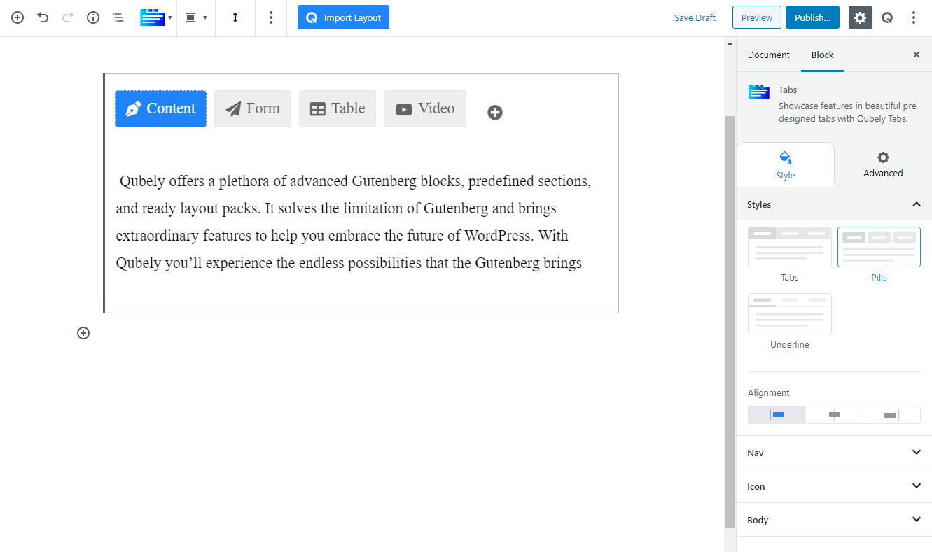
The Tabs block is used for showing tabbed content on a web page. They offer a navigation system where users can browse content without having to reload the page. It offers an intuitive way to present a handful amount of information on-screen, whilst allowing the visitors to stay on the same page thus improving the user experience.
Style
Styles: Currently, there are 3 predefined styles for the Tabs block, choose your preferred one between Tabs, Pills, and Underline
Alignment: Pick the horizontal alignment of the tabs.
Nav
This tab lets you control the appearance of the tabs on this block
Text: Use text as the title of the navigation bar.
Image: Use image as the title of the navigation bar.
Using the image option you can add any uploaded image in the title section of the tab in the Tabs block. After you have enabled the image option you will find the following options.
Layout: You can choose from the layout options you want to set.
Gap: Define the gap between each tab using the slider. You can use the slide or set the gap value manually using the number box.
Nav Size: Choose the size of the tabs using the S, M, and L icon. You can also use the custom options to manually set the size and gaps. There are three units available: PX, EM, and Percentage. Responsiveness options are also present.
Radius: Use the radius to add a curved corner effect on the tabs. There are three units available: PX, EM, and Percentage. Responsiveness options are also present.
Image: This set of options allows you to customize the image that you use in the tabs. You will be able to set the following attribute for the image.
Image Size: Define a size for the image.
Image Radius: Use this slider to add a rounded-corner effect for the image. You can choose a uniform radius or specific corners one by one. Responsiveness options are also present
Border: Pick a border type for the image.
Border Color: Pick a border color using the RGBA color picker.
Border Width: Pick a border width for the block. You can choose to create a uniform border or choose different borders for each side of the block. Responsiveness tabs are also present. You can choose from three different units for this slider: PX, EM, and percentage.
Nav Size: Choose the size of the tabs using the S, M, and L icon. You can also use the custom options to manually set the size and gaps. There are three units available: PX, EM, and Percentage. Responsiveness options are also present.
Radius: Use the radius to add a curved corner effect on the tabs. There are three units available: PX, EM, and Percentage. Responsiveness options are also present.
Color: Use this RGBA color picker to change the color of the normal tabs
Background: Use this RGBA color picker to change the background color of the tabs
Border: Select the type of border for the inactive tabs
Border Color: Use the RGBA color picker to change the color of the border
Border Width: Use this slider to change the width of the border. You can choose a uniform border or pick a different border for each one. There are three units available: PX, EM, and Percentage. Responsiveness options are also present.
Color: Use this RGBA color picker to change the color of the active tab
Background: Use this RGBA color picker to change the background color of the tab
Border: Select the type of border for the active tabs
Border Color: Use the RGBA color picker to change the color of the border
Border Width: Use this slider to change the width of the border. You can choose a uniform border or pick a different border for each one. There are three units available: PX, EM, and Percentage. Responsiveness options are also present.
Typography: You can enable typography settings for the text label. Select what typography you would like to use from the settings that you will find.
- Font Size: Define the size of the font. It is a responsive function; therefore, the size of the font can be customized according to the device type.
- Font Family: Choose your desired font to use from the list. Qubely has a collection of 900 fonts including the defaults that come with Gutenberg.
- Weight: Set the font-weight. Normally the font-weight is the thickness of a font.
Advanced Typography: If you click on the gear icon on the Advanced Typography you will be presented with advanced configuration options to set custom typography.
- Line Height: It’s the difference between lines, adjust it the way you want to.
- Letter Spacing: It controls the space in between letters, defines the gap the way you want to.
- Text Transform: Lets you apply your preferred capitalization format to the text.
Icon
Enable this toggle to have icons for each tab. You can select each tab from the editor to change its icon. Search to find a relevant icon for your design from our massive library of icons that includes Font Awesome and Qubely line icons.
Icon Position: Pick a position for the icon in the tab.
Icon Size: Use this slider to change the size of the icon. There are three units available: PX, EM, and Percentage. Responsiveness options are also present.
Icon Gap: Use this slider to change the gap between the icon and the text. There are three units available: PX, EM, and Percentage. Responsiveness options are also present.
Body
Spacing: Use this slider to change the space between the upper tab and the inner block. There are three units available: PX, EM, and Percentage. Responsiveness options are also present.
Auto-Switching
You can enable auto-switching for the tab title. Once enabled the tabs will cycle through the existing tabs and show the contents in the tabs.
Enable/disable: Use the toggle button to enable/disable the auto-switching
Delay Type: There are two types of delay settings to choose from.
- Common: Set the same delay settings for all tabs
- Custom: Set different delay settings for each tabs.
Show Progress Bar: Enable the toggle button to show the progress bar inside the tab button for the automatic switching. Once enabled you can set the following attributes.
Progressbar Position: Select where you want to show the progress bar. You can either choose the bottom of the top section of the tab.
Position: Define the gap between the tab and the progress using the slider. Use the slider or set the gap value using the manual text box option:
Progressbar Background
Fill Color: Selecting this will only set a solid color for your image overlay. From the Fill Color option, you can choose from a wide range of colors.
Clear: Lets you reset the existing gradient effect. You can use it to start over.
Gradient Type – Linear: A linear gradient applies the gradient by an axis. It’s a linear line. The effect is applied with a Gradient Angel, which defines the starting point. And two colors applied at two ends. Color 1 starts at the defined angle point and Color 2 starts after the Color 1 endpoint.
Gradient Type – Radial: A radial gradient applies the gradient effect by a center point. The Radial Pointer defines the starting point of the circle where Color 1 defines the inner circle area and Color 2 defines the outer circle.
Blend Mode: Blend mode allows you to configure how your set overlay should blend with the image that you have uploaded. If you are completely new to this term, Blending means how one layer of an image should blend with another layer. Altogether there are 13 total blending choices you can choose from. Normal, multiply, screen, overlay, darken, lighter, color dodge, saturation, luminosity, color, color burn, exclusion, and lastly hue.
Height: Use this slider to set the height of the progress bar. You can choose a uniform height or specific height one by one. Responsiveness options are also present
Spacing: Use this slider to set the spacing of the progress bar. You can choose a uniform spacing or specific spacing one by one. Responsiveness options are also present
Radius: Use this slider to add a rounded-corner effect on the progress bar. You can choose a uniform radius or specific corners one by one. Responsiveness options are also present
Advanced
Animation
To make the block more interesting, you can add an animation effect. It is disabled by default, to enable this feature, choose an effect from the dropdown list. Once you choose your desired one, then start making modifications as you see fit. The units are in milliseconds. Note: Duration is how long the animation will run and Delay is the waiting time before the animation starts loading. The following effects are currently available.
- Fade: Selecting this will animate your table of contents block with a fading animation.
- Slide: Animate your table of contents block with a sliding animation.
- Bounce: If you want to animate your table of contents block with a bouncing animation then select this.
- Zoom: This option will animate your table of contents block with a Zooming animation.
- Flip: Animate your table of contents block with a Flipping animation using this option.
- Fold: Selecting this will animate your table of contents block with a sliding animation.
- Rotate: This will animate your table of contents block with a rotating animation.
Note: You can control from which direction the animation will start such as from the center, right, left, up or down. Also, control how many times the animation will repeat. You can also select the duration and the starting delay of the animation in milliseconds.
Interaction
Enable Tablet: If you want to enable the interactions for tablet users to enable this to start showing tablet users the image interactions.
Enable Mobile: If you want to enable the interactions for mobile users to enable this to start showing mobile users the image interactions.
Enable Mouse Movement: You can select the way how your interactions work with your mouse movement. There are multiple options once you enable it. You can choose the direction from Direct/Opposite, speed from a scale of 1 to 10, maximum from a scale of 5 to 75.
Live Button: This button will give you “Live experience” on how your interactions work depending on how you set it. Click on it to get an overview.
Advanced
This section lets you override the current styling of this particular block.
Enable Custom Position: If you want to set the block to a custom position then simply enable this option. After enabling you will find the following options
From X-axis: Select from the slider what position you want the image block to be in according to the X-axis. The range limits from -2000 to 2000.
From Y-axis: Select from the slider what position you want the image block to be in according to the X-axis. The range limits from -2000 to 2000.
Z – Index: If any of your blocks override another, then you can set a value here, the one with the higher value will appear before the other.
Hide on Tablet/Phone: Turn it on to hide this block in your desired device. The change will appear on the frontend.
Block Row CSS: In case you need to override current block settings, you can write down your own code followed by {{QUBELY}} to override the current settings.Additional CSS Class: You might need to name a block in order to make custom modifications in the future, this is the field where you define the name.