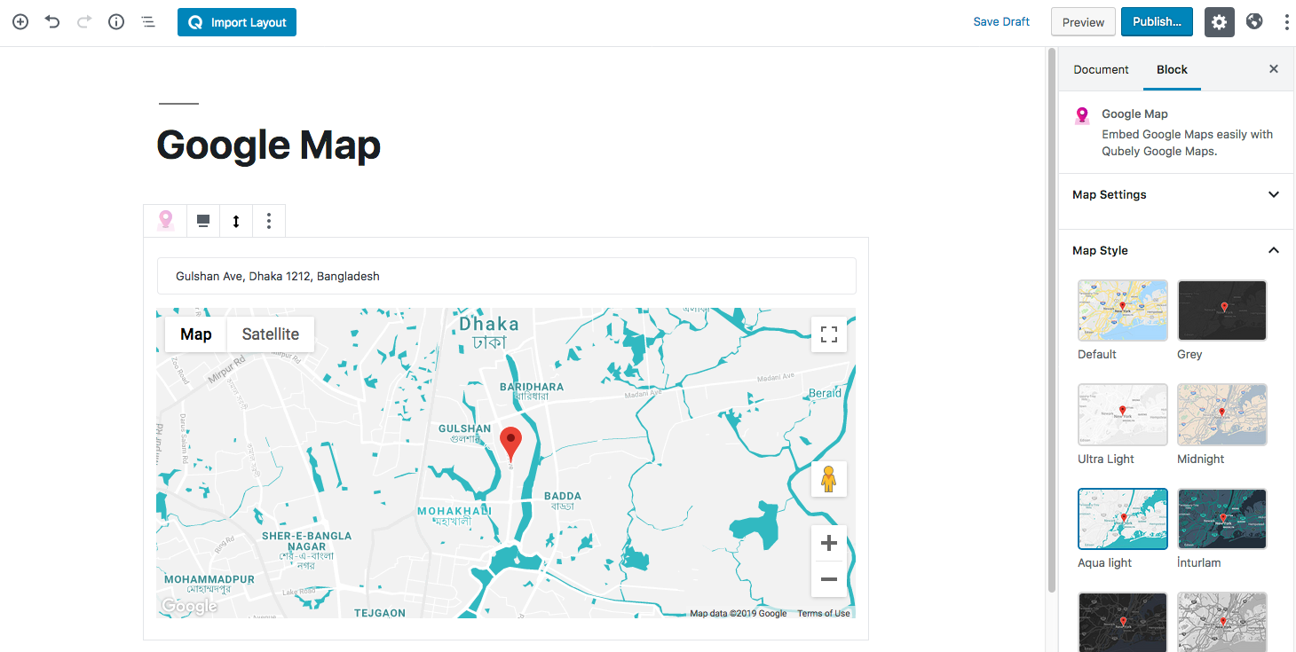
This block allows you to set Google Map location to your web page. In order to use this block, you need a have a Google Map API key. Inserting the key will enable all its functions. To show your desired location on the map, you need to type in your location address exactly the same as written on the Google Map.
Style
Map Style: You can make your web page stand out from the rest by using map styling. Qubely Google Map block currently offers 10 preset styles. You can choose the one you like whenever you want.
Map Options: You can take complete control over the map settings from this section.
- Zoom Buttons: Turning it on will let your users control the zooming functionality.
- Map Type Buttons: Turing it on will let the users switch between traditional and satellite maps.
- Street View Button: If your area supports the street view, this is a great way to let the users see your physical presence.
- Full-Screen Button: Turning it on will make the fullscreen button to appear.
- Draggable: If this option is turned on, your users will be able to browse the neighborhoods.
- Show Marker: Enabling this will show a marker pinpointing your map location. You can add a custom marker as well if you wish to.
Advanced
Animation
To make the block more interesting, you can add an animation effect. It is disabled by default, to enable this feature, choose an effect from the dropdown list. Once you choose your desired one, then start making modifications as you see fit. The units are in milliseconds. Note: Duration is how long the animation will run and Delay is the waiting time before the animation starts loading. The following effects are currently available.
- Fade: Selecting this will animate your table of contents block with a fading animation.
- Slide: Animate your table of contents block with a sliding animation.
- Bounce: If you want to animate your table of contents block with a bouncing animation then select this.
- Zoom: This option will animate your table of contents block with a Zooming animation.
- Flip: Animate your table of contents block with a Flipping animation using this option.
- Fold: Selecting this will animate your table of contents block with a sliding animation.
- Rotate: This will animate your table of contents block with a rotating animation.
Note: You can control from which direction the animation will start such as from the center, right, left, up or down. Also, control how many times the animation will repeat. You can also select the duration and the starting delay of the animation in milliseconds.
Advanced
This section lets you override the current styling of this particular block.
Enable Custom Position: If you want to set the block to a custom position then simply enable this option. After enabling you will find the following options
From X-axis: Select from the slider what position you want the image block to be in according to the X-axis. The range limits from -2000 to 2000.
From Y-axis: Select from the slider what position you want the image block to be in according to the X-axis. The range limits from -2000 to 2000.
Z – Index: If any of your blocks override another, then you can set a value here, the one with the higher value will appear before the other.
Hide on Tablet/Phone: Turn it on to hide this block in your desired device. The change will appear on the frontend.
Block Row CSS: In case you need to override current block settings, you can write down your own code followed by {{QUBELY}} to override the current settings.Additional CSS Class: You might need to name a block in order to make custom modifications in the future, this is the field where you define the name.