A circular progress bar is a great way to show complex information. It breaks down the complicated things and makes it easy to understand.
Select Pie Progress from the Qubely block section and click it to add it to your site.
Layout
Design Templates: Design templates are individual blocks that have been predesigned to use. All you have to do is pick the one you like, and the styling settings will be imported from that template.
Related Sections: Related sections are multi-block sections that have been pre-designed. This tab contains relevant blocks fetched from the Ready Sections of Qubely.
Style
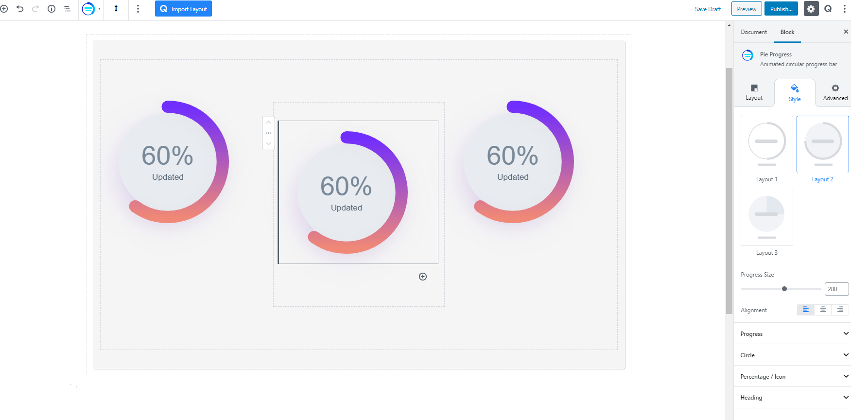
Selecting A Layout
Once you click on the Pie Progress, you will get the block settings. At first, you will find the option to choose three specific layouts. Every layout gives you the option to customize them.
Progress Size
Define the progress size using the slider. You can set the exact size with the slider or enter the value manually.
Alignment
Choose from three alignment options for your Pie Progress block. Left, middle and right.
Templates
With the Qubely Pie Progress block, you also get the ability to choose a predefined design template for your Pie Progress.
Progress
This set of configuration options let you customize the progress bar of the block. Below you will see the list of what settings are available.
Progress Percent: Set the percentage of the progress with the slider. You can also set it manually. You will also be able to see the progress bar change in real-time.
Progress Color: Choose from different types of color options for your progress bar. You can set a specific fill color, set a gradient color or clear any applied color.
- Color: Selecting this will only set a solid color for your progress bar. From the Fill Color option, you can choose from a wide range of colors.
- Gradient Type – Linear: A linear gradient applies the gradient by an axis. It’s a linear line. The effect is applied with a Gradient Angel, which defines the starting point. And two colors applied at two ends. Color 1 starts at the defined angle point and Color 2 starts after the Color 1 endpoint.
- Clear: Lets you reset the existing gradient effect. You can use it to start over.
Corner: Set the corner radius of the progress to either sharp edge or rounded corners.
Progress Width: Define the width of the progress bar with the slider. You can also set the width property manually.
Shadow: You can apply shadow to the progress bar using this feature. Enabling the feature will present you with the following options:
- Color: Lets you choose the color of the shadow.
- X: Lets you define the length of the shadow of X-axis.
- Y: Lets you define the length of the shadow of Y-axis.
- Blur: Lets you control the blurriness of the shadow.
- Spread: Lets you control how far the shadow will spread.
- Inset: Enable this feature if you want the shadows to be drawn inside the border, above the background, but below content.
Speed: Set the duration of the progress bar completion in milliseconds. Use the slider to set the milliseconds or manually enter it.
Circle
You also have the option to customize the inside circle that holds the progress bar. Once you collapse the settings you will find the following options.
Circle Width: Use the slider to define the circle width. You can also use the input box to set it manually.
Circle Shrink: This slider will let you control the shrinking size of the circle that holds the progress bar. Shrinking is done according to the percentage of the progress bar. You can also manually set the shrinking properties.
Circle Background: Select the color of the circle with these settings.
- Color: Selecting this will only set a solid color for your image overlay. From the Fill Color option, you can choose from a wide range of colors.
- Clear: Lets you reset the existing gradient effect. You can use it to start over.’
Shadow: You can apply shadow to the circle using this feature. Enabling the feature will present you with the following options:
- Color: Lets you choose the color of the shadow.
- X: Lets you define the length of the shadow of X-axis.
- Y: Lets you define the length of the shadow of Y-axis.
- Blur: Lets you control the blurriness of the shadow.
- Spread: Lets you control how far the shadow will spread.
- Inset: Enable this feature if you want the shadows to be drawn inside the border, above the background, but below content.
Percentage/Icon
If you want to show a visual inside your Pie Progress block, you can do that from these settings. Once you enable the toggle button, you will find the available options.
Type: There are three types of visuals you can choose.
- Percentage: Select this if you want to show the default percentage icon that you set before.
- Icon
- Searching & adding an icon: You have the option to choose from a wide range of icons. Scroll through the available options and select the one that you like. It will be applied as the visual of your Pie Progress block.
- Icon Size: Use the slider to set the icon size. Or you can manually enter it.
- Icon Color: Choose a specific color from a wide range of color palettes for your icon. Or clear any applied color with the clear button.
- Image
- Image: You can choose any image from your media library or by uploading a new image.
- Retina Image: Upload the version of the image that you want to show on the Retina displays (primary apple devices). It’s optional.
- Alt-Text: Write the alt text that describes what the image is about. It is very important for search engine optimization.
- Image Width: Define the image width with the slider. You can use the slider or set it manually. It is a responsive feature so you also have the option to define image width for different types of devices.
- Text
- Write Your Text: Write down the text you want to show inside your Pie Progress block.
- Text Color: Set the color of the text from a wide range of colors. Choose any one from the color palette.
- Typography: To change the typography of the text turn on this function and you’ll have the followings:
- Font Size: Define the size of the font. It is a responsive function, therefore, the size of the font can be customized according to the device type.
- Font Family: Choose your desired font to use from the list. Qubely has a collection of 900 fonts including the defaults that come with Gutenberg.
- Weight: Set the font-weight. Normally the font-weight is the thickness of a font.
- Advanced Typography
- Line Height: It’s the difference between lines, adjust it the way you want to.
- Letter Spacing: It controls the space in between letters, defines the gap the way you want to.
- Text Transform: Lets you apply your preferred capitalization format to the text.
Heading
If you want to show a heading for your Pie Progress block you need to enable this option. Once you enable it you can set the following options
- Heading Text: Here you need to write down the heading text.
- Heading Color: Choose any color from the wide range of color palette for the heading text.
- Type: Choose what position you want the heading in.
- Inside: Select this option if you want to show the heading inside the Pie Progress block.
- Outside: Choose this option if you want the heading to be outside. You can choose the alignment option for the heading once you set it outside.
- Spacing: Define the spacing between the heading and the rest of the Pie Progress block elements.
- Typography: To change the typography of the text turn on this function and you’ll have the followings:
- Font Size: Define the size of the font. It is a responsive function, therefore, the size of the font can be customized according to the device type.
- Font Family: Choose your desired font to use from the list. Qubely has a collection of 900 fonts including the defaults that come with Gutenberg.
- Weight: Set the font-weight. Normally the font-weight is the thickness of a font.
- Advanced Typography
- Line Height: It’s the difference between lines, adjust it the way you want to.
- Letter Spacing: It controls the space in between letters, defines the gap the way you want to.
- Text Transform: Lets you apply your preferred capitalization format to the text.
Advanced
Animation
To make the block more interesting, you can add an animation effect. It is disabled by default, to enable this feature, choose an effect from the dropdown list. Once you choose your desired one, then start making modifications as you seem fit. The units are in milliseconds. Note: Duration is how long the animation will run and Dealy is the waiting time before the animation starts loading. The following effects are currently available.
Fade: Selecting this will animate your “Pie Progress” with a fading animation.
Slide: Animate your “Pie Progress” with a sliding animation.
Bounce: If you want to animate your “Pie Progress” with a bouncing animation then select this.
Zoom: This option will animate your “Pie Progress” with a Zooming animation.
Flip: Animate your “Pie Progress” with a Flipping animation using this option.
Fold: Selecting this will animate your “Pie Progress” with a sliding animation.
Rotate: This will animate your “Pie Progress” with a rotating animation.
Note: You can control the from which direction the animation will start such as from the center, right, left, up or down. Also, control how many times the animation will repeat. You can also select the duration and the starting delay of the animation which are considered in milliseconds.
Interaction
With the Qubely “Pie Progress”, you also have control over how people interact with your Qubely block. There are three options that you can control how the interaction works.
Enable Tablet: If you want to enable the interactions for Tablet Handheld product users to enable this to start showing tablet users the image interactions.
Enable Mobile: If you want to enable the interactions for Mobile Handheld product users to enable this to start showing mobile users the image interactions.
Enable Mouse Movement: You can select the way how your interactions work with your mouse movement. There are multiple options once you enable it. You can choose the direction from Direct/Opposite, speed from a scale of 1 to 10, maximum from a scale of 5 to 75.
Live Button: This button will give you “Live experience” on how your interactions work depending on how you set it. Click on it to get an overview.
Advanced
This section lets you override the current styling of this particular block.
Enable Custom Position: If you want to set the “Pie Progress” to a custom position then simply enable this option. After enabling you will find the following options
From X-axis: Select from the slider what position you want the “Pie Progress” to be in according to the X-axis. The range limits from -2000 to 2000.
From Y-axis: Select from the slider what position you want the “Pie Progress” to be according to the X-axis. The range limits from -2000 to 2000.
Z – Index: If any of your blocks override another, then you can set a value here, the one with the higher value will appear before the other.
Hide on Tablet/Phone: Turn it on to hide this block in your desired device. The change will appear on the frontend.
Block Row CSS: In case you need to override current block settings, you can write down your own code followed by {{QUBELY}} to override the current settings.
Additional CSS Class: You might need to name a block in order to make custom modifications in the future, this is the field where you define the name.