If you want to create a vertical tabs section on your website page with Gutenberg blocks then Qubely’s Vertical Tab is the perfect choice for you. You will be able to create the vertical tab you want, with its advanced configuration options.
Once you add it to your page/post click on it to find the configuration options on the right side of the editor.
Layout
Design Templates: Design templates are individual blocks that have been predesigned to use. All you have to do is pick the one you like, and the styling settings will be imported from that template.
Style
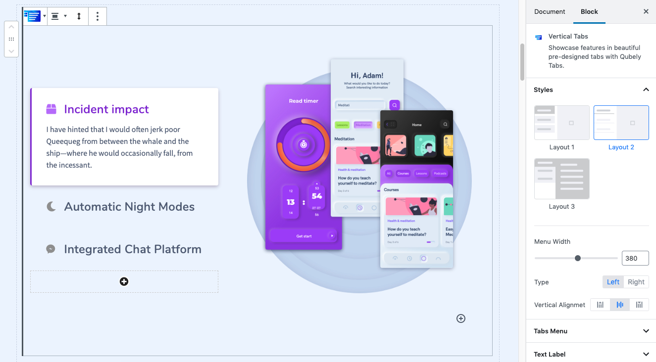
In the styles section, you will find different preset layouts that you can use to easily design your layouts. There are currently three different options to choose from. Tabs, Pills, Underline. After selecting a preset design layout you can define the
- Menu Width: Use the slider to define the width of the menu bar.
- Type: Select which type of tab menu option you want to choose. You can set it as either left or right.
- Vertical Alignment: Choose from three different positions for your vertical alignment.
Tabs Menu
This configuration section of your Vertical Tab lets you customize the tabs menu section. The first configuration settings you will find is
- Normal: This option is suitable for choosing an overlay that will show all the time. Go to the Fill Color feature and choose the color of your choice.
- Active: Active section has the settings that let you set the details when a specific tab is active in the tab menu.
- Hover: If you want the overlay to only show when you or your users hover over the tab then you need to choose the Hover feature.
Regardless you choose Normal, Active or Hover you will have two types of Background options to choose from.
- Color: Selecting this will only set a solid color for your tab overlay. From the Fill Color option, you can choose from a wide range of colors.
- Clear: Lets you reset the existing gradient effect. You can use it to start over.
- Gradient Type – Linear: A linear gradient applies the gradient by an axis. It’s a linear line. The effect is applied with a Gradient Angel, which defines the starting point. And two colors applied at two ends. Color 1 starts at the defined angle point and Color 2 starts after the Color 1 endpoint.
- Gradient Type – Radial: A radial gradient applies the gradient effect by a center point. The Radial Pointer defines the starting point of the circle where Color 1 defines the inner circle area and Color 2 defines the outer circle.
Padding Y/X: To set the Padding of the icon list, you can use the Padding function. You can apply the same value to all the corners by choosing the global option whereas selecting the Custom option will let you set a different value for each corner. Also, it’s a responsive feature that means you can apply different values for different device types.
Corner: Use the slider to set the corner radius of the tab menu section of the Vertical Tab block. It is a responsive feature so you can set different corner values for different types of devices.
Border: Set the border type from different types of the border design. There are solid, dotted, dashed, and double types of border design to choose from. You can also choose the border color from a wide range of color palettes along with border-radius. The border-radius is a responsive feature you can set different attributes for different types of devices.
Gap/Spacing: Use the slider to define the gap/spacing between each of the tab in the Vertical Tab block.
Shadow/Shadow 2: After enabling this, you will be able to set the shadow properties for the applied shadow.
- Color: Lets you choose the color of the shadow.
- X: Lets you define the length of the shadow of X-axis.
- Y: Lets you define the length of the shadow of Y-axis.
- Blur: Lets you control the blurriness of the shadow.
- Spread: Lets you control how far the shadow will spread.
Text Label
This section of the configuration menu lets set the text label and its attributes.
- Normal: This option is suitable for choosing an overlay that will show all the time. Go to the Fill Color feature and choose the color of your choice.
- Active: Active section has the settings that let you set the details when a specific tab is active in the tab menu.
- Hover: If you want the overlay to only show when you or your users hover over the tab then you need to choose the Hover feature.
Regardless you choose Normal or Hover you will have two types of Background options to choose from.
- Color: Selecting this will only set a solid color for your tab overlay. From the Fill Color option, you can choose from a wide range of colors.
- Clear: Lets you reset the existing gradient effect. You can use it to start over.
Alignment: Choose how you want your text to align. Select the alignment it will be applied immediately.
Typography: You can enable typography settings for the text label. Select what typography you would like to use from the settings that you will find.
- Font Size: Define the size of the font. It is a responsive function, therefore, the size of the font can be customized according to the device type.
- Font Family: Choose your desired font to use from the list. Qubely has a collection of 900 fonts including the defaults that come with Gutenberg.
- Weight: Set the font-weight. Normally the font-weight is the thickness of a font.
- Advanced Typography: If you click on the gear icon on the Advanced Typography you will be presented with advanced configuration options to set custom typography.
- Line Height: It’s the difference between lines, adjust it the way you want to.
- Letter Spacing: It controls the space in between letters, defines the gap the way you want to.
- Text Transform: Lets you apply your preferred capitalization format to the text.
Nav Icon
Enable Icon: Enable this using the toggle button if you want to add an icon or an image to your text label.
- Select Icon: Choose from a huge list of icons to set in your text label. Once you select an icon you can configure
- Icon Style: Set the icon as inline or outline.
- Normal/Active/Hover: Select different customizations for different states of the icon.
- Color: Choose from a wide range of colors from the full set of color palettes.
- Icon Position: Set the position of the icon from the preset options.
- Icon Size: Use the slider to set the specific size of the icon. You can use the slider as well as set it using the manual input option. It is a responsive feature so you different values for different types of devices.
- Icon Gap: This lets you control the gap distance between the text label and icon. This is also a responsive feature so you are able to set different gap distances for different types of screens.
- Select Image: If you are opt-in for showing an image in the text label area. Once you select it you will find the following options
- Image: Select an image from your media library or upload a new image file from your local environment.
- Retina image (@2x): Upload the version of the image that you only want to show on the Retina displays (primary apple devices). It’s optional.
- Image Position: Set the position of the image. You can select either left or right.
- Image Size: Use the slider to set the specific size of the image. You can use the slider as well as set it using the manual input option. It is a responsive feature so you different values for different types of devices.
- Image Gap: This lets you control the gap distance between the text label and image. This is also a responsive feature so you are able to set different gap distances for different types of screens.
Subheading
Enable Sub Heading: Enable this toggle button to set a subheading for your vertical tab menu. Once enabled you will find the following options,
- Normal: This option is suitable for choosing an overlay that will show all the time. Go to the Fill Color feature and choose the color of your choice.
- Active: Active section has the settings that let you set the details when a specific tab is active in the tab menu.
- Hover: If you want the overlay to only show when you or your users hover over the tab then you need to choose the Hover feature.
Regardless you choose Normal/Active/Hover state you will find the following settings,
- Color: Set the color of the subheading text. Choose from a wide range of colors or click on the clear button to get rid of any applied color.
- Gap: Use the slider to set the gap distance between the subheading and the rest of the content on the upper side of the vertical tab menu.
- Typography: You can enable typography settings for the text label. Select what typography you would like to use from the settings that you will find.
- Font Size: Define the size of the font. It is a responsive function, therefore, the size of the font can be customized according to the device type.
- Font Family: Choose your desired font to use from the list. Qubely has a collection of 900 fonts including the defaults that come with Gutenberg.
- Weight: Set the font-weight. Normally the font-weight is the thickness of a font.
- Advanced Typography: If you click on the gear icon on the Advanced Typography you will be presented with advanced configuration options to set custom typography.
- Line Height: It’s the difference between lines, adjust it the way you want to.
- Letter Spacing: It controls the space in between letters, defines the gap the way you want to.
- Text Transform: Lets you apply your preferred capitalization format to the text.
Accordion
Enable Accordion: Enable this toggle button to set an accordion for your vertical tab menu. The accordion section will be added after the subheading section in the vertical tab menu. Once enabled you will find the following options,
- Normal: This option is suitable for choosing an overlay that will show all the time. Go to the Fill Color feature and choose the color of your choice.
- Active: Active section has the settings that let you set the details when a specific tab is active in the tab menu.
- Hover: If you want the overlay to only show when you or your users hover over the tab then you need to choose the Hover feature.
Regardless you choose Normal/Active/Hover state you will find the following settings,
- Color: Set the color of the accordion text. Choose from a wide range of colors or click on the clear button to get rid of any applied color.
- Gap: Use the slider to set the gap distance between the subheading and the rest of the content on the upper side of the vertical tab menu.
- Typography: You can enable typography settings for the text label. Select what typography you would like to use from the settings that you will find.
- Font Size: Define the size of the font. It is a responsive function, therefore, the size of the font can be customized according to the device type.
- Font Family: Choose your desired font to use from the list. Qubely has a collection of 900 fonts including the defaults that come with Gutenberg.
- Weight: Set the font-weight. Normally the font-weight is the thickness of a font.
- Advanced Typography: If you click on the gear icon on the Advanced Typography you will be presented with advanced configuration options to set custom typography.
- Line Height: It’s the difference between lines, adjust it the way you want to.
- Letter Spacing: It controls the space in between letters, defines the gap the way you want to.
- Text Transform: Lets you apply your preferred capitalization format to the text.
Tab Body
If you want to configure the look and feel of the body section of the vertical tab menu’s you can do that from this section of the menu. The body section points to the specific area that appears once you click on a menu in the vertical tab.
- Background color: You can choose the color of the body from a variety of ranges or choose one from the predefined color palette.
- Padding: Set the padding of the body section with the slider. You can use the slider or also set it manually. You also have the ability to set different padding specific to each side of the body. This is also a responsive feature that lets you set different padding values for different types of devices.
- Spacing: Use the slider to set the spacing between the body and menu area of the vertical tab. You can set the value using the slider or enter it manually. This is a responsive feature so you can set different spacing values for different types of devices.
- Border: Choose the border type you want to set in the body section. You can choose solid, dotted, dashed, double or click on the clear button.
- Border Color: Select from a wide range of color palette to set the color of your border. You can set a specific color or click on the clear button to remove any applied color.
- Border Width: Set the border width with the slider. You can also enter the border width value manually. You can set the width separately for each side or set a global value. It is a responsive feature so you can set a different value for different types of devices.
- Radius: To add a rounded corner around the body, you can use the Radius function. The scale can be calibrated between 1 to 100. You can apply the same value to all the corners by choosing the Global option whereas selecting the Custom option will let you set a different value for each corner. Also, it’s a responsive feature that means you can apply different values for different device types.
- Box-Shadow: You can apply shadow to the body using this feature. You can apply shadow for both Normal and Hover states. Enabling the feature will present you with the following options:
- Color: Lets you choose the color of the shadow.
- X: Lets you define the length of the shadow of X-axis.
- Y: Lets you define the length of the shadow of Y-axis.
- Blur: Lets you control the blurriness of the shadow.
- Spread: Lets you control how far the shadow will spread.
Advanced
Animation
To make the block more interesting, you can add an animation effect. It is disabled by default, to enable this feature, choose an effect from the dropdown list. Once you choose your desired one, then start making modifications as you seem fit. The units are in milliseconds. Note: Duration is how long the animation will run and Dealy is the waiting time before the animation starts loading. The following effects are currently available.
Fade: Selecting this will animate your tab block with a fading animation.
Slide: Animate your tab block with a sliding animation.
Bounce: If you want to animate your tab block with a bouncing animation then select this.
Zoom: This option will animate your tab block with a Zooming animation.
Flip: Animate your tab block with a Flipping animation using this option.
Fold: Selecting this will animate your tab block with a sliding animation.
Rotate: This will animate your tab block with a rotating animation.
Note: You can control the from which direction the animation will start such as from the center, right, left, up or down. Also, control how many times the animation will repeat. You can also select the duration and the starting delay of the animation which are considered in milliseconds.
Interaction
With the Qubely tab block, you also have control over how people interact with the tab that you upload. There are three options that you can control how the interaction works.
Enable Tablet: If you want to enable the interactions for Tablet Handheld product users to enable this to start showing tablet users the tab interactions.
Enable Mobile: If you want to enable the interactions for Mobile Handheld product users to enable this to start showing mobile users the tab interactions.
Enable Mouse Movement: You can select the way how your interactions work with your mouse movement. There are multiple options once you enable it. You can choose the direction from Direct/Opposite, speed from a scale of 1 to 10, maximum from a scale of 5 to 75.
Live Button: This button will give you “Live experience” on how your interactions work depending on how you set it. Click on it to get an overview.
Advanced
This section lets you override the current styling of this particular block.
Enable Custom Position: If you want to set the tab block to a custom position then simply enable this option. After enabling you will find the following options
From X-axis: Select from the slider what position you want the tab block to be in according to the X-axis. The range limits from -2000 to 2000.
From Y-axis: Select from the slider what position you want the tab block to be in according to the X-axis. The range limits from -2000 to 2000.
Z – Index: If any of your blocks override another, then you can set a value here, the one with the higher value will appear before the other.
Hide on Tablet/Phone: Turn it on to hide this block in your desired device. The change will appear on the frontend.
Block Row CSS: In case you need to override current block settings, you can write down your own code followed by {{QUBELY}} to override the current settings.
Additional CSS Class: You might need to name a block in order to make custom modifications in the future, this is the field where you define the name.