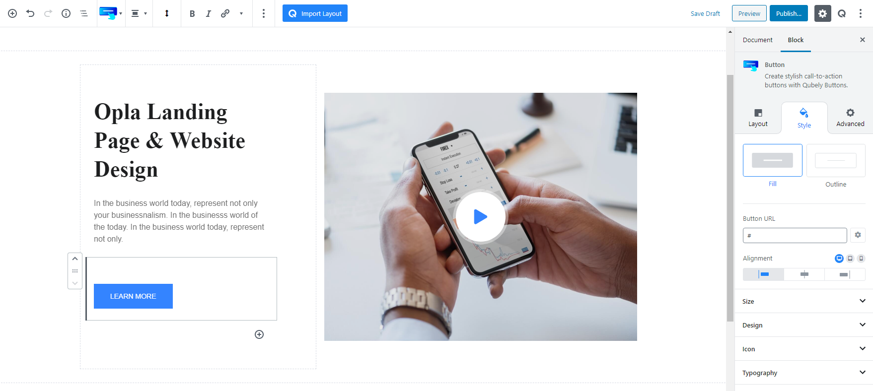
The Button block of Qubely is like a typical button but with remarkable features. Firstly you’ll see 2 predefined layouts, choose the one you like. Then type in the button URL. The little gear icon on the right will let you set the button action, like if you want to open the link in a new tab or make it a no-follow link.
Layout
Related Sections: Related sections are multi-block sections that have been pre-designed. This tab contains relevant blocks fetched from the Ready Sections of Qubely.
Style
Size: The Button block of Qubely lets you change the button size. There are three preset button sizes but if you think a custom size is necessary, you can create one for different device types. To do that, click the little gear icon and define the height and width of the button.
Design: This section will let you change the text and background color of the button. You can even apply a gradient effect on the background if you wish to. For changing the shape of the button, choose one from the Corner dropdown list.
Border: You can set a border width for different devices and change the color for normal and hover state. At times a button may look better without a border, like the one in the screenshot, with Qubely you can set the border to 0.
Icon: You can make your button more interesting by adding an icon once in a while. Qubely has a vast collection of icons that includes Font Awesome and Qubely line icons.
Typography: You can change the styling of the texts on the button, to do that select a font, define the weight (normally a font-weight is the thickness of a font). The font size and letter spacing can be defined for different device types.
Shadow: You can add a shadow effect to the block for both normal and hover state. Pick a color, set the value for the horizontal, vertical, blur, and spread. Enable inset for a reverse shadow effect.
Advanced
Animation
To make the block more interesting, you can add an animation effect. It is disabled by default, to enable this feature, choose an effect from the dropdown list. Once you choose your desired one, then start making modifications as you see fit. The units are in milliseconds. Note: Duration is how long the animation will run and Delay is the waiting time before the animation starts loading. The following effects are currently available.
- Fade: Selecting this will animate your table of contents block with a fading animation.
- Slide: Animate your table of contents block with a sliding animation.
- Bounce: If you want to animate your table of contents block with a bouncing animation then select this.
- Zoom: This option will animate your table of contents block with a Zooming animation.
- Flip: Animate your table of contents block with a Flipping animation using this option.
- Fold: Selecting this will animate your table of contents block with a sliding animation.
- Rotate: This will animate your table of contents block with a rotating animation.
Note: You can control from which direction the animation will start such as from the center, right, left, up or down. Also, control how many times the animation will repeat. You can also select the duration and the starting delay of the animation in milliseconds.
Interaction
Enable Tablet: If you want to enable the interactions for tablet users to enable this to start showing tablet users the image interactions.
Enable Mobile: If you want to enable the interactions for mobile users to enable this to start showing mobile users the image interactions.
Enable Mouse Movement: You can select the way how your interactions work with your mouse movement. There are multiple options once you enable it. You can choose the direction from Direct/Opposite, speed from a scale of 1 to 10, maximum from a scale of 5 to 75.
Live Button: This button will give you “Live experience” on how your interactions work depending on how you set it. Click on it to get an overview.
Advanced
This section lets you override the current styling of this particular block.
Enable Custom Position: If you want to set the block to a custom position then simply enable this option. After enabling you will find the following options
From X-axis: Select from the slider what position you want the image block to be in according to the X-axis. The range limits from -2000 to 2000.
From Y-axis: Select from the slider what position you want the image block to be in according to the X-axis. The range limits from -2000 to 2000.
Z – Index: If any of your blocks override another, then you can set a value here, the one with the higher value will appear before the other.
Hide on Tablet/Phone: Turn it on to hide this block in your desired device. The change will appear on the frontend.
Block Row CSS: In case you need to override current block settings, you can write down your own code followed by {{QUBELY}} to override the current settings.Additional CSS Class: You might need to name a block in order to make custom modifications in the future, this is the field where you define the name.