Qubely Gallery block lets you show a gallery of your uploaded media files with advanced layout options. You can find the Qubely gallery block in the add block section. Once you add it to your post/page click on it to find it’s block configuration options.
Style
General Settings
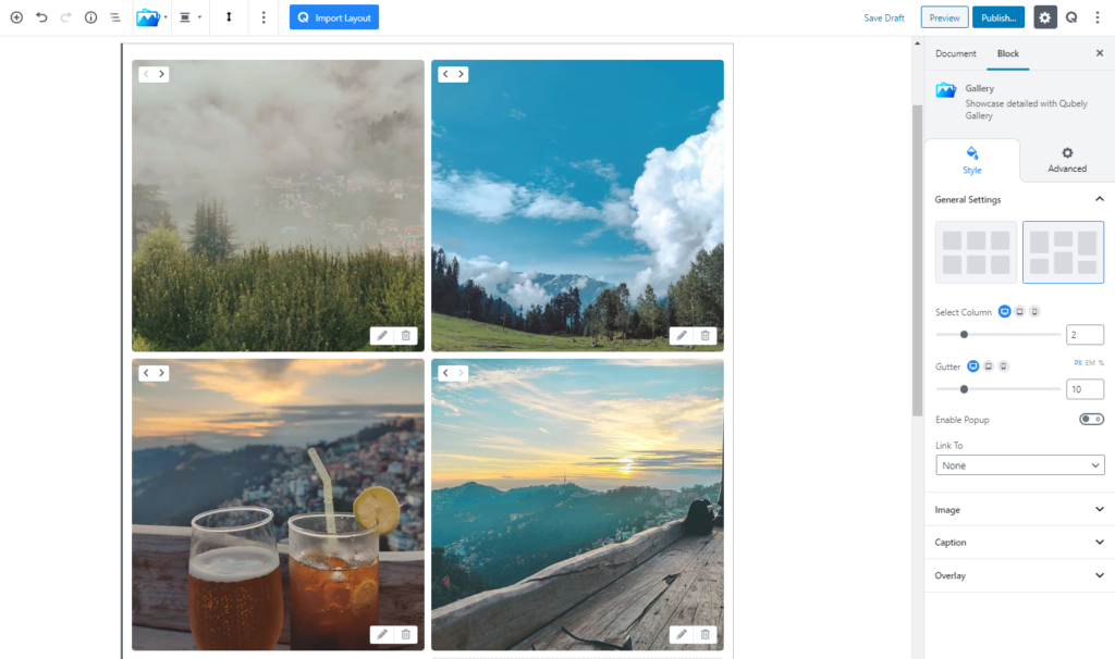
Select from two different layout options for your gallery. Click on the layout option that you want to choose and it will be applied.
Select Column: Select the number of columns you want to show in your Qubely Gallery block. The number you choose will define the number of images the gallery will show. It is a responsive feature so you can choose how many columns you want to show for different types of devices.
Gutter: Define the distance gap between each of the images in the Gallery block. Use the slider or set it manually using the input box.
Image
You can control multiple attributes of the images in your Gallery block from this section.
Fixed Image Height: If you want to fix the image height in the Gallery block you can enable this from here.
- Height: Use the slider to set the height of the images to your requirement. You can also set it manually. It is responsive so you can set height specific to the device type.
Radius: Control the radius of the corner of the image block area in the Gallery block. Set the radius with the slider or provide the number manually. There is a global option to set every corner with the same value or you can select each individual corner with a separate value.
Box-Shadow: You can apply shadow to the image using this feature. You can apply shadow for both Normal and Hover states. Enabling the feature will present you with the following options:
- Color: Lets you choose the color of the shadow.
- X: Lets you define the length of the shadow of X-axis.
- Y: Lets you define the length of the shadow of Y-axis.
- Blur: Lets you control the blurriness of the shadow.
- Spread: Lets you control how far the shadow will spread.
Image Animation: There are multiple animations you can choose from after you click on the drop-down menu.
- No Animation: Selecting this will stop any animation while hovering above the image. Perfect choice if you don’t animation to show.
- Slide from top: You can choose this option to animates the image so that the image slides from the top.
- Slide from right: If you want to animate your image so that it slides from the right to select this option.
- Slide from bottom: By selecting this you can animate the image to slide from the bottom section of the image.
- Zoom in: This option animates the image and shows a Zoom in effect while hovering above the image.
- Zoom out: Animates the image and shows a Zoom out effect while hovering above the image.
- Scale: If you want to animate your image by scaling it while hovering above the image you can use this option.
Caption
You can add a caption to the images by turning this feature on.
Padding: To set the Padding of the caption over your image, you can use the Padding function. The scale can be calibrated between 1 to 200. You can apply the same value to all the corners by choosing the global option whereas selecting the Custom option will let you set a different value for each corner. Also, it’s a responsive feature that means you can apply different values for different device types.
Show: Select whether you want the caption of the images in the gallery to always show. You can choose if the caption will show while your users hover over the image or it will be always shown.
Vertical Align: Choose from three vertical positions for your content.
Horizontal Alignment: Select if you want your caption content to be positioned horizontally in the left, middle or the right section.
Caption Typography: To change the typography of the text turn on this function and you’ll have the followings:
- Font Size: Define the size of the font. It is a responsive function, therefore, the size of the font can be customized according to the device type.
- Font Family: Choose your desired font to use from the list.
- Weight: Set the font-weight. Normally the font-weight is the thickness of a font.
- Advanced Typography
- Line Height: It’s the difference between lines, adjust it the way you want to.
- Letter Spacing: It controls the space in between letters, defines the gap the way you want to.
- Text Transform: Lets you apply your preferred capitalization formate to the text.
Caption Color: You can choose the color of the text from a variety of ranges or choose one from the predefined color palette.
Spacing: Lets you control empty the area between the Image and the Caption. The higher the value is the more the gap becomes.
Overlay
There is a toggle button here that will enable all the Overlay features available for the section. If you are not familiar with overlay, it means to cover your image with a separate foreground. There are two types of Overlay to choose from.
Normal: This option is suitable for choosing an overlay that will show all the time. Go to the Fill Color feature and choose the color of your choice.
Hover: If you want the overlay to only show when you or your users hover over the image then you need to choose the Hover feature.
Regardless you choose Normal or Hover you will have two types of Background options to choose from.
- Color: Selecting this will only set a solid color for your image overlay. From the Fill Color option, you can choose from a wide range of colors.
- Clear: Lets you reset the existing gradient effect. You can use it to start over.
- Gradient Type – Linear: A linear gradient applies the gradient by an axis. It’s a linear line. The effect is applied with a Gradient Angel, which defines the starting point. And two colors applied at two ends. Color 1 starts at the defined angle point and Color 2 starts after the Color 1 endpoint.
- Gradient Type – Radial: A radial gradient applies the gradient effect by a center point. The Radial Pointer defines the starting point of the circle where Color 1 defines the inner circle area and Color 2 defines the outer circle.
- Blend Mode: Blend mode allows you to configure how your set overlay should blend with the image that you have uploaded. If you are completely new to this term, Blending means how one layer of an image should blend with another layer. Altogether there are 13 total blending choices you can choose from. Normal, multiply, screen, overlay, darken, lighter, color dodge, saturation, luminosity, color, color burn, exclusion and lastly hue.
Advanced
Animation
To make the block more interesting, you can add an animation effect. It is disabled by default, to enable this feature, choose an effect from the dropdown list. Once you choose your desired one, then start making modifications as you seem fit. The units are in milliseconds. Note: Duration is how long the animation will run and Dealy is the waiting time before the animation starts loading. The following effects are currently available.
- Fade: Selecting this will animate your Image block with a fading animation.
- Slide: Animate your Image block with a sliding animation.
- Bounce: If you want to animate your Image block with a bouncing animation then select this.
- Zoom: This option will animate your Image block with a Zooming animation.
- Flip: Animate your Image block with a Flipping animation using this option.
- Fold: Selecting this will animate your Image block with a sliding animation.
- Rotate: This will animate your Image block with a rotating animation.
Note: You can control the from which direction the animation will start such as from the center, right, left, up or down. Also, control how many times the animation will repeat. You can also select the duration and the starting delay of the animation which are considered in milliseconds.
Interaction
With the Qubely image block, you also have control over how people interact with the image that you upload. There are three options that you can control how the interaction works.
Enable Tablet: If you want to enable the interactions for Tablet Handheld product users to enable this to start showing tablet users the image interactions.
Enable Mobile: If you want to enable the interactions for Mobile Handheld product users to enable this to start showing mobile users the image interactions.
Enable Mouse Movement: You can select the way how your interactions work with your mouse movement. There are multiple options once you enable it. You can choose the direction from Direct/Opposite, speed from a scale of 1 to 10, maximum from a scale of 5 to 75.
Live Button: This button will give you “Live experience” on how your interactions work depending on how you set it. Click on it to get an overview.
Advanced
This section lets you override the current styling of this particular block.
Enable Custom Position: If you want to set the image block to a custom position then simply enable this option. After enabling you will find the following options
- From X-axis: Select from the slider what position you want the image block to be in according to the X-axis. The range limits from -2000 to 2000.
- From Y-axis: Select from the slider what position you want the image block to be in according to the X-axis. The range limits from -2000 to 2000.
Z – Index: If any of your blocks override another, then you can set a value here, the one with the higher value will appear before the other.
Hide on Tablet/Phone: Turn it on to hide this block in your desired device. The change will appear on the frontend.
Block Row CSS: In case you need to override current block settings, you can write down your own code followed by {{QUBELY}} to override the current settings.
Additional CSS Class: You might need to name a block in order to make custom modifications in the future, this is the field where you define the name.