Showing off the people behind your success or product can be really good for the morale of the company. It also shows that you appreciate the hard work they do for the organization. To make this process a lot easier Qubely has come up with a very easy solution. Just go to the Add Block section and scroll down to add the Team. Click on it to add it to your page/post.
Style
There a complete of three different styles of team display you can choose from. Different types of display styles can be set according to the design elements of your website.
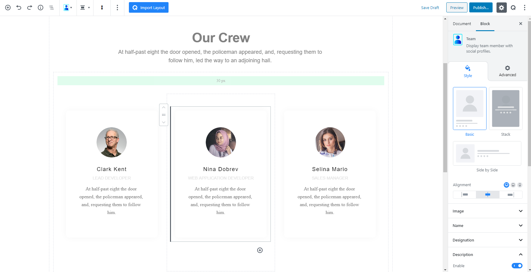
- Basic: This style of team display uses the most basic design and keeps everything minimalistic. According to this design, the team member image will be shown on the upper side of the block and all the rest of the details will show in the downwards section.
- Stack: This type of style is appropriate for a more animation style team member view. If you select this than the initial image will always be shown. Only if a user hovers over the image then the details of that team member will pop up.
- Side by Side: If you would like to choose the team member image and details side by side then this is the perfect option for you. It will show the image on the left side and all the details on the right side.
Alignment: You can apply alignment to your icon list elements regardless of the device types. There are left, middle and right alignment options to choose from. It also offers responsive functionality. Choose your desired device from the list and apply the alignment.
Image
You can upload an image of the team member right from the Image section in the following two options:
Image: Upload an image for all the regular devices out there.
Retina image (@2x): Upload the version of the image that you only want to show on the Retina displays (primary apple devices). It’s optional.
Image Width: You can define the width of the image using a simple slider. There is also an option to manually enter the width of the image. You can set the custom width according to PX, EM, or Percentage. It is a responsive function, therefore, the width of the image can be customized according to the device type.
Radius: You can also define the radius of the image using a simple slider. There is also an option to manually enter the width of the image. Set the custom width according to PX, EM, or Percentage. It is a responsive function, therefore, the width of the image can be customized according to the device type.
Image Spacing: Set how much the image spacing should be between the image and the details using a simple slider. You can also manually enter the spacing distance. You can set the custom width according to PX, EM, or Percentage. It is a responsive function, therefore, the width of the image can be customized according to the device type.
Name
You can change/edit the typography, color and the spacing between the Name and the rest of the details from this section of the Name part.
Typography: To change the typography of the text turn on this function and you’ll have the followings:
- Font Size: Define the size of the font. It is a responsive function, therefore, the size of the font can be customized according to the device type.
- Font Family: Choose your desired font to use from the list. Qubely has a collection of 900 fonts including the defaults that come with Gutenberg.
- Weight: Set the font-weight. Normally the font-weight is the thickness of a font.
- Advanced Typography: If you click on the gear icon on the Advanced Typography you will be presented with advanced configuration options to set custom typography.
- Line Height: It’s the difference between lines, adjust it the way you want to.
- Letter Spacing: It controls the space in between letters, defines the gap the way you want to.
- Text Transform: Lets you apply your preferred capitalization format to the text.
Spacing: Lets you control the empty area between the subtitle texts. The higher the value is the more the gap becomes.
Color: You also have the ability to set the color of the Name font of the Team member. Choose from a wide range of palettes.
Designation
Set a designation to the team member details in the Team block details section. To set it you have to first enable it using the toggle button. After enabling it you will find it’s configuration options.
Typography: To change the typography of the text turn on this function and you’ll have the followings:
- Font Size: Define the size of the font. It is a responsive function, therefore, the size of the font can be customized according to the device type.
- Font Family: Choose your desired font to use from the list. Qubely has a collection of 900 fonts including the defaults that come with Gutenberg.
- Weight: Set the font-weight. Normally the font-weight is the thickness of a font.
- Advanced Typography: If you click on the gear icon on the Advanced Typography you will be presented with advanced configuration options to set custom typography.
- Line Height: It’s the difference between lines, adjust it the way you want to.
- Letter Spacing: It controls the space in between letters, defines the gap the way you want to.
- Text Transform: Lets you apply your preferred capitalization format to the text.
Spacing: Lets you control the empty area between the subtitle texts. The higher the value is the more the gap becomes.
Color: You also have the ability to set the color of the Name font of the Team member. Choose from a wide range of palettes.
Description
You can show a description for the team member right under the designation area. To turn on the settings enable it from the toggle button.
Typography: To change the typography of the text turn on this function and you’ll have the followings:
- Font Size: Define the size of the font. It is a responsive function, therefore, the size of the font can be customized according to the device type.
- Font Family: Choose your desired font to use from the list. Qubely has a collection of 900 fonts including the defaults that come with Gutenberg.
- Weight: Set the font-weight. Normally the font-weight is the thickness of a font.
- Advanced Typography: If you click on the gear icon on the Advanced Typography you will be presented with advanced configuration options to set custom typography.
- Line Height: It’s the difference between lines, adjust it the way you want to.
- Letter Spacing: It controls the space in between letters, defines the gap the way you want to.
- Text Transform: Lets you apply your preferred capitalization format to the text.
Spacing: Lets you control the empty area between the subtitle texts. The higher the value is the more the gap becomes.
Color: You also have the ability to set the color of the Name font of the Team member. Choose from a wide range of palettes.
Information
If you would like to set the general information of the Team member in the Team blocks you have the option to do that from here. You can set:
Phone: Write the contact number of your team member and it will show up under the name and above the details of the team member.
Emails: Here you give the email address of the team member.
Website: If you want to show off the team member’s individual website address in the Team blocks just add it here.
Social
Want to add social media links of your team members in the Team blocks of Qubely. Enable it to show all the available configuration options.
You will get the option to add Facebook, Twitter, Instagram, LinkedIn, Youtube, Github, Flickr, Pinterest, Dribble, Behance. Just add the specific URL in the box and it will show up in the team members’ details area, inside the block.
Icon Style: There are two types of icon styles you can choose from.
The first one is the Fill. It will add a more square shape of the social media icons.
And the second is Normal. It is more close to the actual icon shape of the original. If you want a more original look this is the ideal choice.
Icon Size: Define the size of the icons. There are four preset sizes that you can choose from. They are small, medium, large. There is also a custom sizing option which will let you set a custom size ranging from 0-300. It offers responsive functionality too. Choose your desired device from the list and apply the custom size.
Gutter: This option lets you define the gap distance between each icon. Use the slider to control the distance. There is also an option to manually input the distance. Set the gutter according to PX, EM. It is a responsive function, therefore, the width of the image can be customized according to the device type.
Spacing: If you want to set the spacing distance between the description content and the social icons you can do that easily with this feature. You can also set it from the manual input box. Set the gutter according to PX, EM, and percentage. It is a responsive function, therefore, the width of the image can be customized according to the device type.
Default Styles: Initially the Social Icon style will be the default color that they are in the original logo. But if you want to change it turns off this toggle button and you will find the option to set a specific color to the social icon.
- Color: Click on the color palette and chose the color you want your social icons to be in. There is also a
- Hover: If you want to show a different color while users hover over your Social Icon simply choose from a color from the palette and apply it from here. There is also a clear button.
Content
You will find all the customization options for your content section of the Team blocks team member’s details section from here.
Background: If you would like to show a specific color to the background to the content of the team member details section you have the option to do that from here. You can choose
- Color: Selecting this will only set a solid color for your image overlay. From the Fill Color option, you can choose from a wide range of colors.
- Clear: Lets you reset the existing gradient effect. You can use it to start over.
- Gradient Type – Linear: A linear gradient applies the gradient by an axis. It’s a linear line. The effect is applied with a Gradient Angel, which defines the starting point. And two colors applied at two ends. Color 1 starts at the defined angle point and Color 2 starts after the Color 1 endpoint.
Padding: To set the Padding of the content, you can use the Padding function. The scale can be calibrated between 1 to 200. You can apply the same value to all the corners by choosing the global option whereas selecting the Custom option will let you set a different value for each corner. Also, it’s a responsive feature that means you can apply different values for different device types.
Border: Set a border around your content. Predefined borders include Solid, Dotted, Dashed and Double. There is also a clear button if you don’t want to apply a border.
Border Color: If you would like to define a color to the border of the content simply choose a color from the palette here and apply it.
Border Width: You can also set the width of the borders that you apply. There are two types of configuration options to choose from. You can set the border width on a scale between 0 to 10. You can also apply the same value to all the corners by choosing the global option whereas selecting the Custom option will let you set a different value for each corner.
Background
This feature lets you set a specific type of background individual to the Team blocks.
Background: If you would like to show a specific color to the background to the content of the team member details section you have the option to do that from here. You can choose
- Color: Selecting this will only set a solid color for your image overlay. From the Fill Color option, you can choose from a wide range of colors.
- Clear: Lets you reset the existing gradient effect. You can use it to start over.
- Gradient Type – Linear: A linear gradient applies the gradient by an axis. It’s a linear line. The effect is applied with a Gradient Angel, which defines the starting point. And two colors applied at two ends. Color 1 starts at the defined angle point and Color 2 starts after the Color 1 endpoint.
Padding: To set the Padding of the Background, you can use the Padding function. The scale can be calibrated between 1 to 200. You can apply the same value to all the corners by choosing the global option whereas selecting the Custom option will let you set a different value for each corner. Also, it’s a responsive feature that means you can apply different values for different device types.
Border: Set a border around your content. Predefined borders include Solid, Dotted, Dashed and Double. There is also a clear button if you don’t want to apply a border.
Radius: You can also set the radius of the content, using the Radius function. The scale can be calibrated between 1 to 100. You can apply the same value to all the corners by choosing the global option or also using the Custom option will let you set a different value for each corner. It’s a responsive feature that means you can apply different values for different device types.
- Color: Lets you choose the color of the shadow.
- Box-Shadow: You can apply shadow to the background using this feature. Enabling the feature will present you with the following options:
- X: Lets you define the length of the shadow of X-axis.
- Y: Lets you define the length of the shadow of Y-axis.
- Blur: Lets you control the blurriness of the shadow.
- Spread: Lets you control how far the shadow will spread.
- Inset: Enable this feature if you want the shadows to be drawn inside the border, above the background, but below content.
Advanced
Animation
To make the block more interesting, you can add an animation effect. It is disabled by default, to enable this feature, choose an effect from the dropdown list. Once you choose your desired one, then start making modifications as you see fit. The units are in milliseconds. Note: Duration is how long the animation will run and Delay is the waiting time before the animation starts loading. The following effects are currently available.
- Fade: Selecting this will animate your table of contents block with a fading animation.
- Slide: Animate your table of contents block with a sliding animation.
- Bounce: If you want to animate your table of contents block with a bouncing animation then select this.
- Zoom: This option will animate your table of contents block with a Zooming animation.
- Flip: Animate your table of contents block with a Flipping animation using this option.
- Fold: Selecting this will animate your table of contents block with a sliding animation.
- Rotate: This will animate your table of contents block with a rotating animation.
Note: You can control from which direction the animation will start such as from the center, right, left, up or down. Also, control how many times the animation will repeat. You can also select the duration and the starting delay of the animation in milliseconds.
Interaction
Enable Tablet: If you want to enable the interactions for tablet users to enable this to start showing tablet users the image interactions.
Enable Mobile: If you want to enable the interactions for mobile users to enable this to start showing mobile users the image interactions.
Enable Mouse Movement: You can select the way how your interactions work with your mouse movement. There are multiple options once you enable it. You can choose the direction from Direct/Opposite, speed from a scale of 1 to 10, maximum from a scale of 5 to 75.
Live Button: This button will give you “Live experience” on how your interactions work depending on how you set it. Click on it to get an overview.
Advanced
This section lets you override the current styling of this particular block.
Enable Custom Position: If you want to set the block to a custom position then simply enable this option. After enabling you will find the following options
From X-axis: Select from the slider what position you want the image block to be in according to the X-axis. The range limits from -2000 to 2000.
From Y-axis: Select from the slider what position you want the image block to be in according to the X-axis. The range limits from -2000 to 2000.
Z – Index: If any of your blocks override another, then you can set a value here, the one with the higher value will appear before the other.
Hide on Tablet/Phone: Turn it on to hide this block in your desired device. The change will appear on the frontend.
Block Row CSS: In case you need to override current block settings, you can write down your own code followed by {{QUBELY}} to override the current settings.Additional CSS Class: You might need to name a block in order to make custom modifications in the future, this is the field where you define the name.