Want to show your user a list of some important notes with specific icons beside them? Using a simple numbering system of creating a list is the old way. With the arrival of Qubely, our state of the art Gutenberg block plugin you can create a list of things with their appropriate icon within seconds.
Go to the Add Block section and scroll down to Qubely. You will find the Icon list. Click on it to add it to your page/post.
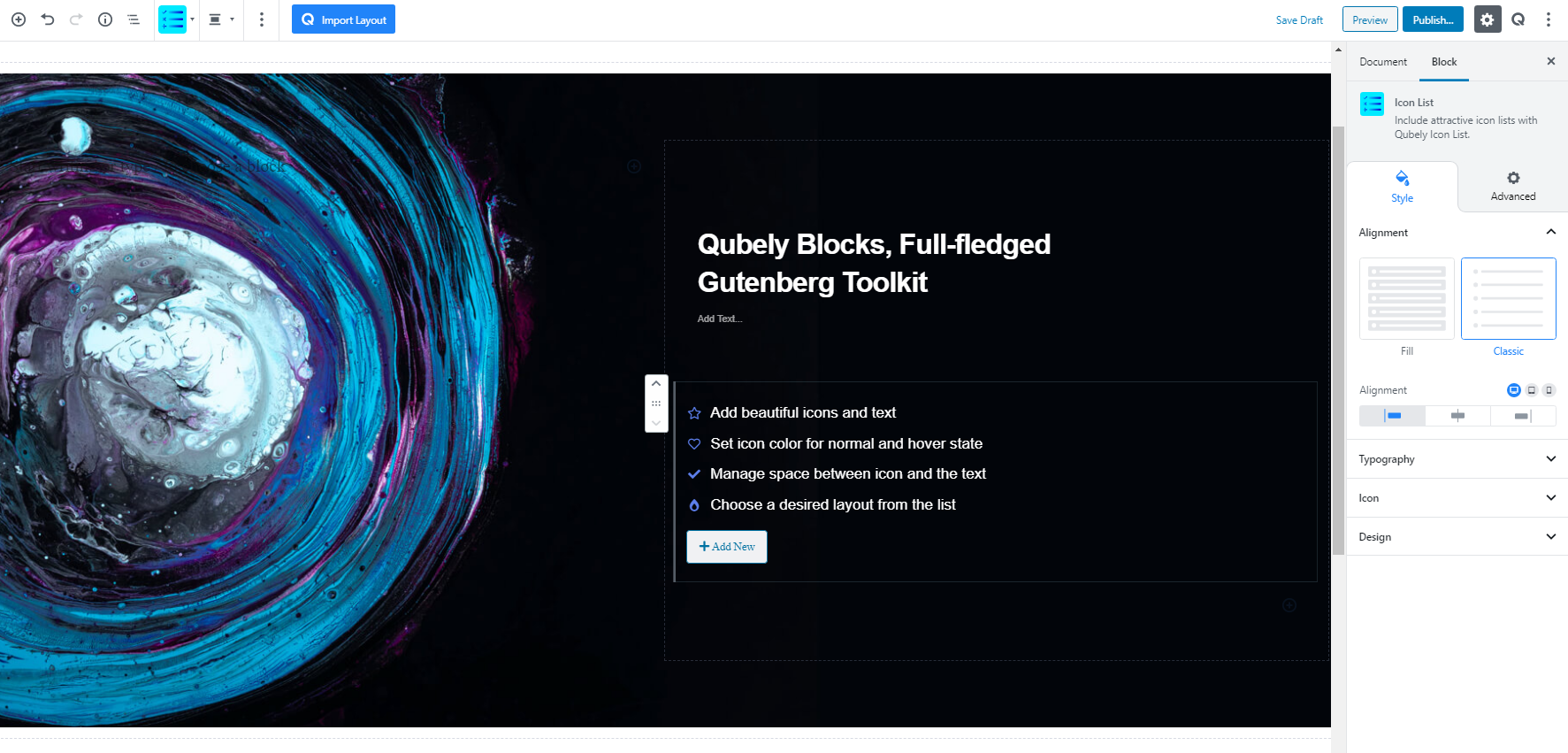
After adding the Icon List block you will see all the available options that you can use to customize your Icon list. At a glance, you will get the following options.
Style
Alignment
In the first configuration option, you will find the choice to implement two types of Icon List. The two types are
- Fill: Selecting this option will fill the background specific to the text of the icon with a color. You are free to choose the color of the background from the Design section of the block settings.
- Classic: This option will select the classic icon list viewing configuration with any type of background color.
Alignment: You can apply alignment to your icon list elements regardless of the device types. There are left, middle and right alignment options to choose from. It also offers responsive functionality. Choose your desired device from the list and apply the alignment.
Typography
To change the typography of the text turn on this function and you’ll have the followings:
- Font Size: Define the size of the font. It is a responsive function, therefore, the size of the font can be customized according to the device type.
- Font Family: Choose your desired font to use from the list.
- Weight: Set the font-weight. Normally the font-weight is the thickness of a font.
- Advanced Typography: When you click on the Advanced Typography you will find the following options.
- Line Height: It’s the difference between lines, adjust it the way you want to.
- Letter Spacing: It controls the space in between letters, defines the gap the way you want to.
- Text Transform: Lets you apply your preferred capitalization formate to the text.
Icon
In the Icon section of the block settings, you will find multiple options to customize how the icons in your Icon List will look like. There are options like,
Size: Define the size of the icons. There are four preset sizes that you can choose from. They are small, medium, large, extra-large. There is also a custom sizing option which will let you set a custom size ranging from 0-100. It offers responsive functionality too. Choose your desired device from the list and apply the custom size.
Position: From this option select which side you want your icon to position. There are two options: Left side and right side.
Spacing: Lets you control the empty area between the icons and the text. The higher the value is the more the gap becomes. The spacing parameter ranges from 0-60.
Normal: From this section, you can choose a specific color for the icons in your icon list. There is also a clear button to get rid of any color previously set.
Hover: From this section, you can choose a specific color for the times while you hover over your icons in the icon list. There is also a clear button to get rid of any color previously set.
Note: Both Normal Color and Hover Color can be set at the same as they will at different times as the user interacts with your icon list.
Design
From the design section of the block settings, you can control how your separate icon lists look like in your post. You will be able to configure
Spacing: Select the spacing between every separate list in the icon list. The spacing limit ranges from 0 to 60.
Normal: This setting applies to the static state of the icon list design. From here you can change the Text color, Background color, and set the Border. Ther borders settings include: Solid, Dotted, Dashed and Double.
Hover: This setting applies to the state while you hover over the icon list design. From here you can change the Text color, Background color.
Shadow
You can apply shadow to the Icon List using this feature. You can apply shadow for both Normal and Hover states. Enabling the feature will present you with the following options:
- Color: Lets you choose the color of the shadow.
- X: Lets you define the length of the shadow of X-axis.
- Y: Lets you define the length of the shadow of Y-axis.
- Blur: Lets you control the blurriness of the shadow.
- Spread: Lets you control how far the shadow will spread.
Advanced
Animation
To make the block more interesting, you can add an animation effect. It is disabled by default, to enable this feature, choose an effect from the dropdown list. Once you choose your desired one, then start making modifications as you see fit. The units are in milliseconds. Note: Duration is how long the animation will run and Delay is the waiting time before the animation starts loading. The following effects are currently available.
- Fade: Selecting this will animate your table of contents block with a fading animation.
- Slide: Animate your table of contents block with a sliding animation.
- Bounce: If you want to animate your table of contents block with a bouncing animation then select this.
- Zoom: This option will animate your table of contents block with a Zooming animation.
- Flip: Animate your table of contents block with a Flipping animation using this option.
- Fold: Selecting this will animate your table of contents block with a sliding animation.
- Rotate: This will animate your table of contents block with a rotating animation.
Note: You can control from which direction the animation will start such as from the center, right, left, up or down. Also, control how many times the animation will repeat. You can also select the duration and the starting delay of the animation in milliseconds.
Interaction
Enable Tablet: If you want to enable the interactions for tablet users to enable this to start showing tablet users the image interactions.
Enable Mobile: If you want to enable the interactions for mobile users to enable this to start showing mobile users the image interactions.
Enable Mouse Movement: You can select the way how your interactions work with your mouse movement. There are multiple options once you enable it. You can choose the direction from Direct/Opposite, speed from a scale of 1 to 10, maximum from a scale of 5 to 75.
Live Button: This button will give you “Live experience” on how your interactions work depending on how you set it. Click on it to get an overview.
Advanced
This section lets you override the current styling of this particular block.
Enable Custom Position: If you want to set the block to a custom position then simply enable this option. After enabling you will find the following options
From X-axis: Select from the slider what position you want the image block to be in according to the X-axis. The range limits from -2000 to 2000.
From Y-axis: Select from the slider what position you want the image block to be in according to the X-axis. The range limits from -2000 to 2000.
Z – Index: If any of your blocks override another, then you can set a value here, the one with the higher value will appear before the other.
Hide on Tablet/Phone: Turn it on to hide this block in your desired device. The change will appear on the frontend.
Block Row CSS: In case you need to override current block settings, you can write down your own code followed by {{QUBELY}} to override the current settings.Additional CSS Class: You might need to name a block in order to make custom modifications in the future, this is the field where you define the name.