Increase your sales, create excitement, announce product release with the all-new Countdown block in Qubely. After you add it to your website, you will find the below settings for the configuration of your block.
Layout
Design Templates: Design templates are individual blocks that have been predesigned to use. All you have to do is pick the one you like, and the styling settings will be imported from that template.
Related Sections: Related sections are multi-block sections that have been pre-designed. This tab contains relevant blocks fetched from the Ready Sections of Qubely.
Style
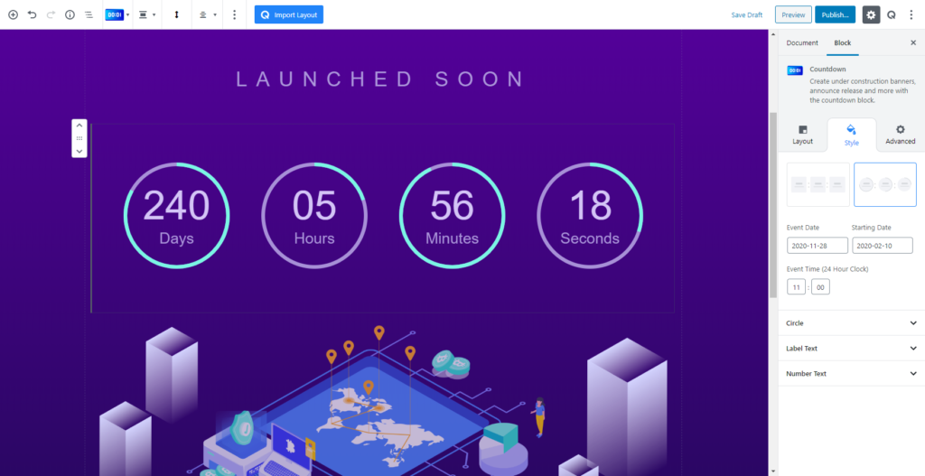
There are two types of layout you can choose from. Each one offers a different set of layouts. One offers a square-shaped timer face and the other one offers a circular type design.
Event Date
Choose the event date from the calendar and the countdown timer will show the time duration.
Starting Date (Available in circular layout)
Chose the date from which you want to start the countdown. Click on the menu you will all the available dates.
Ending Date (Available in circular layout)
Select the date when the countdown will stop. Choose your desired date from the calendar and apply it.
Ending Time (24-hour format)
This option lets you choose the exact time to the hours and minutes for when the timer will stop. You don’t need to worry about different times zones as it is applicable for 24 hours.
Templates
There are a number of pre-designed templates that you choose as your design. Each of them are crafter with user experience in mind.
All the templates are also completely customizable. So you can make them look just the way you want.
Container
This section has the configuration settings for the container area of the Countdown block. It lets you set multiple attributes with advanced options.
Background Color
Choose from a wide range of colors from the palette to choose a background for your Countdown block.
Background Type
You can either choose a gradient type, an image or clear any applied background with the clear button.
Background Image
Upload a background image to the background of your countdown block. After you upload an image you get an advanced customization option. Advanced customization options include
- Background Position
- Background Attachment
- Background Repeat
- Background Size
Gradient
If you choose Gradient type as your background, then you get the following options,
- Gradient Type – Linear: A linear gradient applies the gradient by an axis. It’s a linear line. The effect is applied with a Gradient Angel, which defines the starting point. And two colors applied at two ends. Color 1 starts at the defined angle point and Color 2 starts after the Color 1 endpoint.
- Gradient Type – Radial: A radial gradient applies the gradient effect by a center point. The Radial Pointer defines the starting point of the circle where Color 1 defines the inner circle area and Color 2 defines the outer circle.
Minimum Width
Define the minimum width between each of the sections of the countdown timer. You can set the gap using the slider or use the manual option to enter the gap distance.
It is also a responsive feature so you can set different gap distance for different device types.
Padding
Set the padding of the body section with the slider. You can use the slider or also set it manually. You also have the ability to set different padding specific to each side of the body. This is also a responsive feature that lets you set different padding values for different types of devices.
Space Between
Use the slider to set the spacing. You can set the value using the slider or enter it manually. This is a responsive feature so you can set different spacing values for different types of devices.
Border
Choose the border type you want to set in the body section. You can choose solid, dotted, dashed, double or click on the clear button.
Border Color
Select from a wide range of color palette to set the color of your border. You can set a specific color or click on the clear button to remove any applied color.
Border Width
Set the border width with the slider. You can also enter the border width value manually. You can set the width separately for each side or set a global value. It is a responsive feature so you can set a different value for different types of devices.
Radius
To add a rounded corner around the body, you can use the Radius function. The scale can be calibrated between 1 to 100. You can apply the same value to all the corners by choosing the Global option whereas selecting the Custom option will let you set a different value for each corner. Also, it’s a responsive feature that means you can apply different values for different device types.
Box-Shadow
You can apply shadow to the body using this feature. You can apply shadow for both Normal and Hover states. Enabling the feature will present you with the following options:
Color: Lets you choose the color of the shadow.
X: Lets you define the length of the shadow of X-axis.
Y: Lets you define the length of the shadow of Y-axis.
Blur: Lets you control the blurriness of the shadow.
Spread: Lets you control how far the shadow will spread.
Label Text
You will be able to define the label texts of the Countdown timer from this section of the settings. Once you enable the Label Text using the toggle button you will see the following configuration settings.
View
Choose where you want your label texts to show. You can either choose to show them inside the container or inside the outside.
Position
Choose where you want the texts to align. You can choose the top, right, bottom, left position.]
Enable & chose the name each section
You can also set the name of each box according to your needs. There are box options for days, hours, minutes, seconds. You can enable/disable each of them.
Spacing
Use the slider to define the spacing between the texts and the numbers. You can either use the slider or set the spacing manually.
Color
Choose from a wide range of colors from the color palette for your label texts. Or click on the clear button to get rid of any applied color.
Typography
You can enable typography settings for the text label. Select what typography you would like to use from the settings that you will find.
- Font Size: Define the size of the font. It is a responsive function, therefore, the size of the font can be customized according to the device type.
- Font Family: Choose your desired font to use from the list. Qubely has a collection of 900 fonts including the defaults that come with Gutenberg.
- Weight: Set the font-weight. Normally the font-weight is the thickness of a font.
- Advanced Typography: If you click on the gear icon on the Advanced Typography you will be presented with advanced configuration options to set custom typography.
- Line Height: It’s the difference between lines, adjust it the way you want to.
- Letter Spacing: It controls the space in between letters, defines the gap the way you want to.
- Text Transform: Lets you apply your preferred capitalization format to the text.
Number Text
Color: Choose the color of the numbers in your Countdown timer. You can choose any color from the wide range of colors from the palette. Or if you want to clear any applied color click on the clear button.
Spacing: Define the spacing area between the text and the number of the Countdown block.
Typography
You can enable typography settings for the text label. Select what typography you would like to use from the settings that you will find.
- Font Size: Define the size of the font. It is a responsive function, therefore, the size of the font can be customized according to the device type.
- Font Family: Choose your desired font to use from the list. Qubely has a collection of 900 fonts including the defaults that come with Gutenberg.
- Weight: Set the font-weight. Normally the font-weight is the thickness of a font.
- Advanced Typography: If you click on the gear icon on the Advanced Typography you will be presented with advanced configuration options to set custom typography.
- Line Height: It’s the difference between lines, adjust it the way you want to.
- Letter Spacing: It controls the space in between letters, defines the gap the way you want to.
- Text Transform: Lets you apply your preferred capitalization format to the text.
Separator
You can also choose different settings for your separator in the Countdown block.
Separator Type
Set the separator type you want to show in your Countdown block. You can choose
- None: Show no separator.
- Semi-colon: Use a semicolon as the separator. You can adjust the color, size and offset. These attributes are responsive so you can set different values for different types of devices.
- Straight Line: Use a semicolon as the separator. You can adjust the color, width, height, and offset. These attributes are responsive so you can set different values for different types of devices.
Advanced
Animation
To make the block more interesting, you can add an animation effect. It is disabled by default, to enable this feature, choose an effect from the dropdown list. Once you choose your desired one, then start making modifications as you seem fit. The units are in milliseconds. Note: Duration is how long the animation will run and Dealy is the waiting time before the animation starts loading. The following effects are currently available.
Fade: Selecting this will animate your tab block with a fading animation.
Slide: Animate your tab block with a sliding animation.
Bounce: If you want to animate your tab block with a bouncing animation then select this.
Zoom: This option will animate your tab block with a Zooming animation.
Flip: Animate your tab block with a Flipping animation using this option.
Fold: Selecting this will animate your tab block with a sliding animation.
Rotate: This will animate your tab block with a rotating animation.
Note: You can control the from which direction the animation will start such as from the center, right, left, up or down. Also, control how many times the animation will repeat. You can also select the duration and the starting delay of the animation which are considered in milliseconds.
Interaction
With the Qubely tab block, you also have control over how people interact with the tab that you upload. There are three options that you can control how the interaction works.
Enable Tablet: If you want to enable the interactions for Tablet Handheld product users to enable this to start showing tablet users the tab interactions.
Enable Mobile: If you want to enable the interactions for Mobile Handheld product users to enable this to start showing mobile users the tab interactions.
Enable Mouse Movement: You can select the way how your interactions work with your mouse movement. There are multiple options once you enable it. You can choose the direction from Direct/Opposite, speed from a scale of 1 to 10, maximum from a scale of 5 to 75.
Live Button: This button will give you “Live experience” on how your interactions work depending on how you set it. Click on it to get an overview.
Advanced
This section lets you override the current styling of this particular block.
Enable Custom Position: If you want to set the tab block to a custom position then simply enable this option. After enabling you will find the following options
From X-axis: Select from the slider what position you want the tab block to be in according to the X-axis. The range limits from -2000 to 2000.
From Y-axis: Select from the slider what position you want the tab block to be in according to the X-axis. The range limits from -2000 to 2000.
Z – Index: If any of your blocks override another, then you can set a value here, the one with the higher value will appear before the other.
Hide on Tablet/Phone: Turn it on to hide this block in your desired device. The change will appear on the frontend.
Block Row CSS: In case you need to override current block settings, you can write down your own code followed by {{QUBELY}} to override the current settings.
Additional CSS Class: You might need to name a block in order to make custom modifications in the future, this is the field where you define the name.