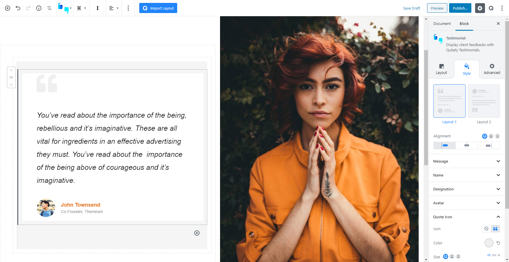
As the name suggests, the Testimonial block is there for showcasing the valuable words of your clients to your new potential visitors. It’s always better to put them in a neat manner.
Layout
Related Sections: Related sections are multi-block sections that have been pre-designed. This tab contains relevant blocks fetched from the Ready Sections of Qubely.
Style
There are two preset layouts to choose from, each with a different style. Pick the one that suits your design the most.
Alignment: Pick the content alignment for your testimonial block. Responsiveness tabs are also present
Message
Top Spacing: Control the spacing above the message text. The units are in px, em, or %. Responsiveness tabs are also present.
Bottom Spacing: Control the spacing below the message text. The units are in px, em, or %. Responsiveness tabs are also present.
Message: This section will let you control the message typography, set its position, and change the spacing.
Typography: Enable this tab to change the typography of the message text.
- Font: Choose your desired font from the list.
- Weight: Set the font-weight. Normally the font-weight is the thickness of a font.
- Font Size: Define the font size.
- Line Height: It’s the line-height, adjust it the way you want to.
- Letter Spacing: It’s the letter-spacing, defines the gap between letters.
- Text Transform: Use this tab to apply a text transformation on the text. Use auto caps, all caps, and no caps to give the text a different tone.
Designation
Color: Use this RGBA color picker to change the color of the designation text
Typography: Enable this tab to change the typography of the designation text.
- Font: Choose your desired font from the list.
- Weight: Set the font-weight. Normally the font-weight is the thickness of a font.
- Font Size: Define the font size.
- Line Height: It’s the line-height, adjust it the way you want to.
- Letter Spacing: It’s the letter-spacing, defines the gap between letters.
- Text Transform: Use this tab to apply a text transformation on the text. Use auto caps, all caps, and no caps to give the text a different tone.
Avatar
Show Avatar: Enable this tab to show the avatar.
Upload Avatar/Upload Avatar @2x: Use these insert buttons to upload or add avatar icons for both regular and retina displays
Avatar Layout: Pick the avatar position.
Avatar Size: Pick between S, M, L, and a custom avatar size
Radius: Pick a radius for the icon. You can pick separate for radii for each side or a uniform radius for a rounded corner or circle effect. The units are in px (pixels). Responsiveness tabs are also present.
Border: Pick a border type for the block.
- Border Color: Pick a border color using the RGBA color picker.
- Border Width: Pick a border width for the block. You can choose to create a uniform border or choose different borders for each side of the block. Responsiveness tabs are also present. You can choose from three different units for this slider: PX, EM, and percentage.
Spacing: Use this slider to change the horizontal spacing between the avatar and the text. The units are in px, em, or %. Responsiveness tabs are also present.
Quote Icon
Place a Quote icon on the testimonial block to give a feel of credibility to the user
Color: Use the RGBA color picker to choose a color for the quote icon
Size: Use this slider to change the size of the icon
Spacing: Use this slider to change the vertical spacing between the text and the icon
Ratings
Enable this toggle to show ratings in this block
Ratings: Select a rating out of 5
Color: Pick a color for the rating using the RGBA color picker
Stars Size: Pick a size for the stars. The units are in px, em, or %. Responsiveness tabs are also present.
Spacing: Pick a vertical spacing between the rating icon and the content around it. The units are in px, em, or %. Responsiveness tabs are also present.
Design
Text Color: Pick a color for the message text.
Background Type: Choose a background type between a background image and a gradient
Image: Insert an image from the media library or upload a new one.
Gradient:
- Color picker: Pick two colors for the gradient background. The gradient will be generated between these two colors.
- Gradient Type:
- Linear: Picks a linear gradient model that applies the gradient on an axis.
- Gradient Angle: Pick the angle of the axis on which the gradient will be applied.
- Radial: Picks a radial gradient model, where the gradient will be generated from a certain point.
- Radial Pointer: Pick the point where the color will generate from.
- Color 1 Stop: Pick the color 1 stop position. The higher it is, the sharper the gradient shift
- Color 2 Start: Pick the color 2 start position. The lower this is, the sharper the gradient shift.
- Linear: Picks a linear gradient model that applies the gradient on an axis.
Border: Pick a border type for the block
Padding: Apply a padding around the testimonial block. You can choose a uniform padding or customize every side. The units are in px, em, or %. Responsiveness tabs are also present.
Border Radius: Use this tab to add a rounded corner effect to the block. You can choose a uniform radius or customize every side. The units are in px, em, or %. Responsiveness tabs are also present.
Box Shadow: Enable this toggle if you want a box-shadow effect around this block for both normal and hover mode.
- Color: Lets you choose the color of the shadow.
- X: Lets you define the length of the shadow in the X-axis.
- Y: Lets you define the length of the shadow in the Y-axis.
- Blur: Lets you control the blurriness of the shadow.
- Spread: Lets you control how far the shadow will spread.
- Inset: Enable this feature if you want the shadows to be drawn inside the border.
Advanced
Animation
To make the block more interesting, you can add an animation effect. It is disabled by default, to enable this feature, choose an effect from the dropdown list. Once you choose your desired one, then start making modifications as you see fit. The units are in milliseconds. Note: Duration is how long the animation will run and Delay is the waiting time before the animation starts loading. The following effects are currently available.
- Fade: Selecting this will animate your table of contents block with a fading animation.
- Slide: Animate your table of contents block with a sliding animation.
- Bounce: If you want to animate your table of contents block with a bouncing animation then select this.
- Zoom: This option will animate your table of contents block with a Zooming animation.
- Flip: Animate your table of contents block with a Flipping animation using this option.
- Fold: Selecting this will animate your table of contents block with a sliding animation.
- Rotate: This will animate your table of contents block with a rotating animation.
Note: You can control from which direction the animation will start such as from the center, right, left, up or down. Also, control how many times the animation will repeat. You can also select the duration and the starting delay of the animation in milliseconds.
Interaction
Enable Tablet: If you want to enable the interactions for tablet users to enable this to start showing tablet users the image interactions.
Enable Mobile: If you want to enable the interactions for mobile users to enable this to start showing mobile users the image interactions.
Enable Mouse Movement: You can select the way how your interactions work with your mouse movement. There are multiple options once you enable it. You can choose the direction from Direct/Opposite, speed from a scale of 1 to 10, maximum from a scale of 5 to 75.
Live Button: This button will give you “Live experience” on how your interactions work depending on how you set it. Click on it to get an overview.
Advanced
This section lets you override the current styling of this particular block.
Enable Custom Position: If you want to set the block to a custom position then simply enable this option. After enabling you will find the following options
From X-axis: Select from the slider what position you want the image block to be in according to the X-axis. The range limits from -2000 to 2000.
From Y-axis: Select from the slider what position you want the image block to be in according to the X-axis. The range limits from -2000 to 2000.
Z – Index: If any of your blocks override another, then you can set a value here, the one with the higher value will appear before the other.
Hide on Tablet/Phone: Turn it on to hide this block in your desired device. The change will appear on the frontend.
Block Row CSS: In case you need to override current block settings, you can write down your own code followed by {{QUBELY}} to override the current settings.Additional CSS Class: You might need to name a block in order to make custom modifications in the future, this is the field where you define the name.