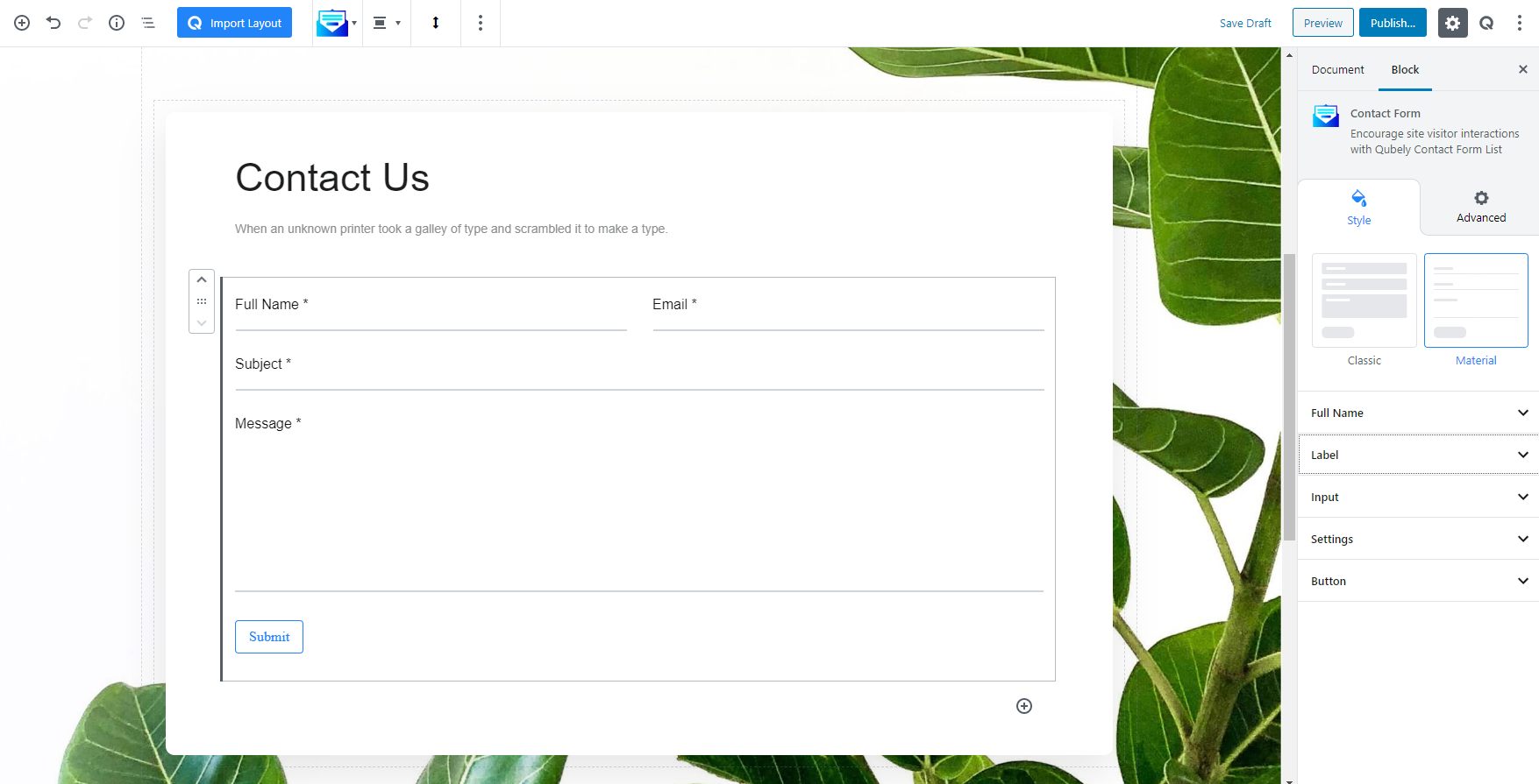
The contact form block has two designs included. The classic one has a traditional boxed layout. If you are feeling adventurous, you can try the material form. It was designed following Google’s Material design.
You have full control over each and every element in the form. You can customize the labels, placeholder text and button style. Just click where you want to edit and the settings column on the right side will show all the possible controls.
For now, this block has fixed elements and you cannot add a new field or remove a field.
Style
Settings: The settings option for the form block has two sections- Form and Email. The form section of settings have all the error messages if the user misses any of the fields, the mentioned messages will be displayed on the screen.
It also has a captcha feature. You can register your preferred version of captcha from Google and place the keys on the respective fields to avoid getting spam from the form.
The Email section on the settings contains the technical configuration about which email address will be used to send the responses, email body content, subject text, etc.
The mail body supports the following shortcodes-
- {{full-name }} – this shortcode adds the value from the name field.
- {{site-name}} – this value is inserted automatically. It will add the website URL.
- {{subject}} – this one will add the subject field value.
- {{email}} – you can get the user email address using this shortcode.
- {{message}} – the message content can be added using this one.
Advanced
Animation
To make the block more interesting, you can add an animation effect. It is disabled by default, to enable this feature, choose an effect from the dropdown list. Once you choose your desired one, then start making modifications as you see fit. The units are in milliseconds. Note: Duration is how long the animation will run and Delay is the waiting time before the animation starts loading. The following effects are currently available.
- Fade: Selecting this will animate your table of contents block with a fading animation.
- Slide: Animate your table of contents block with a sliding animation.
- Bounce: If you want to animate your table of contents block with a bouncing animation then select this.
- Zoom: This option will animate your table of contents block with a Zooming animation.
- Flip: Animate your table of contents block with a Flipping animation using this option.
- Fold: Selecting this will animate your table of contents block with a sliding animation.
- Rotate: This will animate your table of contents block with a rotating animation.
Note: You can control from which direction the animation will start such as from the center, right, left, up or down. Also, control how many times the animation will repeat. You can also select the duration and the starting delay of the animation in milliseconds.
Advanced
This section lets you override the current styling of this particular block.
Enable Custom Position: If you want to set the block to a custom position then simply enable this option. After enabling you will find the following options
From X-axis: Select from the slider what position you want the image block to be in according to the X-axis. The range limits from -2000 to 2000.
From Y-axis: Select from the slider what position you want the image block to be in according to the X-axis. The range limits from -2000 to 2000.
Z – Index: If any of your blocks override another, then you can set a value here, the one with the higher value will appear before the other.
Hide on Tablet/Phone: Turn it on to hide this block in your desired device. The change will appear on the frontend.
Block Row CSS: In case you need to override current block settings, you can write down your own code followed by {{QUBELY}} to override the current settings.Additional CSS Class: You might need to name a block in order to make custom modifications in the future, this is the field where you define the name.