Timeline is a great way to show the development phases of a particular project, stages of your education and achievements in your portfolios, the history of your company describing each milestone along the way, stages of any event in chronological order, a product lifeline describing releases and updates, etc.
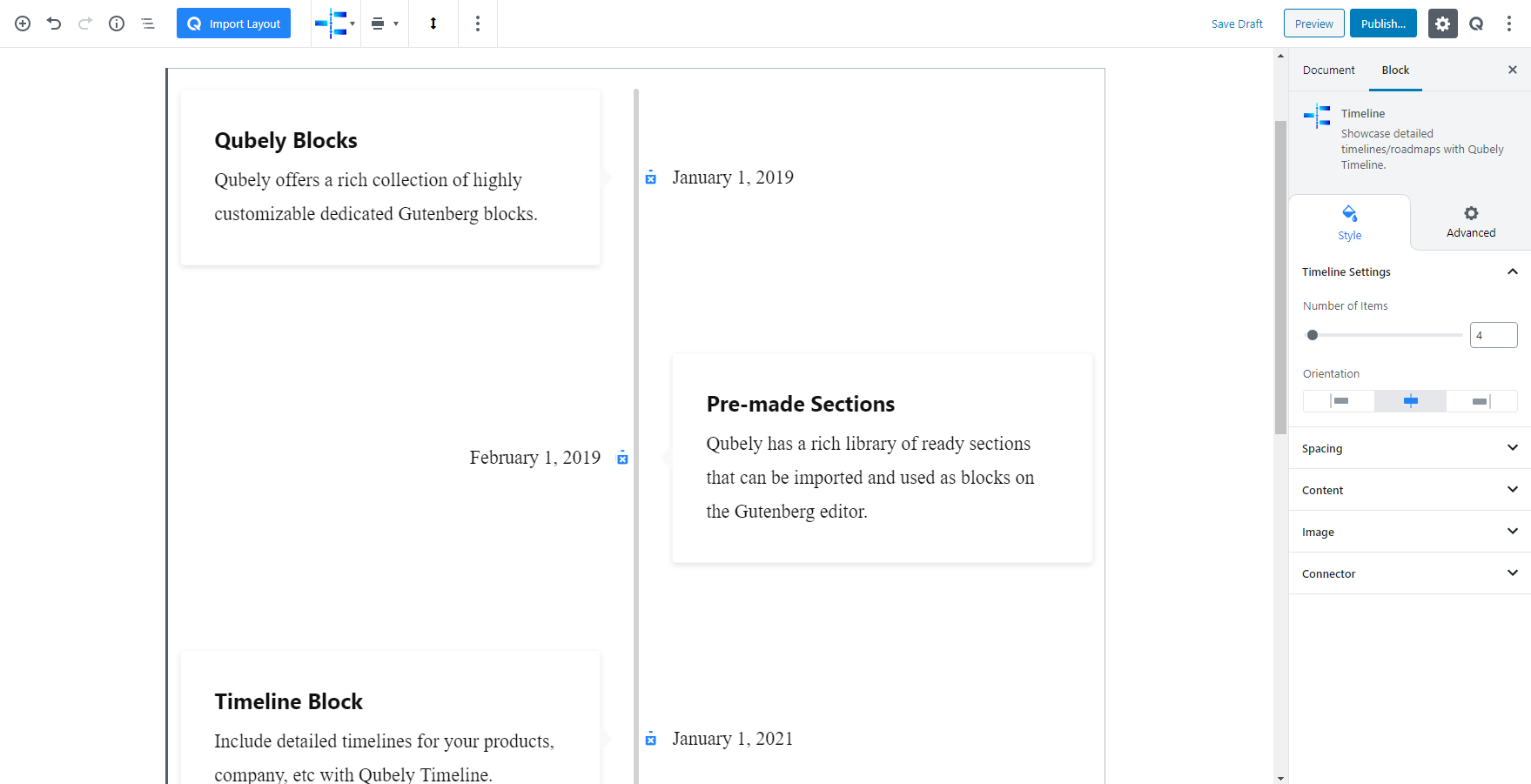
And to make your process of adding a timeline to your post/page, Qubely has its own timeline block. Go to the Add block and just click on the Qubely Timeline block to add it. You will find its configuration options from the block settings.
Style
Timeline Settings
This option provides the settings for the timeline itself. You can set
Number of items: Use the slider to set the number of timelines you are going to use.
Orientation: Select the positioning of the timeline bar. You can choose to show the timeline bar on the left, the middle or on the right side of the timeline.
Spacing
You can use this option to configure the spacing between the timeline bar. There are two sliders here.
Horizontal Spacing: Change the horizontal space between each item in the timeline block. There are three units available, PX, EM, and Percentage. Responsiveness functions are also present.
Vertical Spacing: Change the vertical space between each item in the timeline block. There are three units available, PX, EM, and Percentage. Responsiveness functions are also present.
Content
This area of the block settings set the content area details. There are options to set
Background Color: Select a color from the color palette to add it to the background of the Timeline block content.
Enable Border: Switch on/off the toggle button to enable or disable the border for the content block in the timeline content.
- Border Width: If you enable the border you will find its customization settings. You can also set the width of the borders with a slider. It is a responsive feature so that means you can set different border width for different types of devices.
- Border Color: Choose a color from the palette and apply it to the border.
Radius: Select the radius of the content block from the slider and apply it. There is also an option to manually enter the width of the image. Set the custom width according to PX, EM, or Percentage. It is a responsive function; therefore, the width of the image can be customized according to the device type.
Padding: To set the Padding of the icon list, you can use the Padding function. You can apply the same value to all the corners by choosing the global option whereas selecting the Custom option will let you set a different value for each corner. Also, it’s a responsive feature that means you can apply different values for different device types.
Box-Shadow: You can apply shadow to the background using this feature. Enabling the feature will present you with the following options:
- Color: Lets you choose the color of the shadow.
- X: Lets you define the length of the shadow of X-axis.
- Y: Lets you define the length of the shadow of Y-axis.
- Blur: Lets you control the blurriness of the shadow.
- Spread: Lets you control how far the shadow will spread.
Heading Tag: This option lets you select the Tag for the heading section of the content block. You can choose from six options such as H1, H2, H3, H4, H5, H6
Heading Typography: To change the typography of the text turn on this function and you’ll have the followings:
- Font Size: Define the size of the font. It is a responsive function; therefore, the size of the font can be customized according to the device type.
- Font Family: Choose your desired font to use from the list. Qubely has a collection of 900 fonts including the defaults that come with Gutenberg.
- Weight: Set the font-weight. Normally the font-weight is the thickness of a font.
- Advanced Typography: If you click on the gear icon on the Advanced Typography you will be presented with advanced configuration options to set custom typography.
- Line Height: It’s the difference between lines, adjust it the way you want to.
- Letter Spacing: It controls the space in between letters, defines the gap the way you want to.
- Text Transform: Lets you apply your preferred capitalization format to the text.
Heading Color: Set the color of the heading text with the color palette. Click on the clear button. Reverse any applied color.
Heading Spacing: Define the spacing between the header and the paragraph. Slide the bar to set the spacing value or manually enter it. It is also responsive so you have the option to set a different spacing value for different devices.
Content Color: This color palette allows you to set a specific color to the content text of the Qubely Timeline block.
Content Typography: Select what typography you would like to use from these settings.
- Font Size: Define the size of the font. It is a responsive function; therefore, the size of the font can be customized according to the device type.
- Font Family: Choose your desired font to use from the list. Qubely has a collection of 900 fonts including the defaults that come with Gutenberg.
- Weight: Set the font-weight. Normally the font-weight is the thickness of a font.
- Advanced Typography: If you click on the gear icon on the Advanced Typography you will be presented with advanced configuration options to set custom typography.
- Line Height: It’s the difference between lines, adjust it the way you want to.
- Letter Spacing: It controls the space in between letters, defines the gap the way you want to.
- Text Transform: Lets you apply your preferred capitalization format to the text.
Enable Date/Time: Switch on/off this toggle button to show or hide the date under the content block of the timeline.
- Date/Time Typography: Allows you to set the typography for the date/time text. Turning on the toggle button will give you the extended customization options.
- Font Size: Define the size of the font. It is a responsive function; therefore, the size of the font can be customized according to the device type.
- Font Family: Choose your desired font to use from the list. Qubely has a collection of 900 fonts including the defaults that come with Gutenberg.
- Weight: Set the font-weight. Normally the font-weight is the thickness of a font.
- Advanced Typography: If you click on the gear icon on the Advanced Typography you will be presented with advanced configuration options to set custom typography.
- Line Height: It’s the difference between lines, adjust it the way you want to.
- Letter Spacing: It controls the space in between letters, defines the gap the way you want to.
- Text Transform: Lets you apply your preferred capitalization format to the text.
Date/Time Color: Open the color palette and choose the color you want the text of the time to be.
Image:
You can add an image to the content block using this feature. To get started enable the function with the toggle button.
Position: After enabling you can set the position of the image. Select if you want the image to be in before or after the main text of the content section.
Radius: Select the radius of the content block from the slider and apply it. There is also an option to manually enter the width of the image. Set the custom width according to PX, EM, or Percentage. It is a responsive function; therefore, the width of the image can be customized according to the device type.
Spacing: Lets you control the empty area between the image and the text. You can also manually set the gap.
Connector
After you add the Timeline block, you will see an icon for each timeline stamp. Those timestamp icons are customizable. Those options are available from the connector settings.
Color: Select any color from the wide color palette. Click on the clear button to undo any applied color.
Size: Define the size using the slider. The size is responsive so you can set the size according to different device types.
Border: Set a border around your content. Predefined borders include Solid, Dotted, Dashed and Double.
Box-Shadow: You can apply shadow to the background using this feature. Enabling the feature will present you with the following options:
- Color: Lets you choose the color of the shadow.
- X: Lets you define the length of the shadow of X-axis.
- Y: Lets you define the length of the shadow of Y-axis.
- Blur: Lets you control the blurriness of the shadow.
- Spread: Lets you control how far the shadow will spread.
Radius: You can also set the radius of the content, using the Radius function. The scale can be calibrated between 1 to 100. You can apply the same value to all the corners by choosing the global option or also using the Custom option will let you set a different value for each corner. It’s a responsive feature that means you can apply different values for different device types.
Icon Search Option: There is a search bar here that lets you search an icon of your choice and add that icon to the timestamp.
Icon Size: You can set the icon size using the slider found here. It is also responsive so you can set different icon sizes according to different device types.
Icon Color: Set the color of the icon from the color palette. There is also a clear button to reverse any applied color.
Bar Width: Set the width of the bar with the slider or manually apply it. It is responsive so you can show different width for different devices.
Bar color: Choose from the color palette to set the specific color.
Advanced
Animation
To make the block more interesting, you can add an animation effect. It is disabled by default, to enable this feature, choose an effect from the dropdown list. Once you choose your desired one, then start making modifications as you see fit. The units are in milliseconds. Note: Duration is how long the animation will run and Delay is the waiting time before the animation starts loading. The following effects are currently available.
- Fade: Selecting this will animate your table of contents block with a fading animation.
- Slide: Animate your table of contents block with a sliding animation.
- Bounce: If you want to animate your table of contents block with a bouncing animation then select this.
- Zoom: This option will animate your table of contents block with a Zooming animation.
- Flip: Animate your table of contents block with a Flipping animation using this option.
- Fold: Selecting this will animate your table of contents block with a sliding animation.
- Rotate: This will animate your table of contents block with a rotating animation.
Note: You can control from which direction the animation will start such as from the center, right, left, up or down. Also, control how many times the animation will repeat. You can also select the duration and the starting delay of the animation in milliseconds.
Interaction
Enable Tablet: If you want to enable the interactions for tablet users to enable this to start showing tablet users the image interactions.
Enable Mobile: If you want to enable the interactions for mobile users to enable this to start showing mobile users the image interactions.
Enable Mouse Movement: You can select the way how your interactions work with your mouse movement. There are multiple options once you enable it. You can choose the direction from Direct/Opposite, speed from a scale of 1 to 10, maximum from a scale of 5 to 75.
Live Button: This button will give you “Live experience” on how your interactions work depending on how you set it. Click on it to get an overview.
Advanced
This section lets you override the current styling of this particular block.
Enable Custom Position: If you want to set the block to a custom position than simply enable this option. After enabling you will find the following options
From X-axis: Select from the slider what position you want the image block to be in according to the X-axis. The range limits from -2000 to 2000.
From Y-axis: Select from the slider what position you want the image block to be in according to the X-axis. The range limits from -2000 to 2000.
Z – Index: If any of your blocks override another, then you can set a value here, the one with the higher value will appear before the other.
Hide on Tablet/Phone: Turn it on to hide this block in your desired device. The change will appear on the frontend.
Block Row CSS: In case you need to override current block settings, you can write down your own code followed by {{QUBELY}} to override the current settings.Additional CSS Class: You might need to name a block in order to make custom modifications in the future, this is the field where you define the name.