With the Qubely Lottie Block, you will be able to use Lottie Animations right inside your page or post. To get started with adding Lottie Animations to your page/post, simply search for the Qubely Lottie block by typing /Lottie on any blank space and finally click on the block that shows up.
General Settings
The following are some general settings that you may need to adjust to get your Lottie animation up and running.
Lottie URL
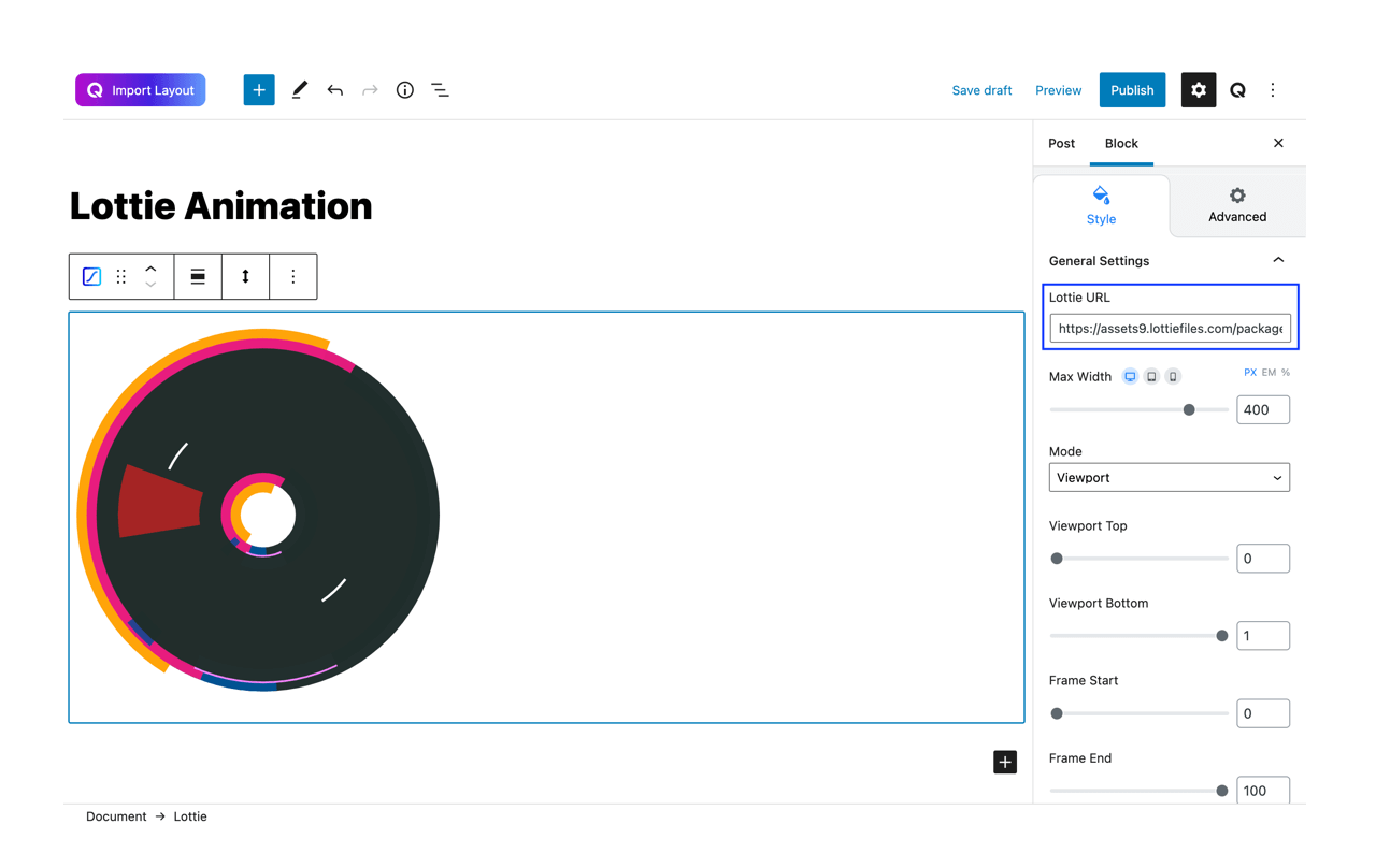
Here, you can set the link of the animation of your choice. You can find a plethora of different animations on their website directory. To add one, simply copy the URL of the one you want and paste it into this text field.
Max Width
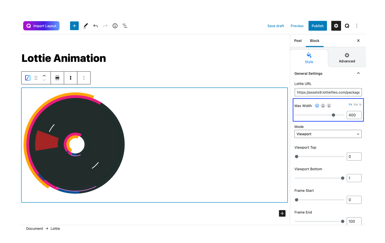
This option lets you set the maximum width of the block. Adjust this using either the sliders or type in your desired width into the text field beside it.
Mode
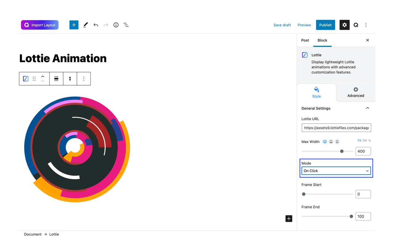
The Mode drop down list lets you choose your animation mode. You can set it to either viewport, on click, on hover or scroll modes.
Viewport Top
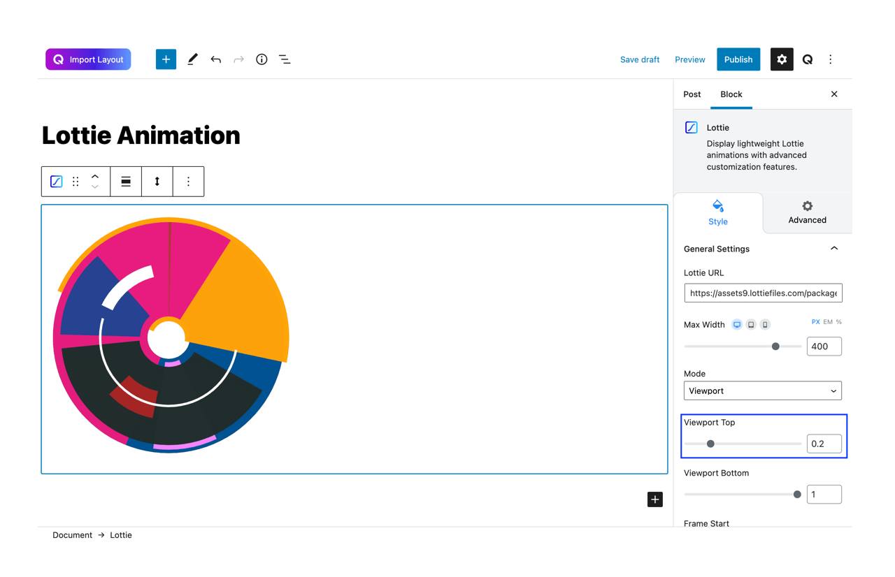
This option appears when you select ‘Viewport’ or ‘Scroll’ mode. It lets you define the top position of your display screen.
Viewport Bottom
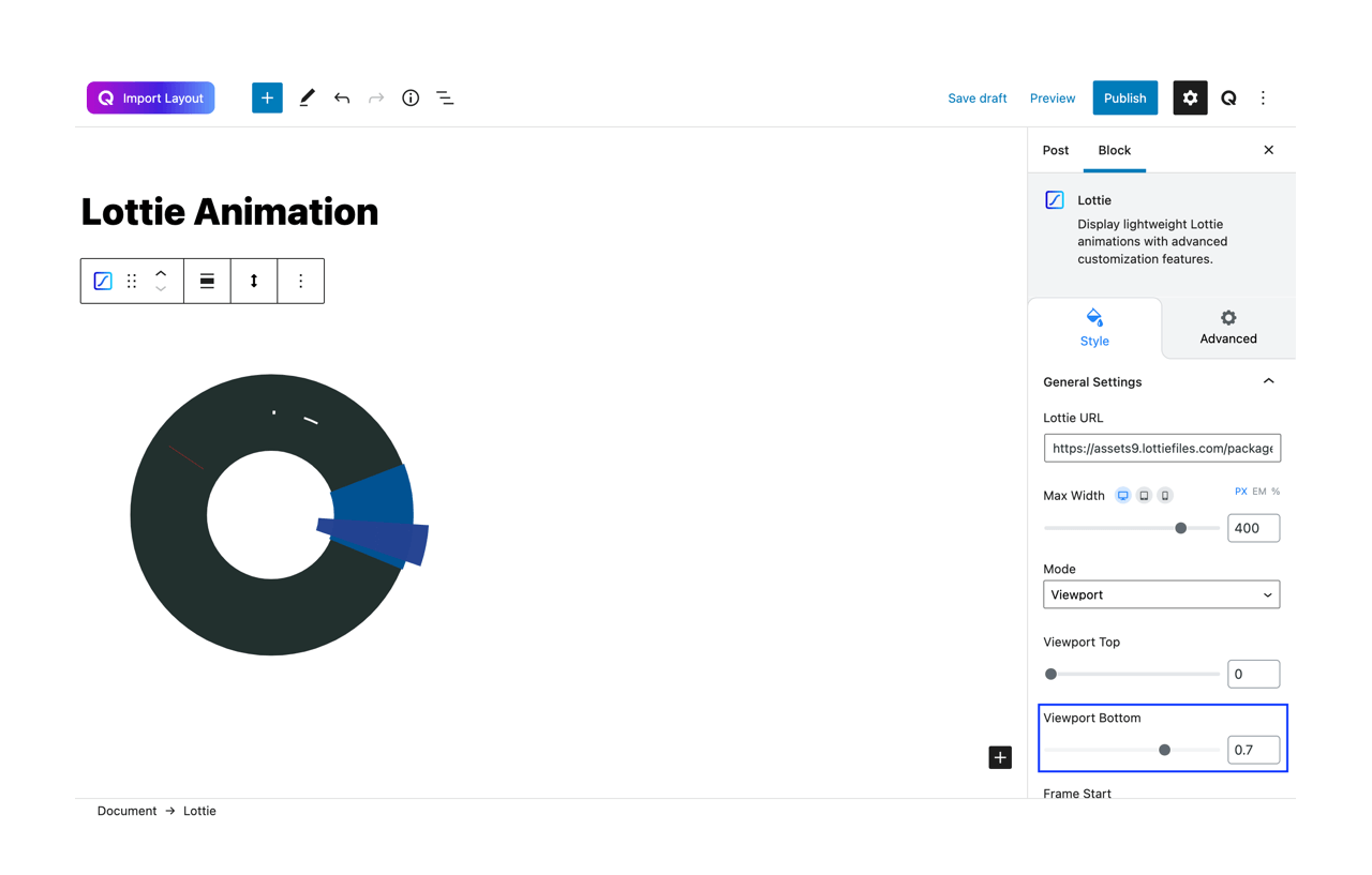
Like Viewport Top, this option also appears when you select ‘Viewport’ or ‘Scroll’ mode. It lets you define the bottom position of your display screen.
Frame Start
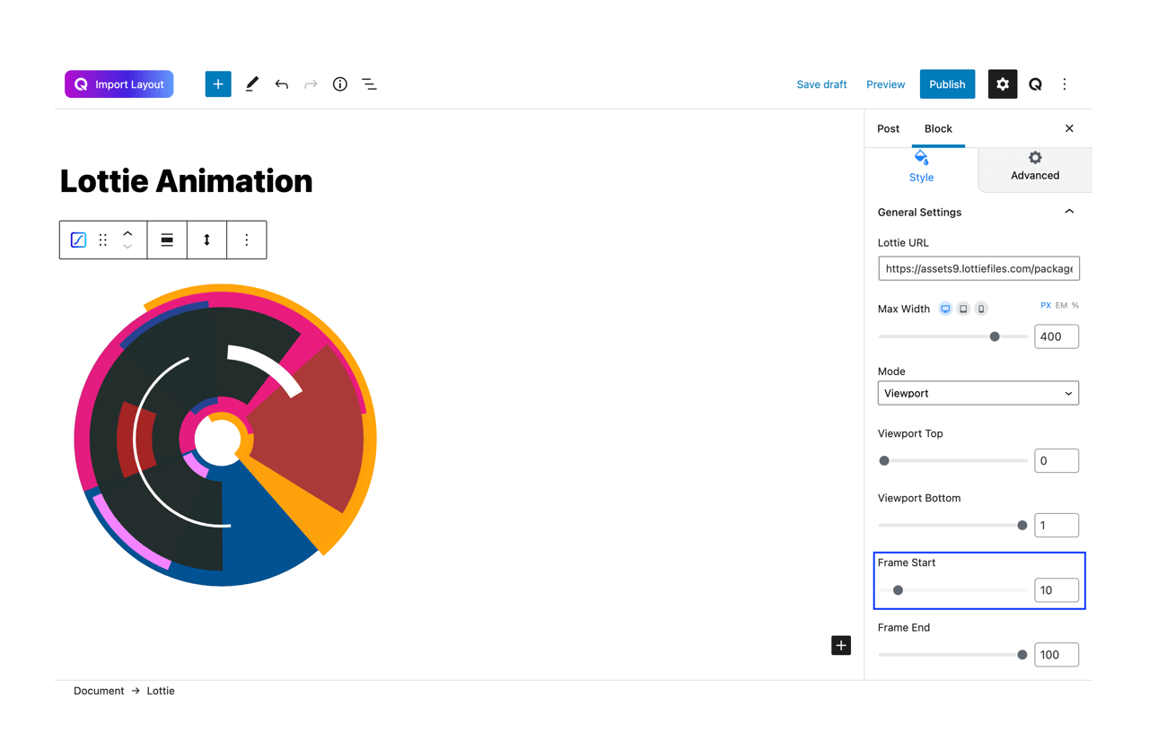
Define the starting point of the animation. By default, it’s set as zero but note that increasing this will shorten the animation duration.
Frame End
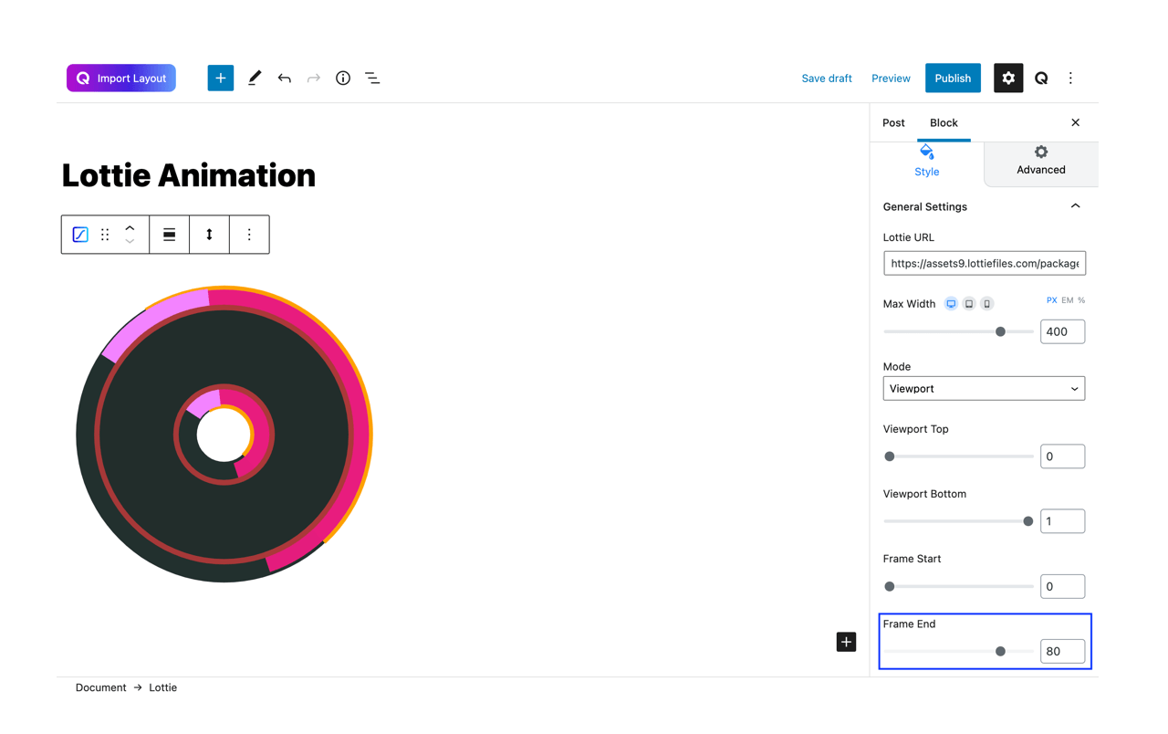
Define the ending point of the animation. By default, it’s set to maximum but note that decreasing this will shorten the animation duration.
Advanced
Animation
To make the block more interesting, you can add an animation effect. It is disabled by default, to enable this feature, choose an effect from the dropdown list. Once you choose your desired one, then start making modifications as you seem fit. The units are in milliseconds. Note: Duration is how long the animation will run and Dealy is the waiting time before the animation starts loading. The following effects are currently available.
- Fade: Selecting this will animate your Image block with a fading animation.
- Slide: Animate your Image block with a sliding animation.
- Bounce: If you want to animate your Image block with a bouncing animation then select this.
- Zoom: This option will animate your Image block with a Zooming animation.
- Flip: Animate your Image block with a Flipping animation using this option.
- Fold: Selecting this will animate your Image block with a sliding animation.
- Rotate: This will animate your Image block with a rotating animation.
Note: You can control from which direction the animation will start such as from the center, right, left, up, or down. Also, control how many times the animation will repeat. You can also select the duration and the starting delay of the animation which are considered in milliseconds.
Advanced
This section lets you override the current styling of this particular block.
Enable Custom Position: If you want to set the image block to a custom position then simply enable this option. After enabling you will find the following options
- From X-axis: Select from the slider what position you want the image block to be in according to the X-axis. The range limits from -2000 to 2000.
- From Y-axis: Select from the slider what position you want the image block to be in according to the X-axis. The range limits from -2000 to 2000.
- Z – Index: If any of your blocks override another, then you can set a value here, the one with the higher value will appear before the other.
- Hide on Tablet/Phone: Turn it on to hide this block in your desired device. The change will appear on the front end.
- Block Row CSS: In case you need to override current block settings, you can write down your own code followed by {{QUBELY}} to override the current settings.
- Additional CSS Class: You might need to name a block in order to make custom modifications in the future, this is the field where you define the name.