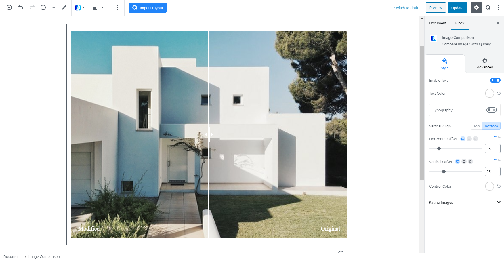
Image Comparison block is used to place two images side by side and use a slider to check the differences between them.
After you insert the block, you can either upload new images, add from media library, or insert from URL
Style
Enable Text: Enabling this toggle will add two captions (Modified and Original) on the images so that the visitor knows which is which.
Text Color: Use this RGBA color picker to pick the color of the captions.
To change the caption’s text, click on the captions on the image.
Typography
To change the typography of the text, turn on this function and you’ll have the followings
- Font Size: Define the size of the font. It is a responsive function; therefore, the size of the font can be customized according to the device type.
- Font Family: Choose your desired font to use from the list. Qubely has a collection of 900 fonts including the defaults that come with Gutenberg.
- Weight: Set the font-weight. Normally the font-weight is the thickness of a font.
Advanced Typography
- Line Height: It’s the difference between lines, adjust it the way you want to.
- Letter Spacing: It controls the space in between letters, defines the gap the way you want to.
- Text Transform: Lets you apply your preferred capitalization format to the text.
Vertical Align
The captions will be placed on the top of the images
The captions will be placed on the bottom of the images
Horizontal Offset: Insert a horizontal offset to perfectly place the caption text on the image. There are three units available: PX, EM, and Percentage. It is also a responsive function, so you can change the settings for all displays.
Vertical Offset: Insert a vertical offset to perfectly place the caption text on the image. There are three units available: PX, EM, and Percentage. It is also a responsive function, so you can change the settings for all displays.
Slider Color: Use this RGBA color picker to choose the color of the comparison slider.
Retina Images: Use these fields to add images for high resolution displays. These should be higher resolution and higher quality images.
Advanced
Animation
To make the block more interesting, you can add an animation effect. It is disabled by default, to enable this feature, choose an effect from the dropdown list. Once you choose your desired one, then start making modifications as you see fit. The units are in milliseconds. Note: Duration is how long the animation will run and Delay is the waiting time before the animation starts loading. The following effects are currently available.
- Fade: Selecting this will animate your table of contents block with a fading animation.
- Slide: Animate your table of contents block with a sliding animation.
- Bounce: If you want to animate your table of contents block with a bouncing animation then select this.
- Zoom: This option will animate your table of contents block with a Zooming animation.
- Flip: Animate your table of contents block with a Flipping animation using this option.
- Fold: Selecting this will animate your table of contents block with a sliding animation.
- Rotate: This will animate your table of contents block with a rotating animation.
Note: You can control from which direction the animation will start such as from the center, right, left, up or down. Also, control how many times the animation will repeat. You can also select the duration and the starting delay of the animation in milliseconds.
Interaction
Enable Tablet: If you want to enable the interactions for tablet users to enable this to start showing tablet users the image interactions.
Enable Mobile: If you want to enable the interactions for mobile users to enable this to start showing mobile users the image interactions.
Enable Mouse Movement: You can select the way how your interactions work with your mouse movement. There are multiple options once you enable it. You can choose the direction from Direct/Opposite, speed from a scale of 1 to 10, maximum from a scale of 5 to 75.
Live Button: This button will give you “Live experience” on how your interactions work depending on how you set it. Click on it to get an overview.
Advanced
This section lets you override the current styling of this particular block.
Enable Custom Position: If you want to set the block to a custom position, then simply enable this option. After enabling you will find the following options
From X-axis: Select from the slider what position you want the image block to be in according to the X-axis. The range limits from -2000 to 2000.
From Y-axis: Select from the slider what position you want the image block to be in according to the X-axis. The range limits from -2000 to 2000.
Z – Index: If any of your blocks override another, then you can set a value here, the one with the higher value will appear before the other.
Hide on Tablet/Phone: Turn it on to hide this block in your desired device. The change will appear on the frontend.
Block Row CSS: In case you need to override current block settings, you can write down your own code followed by {{QUBELY}} to override the current settings.Additional CSS Class: You might need to name a block in order to make custom modifications in the future, this is the field where you define the name.