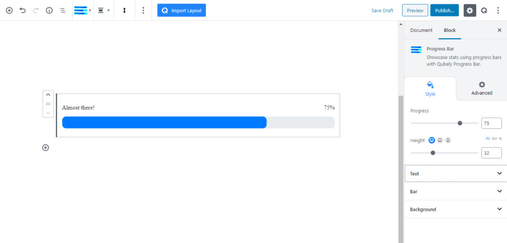
Using the progress bar block you can show the progress of an ongoing project or an interesting statistic. Similar to all other blocks, the controls for Progress Bar are in the right sidebar from where you can set the progress bar value and adjust the bar thickness.
Style
Progress: Specify the progress of the bar
Height: Set the height of the actual progress bar. There are three units available: PX, EM, and Percentage. Responsiveness options are also present.
Text
Title: Add a text title for the progress bar.
Show Percentage: Enable this toggle to show the progress bar’s percentage.
Position: Pick the position of the text and the percentage. If you pick inside, both of them will be located on the inside of the progress bar.
Spacing: Choose the space between the text and the bar. There are three units available: PX, EM, and Percentage. Responsiveness options are also present.
Typography: You can enable typography settings for the text label. Select what typography you would like to use from the settings that you will find.
- Font Size: Define the size of the font. It is a responsive function; therefore, the size of the font can be customized according to the device type.
- Font Family: Choose your desired font to use from the list. Qubely has a collection of 900 fonts including the defaults that come with Gutenberg.
- Weight: Set the font-weight. Normally the font-weight is the thickness of a font.
Advanced Typography: If you click on the gear icon on the Advanced Typography you will be presented with advanced configuration options to set custom typography.
- Line Height: It’s the difference between lines, adjust it the way you want to.
- Letter Spacing: It controls the space in between letters, defines the gap the way you want to.
- Text Transform: Lets you apply your preferred capitalization format to the text.
Color: Use this slider to change the color of the text field and the percent field.
Bar
Background: Use two color modes for the color of the progress bar:
- Solid Color: The bar will be a solid color
- Fill Color: Select the solid color for the background of the bar
- Gradient Color: The bar will have a gradient color. There are two types of gradients.
- Linear: Picks a linear gradient model that applies the gradient on an axis.
- Gradient Angle: Pick the angle of the axis on which the gradient will be applied.
- Radial: Picks a radial gradient model, where the gradient will be generated from a certain point.
- Radial Pointer: Pick the point where the color will generate from.
- Color 1 Stop: Pick the color 1 stop position. The higher it is, the sharper the gradient shift
- Color 2 Start: Pick the color 2 start position. The lower this is, the sharper the gradient shift.
- Linear: Picks a linear gradient model that applies the gradient on an axis.
Striped: Enable this toggle to have a striped effect on the bar
Radius: Use the radius to add a curved corner effect on the bar. You can add a uniform radius or select a different radius for each corner. There are three units available: PX, EM, and Percentage. Responsiveness options are also present.
Background: Pick a color for the empty section of the progress bar.
Advanced
Animation
To make the block more interesting, you can add an animation effect. It is disabled by default, to enable this feature, choose an effect from the dropdown list. Once you choose your desired one, then start making modifications as you see fit. The units are in milliseconds. Note: Duration is how long the animation will run and Delay is the waiting time before the animation starts loading. The following effects are currently available.
- Fade: Selecting this will animate your table of contents block with a fading animation.
- Slide: Animate your table of contents block with a sliding animation.
- Bounce: If you want to animate your table of contents block with a bouncing animation then select this.
- Zoom: This option will animate your table of contents block with a Zooming animation.
- Flip: Animate your table of contents block with a Flipping animation using this option.
- Fold: Selecting this will animate your table of contents block with a sliding animation.
- Rotate: This will animate your table of contents block with a rotating animation.
Note: You can control from which direction the animation will start such as from the center, right, left, up or down. Also, control how many times the animation will repeat. You can also select the duration and the starting delay of the animation in milliseconds.
Interaction
Enable Tablet: If you want to enable the interactions for tablet users to enable this to start showing tablet users the image interactions.
Enable Mobile: If you want to enable the interactions for mobile users to enable this to start showing mobile users the image interactions.
Enable Mouse Movement: You can select the way how your interactions work with your mouse movement. There are multiple options once you enable it. You can choose the direction from Direct/Opposite, speed from a scale of 1 to 10, maximum from a scale of 5 to 75.
Live Button: This button will give you “Live experience” on how your interactions work depending on how you set it. Click on it to get an overview.
Advanced
This section lets you override the current styling of this particular block.
Enable Custom Position: If you want to set the block to a custom position then simply enable this option. After enabling you will find the following options
From X-axis: Select from the slider what position you want the image block to be in according to the X-axis. The range limits from -2000 to 2000.
From Y-axis: Select from the slider what position you want the image block to be in according to the X-axis. The range limits from -2000 to 2000.
Z – Index: If any of your blocks override another, then you can set a value here, the one with the higher value will appear before the other.
Hide on Tablet/Phone: Turn it on to hide this block in your desired device. The change will appear on the frontend.
Block Row CSS: In case you need to override current block settings, you can write down your own code followed by {{QUBELY}} to override the current settings.Additional CSS Class: You might need to name a block in order to make custom modifications in the future, this is the field where you define the name.