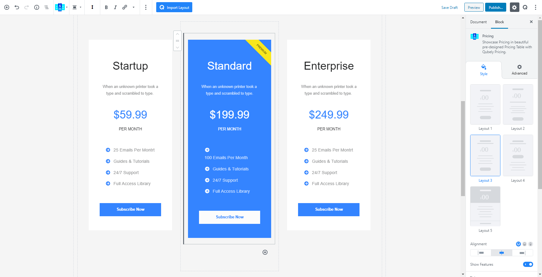
Want to show the pricing of the services or product you are trying to sell on your WordPress website? Qubely has the perfect customizable pricing block for that. Head over to the add block section and scroll down to see the Pricing block. Click on it add it to your page/post.
Style
After adding your Qubely pricing block you will have the option to select a layout. There are a total of five layout designs to choose from. Each of them has been carefully designed to meet the users’ needs.
Alignment: You can apply alignment to your image regardless of the device types. It offers responsive functionality. Choose your desired device from the list and apply the alignment.
Show Features: This a simple toggle button to disable/enable the feature section of the Qubely pricing block.
Title
This section will let you configure the options related to the title of the Qubely Pricing block. From here you can change
Color: Choose from a wide range of colors from the color palette to apply it to your title. There is also a clear button to reverse any previously applied color.
Gap: This slider helps to define the gap between the title and the rest of the details on the Qubely pricing block. It is a responsive feature that means you can apply different values for different device types. You can set the custom width according to PX, EM, or Percentage.
- Typography: To change the typography of the text turn on this function and you’ll have the followings:
- Font Size: Define the size of the font. It is a responsive function, therefore, the size of the font can be customized according to the device type.
- Font Family: Choose your desired font to use from the list.
- Weight: Set the font-weight. Normally the font-weight is the thickness of a font.
- Advanced Typography
- Line Height: It’s the difference between lines, adjust it the way you want to.
- Letter Spacing: It controls the space in between letters, defines the gap the way you want to.
- Text Transform: Lets you apply your preferred capitalization formate to the text.
Price
You will find all the configuration options for how you want the price of the Qubely pricing block to look like from here.
Color: Define the color of the Pricing numbers that show in the Qubely Pricing blocks. You have the option to apply any color from the color palette.
Typography: To change the typography of the text turn on this function and you’ll have the followings:
- Font Size: Define the size of the font. It is a responsive function, therefore, the size of the font can be customized according to the device type.
- Font Family: Choose your desired font to use from the list.
- Weight: Set the font-weight. Normally the font-weight is the thickness of a font.
- Advanced Typography
- Line Height: It’s the difference between lines, adjust it the way you want to.
- Letter Spacing: It controls the space in between letters, defines the gap the way you want to.
- Text Transform: Lets you apply your preferred capitalization formate to the text.
Discount: If you want to show a discount on your pricing block you can enable the toggle button. After enabling the extended features will collapse.
- Original Price: Type in the original price which will be shown using strikethrough next to the reduced price.
- Color: Choose the color of the Discounted price numbers. There is also a clear button to reverse any applied color.
- Typography: To change the typography of the text turn on this function and you’ll have the followings:
- Font Size: Define the size of the font. It is a responsive function, therefore, the size of the font can be customized according to the device type.
- Font Family: Choose your desired font to use from the list.
- Weight: Set the font-weight. Normally the font-weight is the thickness of a font.
- Advanced Typography
- Line Height: It’s the difference between lines, adjust it the way you want to.
- Letter Spacing: It controls the space in between letters, defines the gap the way you want to.
- Text Transform: Lets you apply your preferred capitalization formate to the text.
Gap: Set the gap distance between the price text and the rest of the content using the slider. There is also an option to manually enter the value. It is a responsive feature so you can set the gap distance according to the device type.
Currency
This option helps you set the currency of the Qubely Pricing block. You will find a dropdown menu to set the pricing Symbol. You will symbol options such as the dollar, euro, pound, franc, lira, guilder, rupee, baht, krona, peso, rupee and so on. There is also an option to define a custom currency symbol.
Position: There are two positions you can choose, for your currency to show. Before or after the price.
Alignment: Define the alignment of the currency symbol according to the pricing number location. Using the slider you will be able to choose the perfect alignment. You can even set the alignment manually.
Color: Choose the color of the pricing symbol from the color palette. There is also a clear button to reverse any applied color.
- Typography: To change the typography of the text turn on this function and you’ll have the followings:
- Font Size: Define the size of the font. It is a responsive function, therefore, the size of the font can be customized according to the device type.
- Font Family: Choose your desired font to use from the list.
- Weight: Set the font-weight. Normally the font-weight is the thickness of a font.
- Advanced Typography
- Line Height: It’s the difference between lines, adjust it the way you want to.
- Letter Spacing: It controls the space in between letters, defines the gap the way you want to.
- Text Transform: Lets you apply your preferred capitalization formate to the text.
Duration
Enable this button to show the pricing option for the customer. You can toggle on/off depending on your marketing strategy. Once enabled you will find the following options
Duration: Enter the text of the pricing duration. Such as per month/per year.
Position: Show the duration text just beside or under the pricing number.
Duration align: Select the alignment of the pricing duration text from the slider. You can also manually assign the alignment number using the submit box.
Color: Set the color of the pricing duration text from the color palette. You can also reverse any applied color using the clear button.
Typography: To change the typography of the text turn on this function and you’ll have the followings:
- Font Size: Define the size of the font. It is a responsive function, therefore, the size of the font can be customized according to the device type.
- Font Family: Choose your desired font to use from the list.
- Weight: Set the font-weight. Normally the font-weight is the thickness of a font.
- Advanced Typography
- Line Height: It’s the difference between lines, adjust it the way you want to.
- Letter Spacing: It controls the space in between letters, defines the gap the way you want to.
- Text Transform: Lets you apply your preferred capitalization formate to the text.
Background
This feature lets you set a specific type of background to the Pricing block.
Background: If you would like to show a specific color to the background to the content of the team member details section you have the option to do that from here. You can choose
- Color: Selecting this will only set a solid color for your image overlay. From the Fill Color option, you can choose from a wide range of colors.
- Gradient Type – Linear: A linear gradient applies the gradient by an axis. It’s a linear line. The effect is applied with a Gradient Angel, which defines the starting point. And two colors applied at two ends. Color 1 starts at the defined angle point and Color 2 starts after the Color 1 endpoint.
- Clear: Lets you reset the existing gradient effect. You can use it to start over.
Border: Set a border around your content. Predefined borders include Solid, Dotted, Dashed and Double.
Border Color: If you would like to define a color to the border of the content simply choose a color from the palette here and apply it.
Border Width: You can also set the width of the borders that you apply. There are two types of configuration options to choose from. You can set the border width on a scale between 0 to 10. You can also apply the same value to all the corners by choosing the global option whereas selecting the Custom option will let you set a different value for each corner.
Box-Shadow: You can apply shadow to the background using this feature. Enabling the feature will present you with the following options:
- Color: Lets you choose the color of the shadow.
- X: Lets you define the length of the shadow of X-axis.
- Y: Lets you define the length of the shadow of Y-axis.
- Blur: Lets you control the blurriness of the shadow.
- Spread: Lets you control how far the shadow will spread.
Padding: To set the Padding of the Background, you can use the Padding function. The scale can be calibrated between 1 to 200. You can apply the same value to all the corners by choosing the global option whereas selecting the Custom option will let you set a different value for each corner. Also, it’s a responsive feature that means you can apply different values for different device types.
Radius: You can also set the radius of the content, using the Radius function. The scale can be calibrated between 1 to 100. You can apply the same value to all the corners by choosing the global option or also using the Custom option will let you set a different value for each corner. It’s a responsive feature that means you can apply different values for different device types.
Badge
Sometimes you might want to differentiate a specific pricing package from the rest of the packages. For those times, you can use the badge functionality of the Qubely Pricing block. You can quickly enable/disable badge using the toggle button. After enabling the badge you will get the following configuration settings.
Selecting a Specific Style: You can choose from a set of six preset style layout. Each one offers a different style of badge for your pricing page.
Size: Define the size of the badge area. You have the option to select a small, regular and large size.
Position: This setting allows you to position your applied batch. Where you want to set the badge to show. You can choose from left or right.
Background Color: Choose the color of the background of the badge. You can set any color from the given color palette. There is also a clear button that reverses any set color.
Text color: Use this setting to set the text color of the badge. The color palette gives you a wide range of options to choose from. If you want to reverse any added color just click on the clear button.
Typography: To change the typography of the text turn on this function and you’ll have the followings:
- Font Size: Define the size of the font. It is a responsive function, therefore, the size of the font can be customized according to the device type.
- Font Family: Choose your desired font to use from the list.
- Weight: Set the font-weight. Normally the font-weight is the thickness of a font.
- Advanced Typography
- Line Height: It’s the difference between lines, adjust it the way you want to.
- Letter Spacing: It controls the space in between letters, defines the gap the way you want to.
- Text Transform: Lets you apply your preferred capitalization formate to the text.
Button
The button of your pricing page is a very important part of the overall user experience strategy. You want your users to click on the button and take action. To give you the full flexibility to configure the button Qubely offers a vast range of options.
Style of The Button: There are two types of button styles you can choose from. The Fill style fills the whole button with a color. You can configure it. And the Outline style which only outlines the border of the button.
URL: Apply a URL for the button. Enter the URL or copy/paste it from the source and it will be applied automatically. If you click on the gear icon on you will find the advanced options. You can allow the link to open in a new tab and allow you to add a NoFollow rule to the link.
Size
There are a total number of four button sizes you can choose from. Choices include small, medium, large and custom sizes.
- Padding: To set the Padding of the Background, you can use the Padding function. The scale can be calibrated between 1 to 200. You can apply the same value to all the corners by choosing the global option whereas selecting the Custom option will let you set a different value for each corner. Also, it’s a responsive feature that means you can apply different values for different device types.
- Button Width: If you want to set the button width to choose from any three options from here. Auto, full or a fixed button width. In the fixed option set the button width according to your needs using a slider or the manual entry option. Also, it’s a responsive feature that means you can apply different values for different device types.
Design
Configure the design options of the pricing button text and the border. There are settings for two types of state of the button. One is for the normal state, and the second is for the You can customize
- Text Color: Select any color from the wide color palette. Click on the clear button to undo any applied color.
- Border: Set a border around your content. Predefined borders include Solid, Dotted, Dashed and Double. There is also a clear button if you don’t want to apply a border.
- Border Color: If you would like to define a color to the border of the content simply choose a color from the palette here and apply it.
- Border Width: You can also set the width of the borders that you apply. There are two types of configuration options to choose from. You can set the border width on a scale between 0 to 10. You can also apply the same value to all the corners by choosing the global option whereas selecting the Custom option will let you set a different value for each corner.
- Box-Shadow: You can apply shadow to the background using this feature. Enabling the feature will present you with the following options:
- Color: Lets you choose the color of the shadow.
- X: Lets you define the length of the shadow of X-axis.
- Y: Lets you define the length of the shadow of Y-axis.
- Blur: Lets you control the blurriness of the shadow.
- Spread: Lets you control how far the shadow will spread.
- Inset: Enable this feature if you want the shadows to be drawn inside the border, above the background, but below content.
- Radius: You can also define the radius of the image using a simple slider. There is also an option to manually enter the width of the image. Set the custom width according to PX, EM, or Percentage. It is a responsive function, therefore, the width of the image can be customized according to the device type.
- Gap: This option lets you define the gap between the content of the pricing page and the button. Adjust the slider to your liking to set the gap. Also, adjust the gap my manually adding the gap distance. It is a responsive function, therefore, the width of the image can be customized according to the device type.
Icon
Enable this function to add an icon to the button of the Qubely pricing button. After enabling you will find all the advanced features.
- Add Icon: You can add any icon from the icon list menu. There is also a search to make the process much easier.
- Position: Set the position for the icon. You can choose the icon to be in the left or right.
- Size: Set the size of the icon using the slider or manually set it. It is responsive so the size can be set according to the device types.
- Gap: Configuration option for the gap between the text and the icon. There is a slider to adjust it.
Typography
To change the typography of the text turn on this function and you’ll have the followings:
- Font Size: Define the size of the font. It is a responsive function, therefore, the size of the font can be customized according to the device type.
- Font Family: Choose your desired font to use from the list. Qubely has a collection of 900 fonts including the defaults that come with Gutenberg.
- Weight: Set the font-weight. Normally the font-weight is the thickness of a font.
- Advanced Typography: If you click on the gear icon on the Advanced Typography you will be presented with advanced configuration options to set custom typography.
- Line Height: It’s the difference between lines, adjust it the way you want to.
- Letter Spacing: It controls the space in between letters, defines the gap the way you want to.
- Text Transform: Lets you apply your preferred capitalization format to the text.
Post Button Text
This option enables you to set a text after the pricing button. You can find the configuration options for the text after enabling this feature using the toggle button.
Normal: This shows the options for the normal state of the text.
Hover: Clicking on it will enable you to configure the options, for the times when you hover over the text.
Typography: To change the typography of the text turn on this function and you’ll have the followings:
- Font Size: Define the size of the font. It is a responsive function, therefore, the size of the font can be customized according to the device type.
- Font Family: Choose your desired font to use from the list. Qubely has a collection of 900 fonts including the defaults that come with Gutenberg.
- Weight: Set the font-weight. Normally the font-weight is the thickness of a font.
- Advanced Typography: If you click on the gear icon on the Advanced Typography you will be presented with advanced configuration options to set custom typography.
- Line Height: It’s the difference between lines, adjust it the way you want to.
- Letter Spacing: It controls the space in between letters, defines the gap the way you want to.
- Text Transform: Lets you apply your preferred capitalization format to the text.
Top: Provides the option to adjust the gap after the button and the starting of the text. There are a slider and a manual entry option for your convenience.
Bottom: Gives the option to set the gap distance between the bottom section of the pricing column and the button.
Features
You will find the options to configure the features section of the Qubely Pricing block from here.
Custom Alignment: Provide a quick toggle button to switch on/off a custom alignment feature. After enabling you will find the option to align the content on the left, middle or right side.
Color: Select any color from the wide color palette. Click on the clear button to undo any applied color.
Typography: To change the typography of the text turn on this function and you’ll have the followings:
- Font Size: Define the size of the font. It is a responsive function, therefore, the size of the font can be customized according to the device type.
- Font Family: Choose your desired font to use from the list. Qubely has a collection of 900 fonts including the defaults that come with Gutenberg.
- Weight: Set the font-weight. Normally the font-weight is the thickness of a font.
- Advanced Typography: If you click on the gear icon on the Advanced Typography you will be presented with advanced configuration options to set custom typography.
- Line Height: It’s the difference between lines, adjust it the way you want to.
- Letter Spacing: It controls the space in between letters, defines the gap the way you want to.
- Text Transform: Lets you apply your preferred capitalization format to the text.
Spacing: Provides a slider to let you control the spacing between the texts of each feature.
Padding: To set the Padding of the Background, you can use the Padding function. The scale can be calibrated between 1 to 200. You can apply the same value to all the corners by choosing the global option whereas selecting the Custom option will let you set a different value for each corner. Also, it’s a responsive feature that means you can apply different values for different device types.
Icons: Enable the toggle button to add an icon for the feature list.
- Color: Define the color of the icon using the color palette.
- Add Icon: You can add any icon from the icon list menu. There is also a search to make the process much easier.
- Common settings: You will find the common settings for the icons from here. Select the color, icon size from small, medium, large, extra-large or a custom size. Set the position from left or right, adjust the gap distance.
Advanced
Animation
To make the block more interesting, you can add an animation effect. It is disabled by default, to enable this feature, choose an effect from the dropdown list. Once you choose your desired one, then start making modifications as you see fit. The units are in milliseconds. Note: Duration is how long the animation will run and Delay is the waiting time before the animation starts loading. The following effects are currently available.
- Fade: Selecting this will animate your table of contents block with a fading animation.
- Slide: Animate your table of contents block with a sliding animation.
- Bounce: If you want to animate your table of contents block with a bouncing animation then select this.
- Zoom: This option will animate your table of contents block with a Zooming animation.
- Flip: Animate your table of contents block with a Flipping animation using this option.
- Fold: Selecting this will animate your table of contents block with a sliding animation.
- Rotate: This will animate your table of contents block with a rotating animation.
Note: You can control from which direction the animation will start such as from the center, right, left, up or down. Also, control how many times the animation will repeat. You can also select the duration and the starting delay of the animation in milliseconds.
Interaction
Enable Tablet: If you want to enable the interactions for tablet users to enable this to start showing tablet users the image interactions.
Enable Mobile: If you want to enable the interactions for mobile users to enable this to start showing mobile users the image interactions.
Enable Mouse Movement: You can select the way how your interactions work with your mouse movement. There are multiple options once you enable it. You can choose the direction from Direct/Opposite, speed from a scale of 1 to 10, maximum from a scale of 5 to 75.
Live Button: This button will give you “Live experience” on how your interactions work depending on how you set it. Click on it to get an overview.
Advanced
This section lets you override the current styling of this particular block.
Enable Custom Position: If you want to set the block to a custom position then simply enable this option. After enabling you will find the following options
From X-axis: Select from the slider what position you want the image block to be in according to the X-axis. The range limits from -2000 to 2000.
From Y-axis: Select from the slider what position you want the image block to be in according to the X-axis. The range limits from -2000 to 2000.
Z – Index: If any of your blocks override another, then you can set a value here, the one with the higher value will appear before the other.
Hide on Tablet/Phone: Turn it on to hide this block in your desired device. The change will appear on the frontend.
Block Row CSS: In case you need to override current block settings, you can write down your own code followed by {{QUBELY}} to override the current settings.Additional CSS Class: You might need to name a block in order to make custom modifications in the future, this is the field where you define the name.