Qubely gives you the freedom to customize your form the way you desire. Click to check out the amazing forms you can build with the Form block of Qubely.
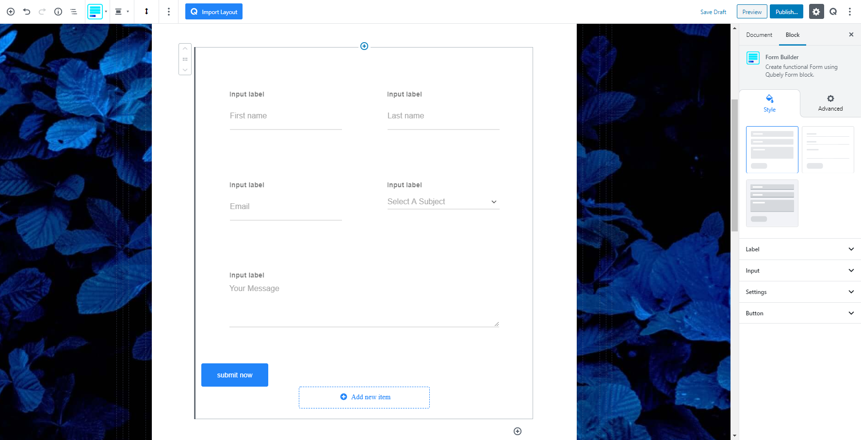
The form builder block of Qubely Gutenberg Plugin has 3 premade designs. You can have the classic, material and a boxed layout with background option. But you are not limited to the premade design or appearance. You can modify any of them any way you like. You can just use the premade designs to get started. The settings interchanges as you change the layouts.
Style
Configuring the Settings
Before we go ahead and start creating form fields, we need to make sure the setting is configured properly. The Form Builder block sends the received data to the email address that is defined in the settings. So the first thing is to go directly to the Settings section and configure the settings accordingly.
The section is separated into two sets of settings: Form and Email
Form: The settings available here lets you customize the error message and configure security.
- Required Field Error Message: Lets you customize the error message shown when a user doesn’t fill up a required form field.
- Form Submit Success Message: Lets you customize the message for successful submission of the form. It should not be left blank.
- Form Submit Failed Message: Lets you customize the message for an unsuccessful submission of the form. It is crucial to let users know the submission did not work.
- Enable Captcha: You can enable reCaptcha for your form submission. Set the Site Key and Secret Key for your form. To get the Keys, visit the link here.
- Enable Policy Checkbox: Enable this toggle button to set a term & condition checkbox and make it required.
Email: This is the most important part of the settings area. Firstly, we need to configure the recipient email.
- Recipient Email: Enter the email address in which you want the received information to send. This field is a mandatory field.
- Email Headers: It gives you the freedom to customize the email sending options. Like putting the customer email so that they can receive a copy of their data.
- From Email: You need to put down the email address that will be used to send emails on behalf of this Form.
- Subject: Write down the email subject that will help you understand that the email was sent from this Form.
- Email Body: This is the second most important thing in the Form Builder settings. Define the Name of the input field that you want to retrieve from the From inside double curly braces {{field-name}}.
Adding custom fields in the email body
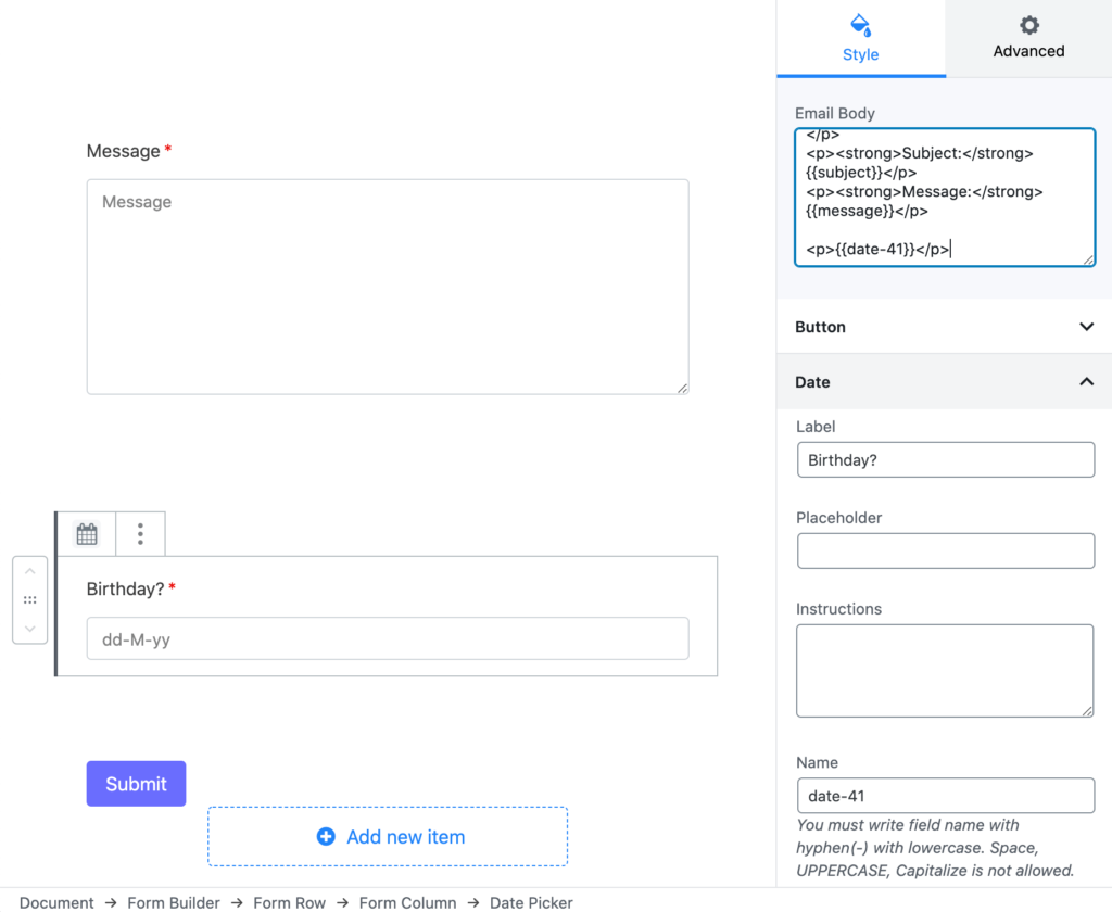
As an example, you can see that we have added a new date picker field called Birthday in the form and the name of this field is date-41. So, to get the data for this field, we have added {{date-41}} shortcode in the email body. Similarly, on the other fields in the settings, you need to put relevant and valid shortcodes. If you do not have a subject field in the form but add {{subject}} on the email subject field, it will print the shortcode directly without parsing it.
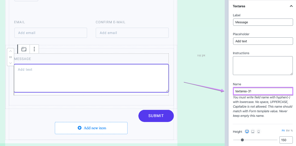
Understanding the input field name
Each field stores data in their respective variables. The variable name is defined for every input using the Name field. For a better understanding, find the image below, here the name ‘textarea-31‘ is the name of the variable that stores the information put in the Message textbox. By using this Name you can retrieve the information stored in each field and put them anywhere of the Email.
The Form block comes with 3 preset design but of course, you can customize it the way you want to. Following is the list of all available input fields in the Form Block:
- Text
- Number
- Radio
- Checkbox
- Textarea
- Date
- Time
- Dropdown
- Add Column
Clicking on any form filed opens up the respective settings. However, before customizing the setting for each input field it is important to configure three settings: Label, Input, and Setting. They are common to all form fields and vital for the Form block to collect information.
Label
From this settings option, you can select the label typography, color, and spacing attributes.
Typography: To change the typography of the text turn on this function and you’ll have the followings:
- Font Size: Define the size of the font. It is a responsive function, therefore, the size of the font can be customized according to the device type.
- Font Family: Choose your desired font to use from the list.
- Weight: Set the font-weight. Normally the font-weight is the thickness of a font.
- Advanced Typography
- Line Height: It’s the difference between lines, adjust it the way you want to.
- Letter Spacing: It controls the space in between letters, defines the gap the way you want to.
- Text Transform: Lets you apply your preferred capitalization formate to the text.
Spacing: Use the slider ton define the spacing between each of the sections of the form. You can also manually enter the spacing value. It is a responsive feature so you can set different spacing values for different types of devices.
Color: Set a specific color for the labels of the form’s different submissions elements. There is also a clear button to reverse any applied color.
Input
Settings to configure the attributes of the submission box areas for Qubely Form block are found here. You can control multiple settings and make the submission area just like you want. You will be able to
Input Size: Set the size of the submission box using three prebuilt sizes such as small, medium, and large. There is also an option for setting a custom size.
Textarea Height: Set the height of the text area submission box using a slider. You can also set the height manually. It is a responsive feature so you can set different height for different types of devices.
Spacing: This setting controls the spacing area between each of the submission area. Set the distance using the slider or set it manually. It is also responsive so you will find the option to set different spacing for different devices.
Border: Set a border around your submission box. Predefined borders include Solid, Dotted, Dashed and Double.
Border Color: Choose a color from the palette and apply it to the border.
Border Width: If you enable the border you will find it’s customization settings. You can also set the width of the borders with a slider. It is a responsive feature so that means you can set different border width for different types of devices.
Radius: Select the radius of the content block from the slider and apply it. There is also an option to manually enter the width of the image. Set the custom width according to PX, EM, or Percentage. It is a responsive function, therefore, the width of the image can be customized according to the device type.
Normal: Configure the color state of the submission box for the normal state of the submission box. You can set the input text color, background color, placeholder color from the wide range of colors from the color palette.
Focus: This setting allows you to set the color configuration options when a user clicks on the submission box. You can set the color for the text, background, border, and placeholder color.
Hover: You can set the text color, background color, border color, placeholder color for when users hover over your submission box. Set the color from the color palette. There is also a clear button to reverse any applied color.
Typography: To change the typography of the text for the form turn on this function and you’ll have the followings:
Font Size: Define the size of the font. It is a responsive function, therefore, the size of the font can be customized according to the device type.
- Font Family: Choose your desired font to use from the list. Qubely has a collection of 900 fonts including the defaults that come with Gutenberg.
- Weight: Set the font-weight. Normally the font-weight is the thickness of a font.
- Advanced Typography: If you click on the gear icon on the Advanced Typography you will be presented with advanced configuration options to set custom typography.
- Line Height: It’s the difference between lines, adjust it the way you want to.
- Letter Spacing: It controls the space in between letters, defines the gap the way you want to.
- Text Transform: Lets you apply your preferred capitalization format to the text.
Box-Shadow: You can apply shadow to the background using this feature. Enabling the feature will present you with the following options:
- Color: Lets you choose the color of the shadow.
- X: Lets you define the length of the shadow of X-axis.
- Y: Lets you define the length of the shadow of Y-axis.
- Blur: Lets you control the blurriness of the shadow.
- Spread: Lets you control how far the shadow will spread.
Button
All the configuration options to configure the submission box is found here.
Choosing the style of the button: There are two predefined submission box styles you can choose. They are Fill and Outline style.
Alignment: You can apply alignment to your image regardless of the device types. It offers responsive functionality. Choose your desired device from the list and apply the alignment.
Size: There are a total number of four button sizes you can choose from. Choices include small, medium, large and custom sizes.
- Button Width: If you want to set the button width to choose from any three options from here. Auto, full or a fixed button width. In the fixed option set the button width according to your needs using a slider or the manual entry option. Also, it’s a responsive feature that means you can apply different values for different device types.
Design: Configure the design options of the pricing button text and the border. There are settings for two types of state of the button. One is for the normal state, and the second is for the You can customize
- Text Color: Select any color from the wide color palette. Click on the clear button to undo any applied color.
- Background: If you would like to show a specific color to the background to the content of the team member details section you have the option to do that from here. You can choose
- Color: Selecting this will only set a solid color for your image overlay. From the Fill Color option, you can choose from a wide range of colors.
- Gradient Type – Linear: A linear gradient applies the gradient by an axis. It’s a linear line. The effect is applied with a Gradient Angel, which defines the starting point. And two colors applied at two ends. Color 1 starts at the defined angle point and Color 2 starts after the Color 1 endpoint.
- Clear: Lets you reset the existing gradient effect. You can use it to start over.
- Border: Set a border around your content. Predefined borders include Solid, Dotted, Dashed and Double. There is also a clear button if you don’t want to apply a border.
- Border Color: If you would like to define a color to the border of the content simply choose a color from the palette here and apply it.
- Border Width: You can also set the width of the borders that you apply. There are two types of configuration options to choose from. You can set the border width on a scale between 0 to 10. You can also apply the same value to all the corners by choosing the global option whereas selecting the Custom option will let you set a different value for each corner.
- Box-Shadow: You can apply shadow to the background using this feature. Enabling the feature will present you with the following options:
- Color: Lets you choose the color of the shadow.
- X: Lets you define the length of the shadow of X-axis.
- Y: Lets you define the length of the shadow of Y-axis.
- Blur: Lets you control the blurriness of the shadow.
- Spread: Lets you control how far the shadow will spread.
- Inset: Enable this feature if you want the shadows to be drawn inside the border, above the background, but below content.
- Radius: You can also define the radius of the image using a simple slider. There is also an option to manually enter the width of the image. Set the custom width according to PX, EM, or Percentage. It is a responsive function, therefore, the width of the image can be customized according to the device type.
- Gap: This option lets you define the gap between the content of the pricing page and the button. Adjust the slider to your liking to set the gap. Also, adjust the gap my manually adding the gap distance. It is a responsive function, therefore, the width of the image can be customized according to the device type.
Icon: Enable this function to add an icon to the button of the Qubely pricing button. After enabling you will find all the advanced features.
- Add Icon: You can add any icon from the icon list menu. There is also a search to make the process much easier.
- Position: Set the position for the icon. You can choose the icon to be on the left or right.
- Size: Set the size of the icon using the slider or manually set it. It is responsive so the size can be set according to the device types.
- Gap: Configuration option for the gap between the text and the icon. There is a slider to adjust it.
Typography: To change the typography of the text turn on this function and you’ll have the followings:
- Font Size: Define the size of the font. It is a responsive function, therefore, the size of the font can be customized according to the device type.
- Font Family: Choose your desired font to use from the list. Qubely has a collection of 900 fonts including the defaults that come with Gutenberg.
- Weight: Set the font-weight. Normally the font-weight is the thickness of a font.
- Advanced Typography: If you click on the gear icon on the Advanced Typography you will be presented with advanced configuration options to set custom typography.
- Line Height: It’s the difference between lines, adjust it the way you want to.
- Letter Spacing: It controls the space in between letters, defines the gap the way you want to.
- Text Transform: Lets you apply your preferred capitalization format to the text.
Advanced
Animation
To make the block more interesting, you can add an animation effect. It is disabled by default, to enable this feature, choose an effect from the dropdown list. Once you choose your desired one, then start making modifications as you see fit. The units are in milliseconds. Note: Duration is how long the animation will run and Delay is the waiting time before the animation starts loading. The following effects are currently available.
- Fade: Selecting this will animate your table of contents block with a fading animation.
- Slide: Animate your table of contents block with a sliding animation.
- Bounce: If you want to animate your table of contents block with a bouncing animation then select this.
- Zoom: This option will animate your table of contents block with a Zooming animation.
- Flip: Animate your table of contents block with a Flipping animation using this option.
- Fold: Selecting this will animate your table of contents block with a sliding animation.
- Rotate: This will animate your table of contents block with a rotating animation.
Note: You can control from which direction the animation will start such as from the center, right, left, up or down. Also, control how many times the animation will repeat. You can also select the duration and the starting delay of the animation in milliseconds.
Interaction
Enable Tablet: If you want to enable the interactions for tablet users to enable this to start showing tablet users the image interactions.
Enable Mobile: If you want to enable the interactions for mobile users to enable this to start showing mobile users the image interactions.
Enable Mouse Movement: You can select the way how your interactions work with your mouse movement. There are multiple options once you enable it. You can choose the direction from Direct/Opposite, speed from a scale of 1 to 10, maximum from a scale of 5 to 75.
Live Button: This button will give you “Live experience” on how your interactions work depending on how you set it. Click on it to get an overview.
Advanced
This section lets you override the current styling of this particular block.
Enable Custom Position: If you want to set the block to a custom position then simply enable this option. After enabling you will find the following options
From X-axis: Select from the slider what position you want the image block to be in according to the X-axis. The range limits from -2000 to 2000.
From Y-axis: Select from the slider what position you want the image block to be in according to the X-axis. The range limits from -2000 to 2000.
Z – Index: If any of your blocks override another, then you can set a value here, the one with the higher value will appear before the other.
Hide on Tablet/Phone: Turn it on to hide this block in your desired device. The change will appear on the frontend.
Block Row CSS: In case you need to override current block settings, you can write down your own code followed by {{QUBELY}} to override the current settings.Additional CSS Class: You might need to name a block in order to make custom modifications in the future, this is the field where you define the name.