Designing and maintaining continuity throughout your entire platform is the very essence of web design. And when it comes to designs that immediately grab your visitors’ attention, a uniform color scheme and typography throughout goes a very long way. Qubely Global Settings will help you do just that.
Global Settings
You can set your default style preference in Qubely. To find the Qubely Global settings, click on the three-doted icon at the top right. You’ll see the Gutenberg editor options opening up, under the plugins section you’ll find Qubely Settings.
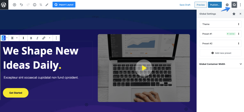
Theme
Note that, If the theme that is currently active in your WordPress site doesn’t provide editor color & font support for Gutenberg then the Theme preset won’t be available under Global Setting.
These settings enable you to take the theme’s color and use them while designing posts and pages. You can either activate, rename, or duplicate the theme option.
Presets
Previously, while taking a block, the design used to take a default color. So, you needed to adjust the color of the design manually. But you can use this feature to set a default preset for the color option.
The blocks that will get the initial color from active preset are
- Button,
- Button Group,
- Infobox Icon,
- Accordion, Icon,
- Video Popup,
- Progress Bar,
- Tabs,
- Vertical Tabs,
- Contact Form,
- Form Builder,
- Icon List,
- Pricing,
- Timeline
- Animated Headline
Once you want to modify the preset, you can customize the following.
Global Colors
Set a global color for the preset that will be used. You can choose from a number of predefined colors or set a color using the color palette. You can also add a new color or delete a color if you want too.
Typography
Select the typography for the preset that you want to set. Choose from heading 1, heading 2, button text typography, paragraph typography, and more.
In a list you can change the website’s typography where the following elements were used:
- Body
- Heading 1 – Heading 6
- Button
To change the styling of any of the tags, expand its options. You’ll be presented with the following common functions:
- Font Size: You can set the size of the font for different device types and also change the unit from px to em or percentage.
- Font Family: Choose your preferred font type for the element from the list of fonts.
- Weight: It is the thickness of a font, the greater the value is the thicker the font becomes.
- Advanced Typography: This opens up a set of settings including line-height and letter spacing which can be changed for different devices. Also, you can define the text transformation type.
Global Container Width
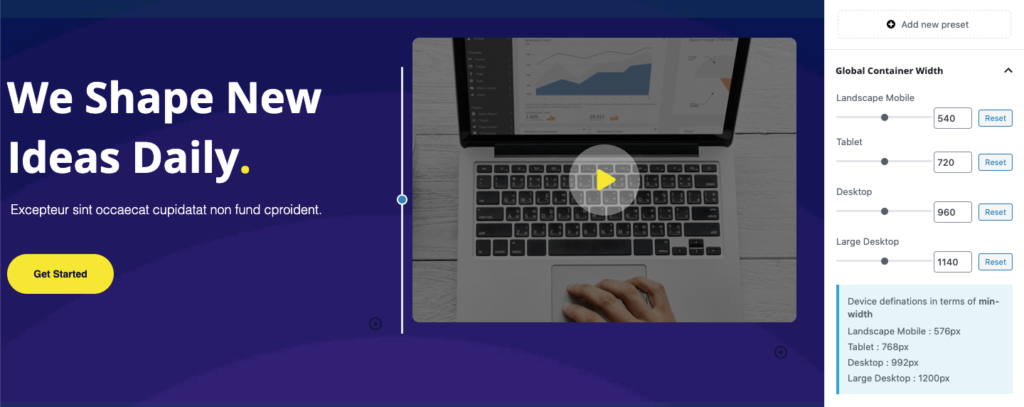
Set a global value for your row container width using these settings. You will find the following configuration options. You need to select the Full-Width option from the Qubely Row block settings to apply the Global Container width.
Please see the values below that represents the device definitions in terms of min-width
Landscape Mobile : 576px
Tablet : 768px
Desktop : 992px
Large Desktop : 1200px
Landscape Width
Use the slider to set a value for the Landscape width. You can either set the value using the slider or set it manually using the number box.
Tablet
Use the slider to set a value for the tablet devices. You can either set the value using the slider or set it manually using the number box.
Desktop
Use the slider to set a value for the desktops. You can either set the value using the slider or set it manually using the number box.
Large Desktop
Use the slider to set a value for the large desktops. You can either set the value using the slider or set it manually using the number box.
Row Container Width Filter Hook (For Developers)
Theme developers can control the default values of the row container width for their themes. If a developer thinks that row container width default values for his/her theme should be different, he/she can change it.
We added the row container hook for developers to control this. Please follow this link for the developer documentation.