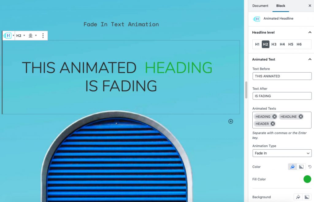
With the new Animated Headline block for Qubely, now you can easily create headlines that capture the attention of your website visitors. Once you add the Qubely block you can easily customize it to your needs.
Style
Templates
You can choose one of the prebuilt templates from this section. All of them are fully customizable so you can set it as your own. To select a specific layout hover over it and select apply.
Animated Text
Text Before
Write in this what text you want to show up before the animated text.
Text After
This box allows you to type in the text that will show up after the animated headline.
Animated Texts
Write the texts that you want to animate in this text box. You can write multiple texts and they will follow the order that you define in the box.
To add a word just write it in the text box and hit enter/comma after each word. After that, it will be added to the animated headline list of words.
Animation Type
From this drop-down menu settings, you can select the type of animation you want to select. You can choose different types of animation based on preset animation types. There are animation types such as Blinds, Clip, Delete Typing, Flip, Fade, Loading Bar, Scale, Push, Twist/wave.
Color
Define the color from a wide color palette. You can choose a fill color, gradient type or clear any applied color from with the clear button.
- Color: From the Fill Color option, you can choose from a wide range of colors. Choose the color that you want & it will be applied to your animated text.
- Gradient Type – Linear: A linear gradient applies the gradient by an axis. It’s a linear line. The effect is applied with a Gradient Angel, which defines the starting point. And two colors applied at two ends. Color 1 starts at the defined angle point and Color 2 starts after the Color 1 endpoint.
- Gradient Type – Radial: A radial gradient applies the gradient effect by a center point. The Radial Pointer defines the starting point of the circle where Color 1 defines the inner circle area and Color 2 defines the outer circle.
- Clear: Lets you reset the existing gradient effect. You can use it to start over.
Background
You can choose the background color of the animated text section from this customization menu.
- Color: Selecting this will only set a solid color for the background of the animated text section. From the Fill Color option, you can choose from a wide range of colors.
- Gradient Type – Linear: A linear gradient applies the gradient by an axis. It’s a linear line. The effect is applied with a Gradient Angel, which defines the starting point. And two colors applied at two ends. Color 1 starts at the defined angle point and Color 2 starts after the Color 1 endpoint.
- Gradient Type – Radial: A radial gradient applies the gradient effect by a center point. The Radial Pointer defines the starting point of the circle where Color 1 defines the inner circle area and Color 2 defines the outer circle.
- Clear: Lets you reset the existing gradient effect. You can use it to start over.
Radius
With this slider, you will be able to choose the border-radius value of the animated texts. There are two options to use. Either use the slider or set the radius value manually. You can choose the radius value of a specific side separately or opt-in for a global value. It is a responsive feature so you can set a different value for different types of devices.
Padding X
This slider will let you define the padding value for the animated texts inside the Animated Headline. Here you will also find two options to input your desired padding value. Either use the slider or set the value manually. It is a responsive feature so you can set different padding values for different types of devices.
Spacing X
This slider will let you define the margin value for the animated texts of the Animated Headline. Here you will also find two options to input your desired margin value. Either use the slider or set the value manually. It is a responsive feature so you can set different margin values for different types of devices.
Design
From this section, you will be able to configure
- Typography: To change the typography of the text turn on this function and you’ll have the followings:
- Font Size: Define the size of the font. It is a responsive function, therefore, the size of the font can be customized according to the device type.
- Font Family: Choose your desired font to use from the list. Qubely has a collection of 900 fonts including the defaults that come with Gutenberg.
- Weight: Set the font-weight. Normally the font-weight is the thickness of a font.
- Advanced Typography
- Line Height: It’s the difference between lines, adjust it the way you want to.
- Letter Spacing: It controls the space in between letters, defines the gap the way you want to.
- Text Transform: Lets you apply your preferred capitalization format to the text.
Color: If you want to set the text color of the full Animated Headline then you can do that from this section. Choose from a wide range of colors from the color palette. Or if you don’t want to set any color or clear any applied color then you can use the clear button.
Advanced
Animation
To make the block more interesting, you can add an animation effect. It is disabled by default, to enable this feature, choose an effect from the dropdown list. Once you choose your desired one, then start making modifications as you seem fit. The units are in milliseconds. Note: Duration is how long the animation will run and Dealy is the waiting time before the animation starts loading. The following effects are currently available.
Fade: Selecting this will animate your “Animated Headline” with a fading animation.
Slide: Animate your “Animated Headline” with a sliding animation.
Bounce: If you want to animate your “Animated Headline” with a bouncing animation then select this.
Zoom: This option will animate your “Animated Headline” with a Zooming animation.
Flip: Animate your “Animated Headline” with a Flipping animation using this option.
Fold: Selecting this will animate your “Animated Headline” with a sliding animation.
Rotate: This will animate your “Animated Headline” with a rotating animation.
Note: You can control the from which direction the animation will start such as from the center, right, left, up or down. Also, control how many times the animation will repeat. You can also select the duration and the starting delay of the animation which are considered in milliseconds.
Interaction
With the Qubely “Animated Headline”, you also have control over how people interact with your Qubely block. There are three options that you can control how the interaction works.
Enable Tablet: If you want to enable the interactions for Tablet Handheld product users to enable this to start showing tablet users the image interactions.
Enable Mobile: If you want to enable the interactions for Mobile Handheld product users to enable this to start showing mobile users the image interactions.
Enable Mouse Movement: You can select the way how your interactions work with your mouse movement. There are multiple options once you enable it. You can choose the direction from Direct/Opposite, speed from a scale of 1 to 10, maximum from a scale of 5 to 75.
Live Button: This button will give you “Live experience” on how your interactions work depending on how you set it. Click on it to get an overview.
Advanced
This section lets you override the current styling of this particular block.
Enable Custom Position: If you want to set the “Animated Headline” to a custom position then simply enable this option. After enabling you will find the following options
From X-axis: Select from the slider what position you want the “Animated Headline” to be according to the X-axis. The range limits from -2000 to 2000.
From Y-axis: Select from the slider what position you want the “Animated Headline” to be according to the X-axis. The range limits from -2000 to 2000.
Z – Index: If any of your blocks override another, then you can set a value here, the one with the higher value will appear before the other.
Hide on Tablet/Phone: Turn it on to hide this block in your desired device. The change will appear on the frontend.
Block Row CSS: In case you need to override current block settings, you can write down your own code followed by {{QUBELY}} to override the current settings.
Additional CSS Class: You might need to name a block in order to make custom modifications in the future, this is the field where you define the name.