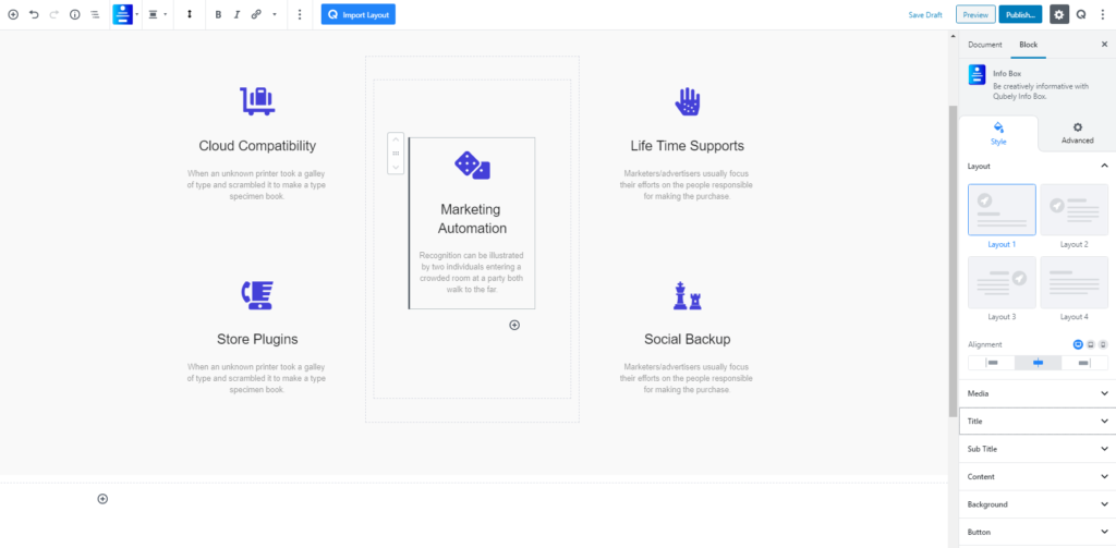
As the name suggests, the Info Box block is there for presenting a large chunk of information in an eye-pleasing manner, which will not overwhelm the visitors when they first see the content. Rather it will make it more interesting. It’s not that when using Info Box you can only use large content, you can also showcase little blocks of content using Info Box like the following image. Currently, there are 4 predefined layouts.
Style
The setting interchanges with the layouts as you need to choose a layout from the 4 predefined ones. All the content related settings including alignment, typography, or padding come with responsive options. For every layout there’s a call to action button, enabling the button will open up the relevant settings.
Media: You can use one of the three types of media: icon, image, number. Choosing one will open up their respective settings. But for all types, the common settings are: you can add background color/image for hover and normal state, add border and border shadow. You can also control background-size, radius, and spacing for different device types.
Title: This set of settings controls the title styling. You can set a title tag among h1-h6, change the color, add a separator, or increase/decrease the content spacing. You can take control over the typography setting by turning Typography on.
Sub Title: Turning it on will let you add a subtitle in the Info Box. You can turn it on if you are in need of a subtitle section. The same set of settings as the Title is available for this section.
Content: Similarly, you can control the visibility of the body content by turning the Show Content function on/off. The typography option will let you customize the typography settings. You can control the font family, size, weight. The advanced typography feature will let you control the line height, letter spacing, and text transformation.
Background: The Background is a common set of settings most of the Qubely blocks. You can add a solid or gradient color effect to the background of any particular block from this section. Some sections like Row, allows you to add still image/video to be added as the background. You can also add padding, border style, box-shadow, and radius (global and custom, global let you apply the same value around the block whereas custom will let you set different values for different sides like top/bottom for different devices).
Advanced
Animation
To make the block more interesting, you can add an animation effect. It is disabled by default, to enable this feature, choose an effect from the dropdown list. Once you choose your desired one, then start making modifications as you see fit. The units are in milliseconds. Note: Duration is how long the animation will run and Delay is the waiting time before the animation starts loading. The following effects are currently available.
- Fade: Selecting this will animate your table of contents block with a fading animation.
- Slide: Animate your table of contents block with a sliding animation.
- Bounce: If you want to animate your table of contents block with a bouncing animation then select this.
- Zoom: This option will animate your table of contents block with a Zooming animation.
- Flip: Animate your table of contents block with a Flipping animation using this option.
- Fold: Selecting this will animate your table of contents block with a sliding animation.
- Rotate: This will animate your table of contents block with a rotating animation.
Note: You can control from which direction the animation will start such as from the center, right, left, up or down. Also, control how many times the animation will repeat. You can also select the duration and the starting delay of the animation in milliseconds.
Interaction
Enable Tablet: If you want to enable the interactions for tablet users to enable this to start showing tablet users the image interactions.
Enable Mobile: If you want to enable the interactions for mobile users to enable this to start showing mobile users the image interactions.
Enable Mouse Movement: You can select the way how your interactions work with your mouse movement. There are multiple options once you enable it. You can choose the direction from Direct/Opposite, speed from a scale of 1 to 10, maximum from a scale of 5 to 75.
Live Button: This button will give you “Live experience” on how your interactions work depending on how you set it. Click on it to get an overview.
Advanced
This section lets you override the current styling of this particular block.
Enable Custom Position: If you want to set the block to a custom position then simply enable this option. After enabling you will find the following options
From X-axis: Select from the slider what position you want the image block to be in according to the X-axis. The range limits from -2000 to 2000.
From Y-axis: Select from the slider what position you want the image block to be in according to the X-axis. The range limits from -2000 to 2000.
Z – Index: If any of your blocks override another, then you can set a value here, the one with the higher value will appear before the other.
Hide on Tablet/Phone: Turn it on to hide this block in your desired device. The change will appear on the frontend.
Block Row CSS: In case you need to override current block settings, you can write down your own code followed by {{QUBELY}} to override the current settings.Additional CSS Class: You might need to name a block in order to make custom modifications in the future, this is the field where you define the name.