Accordion
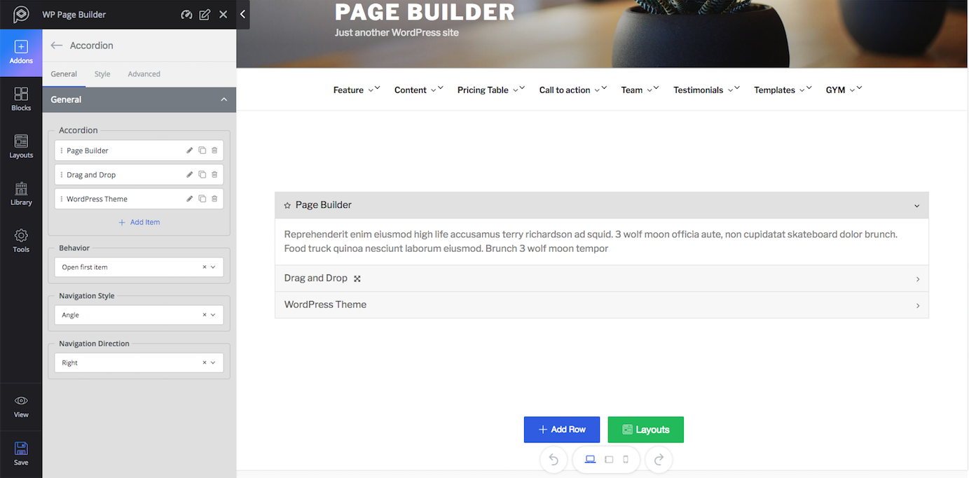
Functionality: Accordion is a way of controlling elements view. In the Accordion menu, the contents remain hidden and they only reveal the contents when clicked. That is the purpose of the Accordion addon. Accordion comes in handy when you have a lot of contents to show and you want to present them in a fresh, clean way.
Major Controls: Click on the edit icon to edit the current item, clone icon to make a copy of the current item and delete icon to delete the current item. You can add more items by simply clicking on the (+ Add Item) icon. The default style can be set from “Behavior” and the style and direction for navigation can be set from “Navigation Style” and “Navigation Direction” respectively.
Style: You can change the visual of this addon from the “Style” tab. You can set the style for Title, Icon, Content, and Border. Each option in the settings is given with a title defining what it really does.
Alert
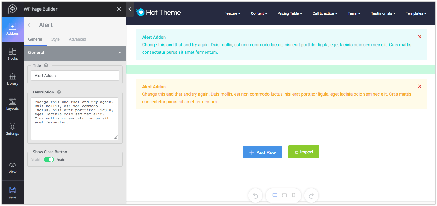
Functionality: The Alert is a text box containing any message you want to show to the visitors of your site. You can control the type of alert you want to show.
Major controls: Give a title to the Alert box to highlight the message. Use the description field to write down your message. If you want to give your users the option to close the alert once they have seen it, enable the “Show Close Button”.
Style: Control the type of your alert from the “Alert Style” option. Then set the style for Title, Description, and Spacing. Each option in the settings is given with a title defining what it really does.
Animated Number
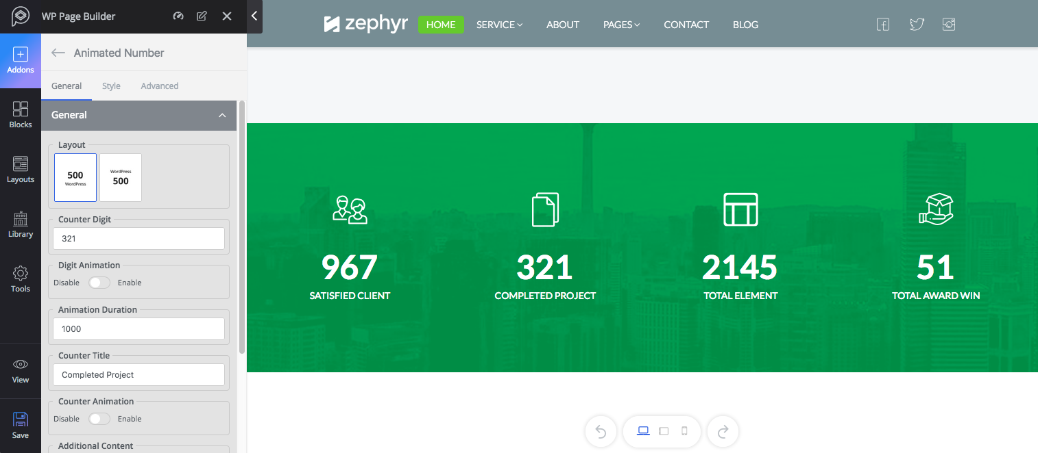
Functionality: The Animated Number addon lets you set animated numbers. This addon is mostly used to display number counter, achievements, and milestones.
Major controls: Choose your preferred layout from the given two options, set the number in “Counter Digit” then set a title to give a meaning to the number. Enable Counter Animation if you want to add animation to the number. The “Additional Content” feature allows you to add extra information besides the number and even decide the position of the additional content.
Style: You can change the style of this addon from the “Style” tab. You can set the style for Number and Title. The style tab lets you select the visual for the additional content as well. Each option in the settings is given with a title defining what it really does.
Block Number
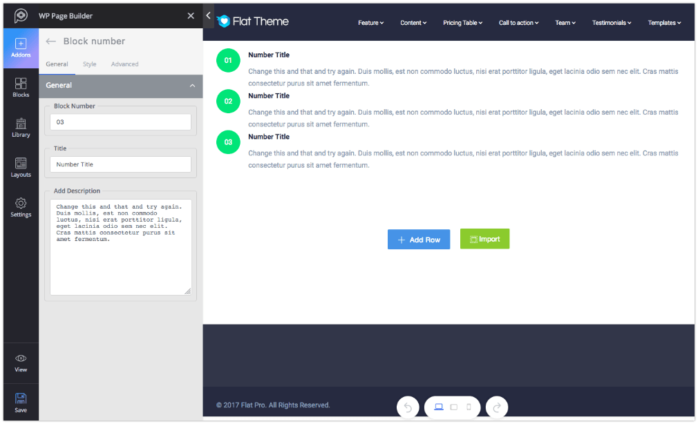
Functionality: Unlike the Animated Number addon, the Block Number addon shows a fixed number with a text field on the side. It can be used to display product features or listing something numerically.
Major controls: Set the number on the “Block Number” field, give a title and then add contents in the “Add Description” field.
Style: You can change the visual of this addon from the “Style” tab. You can set the style for Number and Title. Each option in the settings is given with a title defining what it really does.
Button
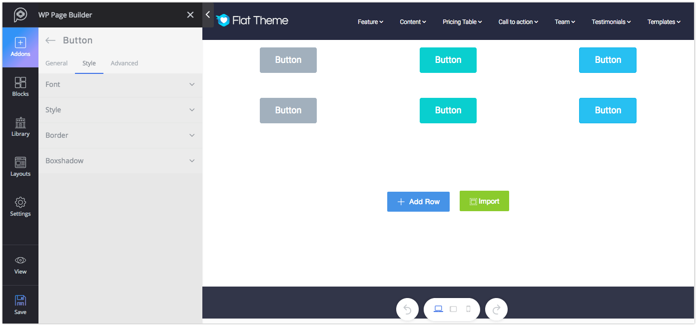
Functionality: A well-designed, good-looking button is always crucial in web designing. Buttons are a great way to manage redirection, interaction and data flow in the web pages.
Major controls: Set text for the button, attach a link or give any icon on the button if you wish to. You can control the size, shape, appearance, and width of any button.
Style: You can change the visual of this addon from the “Style” tab. You can set the style for font, border, and boxshadow. Each option in the settings is given with a title defining what it really does.
Button Group
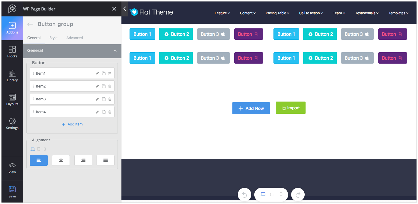
Functionality: Button group is no different than Button. It contains a bunch of buttons altogether and offers the same functionalities as the Button addon does.
Major controls: Click on the edit icon to edit any button, clone icon to make a duplicate button, and the delete icon to delete any button. Use the (+ Add Item) to add a new button.
Style: To control the margin of buttons, set the values from here for any device types. In addition to that, you can adjust the typography of the buttons from the General settings.
Form
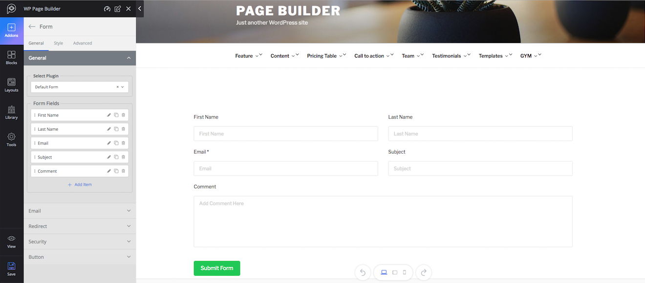
Functionality: This addon lets you create forms with advanced customization options. The addon comes with a default form with all functionalities to build a modern form and if you have Contact Form7 or weForms plugin installed to your website, then those forms will be shown here according to your preference. So to create or customize any form, you can directly do so from the addon settings.
Major controls: Choose the form from the drop-down list. If you need any extra field or need to perform any customization, you can do it from the backend.
Style: Currently the Form addon allows you to change the visuals of the form by changing its label typography, color, and margin as well as button customization features.
Feature Box
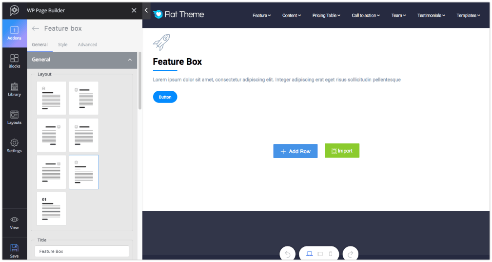
Functionality: Feature Box is a great way to display tag messages, important features, and contents that you think need to draw attention.
Major controls: Choose a layout from the 7 given layouts, set a title or give an animation effect if you want. You can set the animation for title, intro text, and icons.
Style: Feature Box comes with different styling options for every single section of this addon. To change the visual effect of any section, go to that section from the style tab and configure your settings.
Flip Box
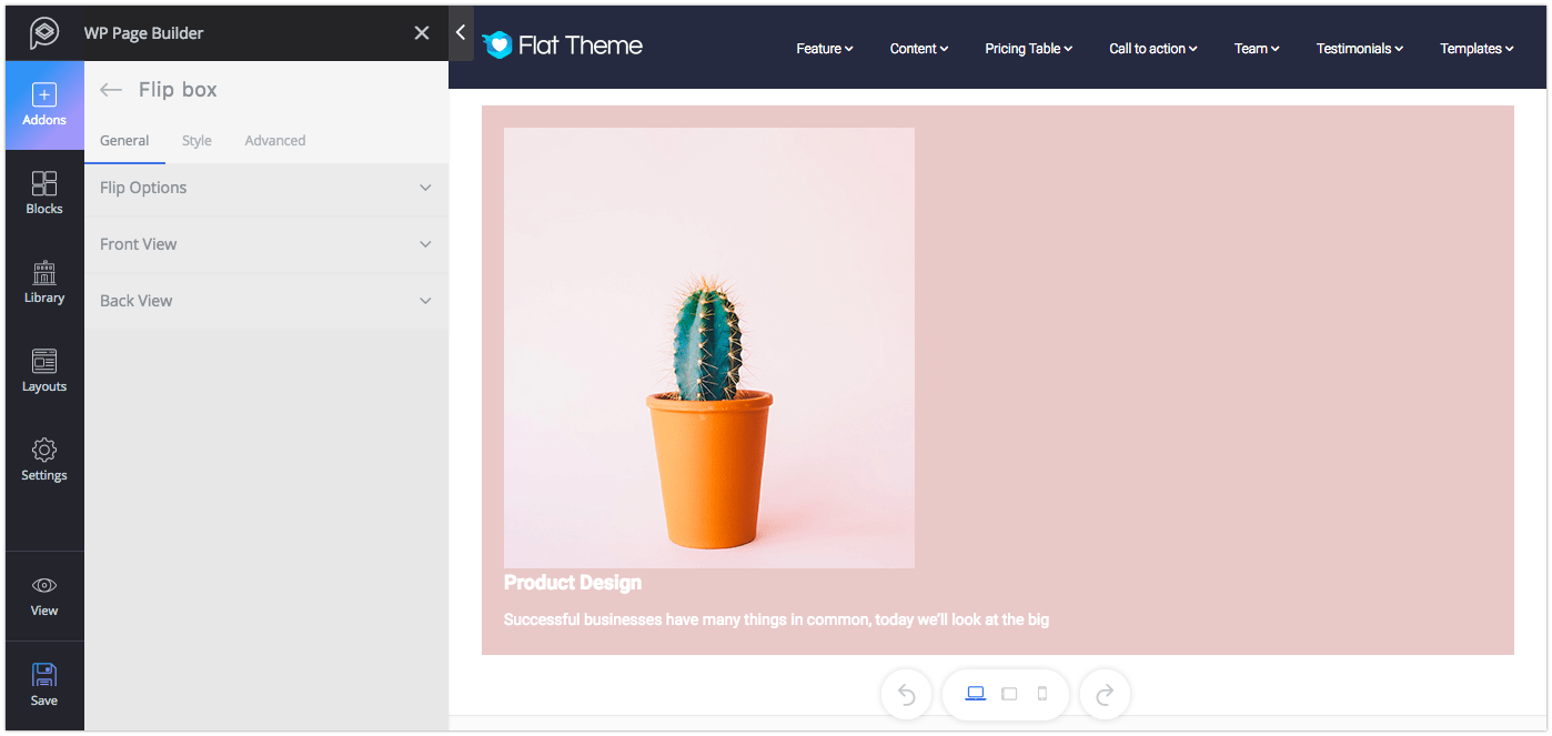
Functionality: Flip box will help you to make a content more appealing. You can set the behavior, how it flips or looks.
Major controls: You can control the rotation styles, directions, and behaviors from Flip options. You also set the Front view and back view contents from Front View and Back View settings.
Style: You can change the visual of the Front View and the Back View from the “Style” tab. Each option in the settings is given with a title defining what it really does.
Heading
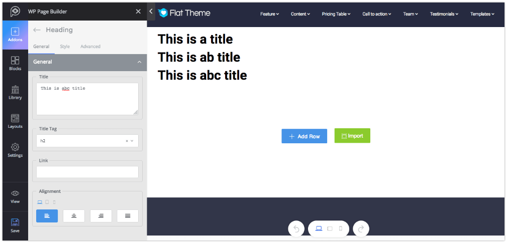
Functionality: The Heading addon is used for displaying a large title on anywhere of your web pages.
Major controls: Put the text on the title field, adjust the size using HTML tag from “Title Tag”, and finally set the Alignment.
Style: This section lets you change the color and typography of your text. To change typography, enable the settings from the bottom.
Icon
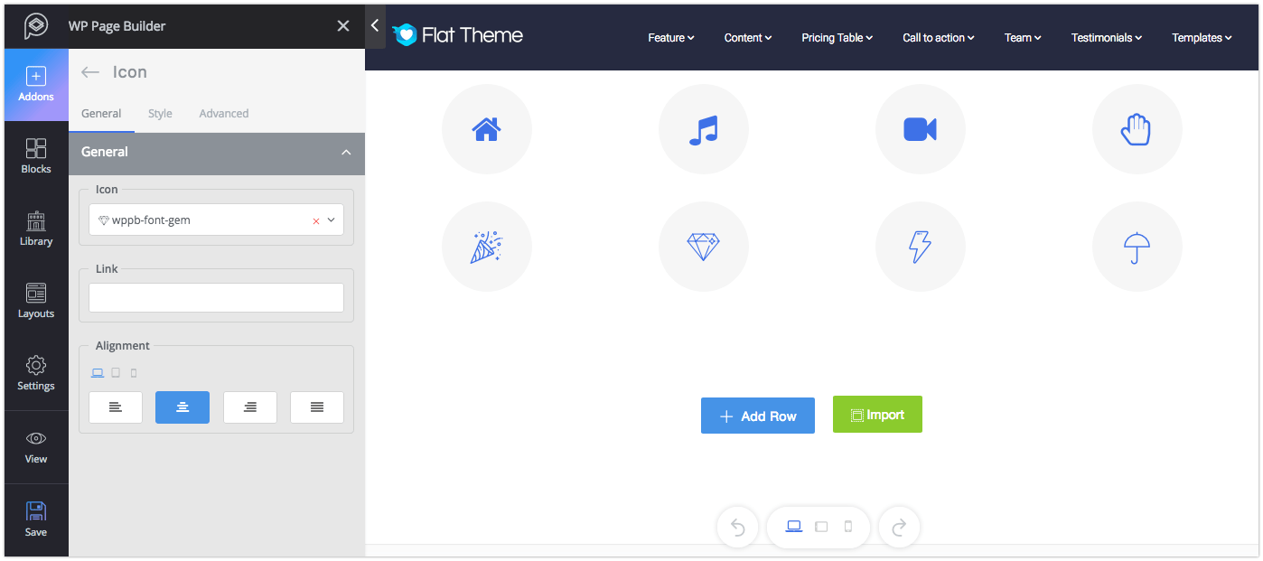
Functionality: Icon addon lets you add icons from a large collection of FontAwesome and WP Page Builder icons.
Major controls: You can select the icon from “Icon” drop-down list where you’ll have the option to use icons from WP Page Builder icons and Fontawesome. You can add any link to your icons as well.
Style: You can change the visual of this addon from the “Style” tab. You can select color theme and add border shape, border radius and box shadow around the icon in both idle and hover state. The settings are pretty self-explanatory.
Image
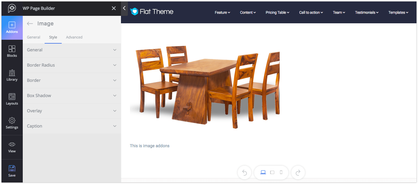
Functionality: The Image addon lets you add an image to your site. With this addon, you can add one image. To add more images use the “Duplicate Addon” option.
Major controls: Upload image, set an alt text, give a caption and if you want to insert a link to that image put the URL in the “Link” field.
Style: Style tab lets you control the height/width of the addon, border, border radius, and box shadow. You can easily change the visual of the addon, these options are pretty self-explanatory.
Image Hover
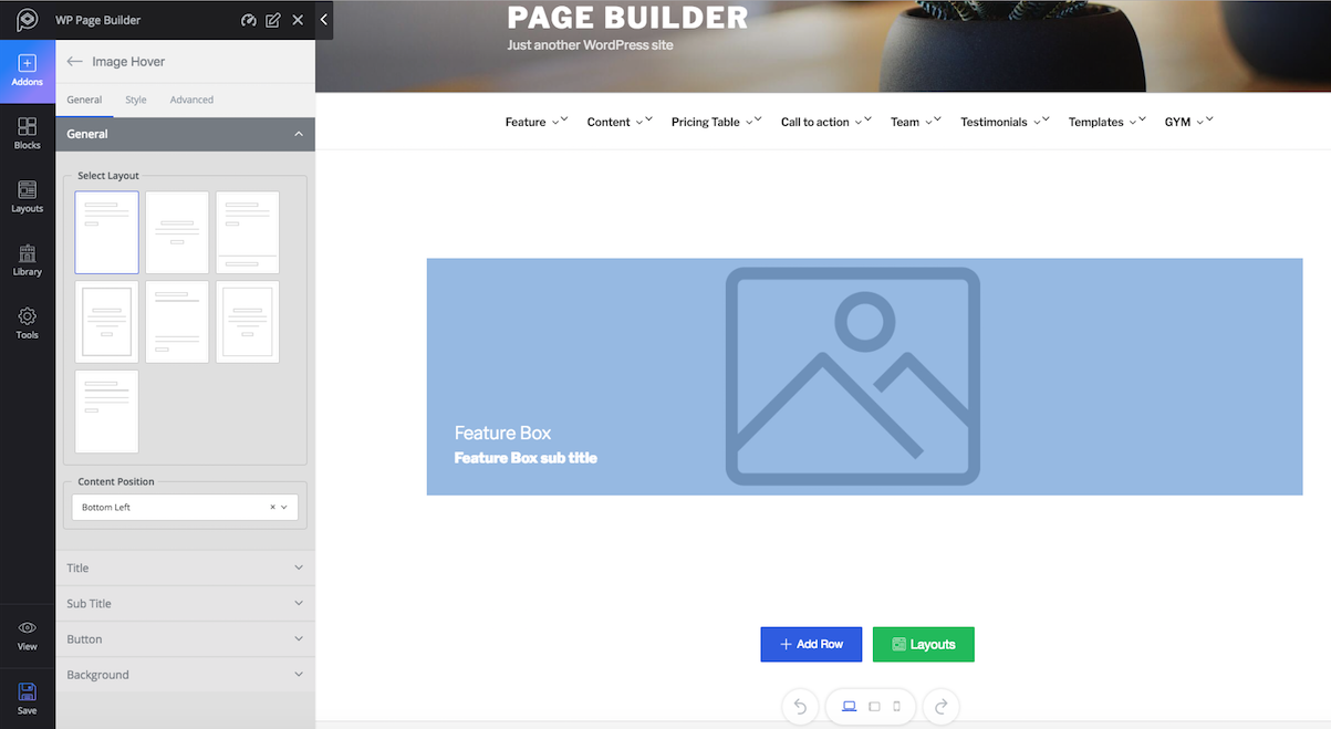
Functionality: You can add the hover effect to an image with this addon. You can also choose the layout you like from the predefined ones.
Major controls: Take control over the content position, set the size, and add button icon if you want. You can set color and gradient instead of an image too.
Style: This section will allow you to make changes to the design of every single part of this addon. You can change animation, title, and others. Each option in the settings is given with a title defining what it really does.
Person
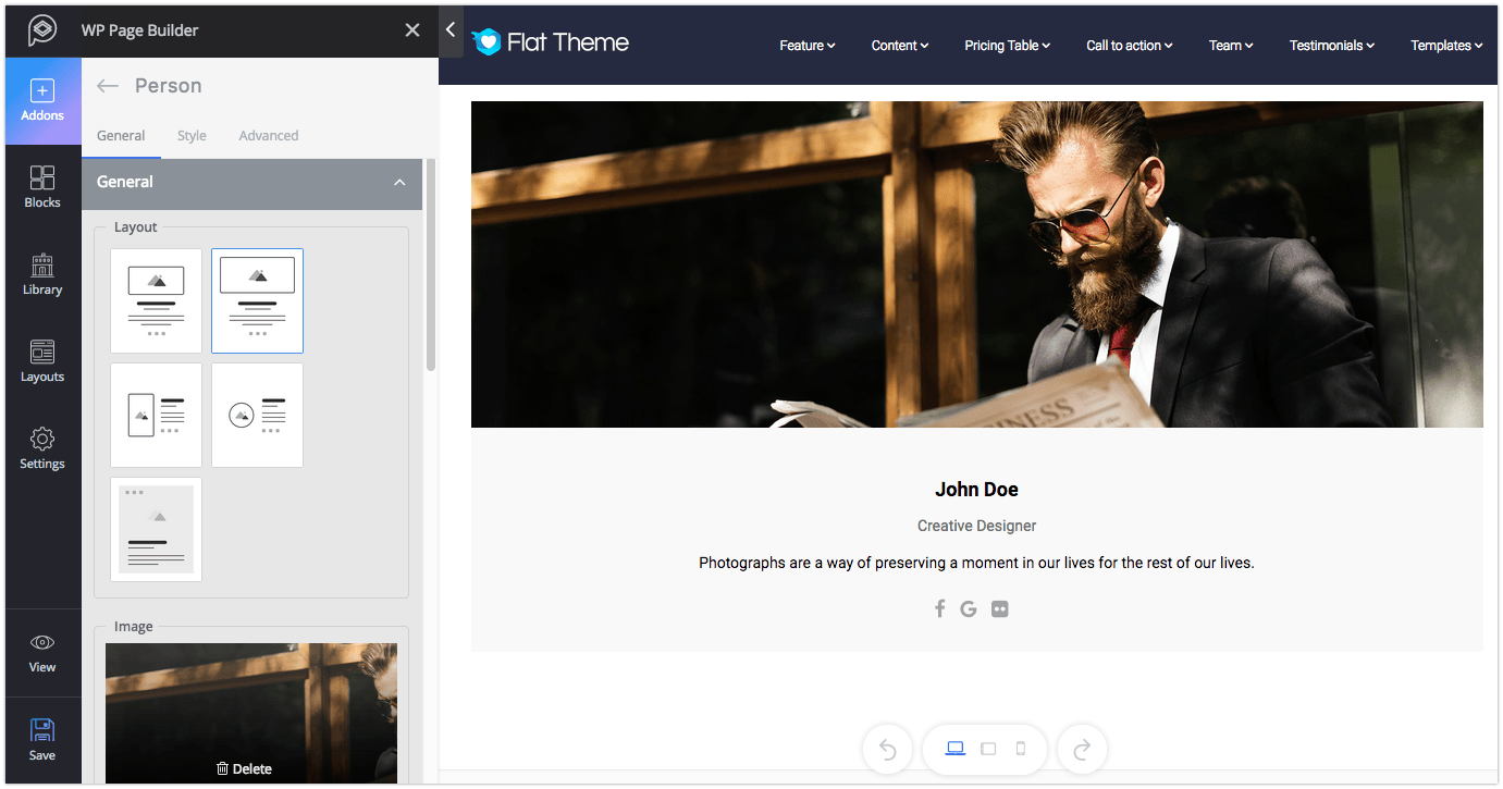
Functionality:The Person addon is a great way to present the profile of any individual on the website. For instance, you may want to show your team members, their designation and email address on your website.
Major controls: Choose your preferred layout from the given 5 layouts. Add social links if you want to show them. Also, add an intro text and finally set the alignment.
Style: From this section, you can change the style of Name, Designation, Email, Intro text, and Social share. The settings are pretty self-explanatory.
Person Carousel
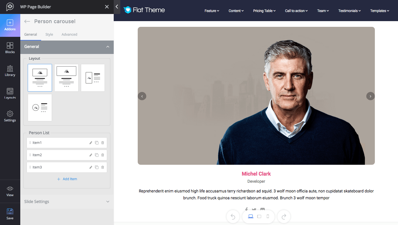
Functionality: This addon is almost the same as the Person addon with some additional functionalities. You can add multiple persons and show them all together.
Major controls: Choose the layout which fits your design among the given 4. Add more persons if you need to. Change the slide settings and apply the effect you like from “Slide Settings”.
Style: This section offers plenty of settings to style every single part of this addon. The options are pretty self-explanatory.
Pie Progress
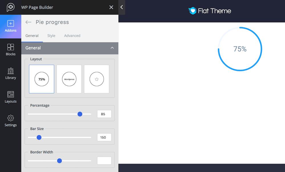
Functionality: This is a great way to show the current status of any project or availability of any product.
Major controls: Choose the layout design you like out of the given 3. Set the percentage and bar size. Control the border width that will blend with your site.
Style: You can change the style of this addon from the “Style” tab. You can set the style of Title, Percentage, and Icon. The settings are pretty self-explanatory.
Posts Grid
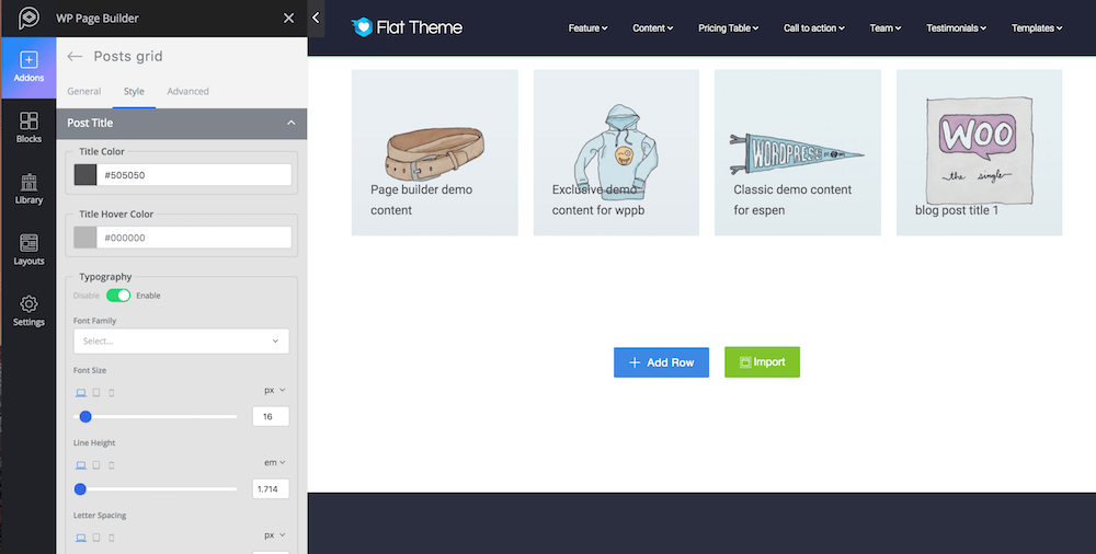
Functionality: Use this addon if you want to show the posts on your site in a nice grid way. You can choose the layout from the predefined ones.
Major controls: Set the numbers of columns, choose how many posts you want to show per page, set the title positions, decide which meta(s) you want to show, and enable read more. From the “Advanced Query” tab choose the tags, categories and set the ordering. From the pagination settings set the pagination type.
Style: You can change the style of this addon from the “Style” tab. You can set the style for Post title, Post Meta Item, Meta Separator, Post Image, Content, Button, and navigation. The settings are pretty self-explanatory.
Pricing Table
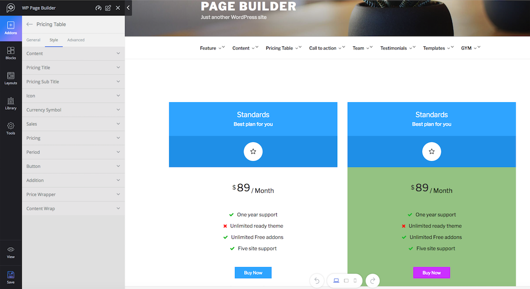
Functionality: The Pricing Table is a great addon to display the pricing of your product or any other service that you provide.
Major controls: Choose the layout that matches with your website design from the given 3 predesigned layouts. Put the contents, and pricing features from the following fields. Add more items to the pricing table, set URL to the button or select icon for the button or add additional information on the additional text field.
Style: Change the visual of this addon from the Style tab. You will find the option to apply custom styling on every item of this addon. You can change the color of content, pricing title, icon, currency symbol, pricing text, period, button, price wrapper, and control wrapper. Also control the padding, and margin of borders.
Progress Bar
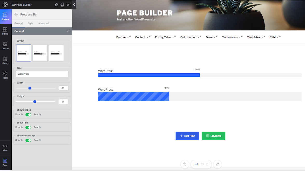
Functionality: The Progress bar addon is a great way to show the progress of any project or availability of any product.
Major controls: Choose the desired layout from the given 3. Set a title for your progress bar. Control the width and height, decide if you want to show or hide the stripes, title or percentage.
Style: Choose a predefined color for all aspects of the progress bar from the style section or for a new color, choose “Custom” from the drop-down list.
Raw HTML
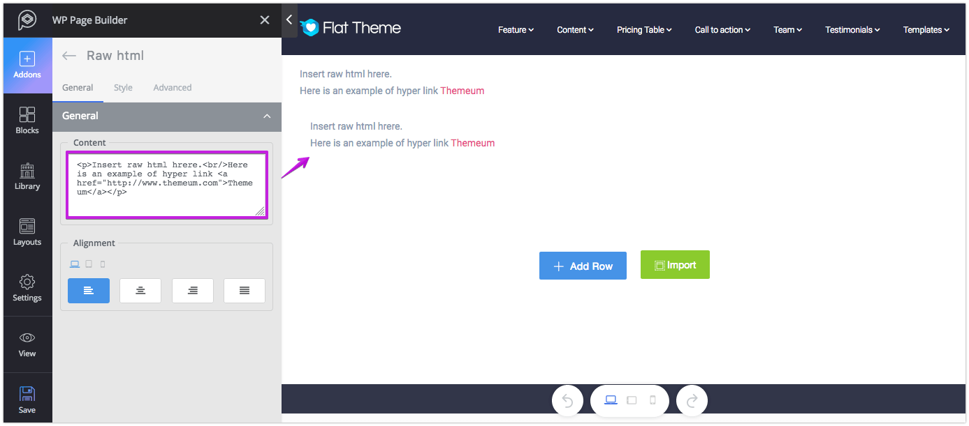
Functionality: If you want to add HTML tags and texts on any webpage, you can use this addon. Please note, you need to be careful when using this plugin. Any missing tag will break the design.
Major controls: Put the HTML tag and texts in the Content field and then set the alignment.
Style: Change the color of the text, link and link hover effect from the style settings option. To control the “Font Style”, turn it on and customize it in your desired way. The settings are pretty self-explanatory.
Social Button
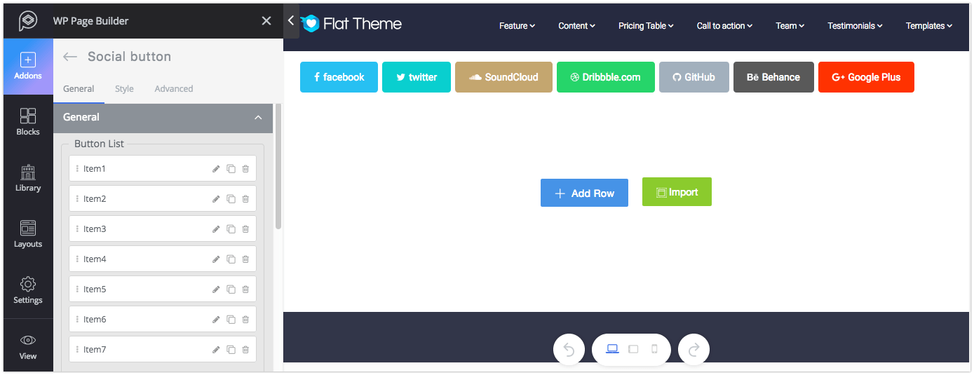
Functionality: The Social Button addon lets you add your social media profile to your website. This addon is a collection of buttons where you can assign a single profile to each button. This collection includes popular social media platforms like Facebook, Twitter, Youtube, and Medium.
Major controls: You can add more social profile links by clicking on the (+ Add Item) button. From the General tab, select the icon of your social platform from the “Title” drop-down box. Add the full social URL in the “Social URL” field and select the action. If you want to add a text say “Facebook” to the button, put it in the “Social Text” field. Select the button color from “Style” drop-down box. To add a border to the button, enable the option the “Social Border”. And finally, control the button shape and size from the respective drop-down list.
Style: This setting will let you control the size of the buttons, line height, and margin. And to change the font style, enable the respective option.
SoundCloud
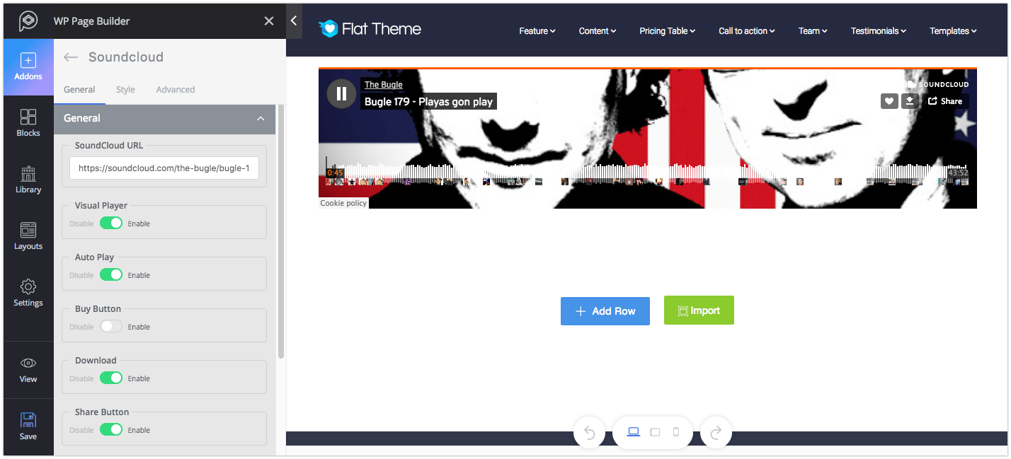
Functionality: SoundCloud is one of the best platforms for sharing audio on the cloud. Use this addon to add a song or a podcast to your site.
Major controls: The options are pretty self-explanatory. You can control the players, show/hide the buttons and other features from their respective settings.
Style: You can find the control color and height settings from here.
Tab
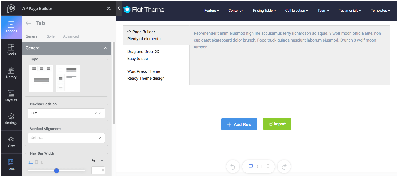
Functionality: The Tab addon lets you show one or more tabs containing texts or media files. This will help you to showcase important features and trends.
Major controls: Add tabs by clicking on the (+ Add Item) sign. Add title and subtitle texts if you want to. You can find media adding option in the content settings. Put the text and control the formatting from the text editor. If you want to show icon to any tab, just select the icon from “Icon” drop-down list and set its position. When you’re done, choose your preferred layout from the given two options.
Style: You can change the visual of this addon from the “Style” tab. You can set the style for The Nav Bar Wrap, Nav Bar Item, Title, Subtitle, Icon, and Tab Content. Each option in the setting is given with a title defining what it really does.
Testimonial
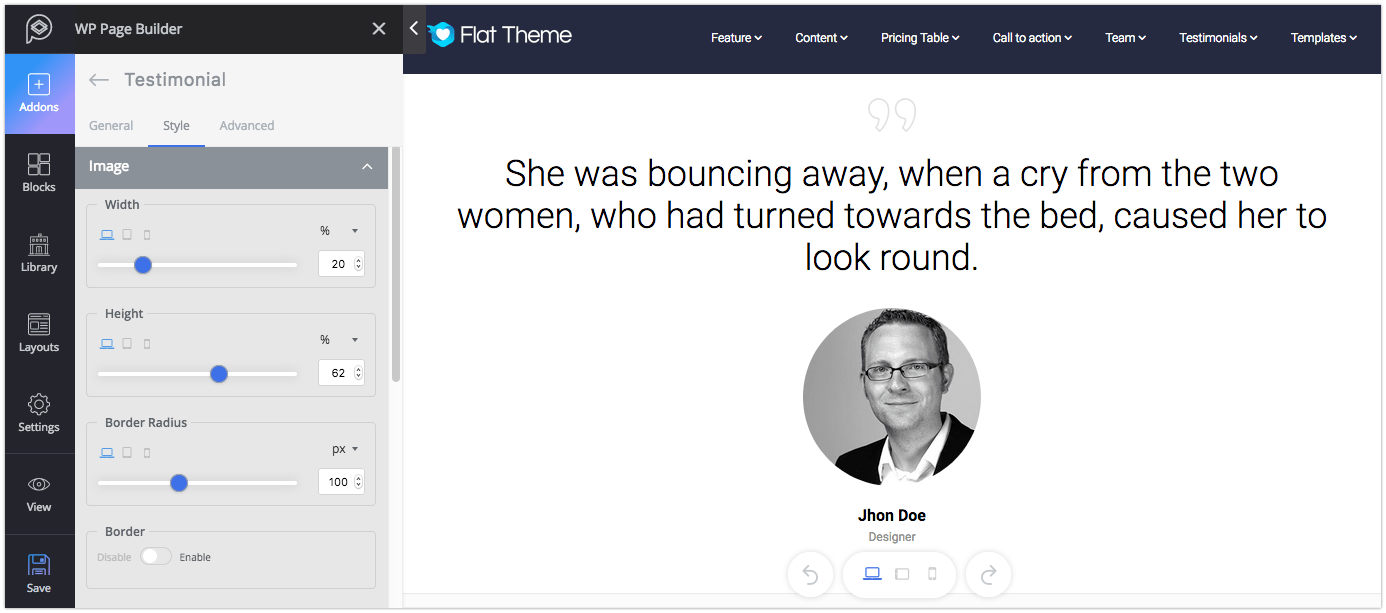
Functionality: The Testimonial addon is a great way to show a single testimonial or a quotation on your site.
Major controls: You can choose the layout for the testimonial from the given four types. Set the name, image, link, designation, and message in their respective field.
Style: You can change the visual of this addon from the “Style” tab. You can set the style for Image, Name, Designation, Message Text, Quote Style, and Testimonial Wrapper. Each option in the settings is given with a title defining what it really does.
Testimonial Carousel
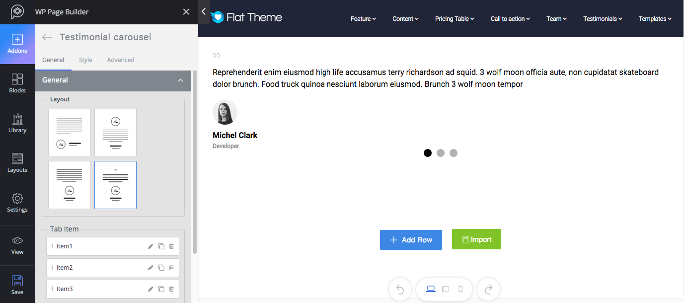
Functionality: This addon is almost the same as the Testimonial addon with additional functionalities. You can add more than one testimonial and show them all together.
Major controls: To add a testimonial click on the (+ Add Item) icon. You can choose the layout for the testimonial from the given four types. Set the name, image, link, designation, and message in their respective fields. The slide settings will let you control how the testimonials would behave. You can enable/disable autoplay, control dots, and control navigation. There are 4 preset styles for slider appearance, choose your desired one.
Style: You can change the visual of this addon from the “Style” tab. You can set the style for Image, Name, Designation, Message Text, Quote Style, Dots Style, Nav Style, and Testimonial Wrapper. The settings are pretty self-explanatory.
Text Block
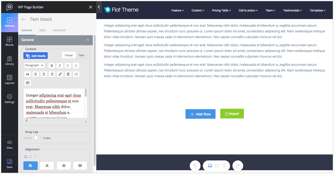
Functionality: It will probably be the most used addon. You can add texts anywhere on your website with the help of this addon. You can also add media files if it becomes necessary.
Major controls: The text editor will let you change the typography and settings of the text block. To add beautification to the content, enable the Drop Cap option.
Style: You can change the color of content and drop cap; and font style of content and drop cap from the “Style” tab.
Video
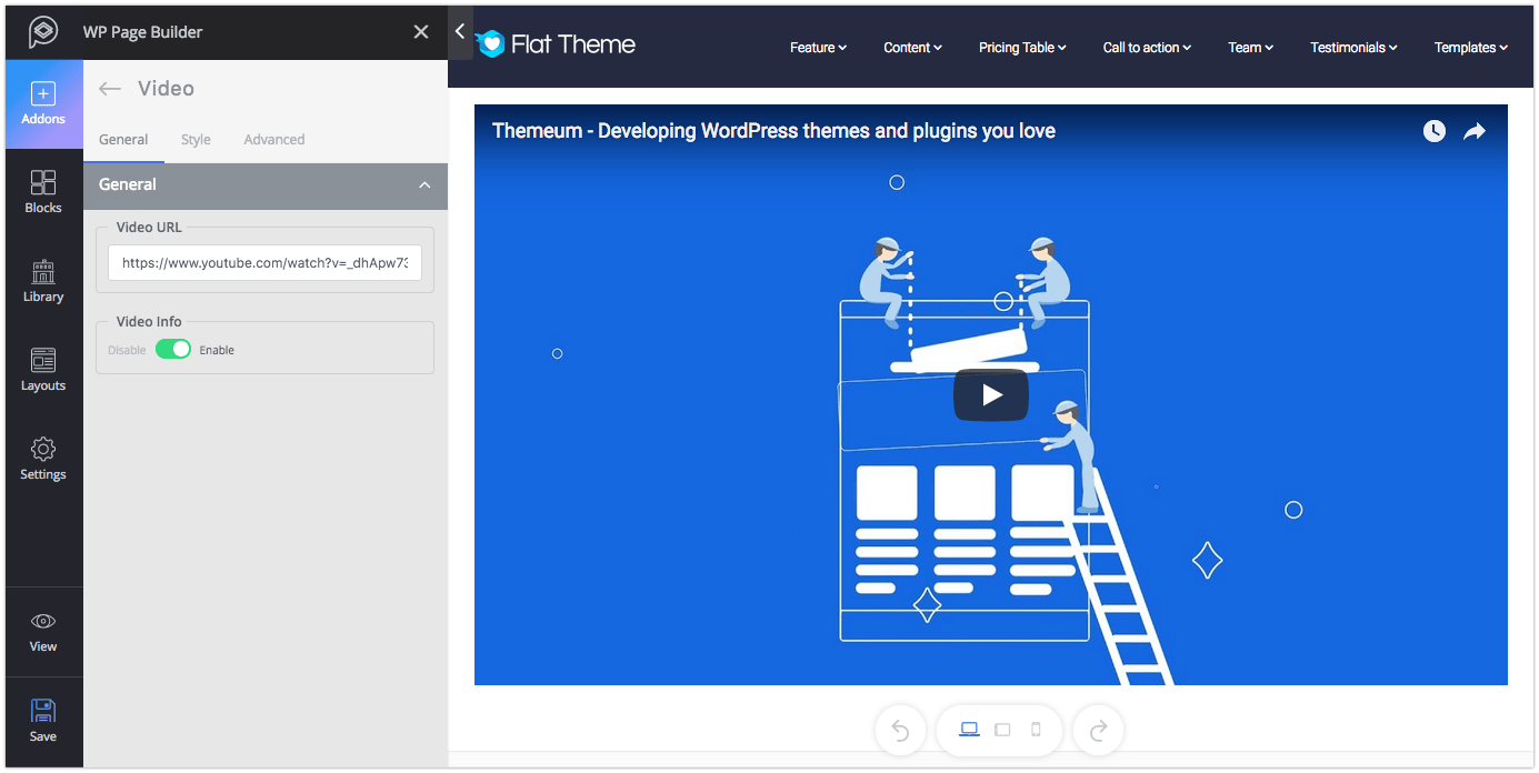
Functionality: The Video addon lets you add video from YouTube and Vimeo websites.
Major controls: Put the link to your YouTube or Vimeo video in the Video URL field. You also have the option to show/hide the video info.
Style: From the style settings you can adjust the width, height and border radius of this addon.
Video Popup
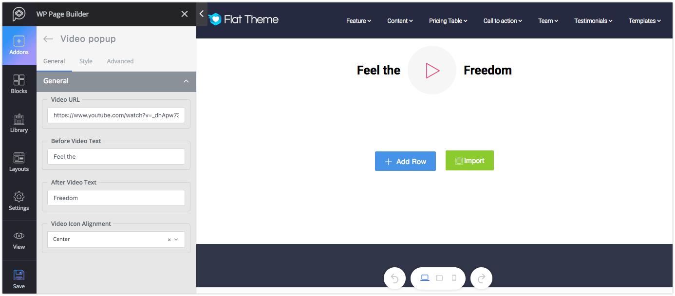
Functionality: Like the Video addon, this addon will let you show video but in popup. Please note, only the videos from YouTube and Vimeo website will work with this addon.
Major controls: Put the video link in the Video URL field. Set the before and after text of the video if you want to. You can control the video icon position as well.
Style: You can change the visual of this addon from the “Style” tab. You can set the style for Icon, Before Text, and After Text. The settings are pretty self-explanatory.
Third Party Addons
If you are a developer who wants to develop your custom addons, or you have downloaded a theme containing third-party addons, they will be shown under the “Third Party Addons” section. Please note, the plugin developer has the option to name plugin category as well as the plugin name.
WordPress Widgets
This section shows the collection of default widgets that are available on your WordPress site. All the WordPress widgets (including the ones installed later) will be found here. To use any of these addons, you just need to drag and drop them to your desired places.