Addon Control options
To use any available addon of WP Page Builder, you just need to drag that particular addon and drop where you want to have it on the page. Please note, you need to create a row or column before using any addon.
All the options of addon control bar are described in the following section.
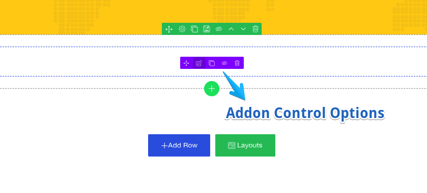
- Move addon: Click and hold on this icon to move any addon with drag and drop.
- Edit addon: Click this icon to customize the current addon.
- Duplicate: To make an exact same copy of any addon, use this option.
- Disable: Clicking this icon will disable the particular addon. Clicking it again will re-enable the addon.
- Delete: Click here to delete the addon.
Addon global options (Advanced Tab)
The following settings are common to all addons, they will be found under the “Advanced” tab. Have a look at the screenshot for better understanding.
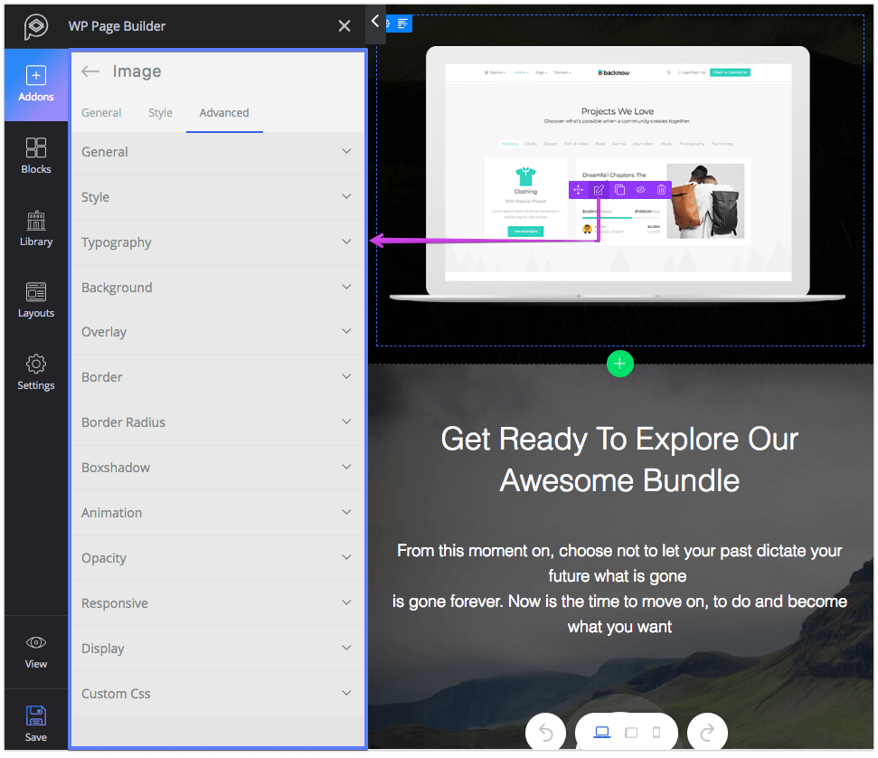
- General
- ID: You can assign row ID to separate your row. So that you can customize anything individually by calling the ID in Custom CSS later.
- Class: you need give the row a class name, if you want to play with it later.
- Z-index: When two elements block each other and you want to bring one element front, then Z-index will rescue you. Change the value to adjust view.
- Style
- Color: Change the color of this single addon.
- Padding: Set padding value for any device type, choose your unit from px, em or %. You can set different values for different sides but for a fixed value click on the lock icon.
- Margin: Set margin value for any device type, choose your unit from px, em or %. You can set different values for different sides but for a fixed value click on the lock icon.
- Typography: To control the typography of a particular addon enable this option and customize it your own way.
- Background: You can change the background color, set image, and apply gradient effect to any addon. You can do the same for hover effect.
- Overlay: This setting lets you set the opacity color and value to the foreground of a addon.
- Border: Style the addon border with these options. You can play with color, border width and apply few style sets.
- Border Radius: Enable this option to set border radius for any addon. Choose the unit among px, em, and %. And set different values for device type if you feel the need.
- Boxshadow: This is a great way to highlight any addon. You can set box shadow for both idle and hover state.
- Animation: For adding animation to any addon, turn on this feature, select your desired animation from the list then finally set the delay and duration for the animation.
- Opacity: You’ll also find opacity control under “Overlay” settings but the difference between them is this setting controls the opacity of the div but opacity under “Overlay” controls the foreground opacity.
- Responsive: This setting will let you show/hide the selected addon for the given device types.
- Display: The display setting provides 5 display types currently, choose the one of your need among the list.
- Custom CSS: Using custom CSS, you can add custom style to any addon. To add custom CSS, give a name to your addon class or ID (you can find it under Advanced > General > Class or ID), then in the Custom CSS code editor call that class and write your CSS code.