Row Control Bar
All the options of Row control bar are described in the following section:
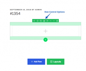
- Move Row: Use this option to move the row with drag and drop.
- Settings: You will find the settings description at the bottom of this page.
- Duplicate Row: Use this button to make a duplicate copy of your current row.
- Save Row: You can save any row for later use. When you save any row, it can be found under “Library” of the left sidebar.
- Disable row: Clicking this icon will disable any particular row. Clicking it again will re-enable the row.
- Move Up: Use this option to move up any row. (This option is not available in Inner Row Bar).
- Move Down: Use this option to move down any row. (This option is not available in Inner Row Bar).
- Delete Row: Click this icon to delete the row.
Column Control Bar
All the options of Column control bar are described in the following section:
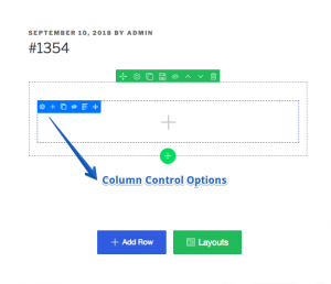
- Settings: You will find the settings description at the bottom of this page.
- Add inner row: You can add a new inner row inside your current row with this option.
- Add column: If you want to add a separate column inside the same row, use this option.
- Duplicate column: To make an exact same copy of any column use this option.
- Disable column: Clicking this icon will disable any particular column. Clicking it again will re-enable the column.
- Delete column: Click this icon to delete the column.
- Move: Use this option to move the column with drag and drop.
Row/Column editing tool
The following settings are present in both column and row editing settings. You will see these settings when clicking on the little gear icon of row or column control bar.
General Tab
- Screen: This option will let you control the width of your current page. If you choose “Default” it will retrieve the default setting from template, choosing “Row Stretch” will create a row, “Row and Container Stretch” will create container with row and selecting “Container Stretch no Gutter” will create a container without any grid.
- Custom Height: Will let you set fixed height for a particular row.
- Content Position: Set position of your content with this option.
- Custom Width: For a fixed width of a row, set the value here.
- Custom Gutter: To set a custom gutter, adjust the value from here.
- Animation: For adding animation to any row, turn on this feature, select your desired animation from the list then finally set the delay and duration for the animation.
Style Tab
This setting controls the global styling of any particular row. Making any changes to these settings will result in overriding the previous styling.
- General
- Color: Pick a color for your row with the color picker or apply the color code.
- Padding: Set padding value for any device type, choose your unit from px, em or %. You can set different values for different sides but for a fixed value click on the lock icon.
- Margin: Set margin value for any device type, choose your unit from px, em or %. You can set different values for different sides but for a fixed value click on the lock icon.
- Typography: To control the typography of a particular row enable this option and customize it your own way.
- Boxshadow: This is a great way to highlight any row. You can set box shadow for both idle and hover state.
- Border: Style the row border with these options. You can play with color, border width and apply few style sets.
- Border Radius: Enable this option to set border radius for any row. Choose the unit among px, em, and %. And set different values for device type if you feel the need.
- Background: You can change the background of any row with a color, image, video or a gradient effect.
- Overlay: This option lets you set the overlay color and opacity.
- Shape: Currently there are 18 styles to shape any row.
Advanced Tab
- General
- Row ID: You can assign row ID to separate your row. If you want to customize anything later, naming your row comes in handy.
- Class: You need give the row a class name if you want to play with it later.
- Z-index: The Z-index option is used when two elements block each other and you want to bring one element front. Change the value to adjust the view.
- Responsive: This option will let you hide/show your row for any devices.
- Custom CSS: Using the custom CSS option, you can add custom CSS to every section, column or widget. To add custom CSS.
- Click on the settings button of a column or row.
- Go to Advanced > Custom CSS
- Add your CSS code to the editor.
This should work instantly.
Note: Please give a class name and use it before the selector to wrap the element, otherwise it will work globally.