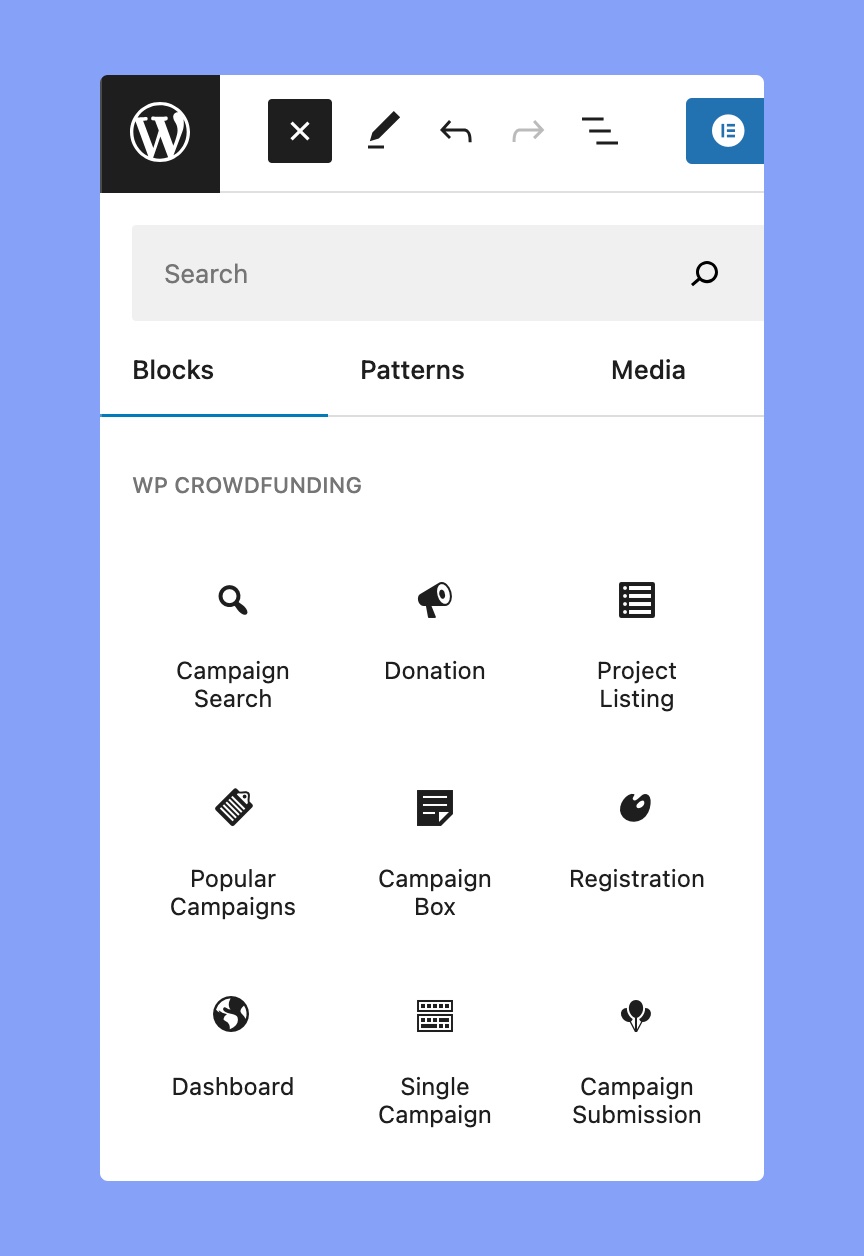
After installing WP Crowdfunding, you will see a list of Gutenberg blocks in your WordPress editor.
To add these WP Crowdfunding blocks, click on the (+) icon on the top-left. Then scroll down or search for “WP Crowdfunding” to get all the Gutenberg blocks of WP Crowdfunding.
Campaign Search
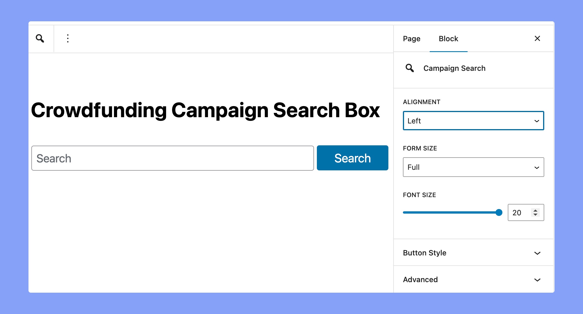
It will allow you to create a search bar, using which you can search for all the campaigns. After adding the block to your page/post you will find the following options.
- Alignment: Set the right/left/middle alignment of your search box.
- Form Size: Set the form size from small, medium, and full.
- Font Size: Define the font size for the text. You can use the slider or set the font size manually.
Button Style
Use the following configuration options to define the button style.
- Font Size: Set the font size using the slider or you can also use the manual option too.
- Font Weight: Select what font-weight you want your fonts to be.
- Text Color: Implement a specific text color for the texts.
- Background Color: Select a color for the background of the block.
Donation
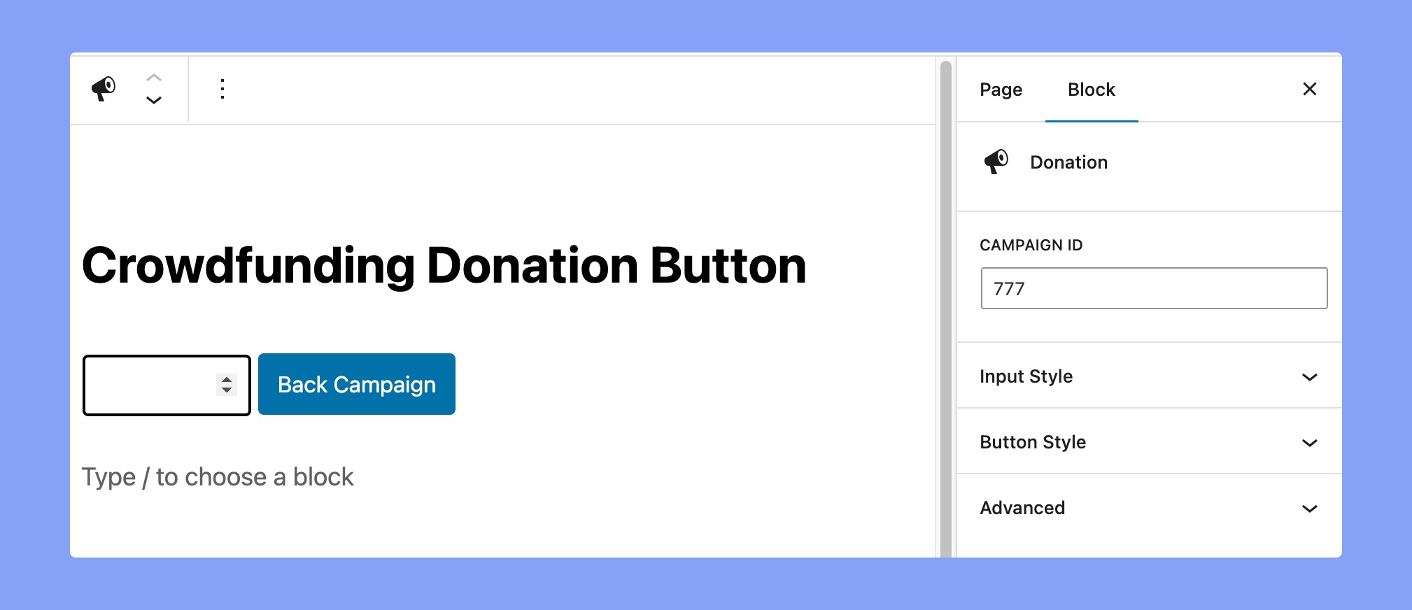
Add a donate form so your users can easily donate to your campaign. After you add the ‘Donation’ block you will find the following option.
Campaign ID
Set the campaign ID for which campaign you want to donate by using this button.
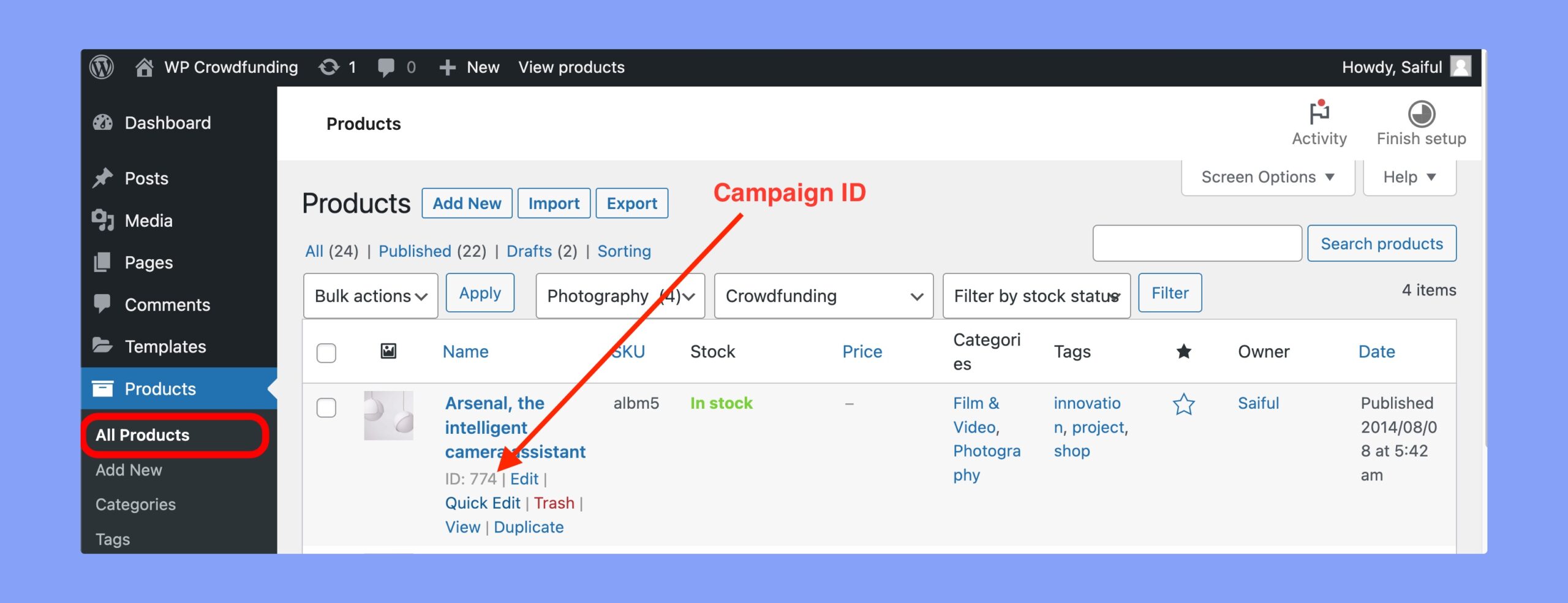
You can collect the campaign ID from the WooCommerce product page. Navigate to WP Dashboard > Products > All Products. Then hover on your preferred product and you’ll get the ID.
Using that campaign ID will automatically fetch the data related to that campaign.
Input Style
- Alignment: Set the alignment for the donate box.
- Form Size: Set the form size from small, medium, and full.
- Font Size: Define the font size for the text. You can use the slider or set the font size manually.
Button Style
- Font Size: Set the font size using the slider or input it manually.
- Font Weight: Select your preferred font-weight.
- Text Color: Implement a specific text color for the texts.
- Background Color: Select the background color for the button.
Project Listing
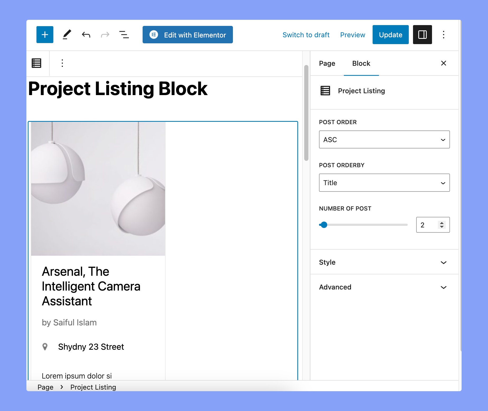
You can display all of your campaign projects using this Gutenberg block. The available options are:
- Post Order: Display campaigns in ascending or descending order based on the selected criteria.
- Post Order By: Order campaigns by date published, title of the post, or the lastly modified.
- Number of post: The quantity of campaigns to be displayed on the page.
Here’s the settings of Style tab:
- Major color: Changes the default text color.
- Author color: Changes the author name text color.
- Progressbar Color: Changes the color of the donation progress bar.
Popular Campaigns
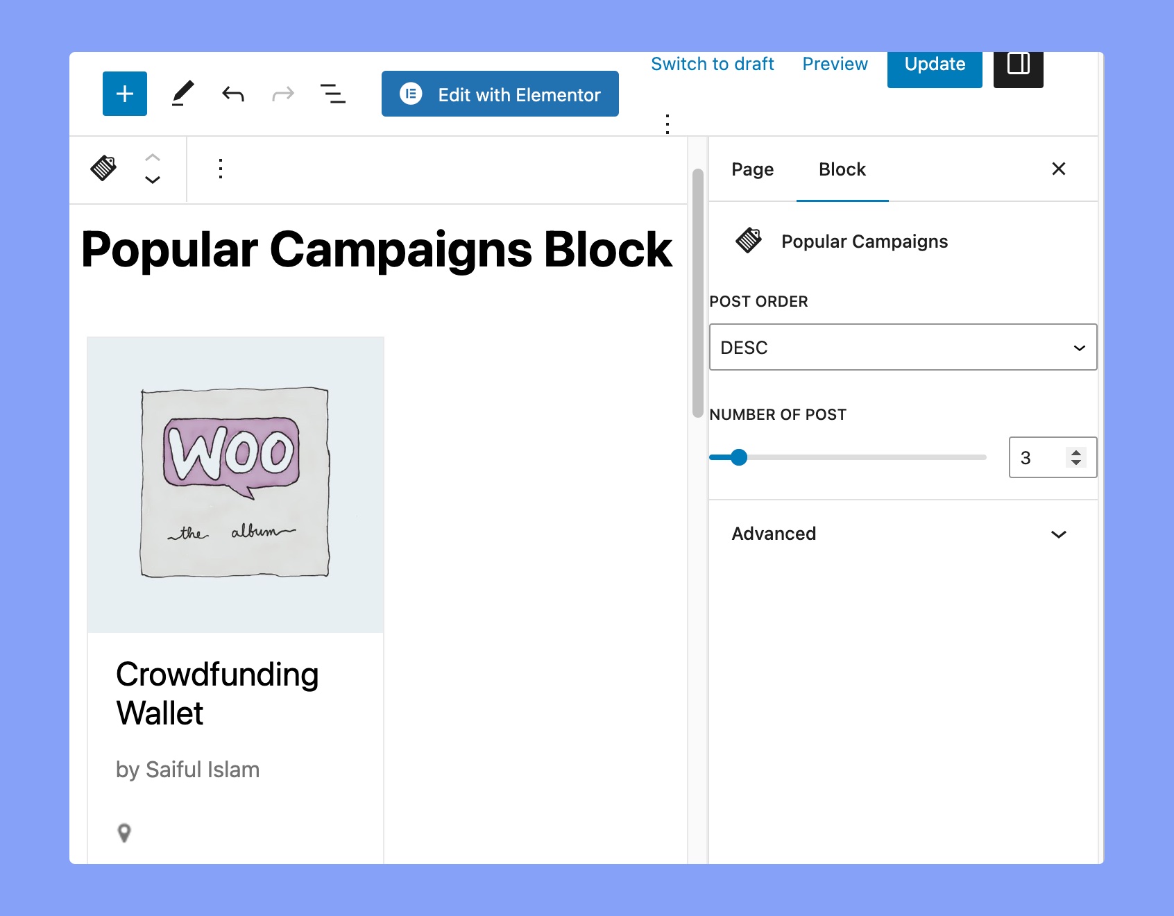
This block helps you to display the most popular crowdfunding campaigns. This block works in a similar way to the popular product widget of WooCommerce. The popularity is calculated by the number of sales.
- Post Order: Select the post order as ascending or descending.
- Number of Post: Select the number of crowdfunding campaign posts that you want to show. You can use the slider or set the popular campaign numbers to show manually.
Campaign Box
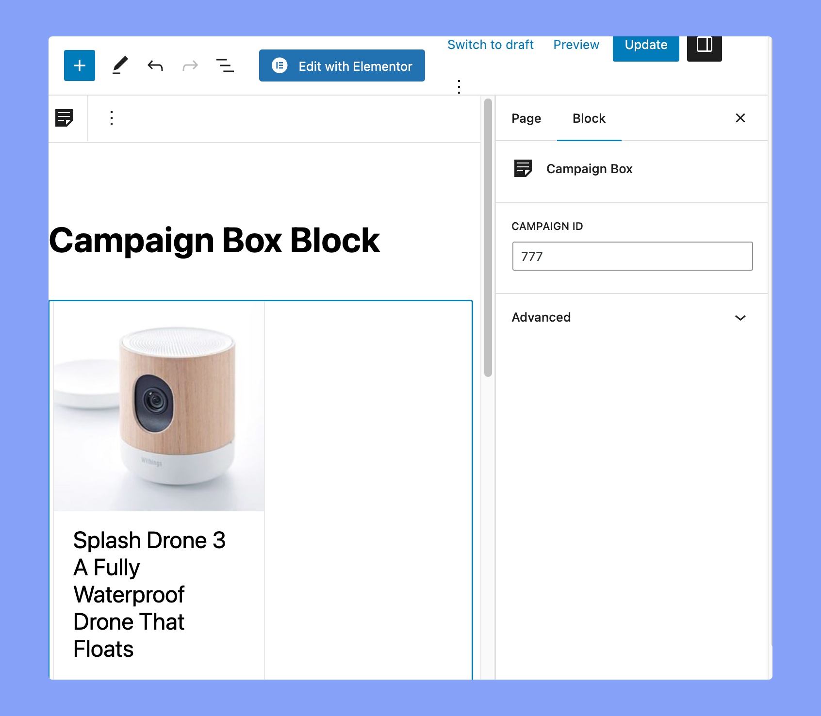
If you want to show any particular campaign inside a box, you can use this Gutenberg block to do so. Just input the campaign ID and you’ll see the campaing on your website.
Registration
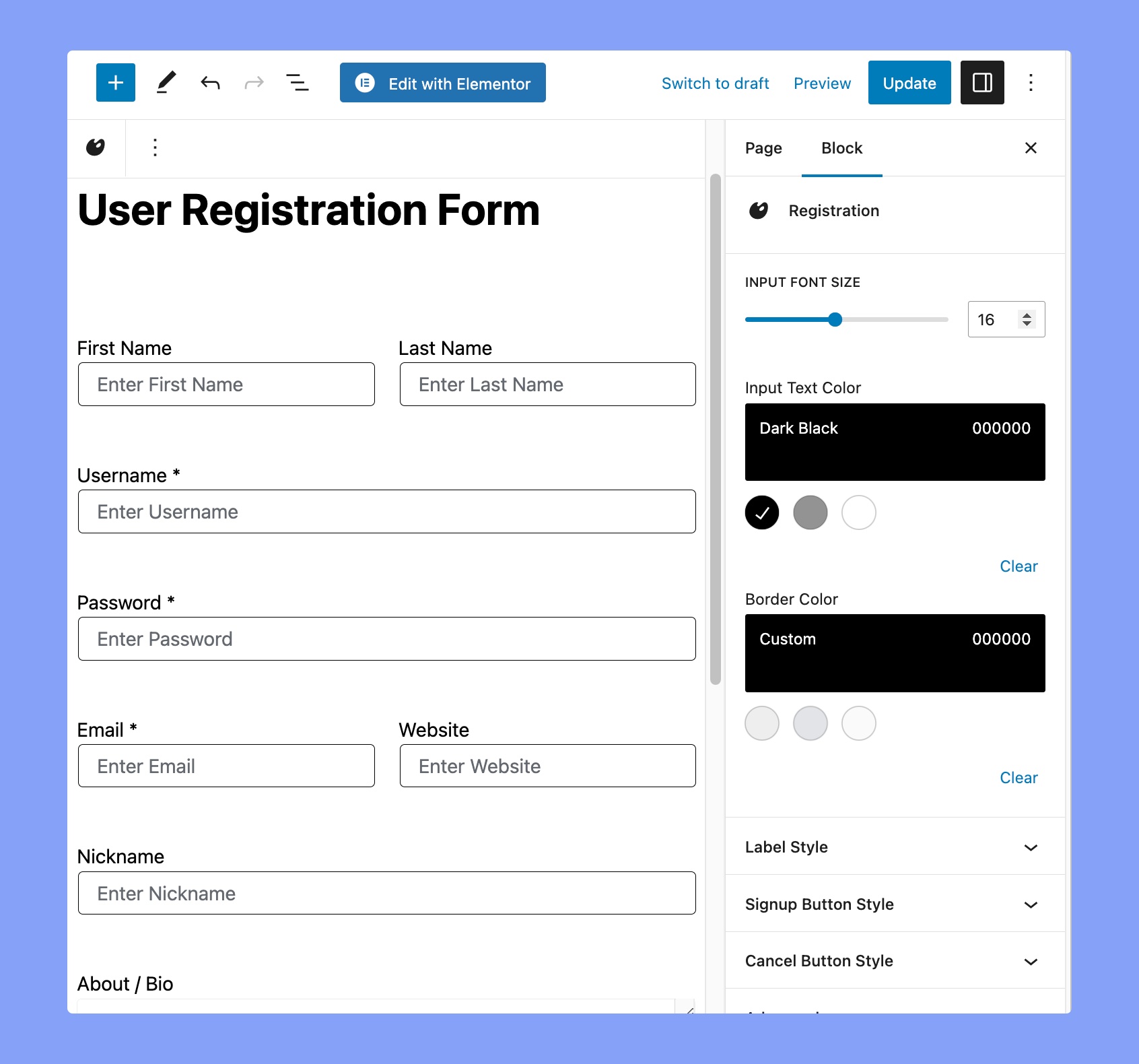
You can add a user registration form on any page using. Once you add it to your site you will see the following options.
- Input Font Size: Use the slider or manually enter the font size for input text.
- Input Text Color: Set the input text color from the color palette. There are some predefined colors available and also you can set any color using the custom color option. There is also a clear option to reset any applied color.
- Border Color: Set the border color from the color palette. There are some predefined colors available and also you can set any color using the custom color option. There is also a clear option to reset any applied color.
Label Style
- Label Font Size: Use the slider or manually enter the font size for input.
- Label Text Color: Set the input label text color from the color palette. There are some predefined colors available and also you can set any color using the custom color option. There is also a clear option to reset any applied color.
Signup Button
- Font Size: Set the font size using the slider or you can also use the manual option too.
- Font Weight: Select what font-weight you want your fonts to be.
- Text Color: Implement a specific text color for the texts.
- Background Color: Select a color for the background of the block.
Cancel Button Style
- Font Size: Set the font size using the slider or you can also use the manual option too.
- Font Weight: Select what font-weight you want your fonts to be.
- Text Color: Implement a specific text color for the texts.
- Background Color: Select a color for the background of the block.
Dashboard
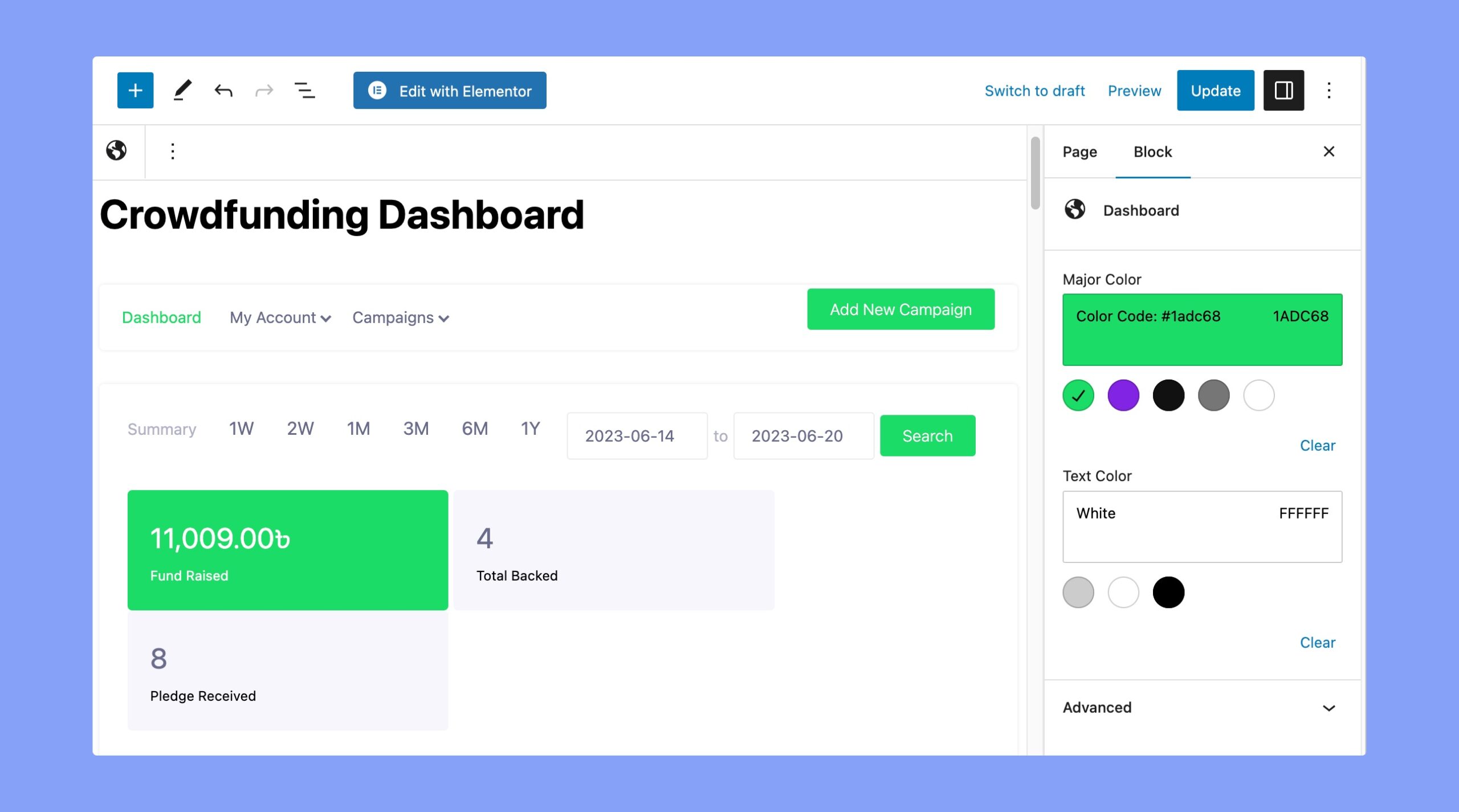
You can dispplay the crowdfunding dashboard on any page.
- Major Color: Set the major color from the color palette. There are some predefined colors available and also you can set any color using the custom color option. There is also a clear option to reset any applied color.
- Text Color: Set the input label text color of the dashboard. There are some predefined colors available and also you can set any color using the custom color option. There is also a clear option to reset any applied color.
Single Campaign
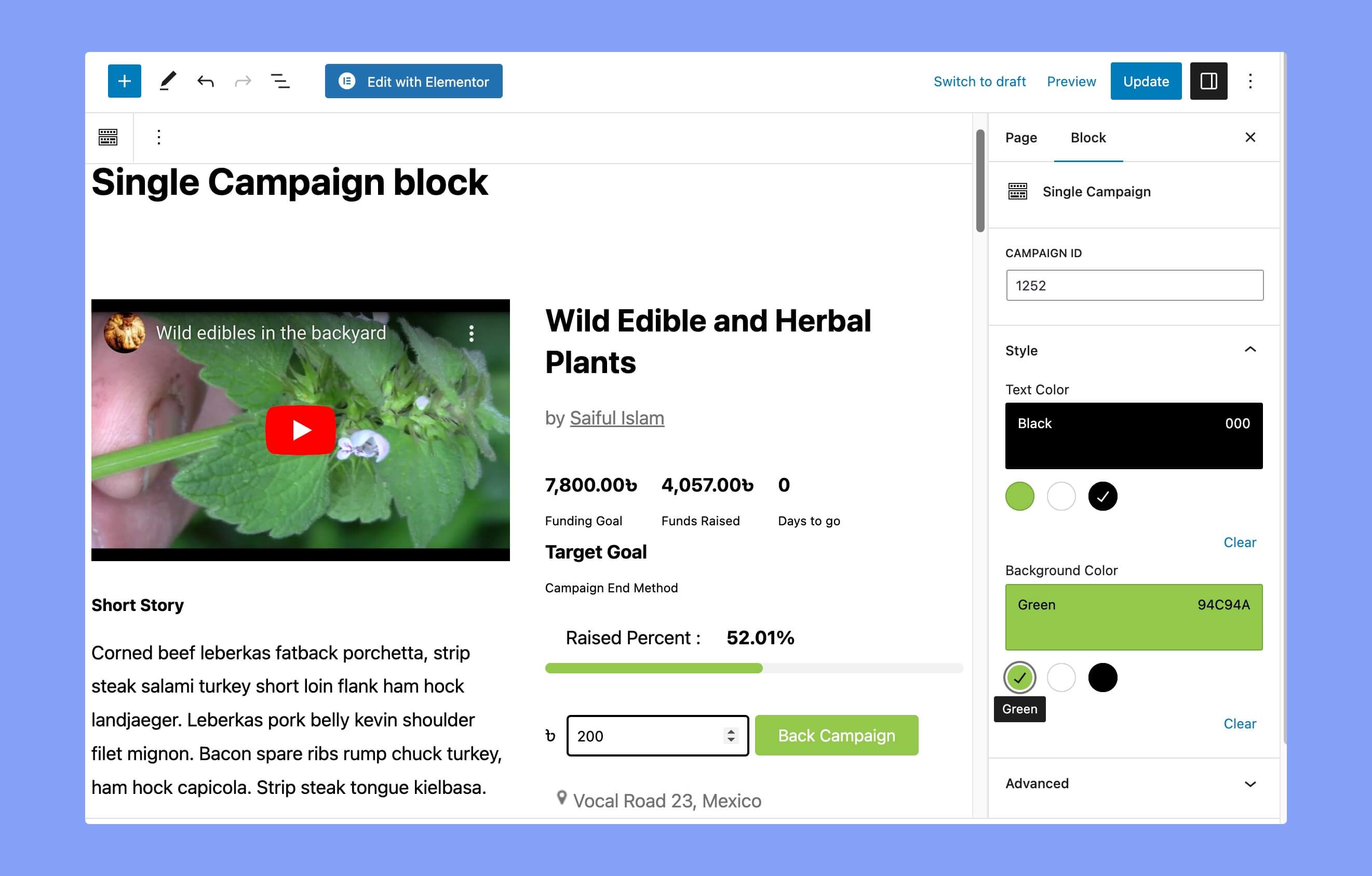
If you want to show any particular campaign inside the page/post, you can use this Gutenberg block to do so. Just add the campaign ID, (example ID “675” you see here your specific campaign) to see it on the page/post.
Campaign ID
Add the campaign ID here to fetch the data to show it in the post/page. You can collect the campaign ID from the product page.
Style
- Text Color: Implement a specific text color for the texts.
- Background Color: Select a color for the background of the block.
Campaign Submission
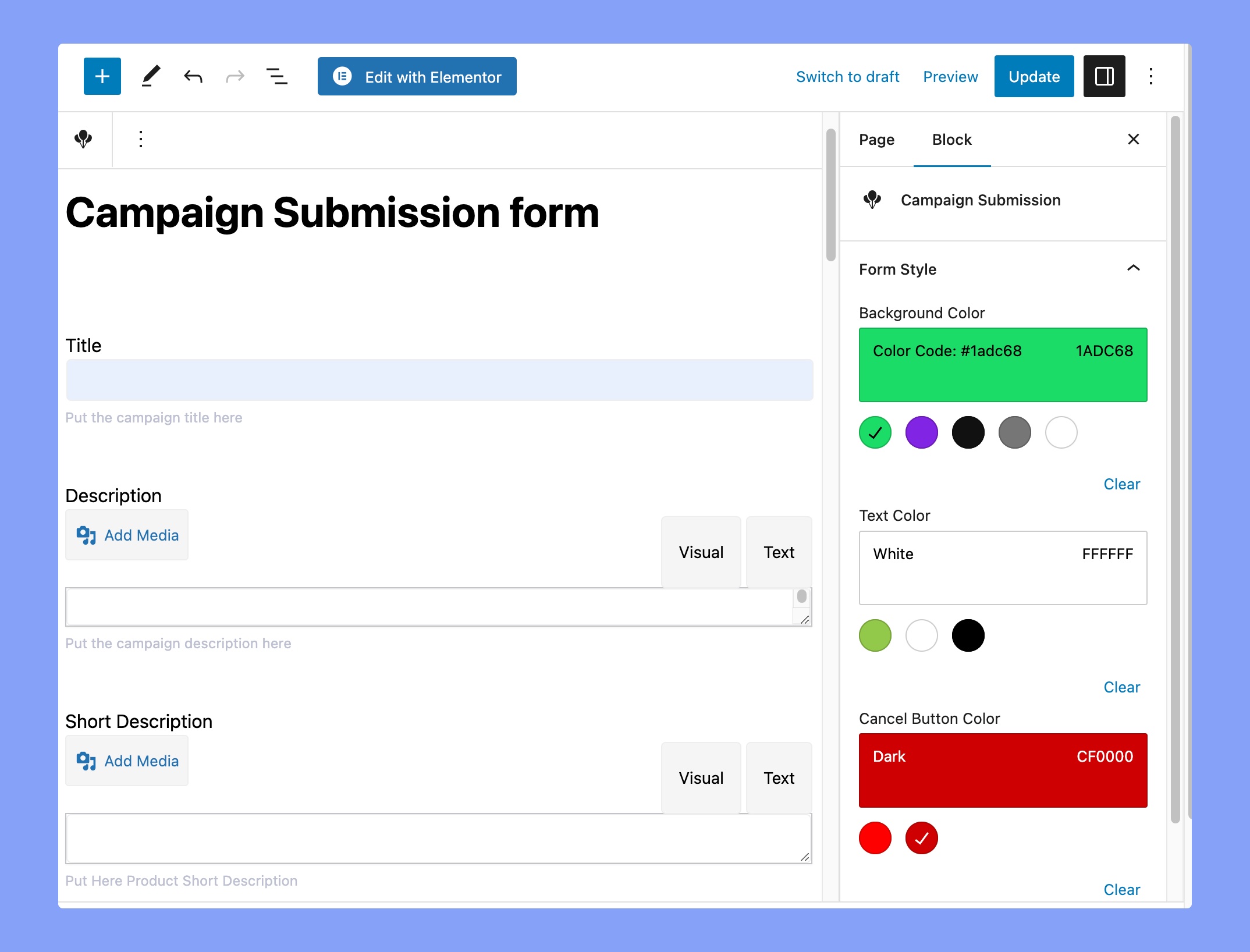
This block allows you to create an “Add new campaign” form on any page. Once you add the block you will find the following options.
Form Style
- Background color: Set the background color of the buttons of the submission form.
- Text Color: Define the button’s text color from the color palette.
- Cancel Button Color: Set the color of the cancel button.