Qubely is a WordPress plugin with advanced blocks for dynamic content creation. This Gutenberg block plugin comes with lots of additional blocks along with the regular Gutenberg blocks. If you use the Edumax theme along with the Qubely plugin, you’ll get three additional blocks to design your webpage better.
Here are the available blocks:
- Course Listing
- Course Search
- Category Listing
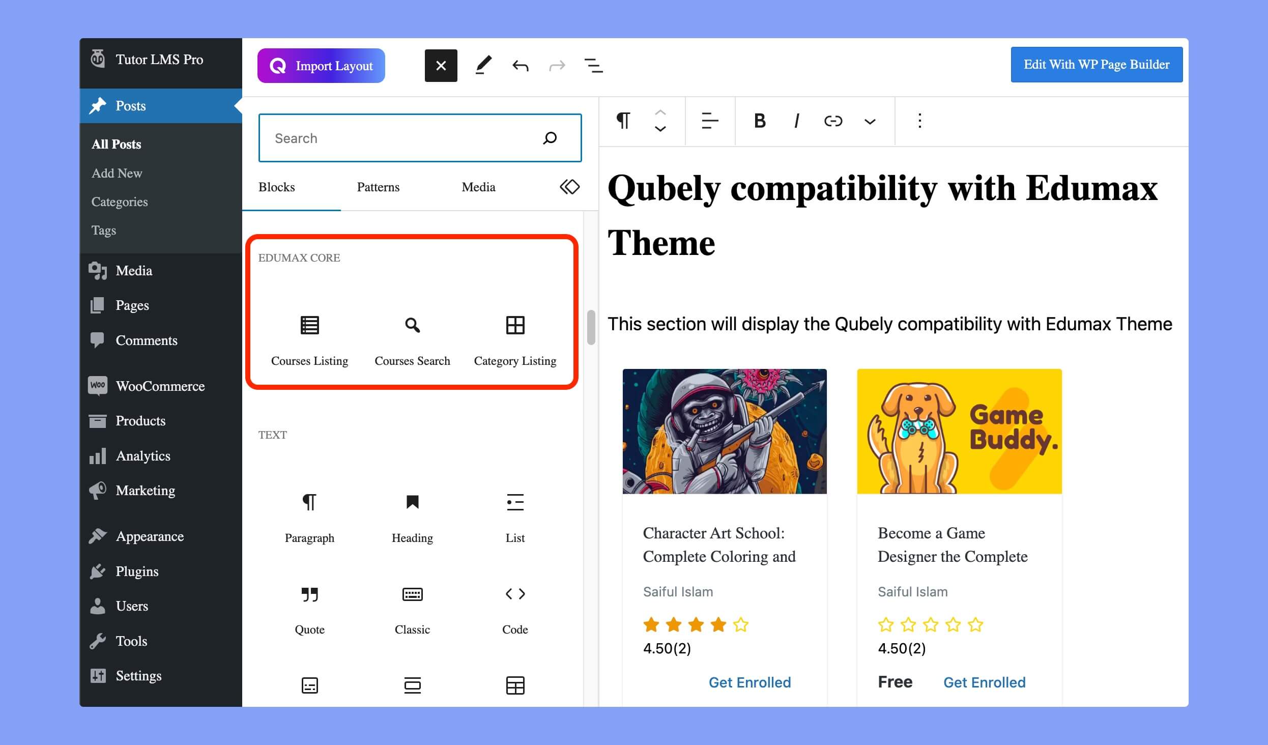
You will find these blocks under the Edumax section. Let’s explain these blocks.
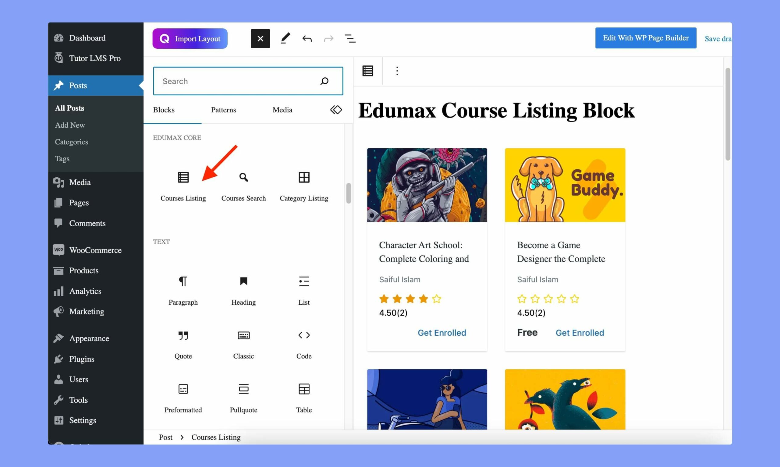
Course Listing Block
Course Listing block helps you to display all the existing courses of your site on a webpage.
After using this block, you can customize various options to control the preview. Here are the available options for customization.
Course Settings
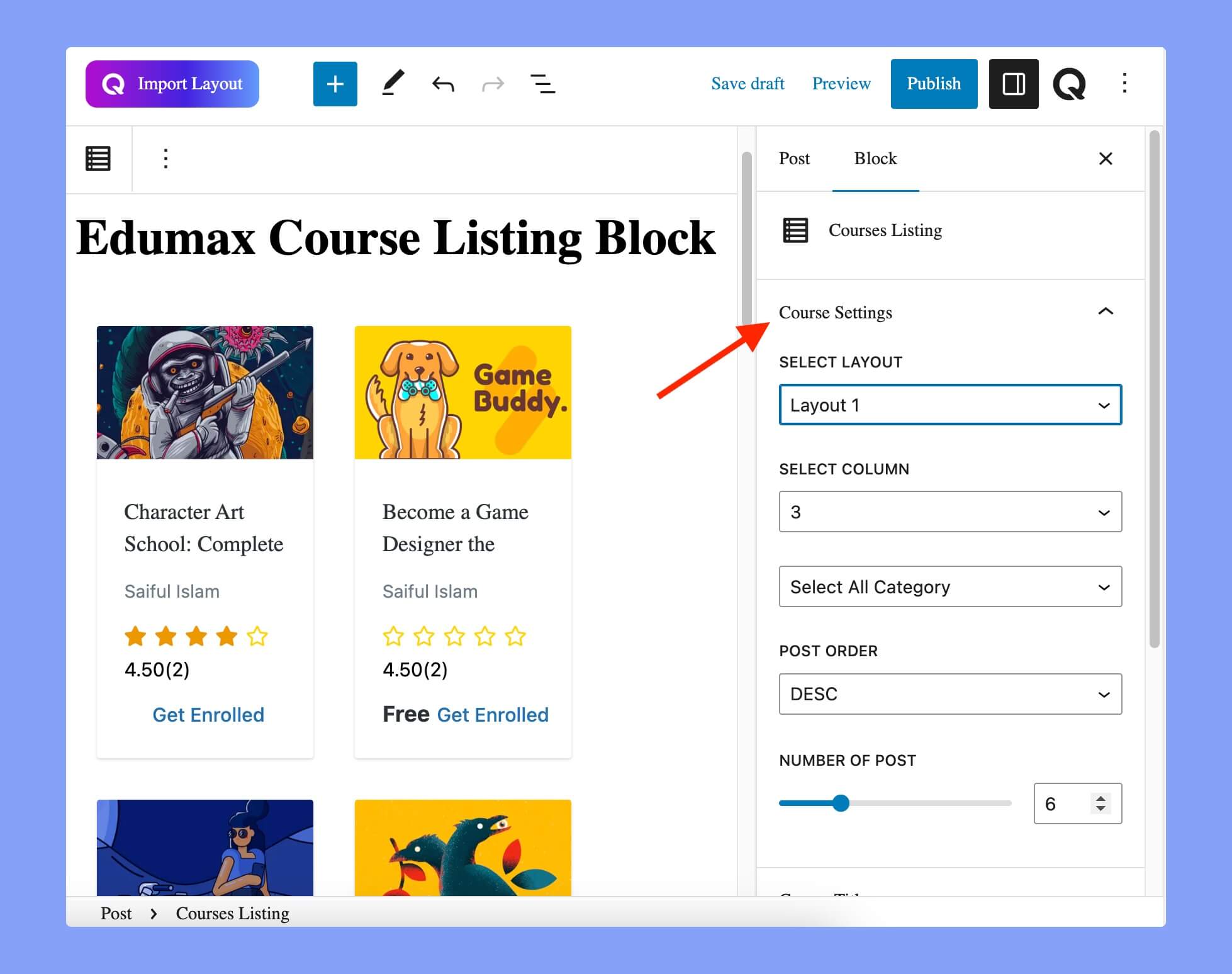
The available customization options on Course Settings are:
- Select Layout: Choose the layout for the page or post.
- Select Column: Set the number of columns for the page or post.
- Category Selection: Choose the categories to display on the page or post.
- Post Order: Set the order in which the posts are displayed. You can set the order either in ascending or descending order.
- Number of Post: Set the maximum number of posts to display on the page or post.
Course Title
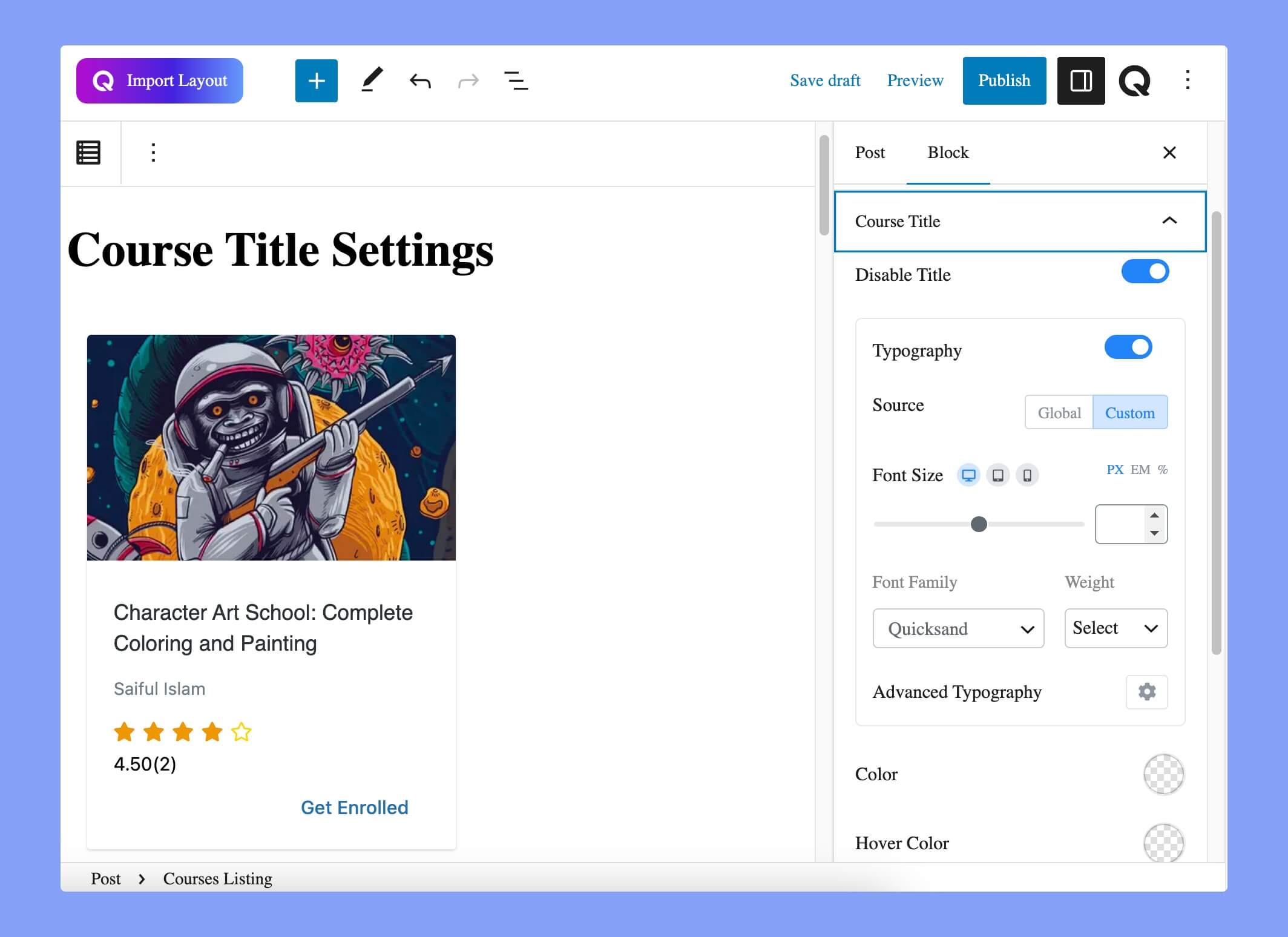
The available options in the course title settings are:
- Disable Title: Use the toggle button to enable/disable the course title.
- Typography: To change the typography of the text, enable the typography section by using the following options:
- Source: This section has two options: Global and Custom. If you choose the Global option, it will fetch the global typography settings for your webpage. To set personalized fonts, choose the Custom option.
- Font Size: Define the size of the font. You can set the font size in pixel, em, and percentage units for different devices.
- Font Family: Choose your desired font to use from the list. Qubely has a collection of around 900 fonts, including the defaults that come with Gutenberg.
- Weight: Set the font weight from this section. You can choose the default font-weight or choose from 300 to 700.
- Advanced Typography: You can set letter spacing and text transformation from the advanced typography section. The letter spacing option lets you control the space between letters and the text transform option lets you set the preferred capitalization format to the text.
- Color: Choose a color for your title text from the color picker.
- Hover Color: If you want to set a specific hover color for the course title, you can choose a color from the color picker.
Admin
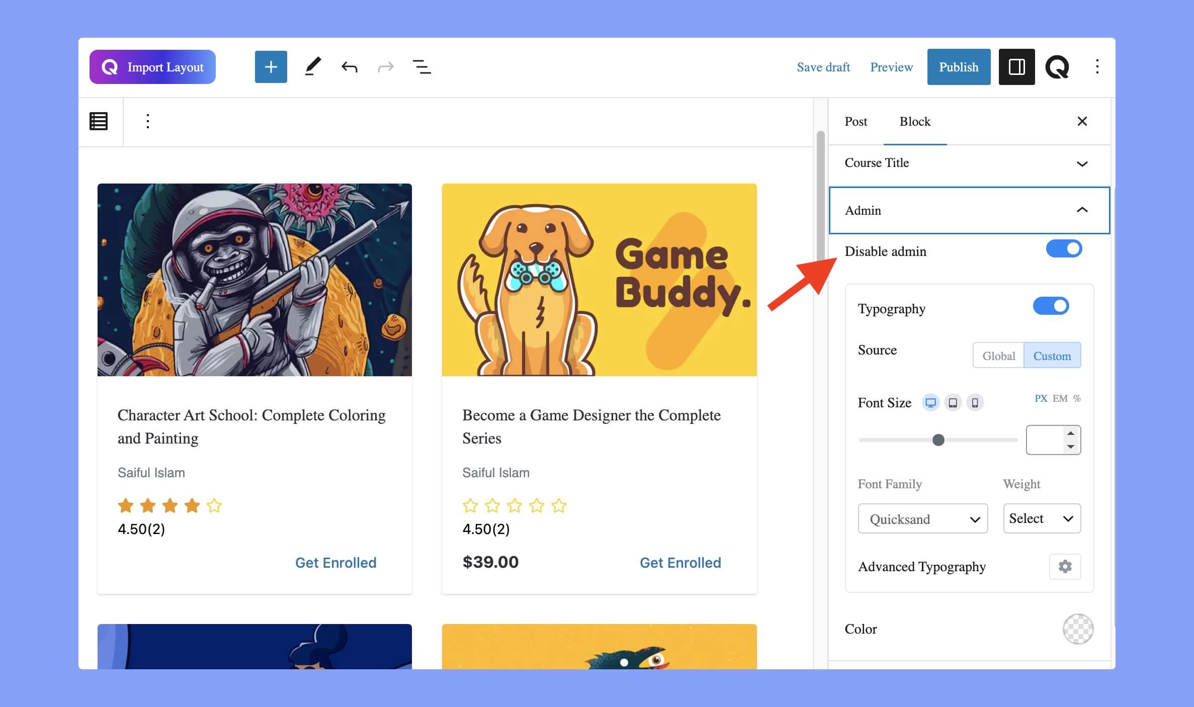
Enabling this option will display the name of the course author on the course list. After enabling it, you can also customize the typography for it.
Rating
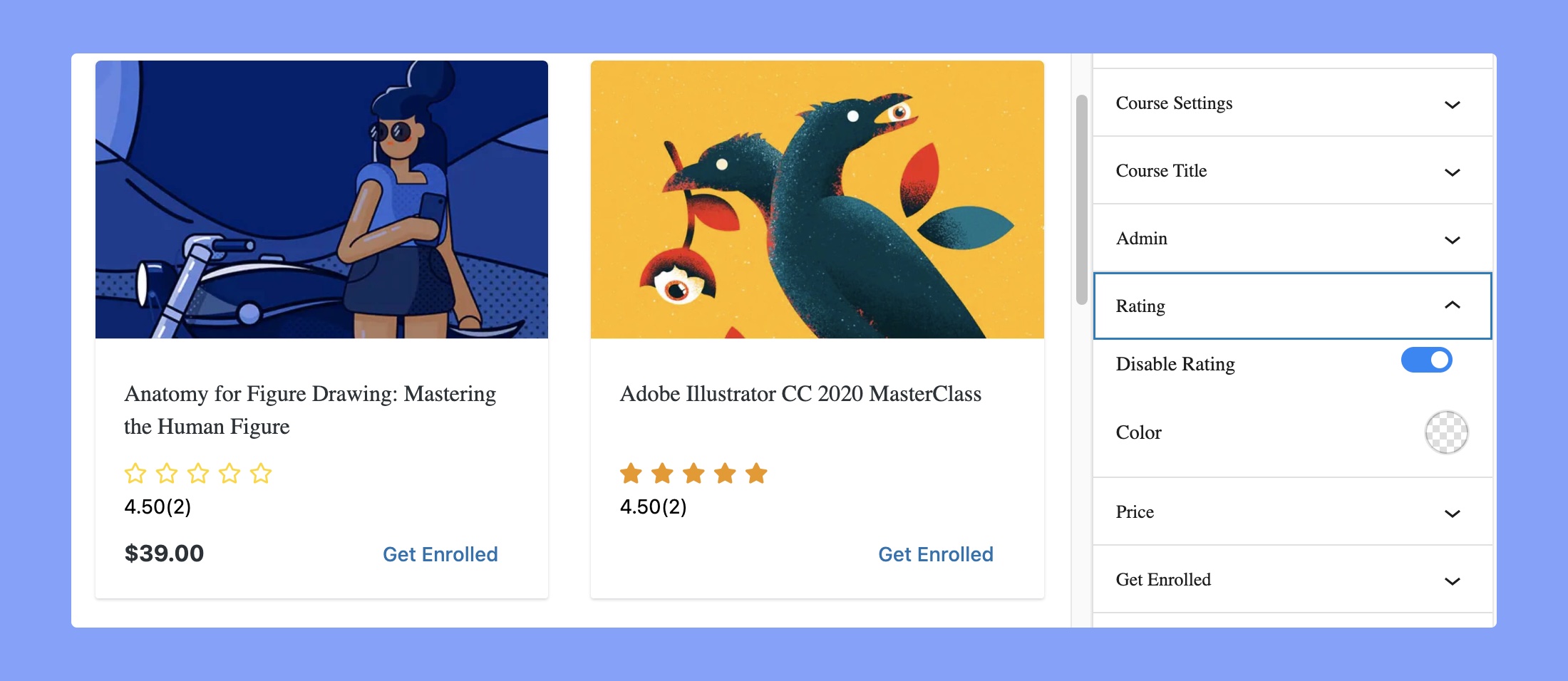
Every student can rate a course after completing it. You can display the ratings on the course by enabling this option.
- Disable Rating: You can choose to enable or disable the ratings of the courses in your listing using the toggle button.
- Color: You can choose the rating color from this option. Choose a color using the color picker and set the appropriate color related to your brand color. However, it’ll update the border color of the stars only, not the fill color.
Price
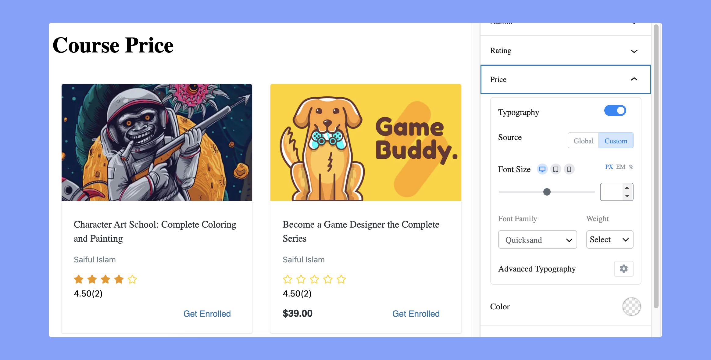
Your courses can be both free and paid. The price of your course will be displayed right beside the enrollment option. You can only customize the typography of the options by using this feature.
Get Enrolled
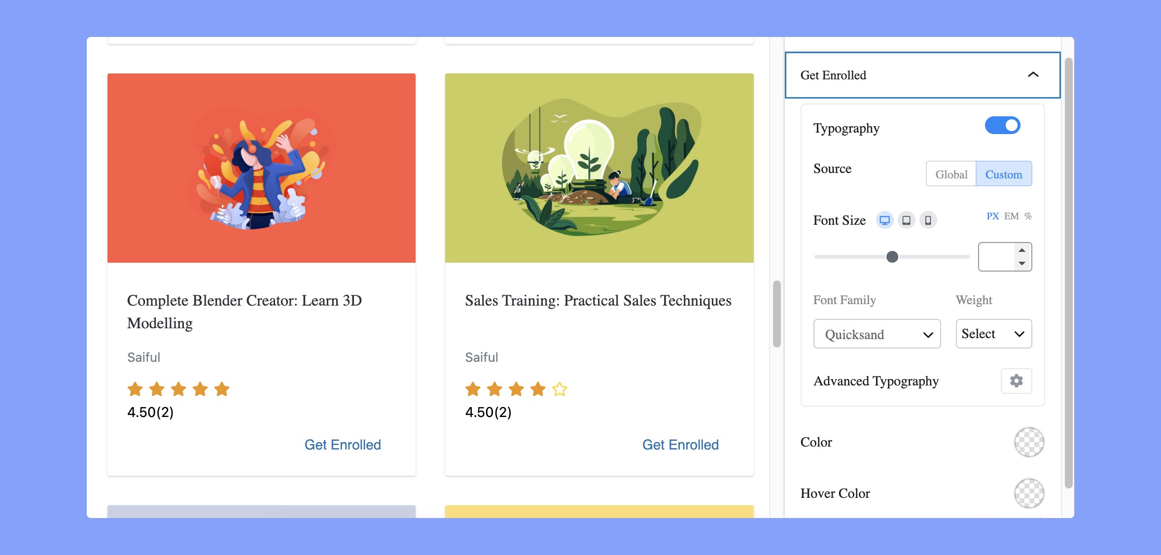
Students can enroll in a course using this Get Enrolled button. For the free courses, the button will be displayed as ‘Enroll course’, and it’ll say ‘Add to Cart’ for the paid courses.
Here, you can update three different options. These are:
- Typography: Choose whether you want to use global typography or a custom one.
- Color: Choose a color for your text from the color picker.
- Hover Color: If you want to set a specific hover color for this button, you can choose one using the color picker.
Advanced CSS Class
Using the Advanced block setting, you can add a CSS class to your block, letting you write custom CSS to style the block as you wish.
Courses Search
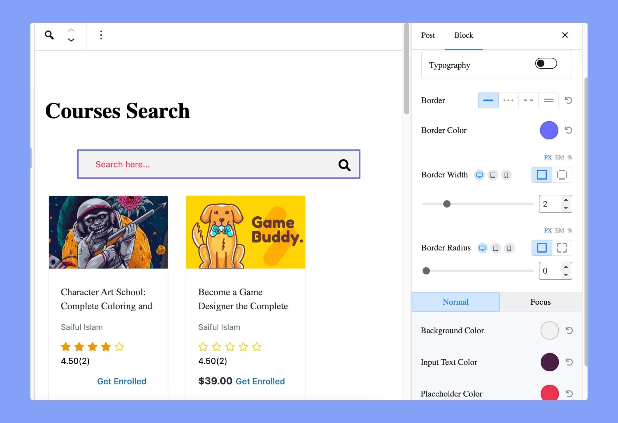
With the course search block, you can enable your users to search for a specific course using relevant keywords. Once you add it to your post/page, you will find the following options:
- Typography: Set the font family, font size, font weight, line height, etc for the search box.
- Border: Set the border style for the search box. The available options are solid, dotted, dash, and double line.
- Border Color: Set the color of the border for the search box.
- Border Width: Set the width of the border for the search box.
- Border Radius: Set the border radius for the search box.
- Background Color: Set the background color of the search box.
- Input Text Color: Set the color of the text inside the input fields.
- Placeholder Color: Set the color of the placeholder text inside input fields.
Category Listing
You can use the Category Listing block to display the course categories on a webpage. Here are the available options for the Category Listing block.
Course Settings
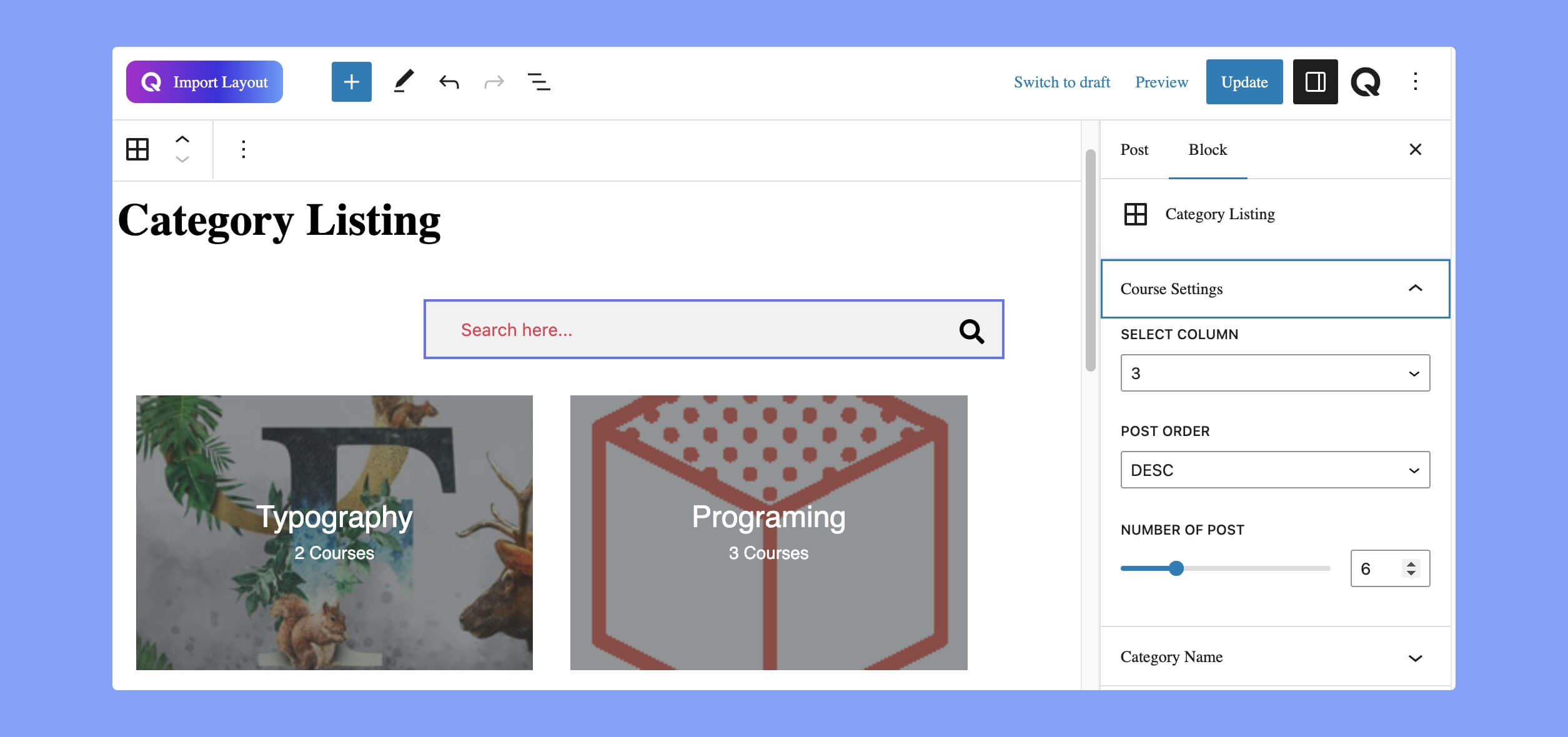
The Course Settings option allows you to customize the visual appearance of the category list. The available settings in this section are:
- Select Column: Set how many columns of categories you want to display on the page or post.
- Post Order: Set the order in which the categories are displayed. You can set the order either in ascending or descending order.
- Number of Post: Set the maximum number of categories to display on the page or post.
Category Name
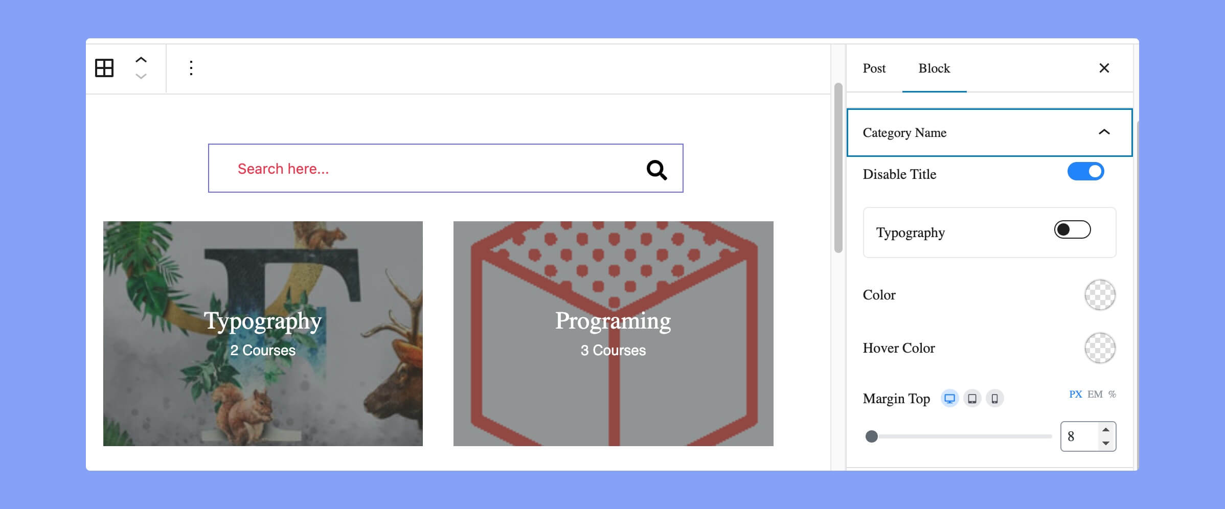
You can customize the appearance of the category names from this section. Here the available options are:
- Disable Title: Use the toggle button to enable or disable the category name.
- Typography: Design your text from the typography section.
- Color: Choose a color for your category name from the color picker.
- Hover Color: If you want to set a specific hover color for the category name, you can choose one using the color picker.
- Margin Top: Choose the space you need at the top of this category section.
Course Count
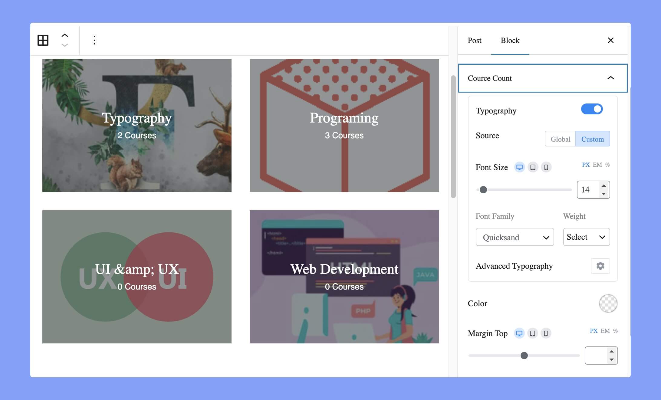
Use the toggle button to enable/disable course count. Once you enable the course title, you will find the following options:
- Typography: Design your text from the typography section.
- Color: Choose a color for your category name from the color picker.
- Margin Top: Choose the space you need at the top of this category section.
Category Button
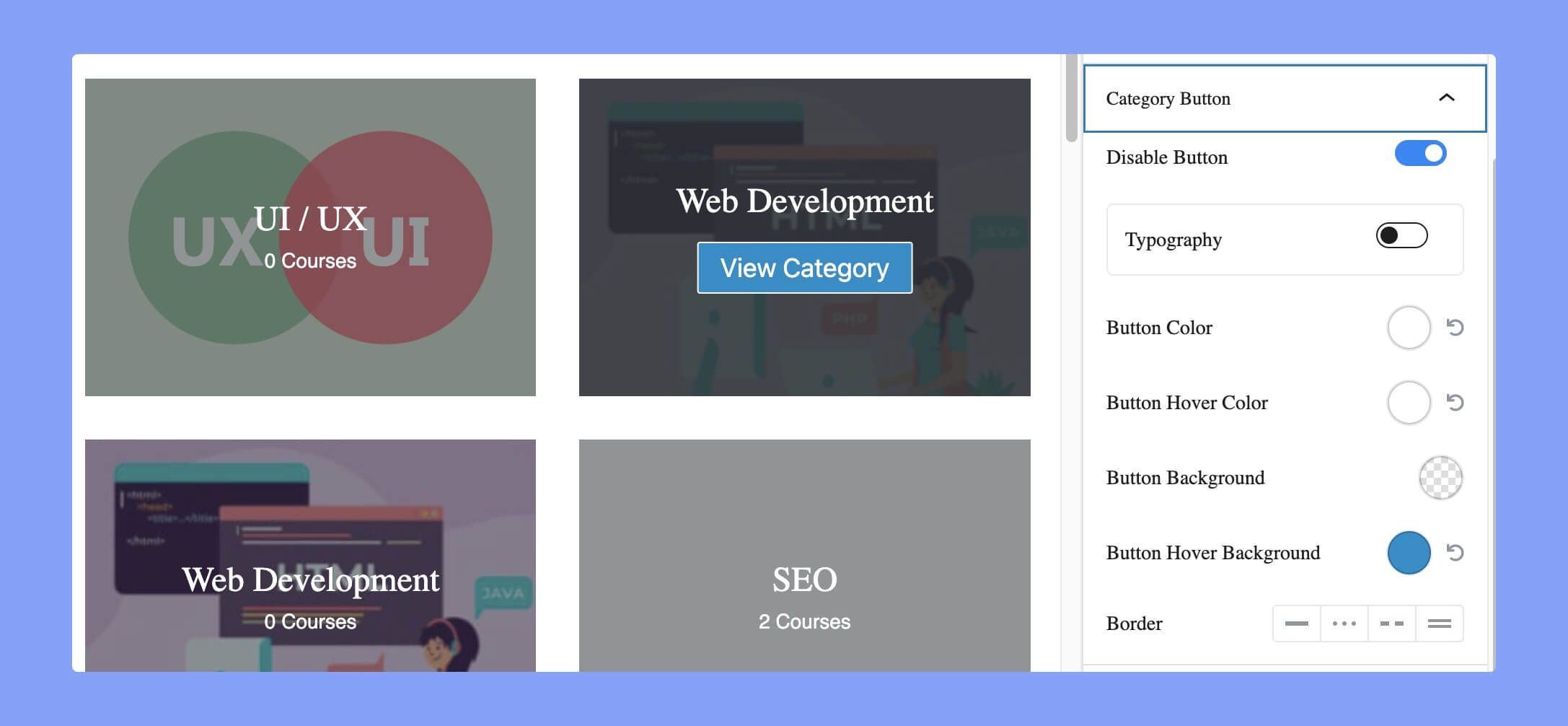
The Category Button option will display the ‘view category’ button whenever the visitors hover over the category option. The available options are:
- Disable Button: This toggle button allows you to enable or disable the category button on the website.
- Typography: Set the font family, font size, font weight, line height, etc for the button text.
- Button Color: Set the color of the button text.
- Button Hover Color: Set the color of the button text on hover.
- Button Background: Set the background color for the button.
- Button Hover Background: Set the background color for the button on hover.
- Border: Set the border style for the category button. The available options are solid, dotted, dash, and double line.
Advanced
Additional CSS Class(es): “Additional CSS Class(es)” is an option that allows you to add one or more custom CSS classes to an element on the website. This can be useful if you want to apply custom styling or functionality to a specific element.