Skillate offers a dedicated menu for mobile users. It has a different vibe than using just a hamburger menu on the top. Besides offering smoother navigation, it improves the user experience and offers an app-like interface for your website.
Here’s the front-end preview of the Skillate theme on a mobile device-

You can access the mobile menu settings by navigating to WP Dashboard > Appearance > Customize > Skillate Options > Mobile Menu Settings. There you’ll get four options to customize the mobile menu
- Mobile Menu Enable: It’ll enable or disable the whole mobile menu option
- Category Enable: The ON button shows the Category option on the mobile screen, while the OFF button hides it from the menu.
- Search Enable: The Search option can be displayed on the mobile screen by clicking the ON button and hidden by clicking the OFF button.
- Cart Enable: Clicking the ON button will make the Cart option visible on the mobile screen, whereas clicking the OFF button will remove it from the menu.
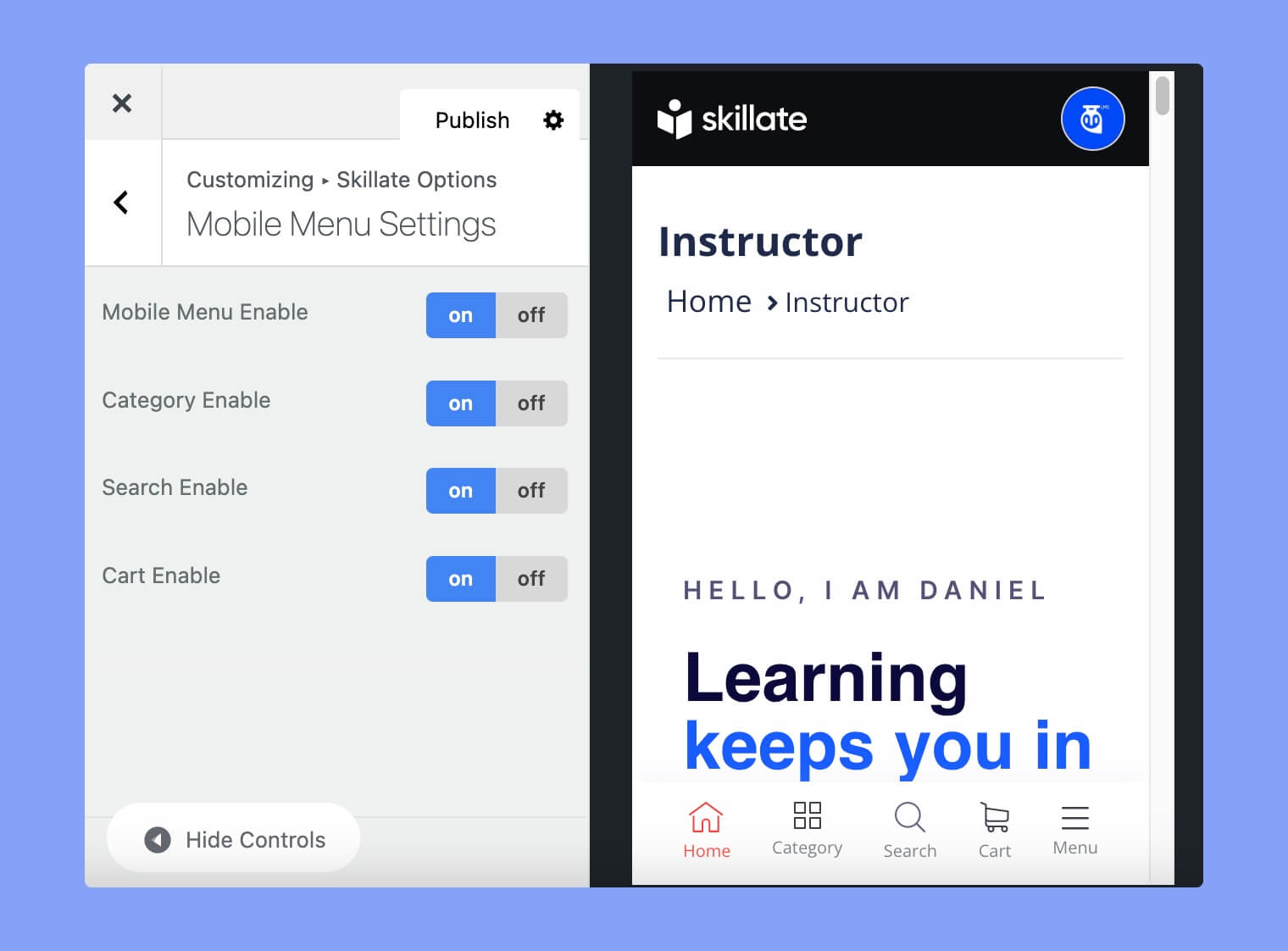
However, if you want to add a new item to the menu, we strongly advise you to turn off an existing one. There should not be more than 5 menu items at the bottom of the mobile devices. Besides, the Menu and Home option is fixed. So, you can update three options from here.
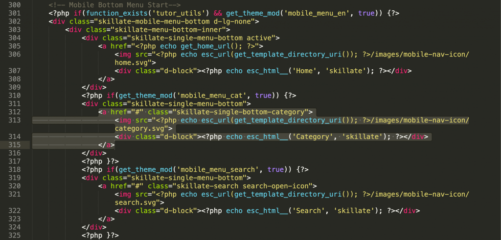
If you want to update the menu manually, you can also do so by updating the code by yourself. Simply update the ‘skillate-single-bottom-category’ class on the header.php file, and the interface will be updated per your instruction.