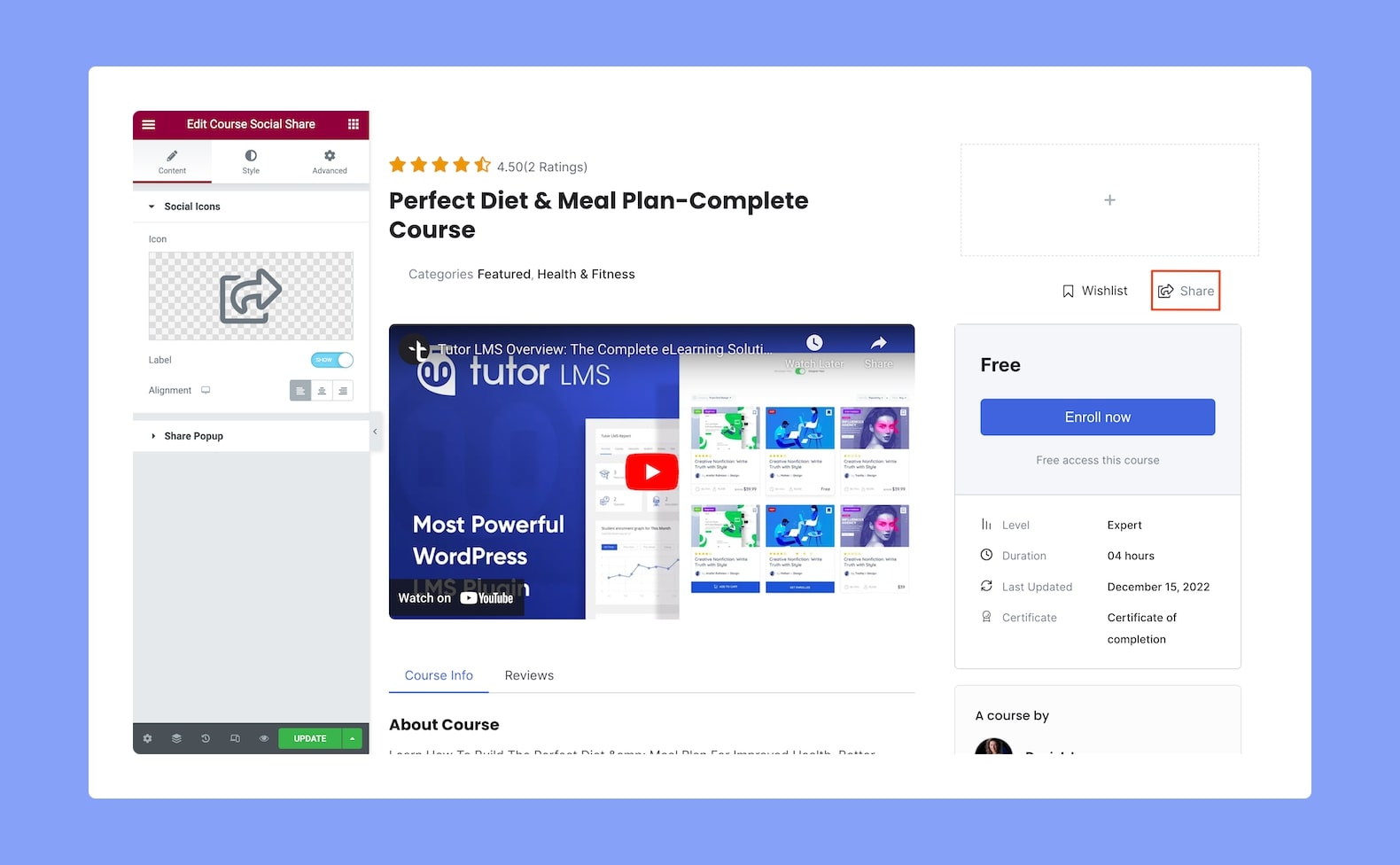
Use the Course Social Share Elementor add-on to allow users to share specific Tutor LMS courses on their favorite platform.
Now, after you’ve added this add-on to your post or page, you will see the following configuration options:
Content
Under the Content tab in the Configuration panel, we have two sections: Social Icons and Share Popup.
From the Social Icons section, you can customize the add-on’s icon and label. And from the Share Popup section, you’ll find configuration options for the popup that will appear when users click on the Share button.
Social Icons:
- Icon: Select an Icon for this add-on from the Icon Library or upload your own custom icon in SVG file format.
- Label: Enable this to display the “Share” label beside the icon.
- Alignment: Pick an alignment for the social icons. This is a responsive function, so you can edit for different display sizes.
Share Popup:
- Section Title: Customize the title of the share popup window using this field.
- Share Title: Customize the share button title in the share popup window using this field.
- Shape: Select what shape the social share buttons are going to be. Options include Rounded, Square, and Circle.
- Show Icon: Enable this to display the social media platform’s icon on its share button.
- Show Icon Text: Enable this to display the social media platform’s name on the button.
Style
Under the Style tab, we can then customize the Course Social Share add-on’s Style. Let’s go over the options we have available to do this.
Label:
- Color: Set the color of the add-on’s Label text from a wide range of colors in the color palette.
- Typography: Adjust the typography for the add-on’s Label text from here.
Share Icon:
- Icon Color: Set the color of the Course Social Share add-on’s icon.
- Size: Define this icon’s size from here.
Social Icon:
- Icon Color: Set the color of the Social Icon that’s in the share popup.
- Shape Color: Select the color of the Social Icon’s shape that’s in the share popup.
- Size: Define the size of the Social Icon button from here. This is a responsive option so you can set it differently for different types of devices.
- Padding: Define its top, right, bottom, and left padding. You can also click on the link icon to unlink them and define them differently.
- Spacing: Set the spacing between the icon and the label. This is also a responsive feature, so you can define this differently for various display sizes.
- Border Type: Select a border style from the drop-down list. Options include Default, None, Solid, Double, Dotted, Dashed, and Groove.
- Border Radius: Use this feature to curve the corners of the shape. 0 means a square shape and the higher the value, the more rounded it gets. You can also click on the link icon to unlink them and define each corner differently.
Social Icon on Hover:
- Icon Color: Set the color of the Social Icon that’s in the share popup when in hover mode.
- Shape Color: Select the color of the Social Icon’s shape that’s in the share popup when in hover mode.
- Hover Animation: Select an animation style for this social icon which will be triggered when a user hovers over it. You can always click on the little x icon to remove the animation if need be.
Popup:
- Section Title: Select a color for the share popup section’s title from here.
- Share Title: Select a color for the share popup section’s share title from here.
- Close Icon: Select a color for the share popup section’s close icon.
- Page Link: Select a color for the label text “Page Link”.
- Background Color: Select a color for the share popup section’s background.
- Border Type: Choose a border style from the drop-down list. Options include Default, None, Solid, Double, Dotted, Dashed, and Groove.
- Border Radius: Use this feature to curve the corners of the share popup section’s shape. 0 means a square shape and the higher the value, the more rounded it gets. You can also click on the link icon to unlink them and define each corner differently.
- Input Text Color: Select a color for the share popup section’s Page Link field’s input text.
- Input Background Color: Select a color for the Page Link field’s background.
- Border Type: Select a border style from the drop-down list for the Page Link field. Options include Default, None, Solid, Double, Dotted, Dashed, and Groove.
- Width: If you set the Border Type as anything other than Default or None, then you’ll see this option in place of the Border Radi. You can use this to define the width of the border.
- Input Border Radius: Use this feature to curve the corners of the Page Link input field’s shape. 0 means a square shape and the higher the value, the more rounded it gets. You can also click on the link icon to unlink them and define each corner differently.