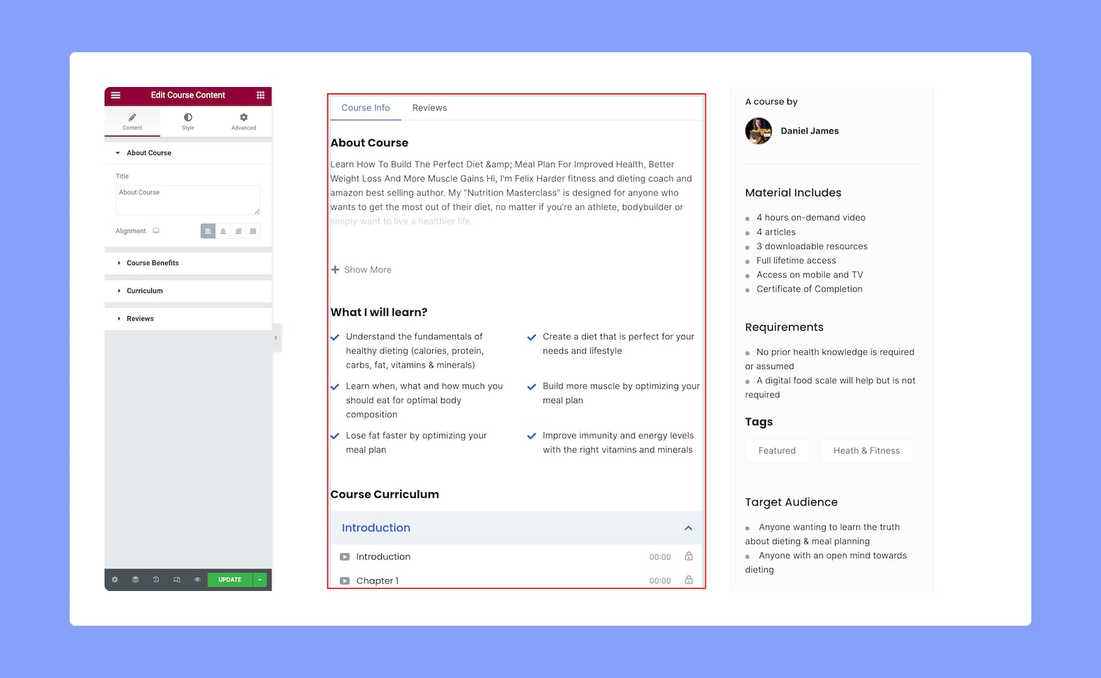
Use the Course Content add-on to show what’s included in the course with information such as the Course Description, Course Benefits, Course Curriculum, and more! This multi-purpose add-on will allow you to easily grab the attention of the users and make it easier for them to make the purchase decision.
Once you add this to your post or page, you’ll find the following configuration options available:
Content
About Course:
- Title: Set the title of the About Course section in this add-on.
- Alignment: Select whether the horizontal alignment will be to the left, center, right, or justified. Since this is a responsive feature, you can set this differently for different types of devices.
Course Benefits:
- Title: Set the title of the Course Benefits section in this add-on.
- Layout: Select whether the layout of this section will be in list format or in-line. This is also a responsive feature so you can set it differently for various devices.
- List Icon: Select the icon to bullet each list item from either the icon library or upload your own SVG file.
- Alignment: Select whether the horizontal alignment will be to the left, center, or right. Again, another responsive feature so you can set it differently for various devices.
Curriculum:
- Title: Set the title of the Curriculum section in this add-on.
Reviews:
- Title: Set the title of the Reviews section in this add-on.
Style
Now from the Style Settings, customize the Color, Typography, and Gap of the Course Content add-on using the following configuration options:
About Course Title:
- Color: Choose the color of the About Course Title from a wide range of colors in the color palette.
- Typography: Adjust this title’s typography settings from here.
- Gap: Define the vertical gap size between the title and the rest of the content in the add-on. This is a responsive feature so you can set this differently for each type of device.
About Course Text:
- Color: Choose the color of the About Course text from a wide range of colors in the color palette.
- Typography: Adjust the About Course text’s typography settings from here.
Course Benefit:
- Color: Choose the color of the Course Benefit Title from a wide range of colors in the color palette.
- Typography: Adjust this title’s typography settings from here.
- Gap: Define the vertical gap size between the title and the rest of the content in the add-on. This is a responsive feature so you can set this differently for each type of device.
Course Benefit List:
- Space Between: Set the space between each item on the list. This is a responsive feature so you can set this differently for various display sizes.
- Border Type: Select a border style from the drop-down list. Options include Default, None, Solid, Double, Dotted, Dashed, and Groove.
- Border Radius: Use this feature to curve the corners of the list shape. 0 means a square shape and the higher the value, the more rounded it gets. You can also click on the link icon to unlink them and define each corner differently. This is also a responsive feature so you can set this differently for each type of device.
- Padding: Define its top, right, bottom, and left padding. You can also click on the link icon to unlink them and define them differently.
Course Benefit Icon:
- Color: Select the color of the icon that’s beside each list item from a wide range of colors in the color palette.
- Size: Define the size of this icon from here.
Course Benefit Text:
- Color: Select the color of the text from a range of colors in the color palette.
- Text Indent: Define the size of the text-indent from here. This is also a responsive feature so you can set this differently for different types of devices.
- Typography: Adjust the text’s typography settings from here.
Curriculum Header:
- Title Color: Choose the color of the Curriculum title text from a wide range of colors in the color palette.
- Title Typography: Adjust the typography settings of this title text from here.
- Gap: Define the vertical gap size between the title and the rest of the content in the add-on. Since this is a responsive feature, you can set this differently for different types of devices.
Topic:
- Icon Size: Define the size of the topic icon from here.
- Typography: Adjust the typography settings for the topics.
- Normal VS Active VS Hover: Select if the following settings will be applied to the Pagination in Normal, Hover, or Active Mode.
- Icon Color: Choose the color of the icon from a wide range of colors in the color palette.
- Text Color: Select the color of the text from the color palette.
- Background Color: Select the color of the background from the color palette.
- Border Type: Select a border style for the topics from the drop-down list. Options include Default, None, Solid, Double, Dotted, Dashed, and Groove.
- Border Radius: Use this feature to curve the corners of the topics’ shapes. 0 means a square shape and the higher the value, the more rounded it gets. You can also click on the link icon to unlink them and define each corner differently.
Lesson:
- Icon Size: Define the size of the lesson icon from here.
- Typography: Adjust the typography settings for the lessons.
- Normal VS Hover: Select if the next style settings will be applied to Normal or Hover Mode.
- Icon Color: Choose the color of the icon from a wide range of colors in the color palette.
- Text Color: Select the color of the text from the color palette.
- Info Text Color: Select the color of the info text from the color palette.
- Background Color: Select the color of the background from the color palette.
- Border Width: Define the width of the border from here.
- Border Color: Select the color of the border from the color palette.
Spacing:
- Topic Padding: Define the topics’ top, right, bottom, and left padding. You can also click on the link icon to unlink them and define them differently. This is a responsive feature so you can define this differently for various display sizes.
- Lesson Padding: Define the lessons’ top, right, bottom, and left padding. You can also click on the link icon to unlink them and define them differently. This is also a responsive feature so you can define this differently for various display sizes.
- Space Between Topic: Define the space between each topic from here.
Review Section Title:
- Color: Choose the color of the Review Title from a wide range of colors in the color palette.
- Typography: Adjust this title’s typography settings from here.
- Gap: Define the vertical gap size between the title and the rest of the content in the add-on. This is a responsive feature so you can set this differently for each type of device.
Review Avg:
- Text Color: Choose the text color for the review average value text.
- Text Typography: Adjust the typography settings for the review average value text.
- Stars Color: Choose the color for the review stars.
- Stars Size: Define the size of the review stars.
- Total Label Color: Choose the color of the total label text.
- Total Label Typography: Adjust the typography settings for the total label text.
Right Rating Bar:
- Color: Choose the color of the rating bar.
- Fill Color: Choose the fill color of the rating bar.
- Height: Define the height of the rating bar.
- Star Color: Choose the color of the stars beside the rating bar.
- Star Size: Define the size of the rating stars beside the rating bar.
- Text Color: Choose a color for the text beside the rating bar.
- Text Typography: Adjust the typography settings for the rating bar’s text.
Review List:
- Image Size: Define the size of the user’s image in the review list.
- Border Type: Select a border style for the avatar from the drop-down list. Options include Default, None, Solid, Double, Dotted, Dashed, and Groove.
- Border Radius: Use this feature to curve the corners of the avatar shape. 0 means a square shape and the higher the value, the more rounded it gets. You can also click on the link icon to unlink them and define each corner differently.
- Name Color: Choose the color of the text of the names in the review list.
- Name Typography: Adjust the typography settings for the text of the names in the review list.
- Time Text Color: Choose the color of the time text in the review list.
- Time Text Typography: Adjust the typography settings for the time text in the review list.
- Stars Color: Choose the color of the stars in the review list.
- Rating Color: Choose the color of the rating in the review list.
- Star Size: Define the size of rating stars in the review list.
- Comment Color: Choose the color of the comments’ text in the review list.
- Comment Typography: Adjust the typography settings of the comments’ text.