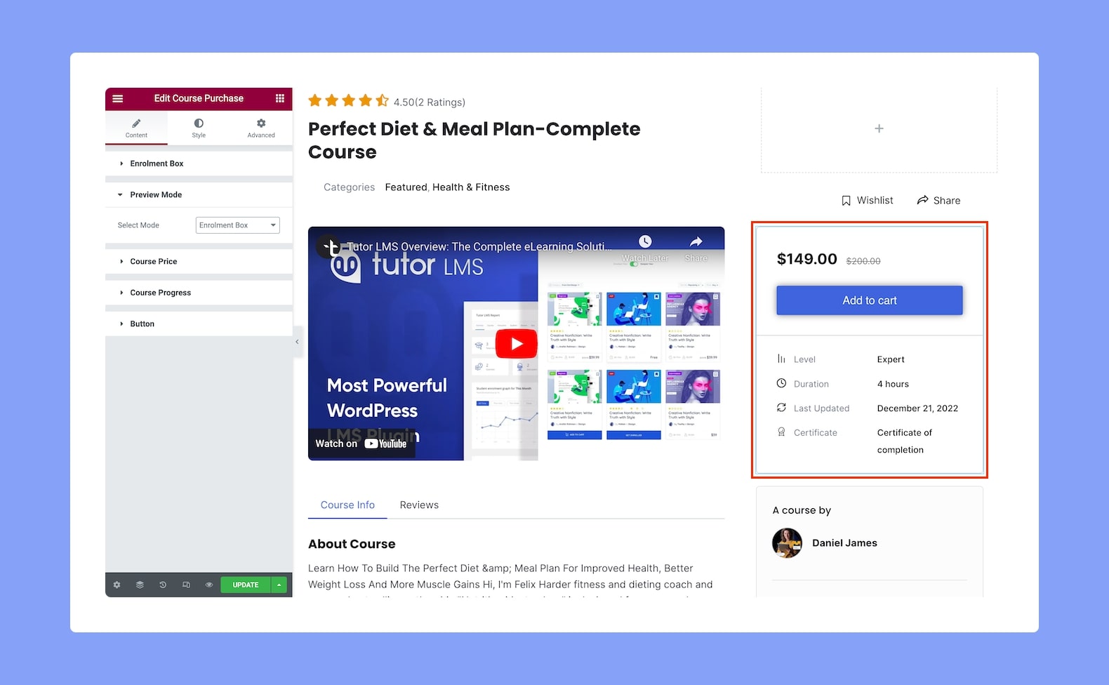
Use the Course Purchase add-on to allow your users to easily buy their desired courses. Once you add it to your post or page, you’ll see an Enroll Now or Add To Cart button appear with this box that the users can click to join the course.
Next, on the configuration panel, you’ll find the following customization options for this add-on:
Content
From here, you can find the customization options for the Enrolment Box, Course Progress, Button, and more.
Enrolment Box:
- Show: Enable this toggle to show additional course info like course difficulty level, duration, course last updated, and certificate.
Preview Mode:
This add-on has two modes, Enrolment Box and Enrolled Box. As you can guess, once the students click on the Enroll button, the Enrolment Box will transform into the Enrolled mode.
- Select Mode: From here, select which mode you want to see in the preview while you’re customizing this add-on. Options are, of course, the Enrolment Box and Enrolled Box.
Course Price:
- Alignment: Set whether the add-on’s price alignment will be to the left, center, or right. This is a responsive feature so you can set this differently for different types of devices.
Course Progress:
In Enrolled Box mode, this add-on also displays the Course Progress. From this section, you can customize it.
- Title: Edit the Course Progress title from here.
- Display Percentage: Enable this toggle option to show the Progress Percentage value.
Button:
From this last section under the Content tab, you can customize the Enrolment button.
- Alignment: Set whether the button alignment will be to the left, center, or right. This is a responsive feature so you can set this differently for different types of devices.
- Size: Select a button size from this drop-down list. Options are Small, Medium, and Large.
- Width: Select the width of the button from this drop-down list. Options include Auto, Fill, and Fixed.
Style
From the Style Settings, customize the Enrolment Box add-on to suit your preferences.
Course Progress Title:
- Color: Choose the color of the title’s text from a wide range of colors in the color palette.
- Typography: Adjust the title’s typography from here.
- Gap: Define the vertical gap size between the title and the rest of the elements that make up this add-on. This is also a responsive feature so you can set this differently for various screen sizes.
Progress Bar:
- Color: Set a color for the progressed portion of the progress bar from a wide range of colors in the color palette.
- Background Color: Select a color for the background i.e not yet progressed portion of the progress bar.
- Height: Set a value for the height of the progress bar.
- Border Radius: Use this feature to curve the corners of the progress bar shape. 0 means a square shape and the higher the value, the more rounded it gets. You can also click on the link icon to unlink them and define each corner differently. Do note that this feature is only obvious when the progress bar height is set higher (at around 3px or more).
- Progress Text:
- Color: Select a color for the progress bar text from a wide range of colors in the color palette.
- Typography: Adjust the progress bar text’s typography from here.
Course Price:
For Course Price, you’ll find two tabs, Normal and Strike. From the Normal tab, you can format the Course Price Value. From the Strike tab, you can format the Original price if the course is on sale.
- Normal
- Color: Choose the color of the pricing text from a wide range of colors in the color palette.
- Typography: Adjust the pricing text’s typography from here.
- Strike
- Color: Choose the color of the original pricing text from a wide range of colors in the color palette. (Applicable when courses are discounted.)
- Typography: Adjust the original pricing text’s typography from here. (Applicable when courses are discounted.)
Add To Cart Button:
- Normal VS Hover: Select if the next style settings will be applied to the Add To Cart Button in Normal or Hover Mode.
- Text Color: Set the Add To Cart Button’s text color.
- Background Color: Select the button’s background color from here.
- Typography: Adjust the button text’s typography from here.
- Padding: Define its top, right, bottom, and left padding. You can also click on the link icon to unlink them and define them differently.
- Border Type: Select a border style from the drop-down list. Options include Default, None, Solid, Double, Dotted, Dashed, and Groove.
- Border Radius: Use this feature to curve the corners of the button shape. 0 means a square shape and the higher the value, the more rounded it gets. You can also click on the link icon to unlink them and define each corner differently.
- Box Shadow: Style the button’s shadow by clicking on the edit icon. You can define its color, horizontal shift, vertical shift, blur, spread, and position i.e outline or inset.
Enroll Button:
- Normal VS Hover: Select if the next style settings will be applied to the Enroll Button in Normal or Hover Mode.
- Text Color: Set the Enroll Button’s text color.
- Background Color: Select the button’s background color from here.
- Typography: Adjust the button text’s typography from here.
- Padding: Define its top, right, bottom, and left padding. You can also click on the link icon to unlink them and define them differently.
- Border Type: Select a border style from the drop-down list. Options include Default, None, Solid, Double, Dotted, Dashed, and Groove.
- Border Radius: Use this feature to curve the corners of the button shape. 0 means a square shape and the higher the value, the more rounded it gets. You can also click on the link icon to unlink them and define each corner differently.
- Box Shadow: Style the button’s shadow by clicking on the edit icon. You can define its color, horizontal shift, vertical shift, blur, spread, and position i.e outline or inset.
Star/Continue/Retake Button:
- Normal VS Hover: Select if the next style settings will be applied to this button in Normal or Hover Mode.
- Text Color: Set this button’s text color.
- Background Color: Select the button’s background color from here.
- Typography: Adjust the button text’s typography from here.
- Padding: Define its top, right, bottom, and left padding. You can also click on the link icon to unlink them and define them differently.
- Border Type: Select a border style from the drop-down list. Options include Default, None, Solid, Double, Dotted, Dashed, and Groove.
- Border Radius: Use this feature to curve the corners of the button shape. 0 means a square shape and the higher the value, the more rounded it gets. You can also click on the link icon to unlink them and define each corner differently.
- Box Shadow: Style the button’s shadow by clicking on the edit icon. You can define its color, horizontal shift, vertical shift, blur, spread, and position i.e outline or inset.
Complete Button:
- Normal VS Hover: Select if the next style settings will be applied to the Complete Button in Normal or Hover Mode.
- Text Color: Set this button’s text color.
- Background Color: Select the Complete Button’s background color from here.
- Typography: Adjust the button text’s typography from here.
- Padding: Define its top, right, bottom, and left padding. You can also click on the link icon to unlink them and define them differently.
- Border Type: Select a border style from the drop-down list. Options include Default, None, Solid, Double, Dotted, Dashed, and Groove.
- Border Radius: Use this feature to curve the corners of the button shape. 0 means a square shape and the higher the value, the more rounded it gets. You can also click on the link icon to unlink them and define each corner differently.
- Box Shadow: Style the button’s shadow by clicking on the edit icon. You can define its color, horizontal shift, vertical shift, blur, spread, and position i.e outline or inset.
View Cart Button:
- Normal VS Hover: Select if the next style settings will be applied to the View Cart Button in Normal or Hover Mode.
- Text Color: Set this button’s text color.
- Background Color: Select the View Cart Button’s background color from here.
- Typography: Adjust the button text’s typography from here.
- Padding: Define its top, right, bottom, and left padding. You can also click on the link icon to unlink them and define them differently.
- Border Type: Select a border style from the drop-down list. Options include Default, None, Solid, Double, Dotted, Dashed, and Groove.
- Border Radius: Use this feature to curve the corners of the button shape. 0 means a square shape and the higher the value, the more rounded it gets. You can also click on the link icon to unlink them and define each corner differently.
- Box Shadow: Style the button’s shadow by clicking on the edit icon. You can define its color, horizontal shift, vertical shift, blur, spread, and position i.e outline or inset.
View Certificate Button:
- Normal VS Hover: Select if the next style settings will be applied to the View Certificate Button in Normal or Hover Mode.
- Text Color: Set this button’s text color.
- Background Color: Select the View Certificate Button’s background color from here.
- Typography: Adjust the button text’s typography from here.
- Padding: Define its top, right, bottom, and left padding. You can also click on the link icon to unlink them and define them differently.
- Border Type: Select a border style from the drop-down list. Options include Default, None, Solid, Double, Dotted, Dashed, and Groove.
- Border Radius: Use this feature to curve the corners of the button shape. 0 means a square shape and the higher the value, the more rounded it gets. You can also click on the link icon to unlink them and define each corner differently.
- Box Shadow: Style the button’s shadow by clicking on the edit icon. You can define its color, horizontal shift, vertical shift, blur, spread, and position i.e outline or inset.
Enrolled Info:
- Icon Color: Select a color for the icon beside the “You enrolled in this course on …” message.
- Icon Size: Define this icon’s size from here. Since this is a responsive feature, you can set this differently for different types of devices.
- Text Color: Set the info text’s color from here.
- Text Typography: Adjust the info text’s typography.
- Date Color: Set the Date text’s color.
- Date Typography: Adjust the Date text’s typography.
Enrolment Box:
- Content Background: Select a background color for the content section of the add-on from a range of colors in the color palette.
- Meta Info Background: Select a background color for the meta info section of the add-on from a range of colors in the color palette.
- Border Type: Select a border style for the Enrolment Box from the drop-down list. Options include Default, None, Solid, Double, Dotted, Dashed, and Groove.
- Border Radius: Use this feature to curve the corners of the Enrolment Box’s shape. 0 means a square shape and the higher the value, the more rounded it gets. You can also click on the link icon to unlink them and define each corner differently.
- Icon Color: Select a color for the icon beside the Course Meta Info.
- Icon Size: Define the size of this icon from here.
- Label Color: Set the Meta Info Labels’ color from here.
- Label Typography: Adjust the Meta Info Labels’ typography.
- Value Color: Set the Meta Info Values’ text color from here.
- Value Typography: Adjust the Meta Info Values’ typography.