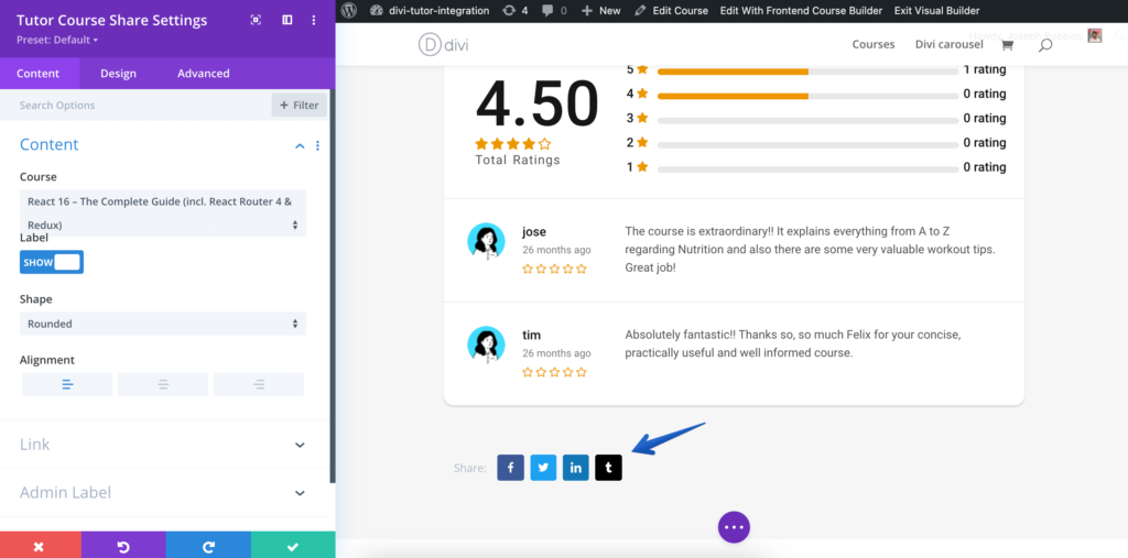
Show a share button for the user, so if they wish they will be able to share the link for the course with a single click to their favorite platform.
Content
Content: In the Content section, you can customize the following attributes.
Content
- Course – You can Select which course you want to import the content for.
- Label – Set what the label describing the Course Share will say.
- Show Label – Toggle to show or hide the Label.
- Show Icon – Toggle to show or hide the Icon.
- Alignment – Set the alignment for the text.
- Space Between – Set the space between, in pixels, of the icons.
Share Popup
- Section – Set what the share popup section should say.
- Share Title – Set what the share title text should say.
- Social Icon – Toggle to show or hide the social icon.
- Social Text – Toggle to show or hide the social text section.
Link
- Module Link URL – When clicked the module will link to this URL.
- Module Link Target – You can set whether or not your module link opens in the same window.
Admin Label
- Admin Label – This will change the label of the module in the builder for easy identification.
Design
Make edits to the Course Share module visual design from this section. In this design section, you can make changes to the following attributes. Remember these are only design changes, to change the content you have to do so from the content section.
- Share Label and Icon
- Popup Section Title
- Popup Share Title
- Popup Share Link
- Social Buttons
- Close Button
- Background
- Spacing