Tutor LMS offers three pre-designed pages. These are:
- Student Registration
- Instructor Registration
- Dashboard
Student Registration
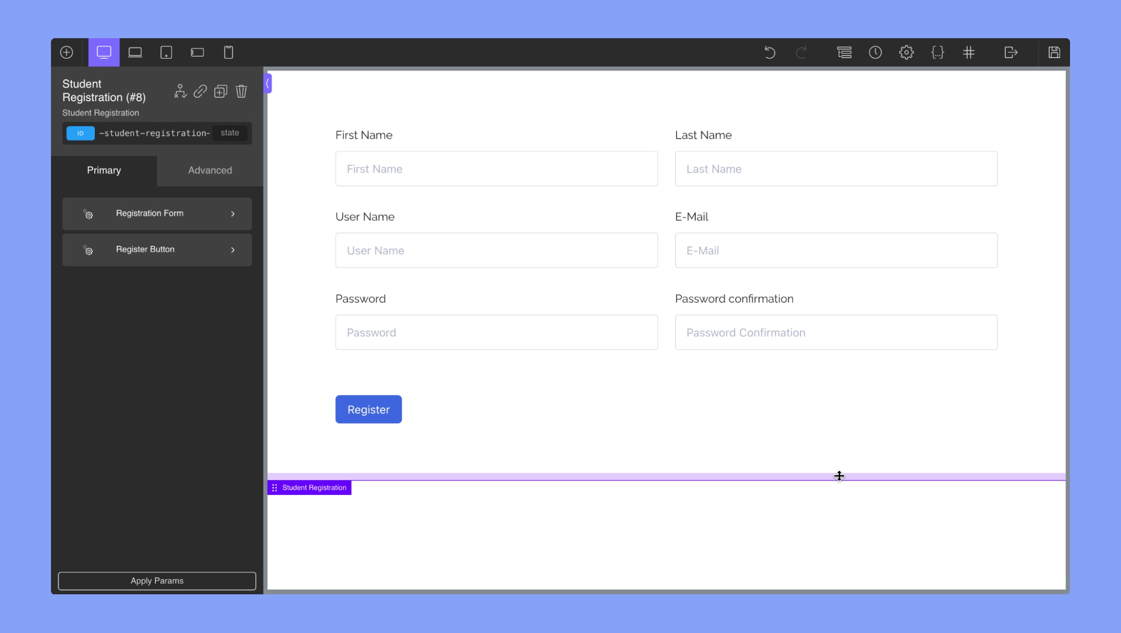
The “Student Registration” tab of Oxygen builder for Tutor LMS provides options for customizing the appearance of the registration form used by students to sign up for courses. Under the “Student Registration” tab, the following items can be edited:
- Label: This section allows you to customize the label that appears above each input field in the registration form. You can adjust the typography of the label, including the font size, weight, style, and color.
- Input Typography: This section allows you to customize the typography of the input fields in the registration form. You can adjust the font size, weight, style, and color of the text that appears in the input fields.
- Input Field: This section allows you to customize the appearance of the input fields themselves. You can adjust the border color and width, the background color, and the height of the input fields.
Instructor Registration
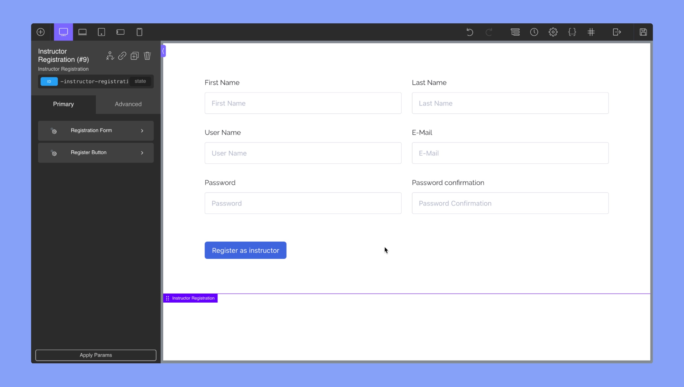
The “Instructor Registration” tab of Oxygen builder for Tutor LMS is where you can customize the design of the instructor registration form. Under the “Instructor Registration” tab, the following items can be edited:
- Label: This section allows you to modify the typography of the registration form labels.
- Input Typography: This section enables you to change the typography of the registration form input fields.
- Input Field: This section allows you to customize the appearance of the input fields in the registration form, including the background color, border color, and border width.
Dashboard
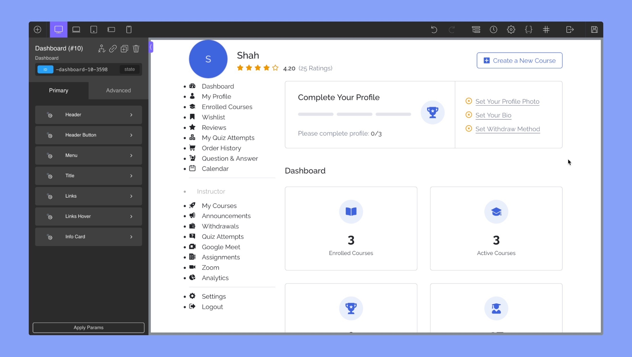
The “Dashboard” tab of Oxygen builder for Tutor LMS is used to customize the appearance of the dashboard page. Under the “Dashboard” tab, the following items can be edited::
Header: This section contains options to change the appearance of the header area of the dashboard, such as the background color and padding.
- Image: This section allows you to modify the dashboard header image. You can set the width and height of the header image. Furthermore, you can customize the height, width, and background color of the info card/icon settings.
- Display Name: This section lets you modify the instructor’s display name. This section lets you change the typography of the instructor’s name. You can adjust the font size, weight, style, color, and alignment.
- Rating Stars: You can add and customize the instructor’s rating stars in this section. You can set the size of the stars, the color of the filled and unfilled stars.
- Rating Average: This section lets you customize the display of the instructor’s average rating. This section lets you change the typography of the instructor’s name. You can adjust the font size, weight, style, color, and alignment.
- Rating Count: This section lets you customize the display of the total number of ratings for the instructor. This section lets you change the typography of the ratings count. You can adjust the font size, weight, style, color, and alignment.
Header Button: The Header Button editor in the Dashboard section of the Oxygen Builder for Tutor LMS allows you to customize the appearance of the button in the header. Here are the different options available in the editor:
- Button padding: Set the padding around the button to adjust its size and position in the header.
- Background color: Choose a background color for the button.
- Hover background color: Set the background color of the button when it is hovered over by the mouse.
- Color: Choose a font color for the text in the button.
- Hover color: Set the font color of the button text when it is hovered over.
- Typography: Change the font size, style, color, alignment, and family of the button text.
- Borders: Add a border to the button and customize its width, style, and color.
- Hover borders: Customize the border of the button when it is hovered over.
- Shadow: Add a shadow to the button to give it a three-dimensional look, and set the color, opacity, horizontal and vertical offsets, and blur radius of the shadow.
- Hover shadow: Customize the shadow of the button when it is hovered over by the mouse.
Menu: The “Menu” editor under the Dashboard section in Oxygen Builder for Tutor LMS provides options to customize the appearance of the menu items. Here are the subsections and their respective editing options:
- Item: This section allows you to change the appearance of the menu items. You can set the color, size, font family, font size, and background color of the item icons and texts.
- Item Hover: This section allows you to change the appearance of the menu items on hover. You can set the color, size, font family, font size, and background color of the item icons and texts.
- Item Active: This section allows you to change the appearance of the active menu item, which is the tab with the “Dashboard” text. You can set the color, size, font family, font size, and background color of the archive icon and text.
- Spacing: This section allows you to add padding and margin around all the menu items. You can set the padding and margin size separately for top, bottom, left, and right sides.
Title: In this section, you can change the typography of the dashboard title using the Oxygen Builder text field editor.
Links: This section allows you to customize the typography of the dashboard links using the Oxygen Builder text field editor.
Link Hover: This section allows you to customize the typography of the dashboard links on hover using the Oxygen Builder text field editor.
Info Card: The “Info Card” editor under the Dashboard section in the Oxygen builder for Tutor LMS allows you to customize the appearance of the information cards that appear on the dashboard page.
Here are the options available in the “Info Card” editor:
- Icon: In this section, you can change the typography of the dashboard icon using the Oxygen Builder text field editor. You can set the color, size, font family, font size, and background color of the archive icon and text.
- Value: In this section, you can change the typography of the dashboard values using the Oxygen Builder text field editor. You can set the color, size, font family, font size, and background color of the archive icon and text.
- Label: In this section, you can change the typography of the dashboard lable using the Oxygen Builder text field editor. You can set the color, size, font family, font size, and background color of the archive icon and text.
- Background: This allows you to set the background color of the card using an RGBA color picker.
- Icon Settings: This allows you to customize the size, color, and alignment of the icon on the card.
- Spacing: This allows you to add padding and margin to the card to adjust its positioning and size.