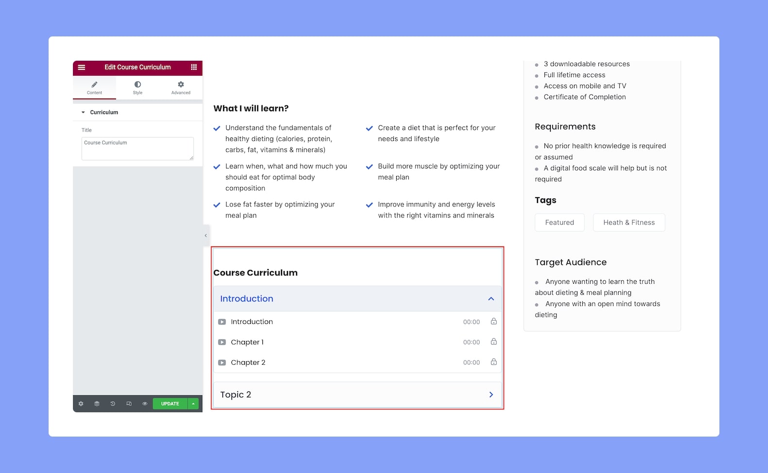
Use this add-on to show the complete Course Curriculum so that your users are aware of the course roadmap. This will help them get a more clear idea of what the course has to offer and they can also prepare themselves better for it.
Once you’ve added this, you’ll see the following options in the configuration panel:
Content
- Title: Define the title of the Course Curriculum widget from here.
Style
Next, it’s time to Style the Course Curriculum add-on using the following options:
Curriculum Header Title:
- Title Color: Choose the color of the title text from a wide range of colors in the color palette.
- Title Typography: Adjust the typography settings of the title text from here.
- Gap: Define the vertical gap size between the title and the rest of the content in the add-on. Since this is a responsive feature, you can set this differently for different types of devices.
Topic:
- Icon Size: Define the size of the topic icon from here.
- Typography: Adjust the typography settings for the topics.
- Normal VS Active VS Hover: Select if the following settings will be applied to the Pagination in Normal, Hover, or Active Mode.
- Icon Color: Choose the color of the icon from a wide range of colors in the color palette.
- Text Color: Select the color of the text from the color palette.
- Background Color: Select the color of the background from the color palette.
- Border Type: Select a border style for the topics from the drop-down list. Options include Default, None, Solid, Double, Dotted, Dashed, and Groove.
- Border Radius: Use this feature to curve the corners of the topics’ shapes. 0 means a square shape and the higher the value, the more rounded it gets. You can also click on the link icon to unlink them and define each corner differently.
Lesson:
- Icon Size: Define the size of the lesson icon from here.
- Typography: Adjust the typography settings for the lessons.
- Normal VS Hover: Select if the next style settings will be applied to Normal or Hover Mode.
- Icon Color: Choose the color of the icon from a wide range of colors in the color palette.
- Text Color: Select the color of the text from the color palette.
- Info Text Color: Select the color of the info text from the color palette.
- Background Color: Select the color of the background from the color palette.
- Border Width: Define the width of the border from here.
- Border Color: Select the color of the border from the color palette.
Spacing:
- Topic Padding: Define the topics’ top, right, bottom, and left padding. You can also click on the link icon to unlink them and define them differently. This is a responsive feature so you can define this differently for various display sizes.
- Lesson Padding: Define the lessons’ top, right, bottom, and left padding. You can also click on the link icon to unlink them and define them differently. This is also a responsive feature so you can define this differently for various display sizes.
- Space Between Topic: Define the space between each topic from here.