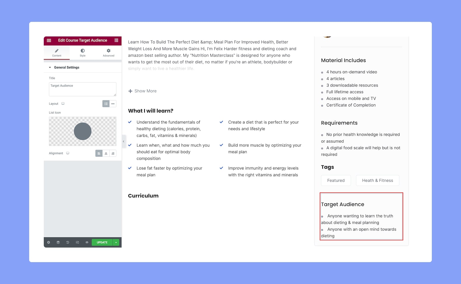
Display your course’s Target Audience with this add-on to let users know who this course is targeted towards, making it easier for them to decide if they should enroll in it or not.
Once you’ve added this to your post/page, you’ll see the following settings on the configuration panel:
Content
- Title: Set the title of the Course Target Audience widget from here.
- Layout: Select whether the layout of this add-on will be in list format or in-line. Since this is a responsive feature, you can set it differently for different types of devices.
- List Icon: Select the icon to bullet each list item from either the icon library or upload your own SVG file.
- Alignment: Select whether the alignment will be to the left, center, or right. This is also a responsive feature, you can set it differently for various display sizes.
Style
Next up, it’s time to customize the Course Target Audience add-on. You can do this using the following settings:
Section Title:
- Color: Select the color of the title text from a wide range of colors in the color palette.
- Typography: Adjust the title’s typography settings from here.
- Gap: Define the vertical gap size between the title and the rest of the content in the add-on. This is a responsive feature so you can set this differently for different device types.
List:
- Space Between: Set the space between each item on the list. This is also a responsive feature so you can set this differently for various display sizes.
- Border Type: Select a border style from the drop-down list. Options include Default, None, Solid, Double, Dotted, Dashed, and Groove.
- Border Radius: Use this feature to curve the corners of the list shape. 0 means a square shape and the higher the value, the more rounded it gets. You can also click on the link icon to unlink them and define each corner differently. Again, this is a responsive feature so you can set this differently for each type of device.
- Padding: Define its top, right, bottom, and left padding. You can also click on the link icon to unlink them and define them differently.
Icon:
- Color: Select the color of the list icon from a range of colors in the color palette.
- Size: Define the size of the list icon from here. You can set this differently for various display sizes as this is also a responsive feature.
Text:
- Color: Select the color of the text from a range of colors in the color palette.
- Text Indent: Define the size of the text-indent from here. This is also a responsive feature so you can set this differently for different types of devices.
- Typography: Adjust the text’s typography settings from here.