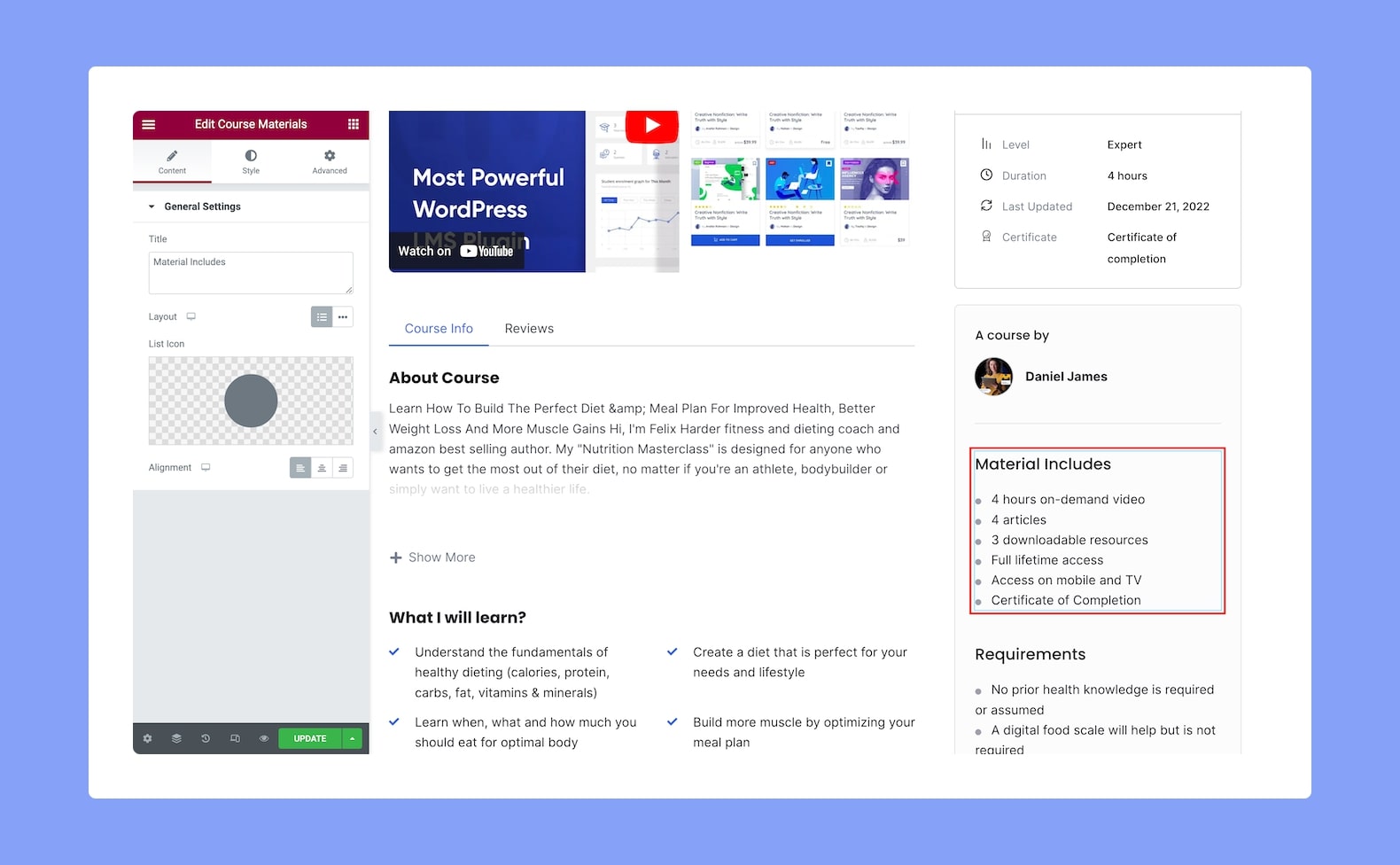
Use the Course Materials add-on to show your visitors what course materials they will get access to after they enroll in a particular course. This gives your future students an idea of what they can expect from it.
Once you have added this to your post or page, you will see the following settings:
Content
- Title: Use the text box to set the title for the Course Materials widget that you added.
- Layout: Set whether you want the content displayed in list format or inline. Since this is a responsive feature, you can set it differently for different types of devices.
- List Icon: Select the icon to bullet each list item from either the icon library or upload your own SVG file.
- Alignment: Select whether the content alignment will be to the left, center, or right. This is also a responsive feature, so you can set this differently for various display sizes.
Style
From the Style tab, you can customize the look of the Course Material add-on using the following options:
Section Title:
- Color: Select the color of the title text from a wide range of colors in the color palette.
- Typography: Adjust the title’s typography settings from here.
- Gap: Define the vertical gap size between the title and the rest of the content in the add-on. This is another responsive feature so you can set this differently for various display sizes.
List:
- Space Between: Set the space between each item on the list. This is a responsive feature so you can set this differently for various display sizes.
- Border Type: Select a border style from the drop-down list. Options include Default, None, Solid, Double, Dotted, Dashed, and Groove.
- Border Radius: Use this feature to curve the corners of the list shape. 0 means a square shape and the higher the value, the more rounded it gets. You can also click on the link icon to unlink them and define each corner differently. This is also responsive.
- Padding: Define its top, right, bottom, and left padding. You can also click on the link icon to unlink them and define them differently.
Icon:
- Color: Select the color of the list icon from a range of colors in the color palette.
- Size: Define the size of the list icon from here. You can set this differently for various display sizes as this is once again a responsive feature.
Text:
- Color: Select the color of the text from a range of colors in the color palette.
- Text Indent: Define the size of the text-indent from here. This is also a responsive feature so you can set this differently for different types of devices.
- Typography: Adjust the text’s typography settings from here.