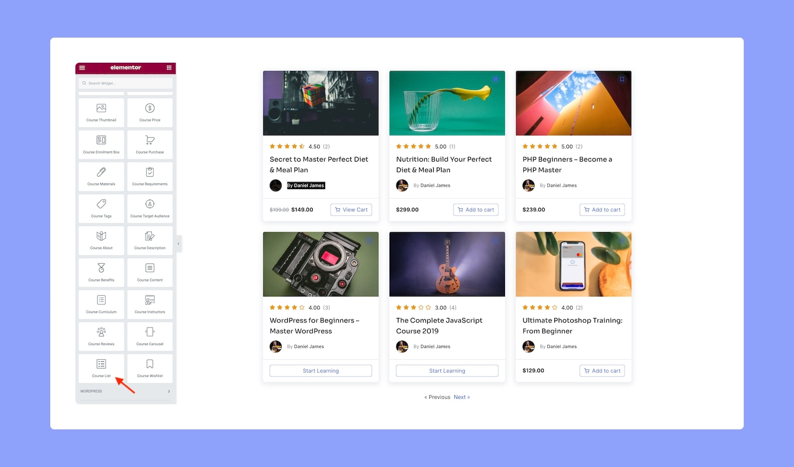
Display the Courses on your Tutor LMS site using the Course List Elementor add-on for Tutor LMS. Once you add it, you will be able to customize it using the options discussed below.
Content
From the Content tab, customize the settings for Layout, Query, and Pagination.
Layout:
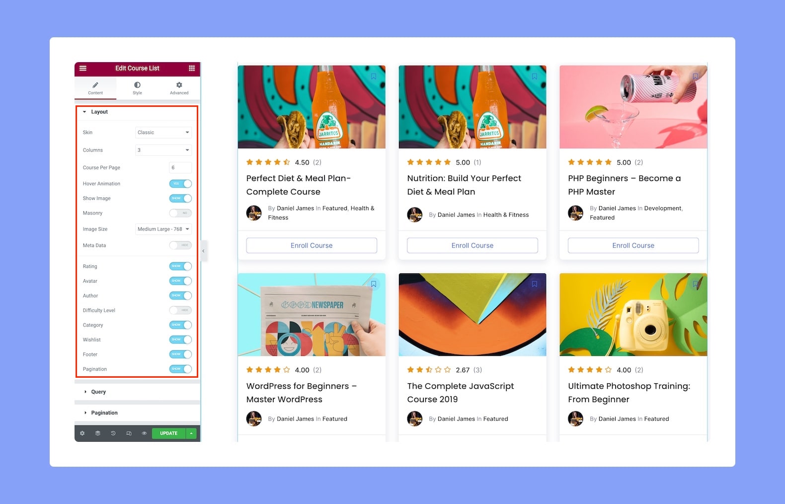
- Skin: Select the skin (layout style) from this dropdown list. Options include Classic, Card, Stacked, and Overlayed.
- Columns: Define the number of columns you want for your Course List.
- Courses Per Page: Define the number of Courses you want to display on the Course List per page.
- Hover Animation: Enable or disable each card’s Hover Animation from here.
- Show Image: Enable this to show the course thumbnail on each card in the Course List.
- Image Size: Select the size of the Image from this dropdown list. Apart from the predefined dimensions, you can also choose the Custom option to define your own values.
- Meta Data: Enable this to show the Meta Data on each card.
- Rating: Enable this to show the Star Rating on each card.
- Avatar: Enable this to show the Avatar on each card.
- Author: Enable this to show the Author on each card.
- Difficulty Level: Enable this to show the Difficulty Level on each card.
- Category: Enable this to show the Category on each card.
- Wishlist: Enable this to show the bookmark icon so that users can add courses to their Wishlist from here.
- Footer: Enable this to show the Footer section on each card.
- Pagination: Toggle this to allow pagination for the Course List.
Query:

Define the Query Settings for the Course Carousel from here. There are two options you can configure for each setting — which to include in the query and which to exclude.
- Categories: Select the categories you want to include or exclude from the course list.
- Authors: Select the authors from the author list from the drop-down menu depending on the exclude or include section.
- Order By: You can order the course list by the order date or by their title.
- Order: Choose if you want to set the course list courses by descending or by ascending order.
Pagination:

- Previous/Next: Select the type of label you want to display for your pagination. Options include Previous/Next, Previous/Next + Numbers, and Numbers.
- Page Limit: Limit the number of pages used for the Course List.
- Previous Label: Define the label text for the Previous button in the pagination.
- Next Label: Define the label text for the Next button in the pagination.
- Alignment: Set the alignment to left, center, or right.
Style
From the Style tab, define the Course List’s style and customize it to suit your page using the following configuration options:
Layout:
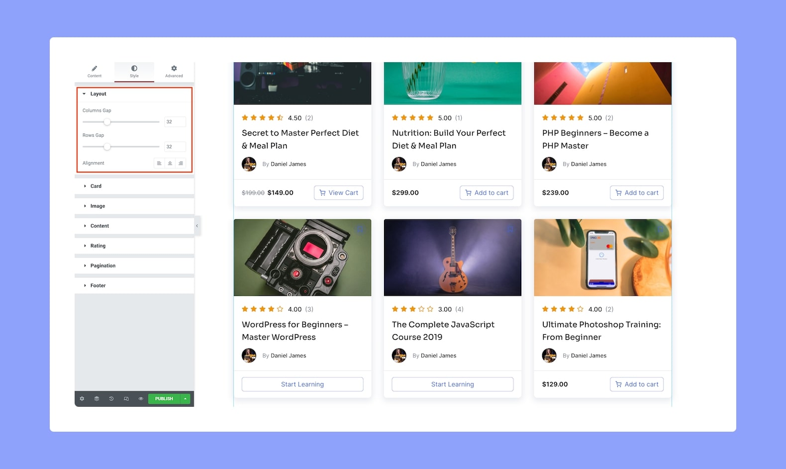
- Columns Gap: Define the gap size between the columns of the Course List from here.
- Rows Gap: Define the gap size between the rows of the Course List from here.
- Alignment: Set the alignment to left, center, or right.
Card:

- Background Color: Set the background color of the Cards from here.
- Normal VS Hover: Select if the next style settings will be applied to Normal or Hover Mode.
- Border Type: Select a border style from the drop-down list. Options include Default, None, Solid, Double, Dotted, Dashed, and Groove.
- Border Radius: Use this feature to curve the corners of the card shape. 0 means a square shape and the higher the value, the more rounded it gets. You can also click on the link icon to unlink them and define each corner differently.
- Box Shadow: Style the box’s shadow by clicking on the edit icon. You can set its color, horizontal shift, vertical shift, blur, and spread.
- Padding: Define its top, right, bottom, and left padding. You can also click on the link icon to unlink them and define them differently.
- Footer Separator Color: Set the footer separator color.
- Footer Separator Width: Define the footer separator width.
Image:

- Normal VS Hover: Select if the next style settings will be applied to Normal or Hover Mode.
- Background Type: Select the background type and style it from here. Options include Classic and Gradient.
- Classic: Here, you can set a solid color or an image as the background.
- Gradient: Here, you can set a two-tone ombre and also define its location, type (linear or radial), and angle.
- CSS Filters: Click on the edit icon to edit the CSS filters. Options include Blur, Brightness, Saturation, and Hue.
- Avatar: Next we have style settings for the Avatar i.e Instructor Profile.
- Size: Define the size of the Avatar.
- Border Radius: Use this feature to curve the corners of the avatar shape. 0 means a square shape and the higher the value, the more rounded it gets. You can also click on the link icon to unlink them and define each corner differently.
Content:
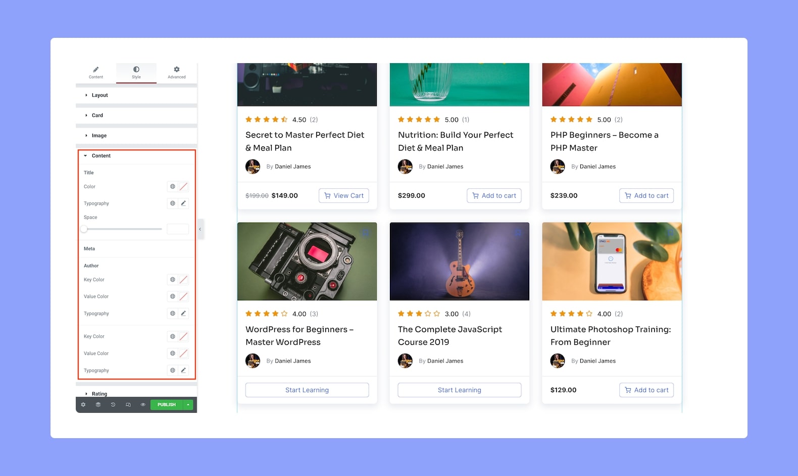
- Title
- Color: Set the Title’s color.
- Typography: Select the Title’s typography. More info on the typography settings can be found here.
- Space: Define the space in the Title’s typography.
- Meta
- Author: Set the Key Color, Value Color, and style its Typography
- Category: Set the Key Color, Value Color, and style its Typography
Rating:

- Star Color: Define the color of the Rating stars.
- Star Size: Set the size of the star.
- Typography: Style the Rating’s typography.
- Text Color: Set the color of the Rating text.
- Gap: Set the gap between the Rating stars. Since this is a responsive feature, you can set it differently for different screen sizes.
Pagination:
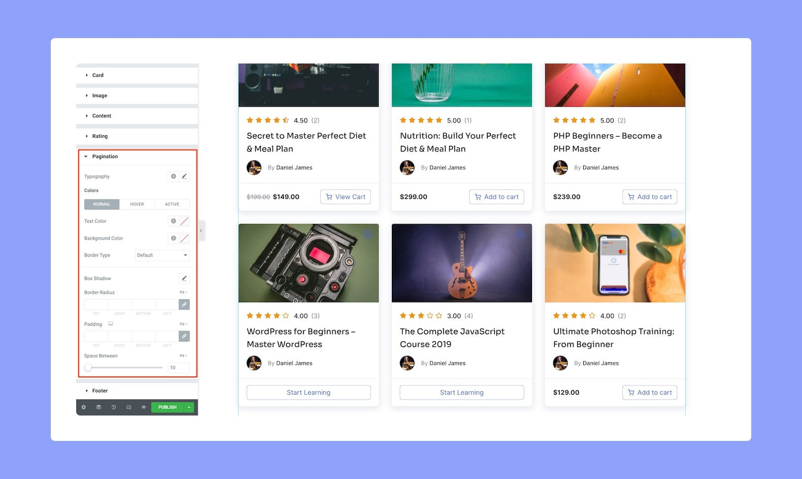
- Typography: Adjust the Pagination text’s typography from here.
- Colors: Set the Pagination’s colors using the following options.
- Normal VS Hover VS Active: Select if these color settings will be applied to the Pagination in Normal, Hover, or Active Mode.
- Text Color: Select the pagination text’s color.
- Background Color: Select the pagination background color from here.
- Border Type: Select a border style for the pagination from the drop-down list. Options include Default, None, Solid, Double, Dotted, Dashed, and Groove.
- Box Shadow: Style the Pagination box’s shadow. You can define its color, horizontal shift, vertical shift, blur, spread, and position i.e outline or inset.
- Border Radius: Use this feature to curve the corners of the Pagination’s shape. 0 means a square shape and the higher the value, the more rounded it gets. You can also click on the link icon to unlink them and define each corner differently.
- Padding: Define its top, right, bottom, and left padding. You can also click on the link icon to unlink them and define them differently. This is another responsive option so you can set this differently for different types of devices.
- Space Between: Define the gap space between the Previous and next pagination buttons.
Footer:
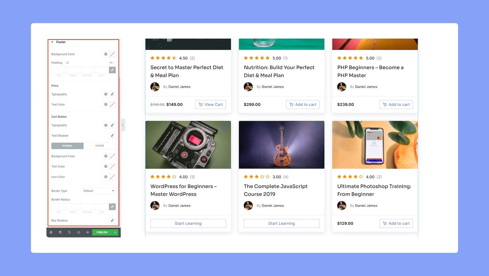
- Background Color: Set the background color of the Footer.
- Padding: Define its top, right, bottom, and left padding. You can also click on the link icon to unlink them and define them differently. Again, this is a responsive feature so you can set it differently for various devices.
- Price:
- Typography: Adjust the Price text’s typography from here.
- Text Color: Set the Price text’s color from here.
- Cart Button:
- Typography: Adjust the button’s typography.
- Text Shadow: Style the button text’s shadow. You can define the color, blur, horizontal shift, and vertical shift.
- Normal VS Hover: Select if the next style settings will be applied to Normal or Hover Mode.
- Background Color: Set the button’s background color.
- Text Color: Set the button’s text color.
- Icon Color: Set the color of the icon.
- Border Type: Select a border style from the drop-down list. Options include Default, None, Solid, Double, Dotted, Dashed, and Groove.
- Border Radius: Use this feature to curve the corners of the shape. 0 means a square shape and the higher the value, the more rounded it gets. You can also click on the link icon to unlink them and define each corner differently.
- Box Shadow: Style the box’s shadow. You can define its color, horizontal shift, vertical shift, blur, spread, and position i.e outline or inset.