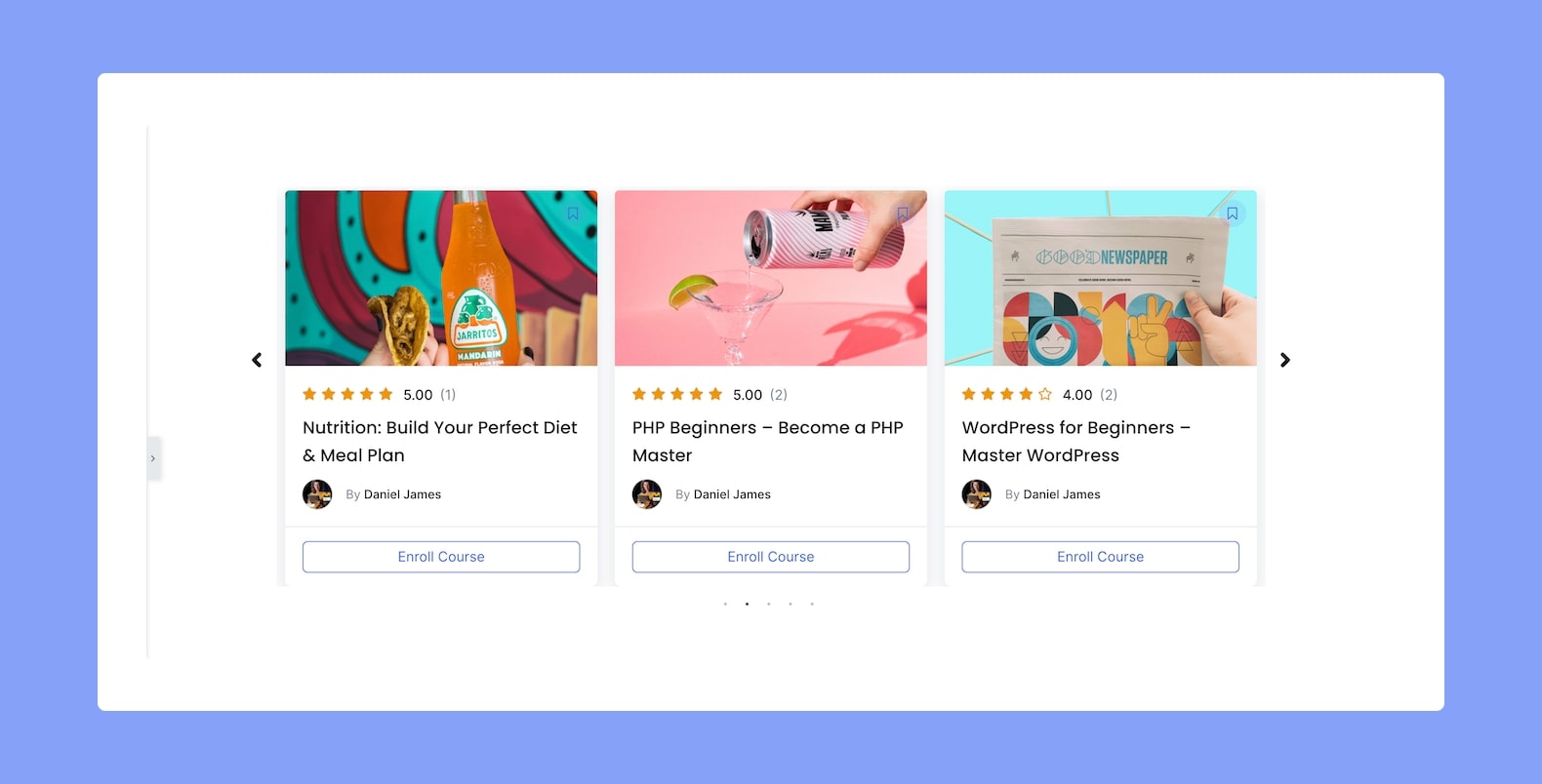
You can use the Course Carousel Elementor add-on for Tutor LMS if you want to showcase all your existing courses in a carousel format. So let us go over the options you’ll get once you add this add-on to your page or post.
Content
In the Content tab, you’ll find the sections Layout, Query, and Carousel Settings.
Layout:
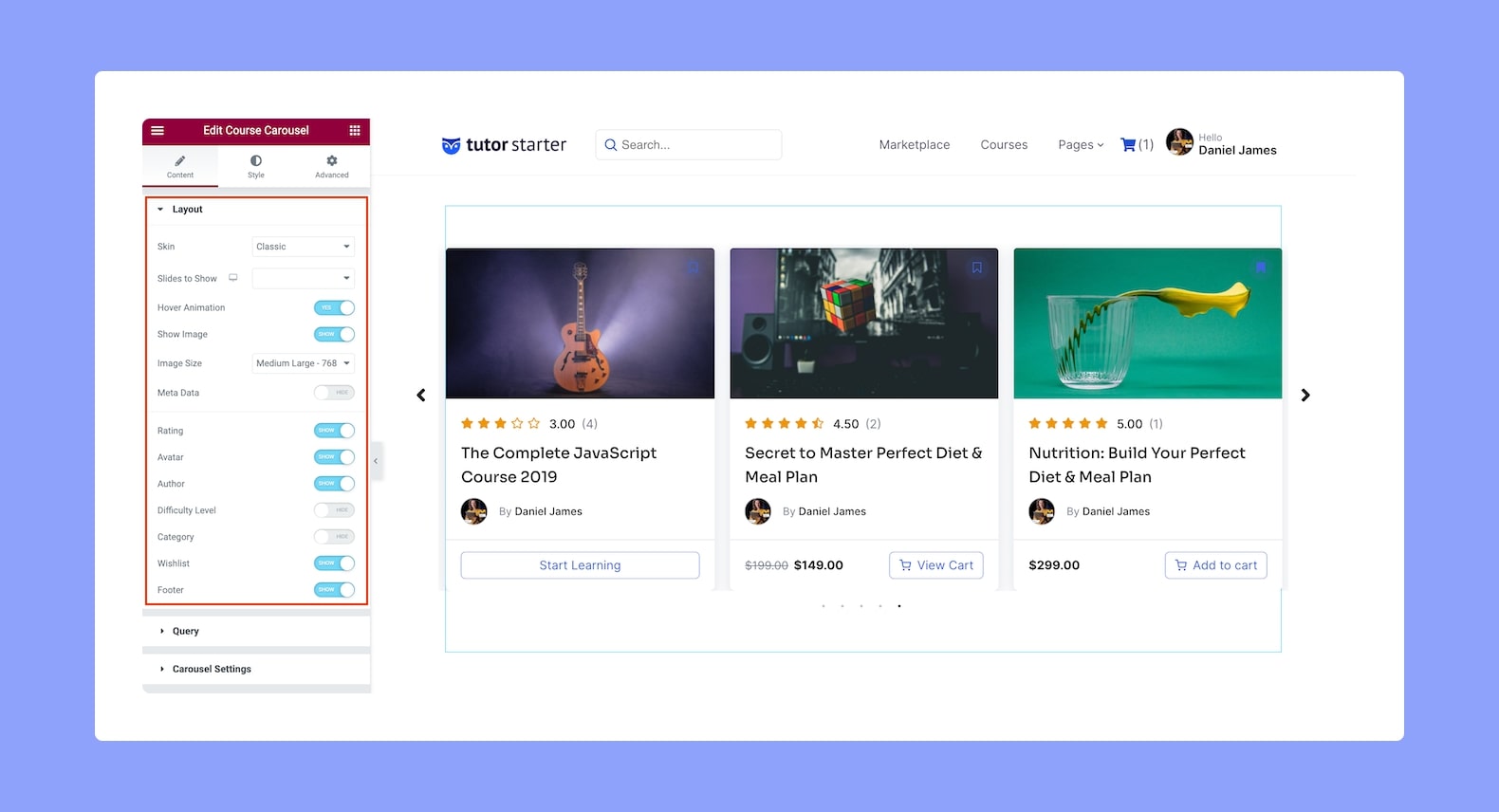
From the Layout section, you can customize the Carousel’s layout using the following options:
- Skin: Select the skin type you want to use for your Course Carousel from the drop-down list. Options include Classic, Card, Stacked, and Overlayed.
- Slides to Show: Select how many slides you want to show from here. This option is responsive so you can set this differently for each type of device. Simply click on the device icon to switch devices.
- Hover Animation: Enable or disable the animation that will occur when users hover over each carousel item.
- Show Image: Enable this to show the Course Feature Image for each Carousel Item.
- Image Size: Define the size of the Image for each Carousel Item.
- Image Ratio: Select the Image Ratio from the drop-down list.
- Meta Data: Enable or disable this to show or hide the Meta Data.
- Rating: Enable this if you want to show the Course Rating of each course.
- Avatar: Enable this if you want to show the Instructor’s avatar for each course.
- Difficulty level: Enable this to display the Difficulty Level of each course.
- Category: Enable this to show the category of each course.
- Wishlist: Enable this to allow users to add courses from the Course Carousel to their Wishlist. Doing so will make a bookmark icon appear at the corner of each Carousel Item.
- Footer: Enable this to show the Footer section for each course. The footer section basically contains the Enroll Now button.
Query:
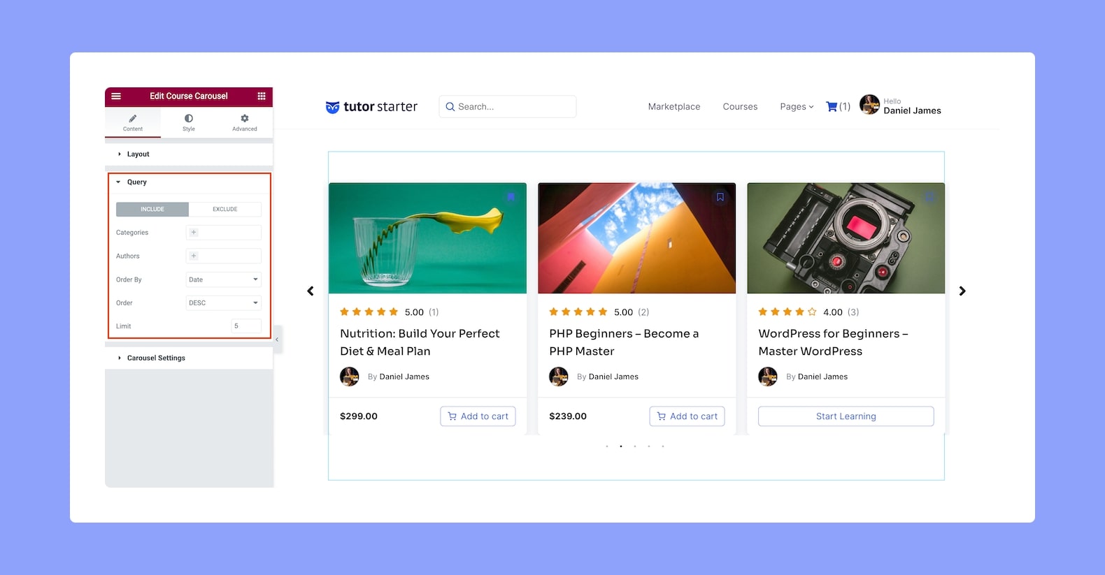
Define the Query Settings for the Course Carousel from here. There are two options you can configure for each setting — which to include in the query and which to exclude.
You will see the following settings for both the Include and Exclude options:
- Categories: Define the Categories you want to include or exclude from the course list.
- Authors: Select which Authors you want to include or exclude from the drop-down list.
- Order By: Select if the order of the course list will be sorted by Date or Title.
- Order: Choose whether the course list will be in ascending or descending order.
- Limit: Define how many courses you want to show in the Course Carousel. You can set the number manually or use the up and down arrow button to increase or decrease the number.
Carousel Settings:
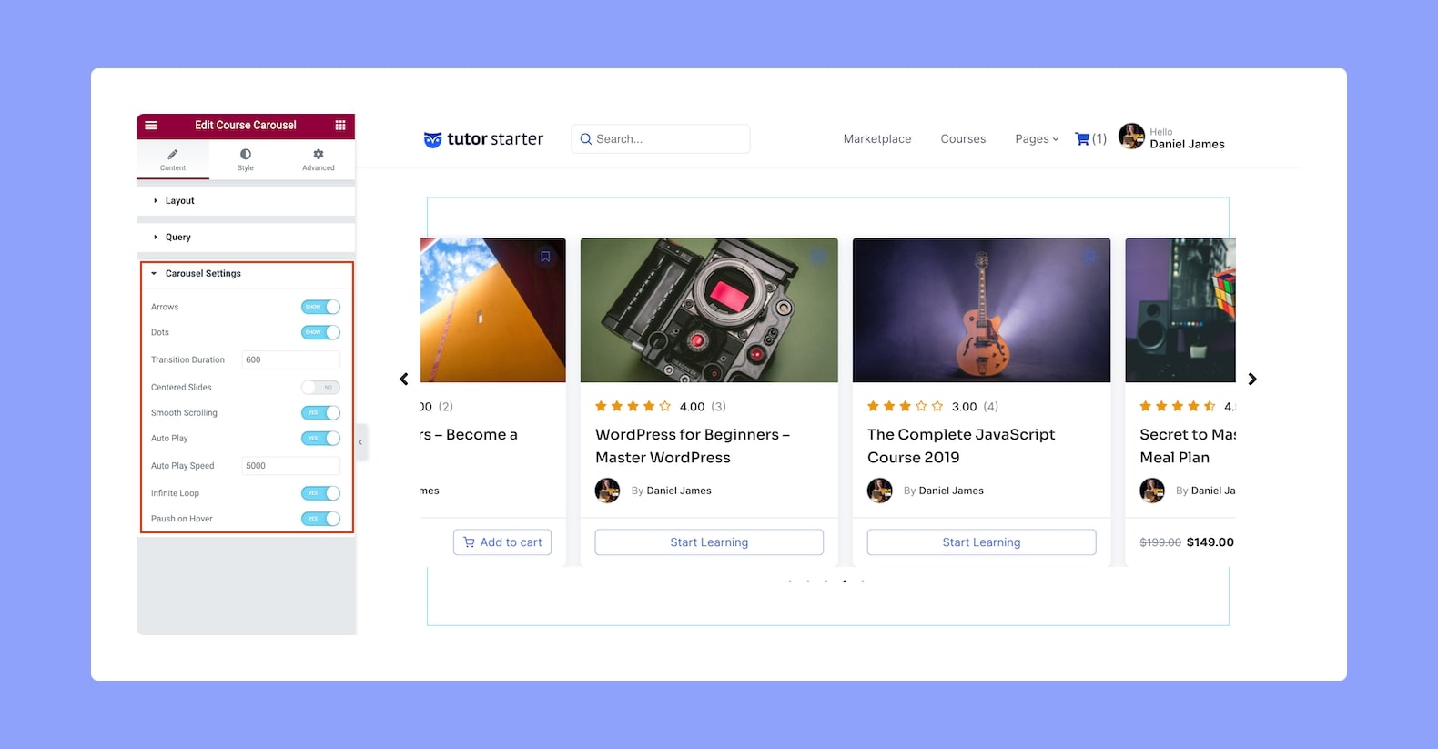
Use the following options to define the attributes you want to display on your Course Carousel:
- Arrows: Enable or disable the arrow navigation.
- Dots: Enable or disable the dots navigation.
- Transition Duration: Define the transition duration for the slides in the number field. Duration is in seconds.
- Centered Slides: Enable or disable Centered Slides for your Course Carousel.
- Smooth Scrolling: Enable or disable Smooth Scrolling.
- Autoplay: Enable this option if you want the Carousel slides to transition automatically.
- Autoplay Speed: Set the Autoplay Speed in the number field.
- Infinite Loop: Enable Infinite Loop if you want the last slide to transition back to the first one and loop repeatedly.
- Pause on Hover: Enable this option if you want the slide transition to pause when users hover over the Course Carousel.
- Pause on Interaction: Enable this to pause slide transition upon user interaction with the Course Carousel.
Style
From the Style tab, define the Course Carousel’s style and customize it to suit your page using the following configuration options:
Card:
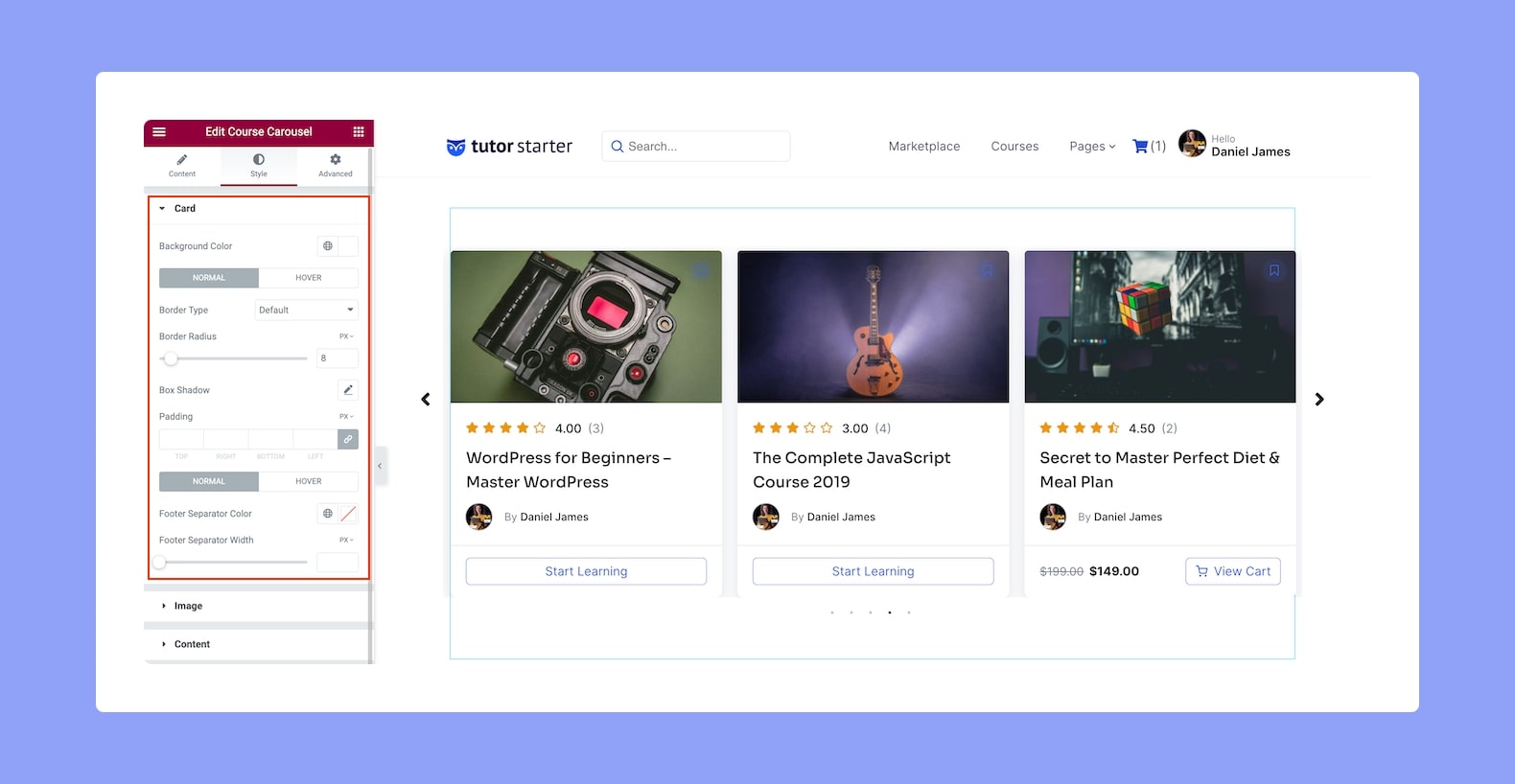
- Background Color: Set the background color of the Cards from here.
- Normal VS Hover: Select if the next style settings will be applied to Normal or Hover Mode.
- Border Type: Select a border style from the drop-down list. Options include Default, None, Solid, Double, Dotted, Dashed, and Groove.
- Border Radius: Use this feature to curve the corners of the card shape. 0 means a square shape and the higher the value, the more rounded it gets. You can also click on the link icon to unlink them and define each corner differently.
- Box Shadow: Style the box’s shadow by clicking on the edit icon. You can set its color, horizontal shift, vertical shift, blur, and spread.
- Padding: Define its top, right, bottom, and left padding. You can also click on the link icon to unlink them and define them differently.
- Footer Separator Color: Set the footer separator color.
- Footer Separator Width: Define the footer separator width.
Image:
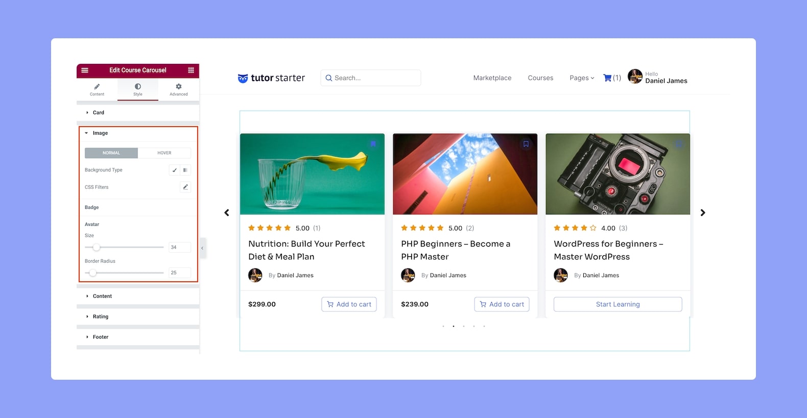
- Normal VS Hover: Select if the next style settings will be applied to Normal or Hover Mode.
- Background Type: Select the background type and style it from here. Options include Classic and Gradient.
- Classic: Here, you can set a solid color or an image as the background.
- Gradient: Here, you can set a two-tone ombre and also define its location, type (linear or radial), and angle.
- CSS Filters: Click on the edit icon to edit the CSS filters. Options include Blur, Brightness, Saturation, and Hue.
- Avatar: Next we have style settings for the Avatar i.e Instructor Profile.
- Size: Define the size of the Avatar.
- Border Radius: Use this feature to curve the corners of the avatar shape. 0 means a square shape and the higher the value, the more rounded it gets. You can also click on the link icon to unlink them and define each corner differently.
Content:

- Title
- Color: Set the Title’s color.
- Typography: Adjust the Title’s typography. More info on the typography settings can be found here.
- Space: Define the space in the Title’s typography.
- Meta
- Author: Set the Key Color, Value Color, and style its Typography
- Category: Set the category’s Key Color.
Rating:
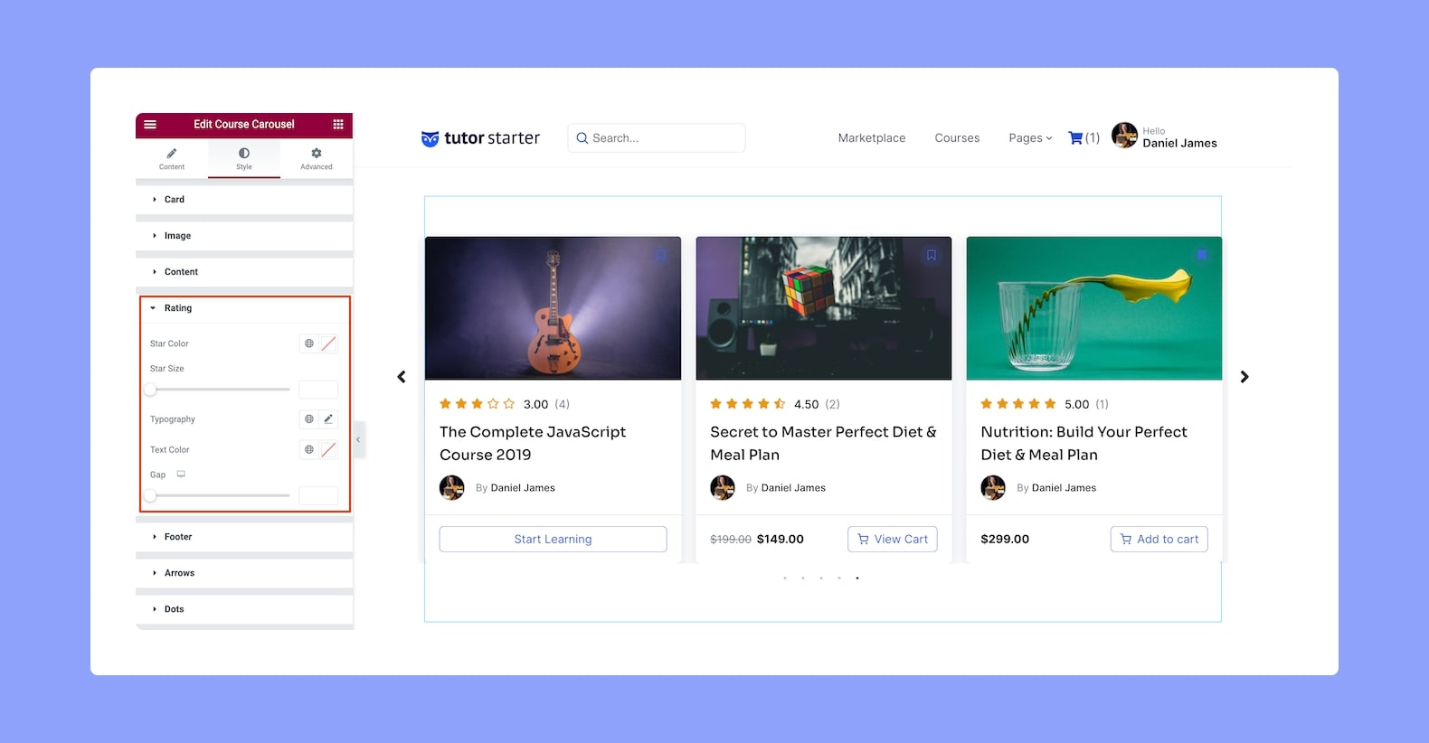
- Star Color: Define the color of the Rating stars.
- Star Size: Set the size of the star.
- Typography: Style the Rating’s typography.
- Text Color: Set the color of the Rating text.
- Gap: Set the gap size between the Rating stars. Since this is a responsive feature, you can set this differently for different screen display sizes.
Footer:
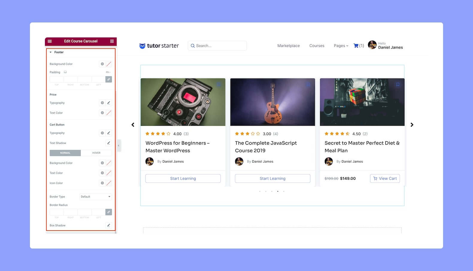
- Background Color: Set the background color of the Footer.
- Padding: Define its top, right, bottom, and left padding. You can also click on the link icon to unlink them and define them differently. This is also a responsive feature so you can set this differently for device types.
- Price:
- Typography: Adjust the Price text’s typography from here.
- Text Color: Set the Price text’s color from here.
- Cart Button:
- Typography: Adjust the button’s typography.
- Text Shadow: Style the button text’s shadow. You can define the color, blur, horizontal shift, and vertical shift.
- Normal VS Hover: Select if the next style settings will be applied to Normal or Hover Mode.
- Background Color: Set the button’s background color.
- Text Color: Set the button’s text color.
- Icon Color: Set the color of the icon.
- Border Type: Select a border style from the drop-down list. Options include Default, None, Solid, Double, Dotted, Dashed, and Groove.
- Border Radius: Use this feature to curve the corners of the shape. 0 means a square shape and the higher the value, the more rounded it gets. You can also click on the link icon to unlink them and define each corner differently.
- Box Shadow: Style the box’s shadow. You can define its color, horizontal shift, vertical shift, blur, spread, and position i.e outline or inset.
Arrows:
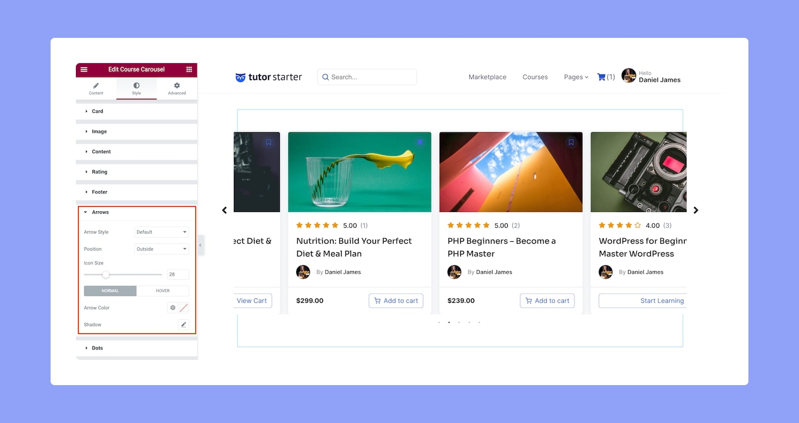
- Arrow Style: Select the style of the Arrow used to navigate the slides from the drop-down list.
- Position: Select the position of the Arrows from the drop-down list.
- Icon Size: Define the size of the icon.
- Normal VS Hover: Select if the next style settings will be applied to Normal or Hover Mode.
- Arrow Color: Select the Arrow color.
- Shadow: Style the Arrow’s shadow. You can set its color, horizontal shift, vertical shift, blur, spread, and position i.e outline or inset.
Dots:
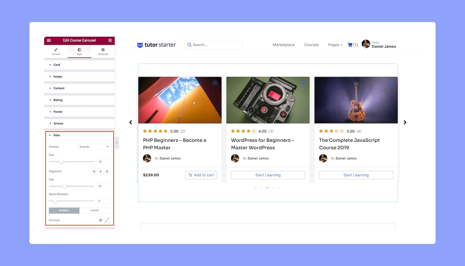
- Position: Define where the navigation Dots will be positioned from the drop-down list. Options include Outside and Inside.
- Size: Set the size of the Dots.
- Alignment: Set whether the Dots’ alignment will be to the left, center, or right.
- Gap: Define the vertical gap size of the Dots.
- Space Between: Set the space between each of the Dots.
- Normal VS Hover: Select if the next style settings will be applied to Normal or Hover Mode.
- Fill Color: Define the fill color of the Dots.