The “Bundle Overview” Elementor widget provides a comprehensive snapshot of the course bundle. Its ultimate purpose is to give users a quick glance at the richness and depth of the listed courses within the bundle.
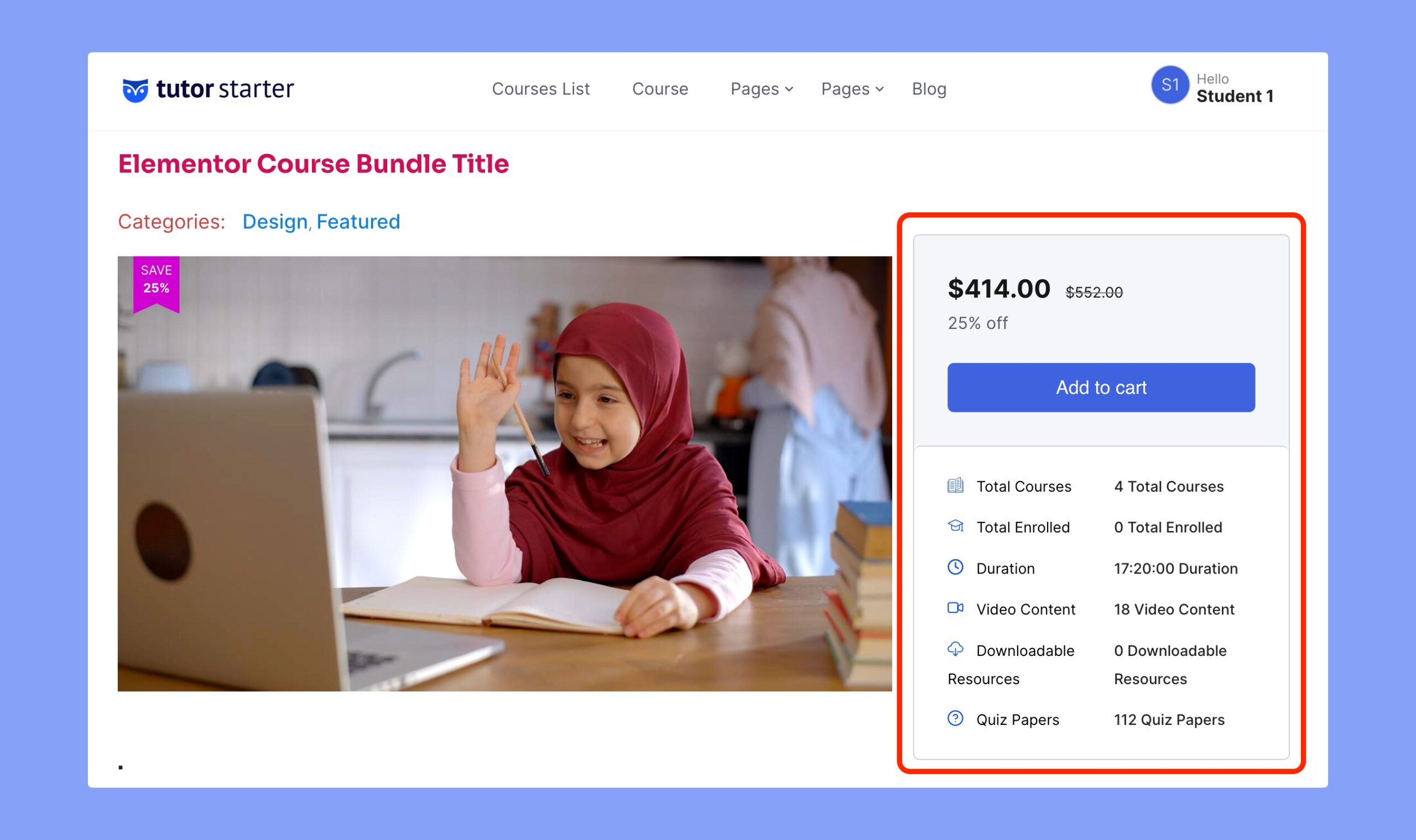
Here’s the frontend preview of the overview section of the course bundle:

As you can see, this widget showcases the following information on your course page –
- Total number of listed courses
- Number of enrolled students
- Duration of the courses listed on the bundle course
- Number of video content
- Number of downloaded resources and
- The number of quiz papers.
These statistics will be automatically updated right after you add or remove courses from the bundle.
Content Settings

Under the content settings, you can update the following option:
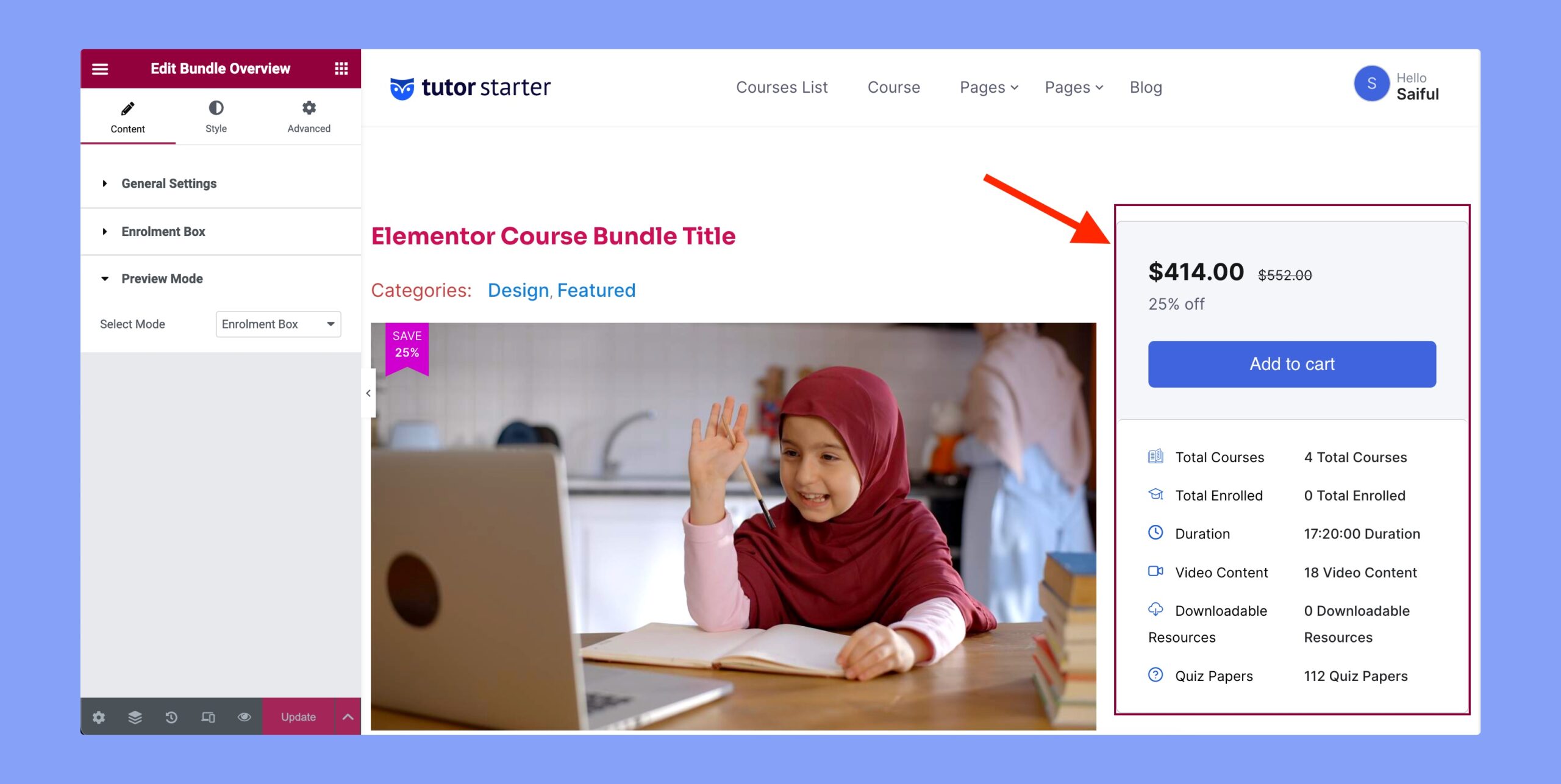
- General Settings: You can choose to set the alignment of the overview section from here. The available alignment options are left, center, and right.
- Enrolment Box: Set whether you want to showcase the enrolment box or not.
- Preview Mode: Choose whether you want to display the enrolled box or the enrolment box.
Style Settings
The Style tab contains the customization options of the Bundle Overview section. You can set the color, typography, and other options from here. The available options are the overview box and the price & cart button.
Price & Cart Button

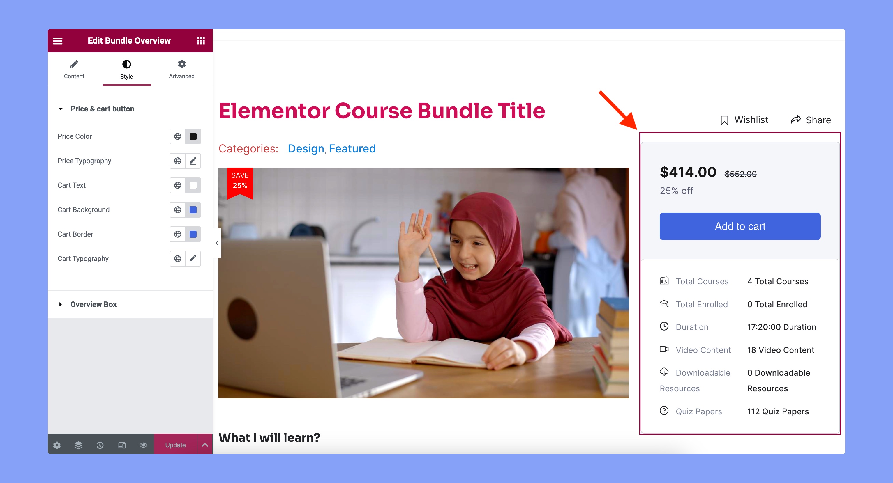
You can customize the appearance of the price and cart box from here. The customization options are:
- Price Color: Set the text color for the price.
- Price Typography: Set the typography of the price text.
- Cart Text: Specify the color for the text of the cart button.
- Cart Background: Set the background color for the cart button.
- Cart Border: Choose the border color for the cart button.
- Cart Typography: Select the typography for the cart button text.
Overview Box

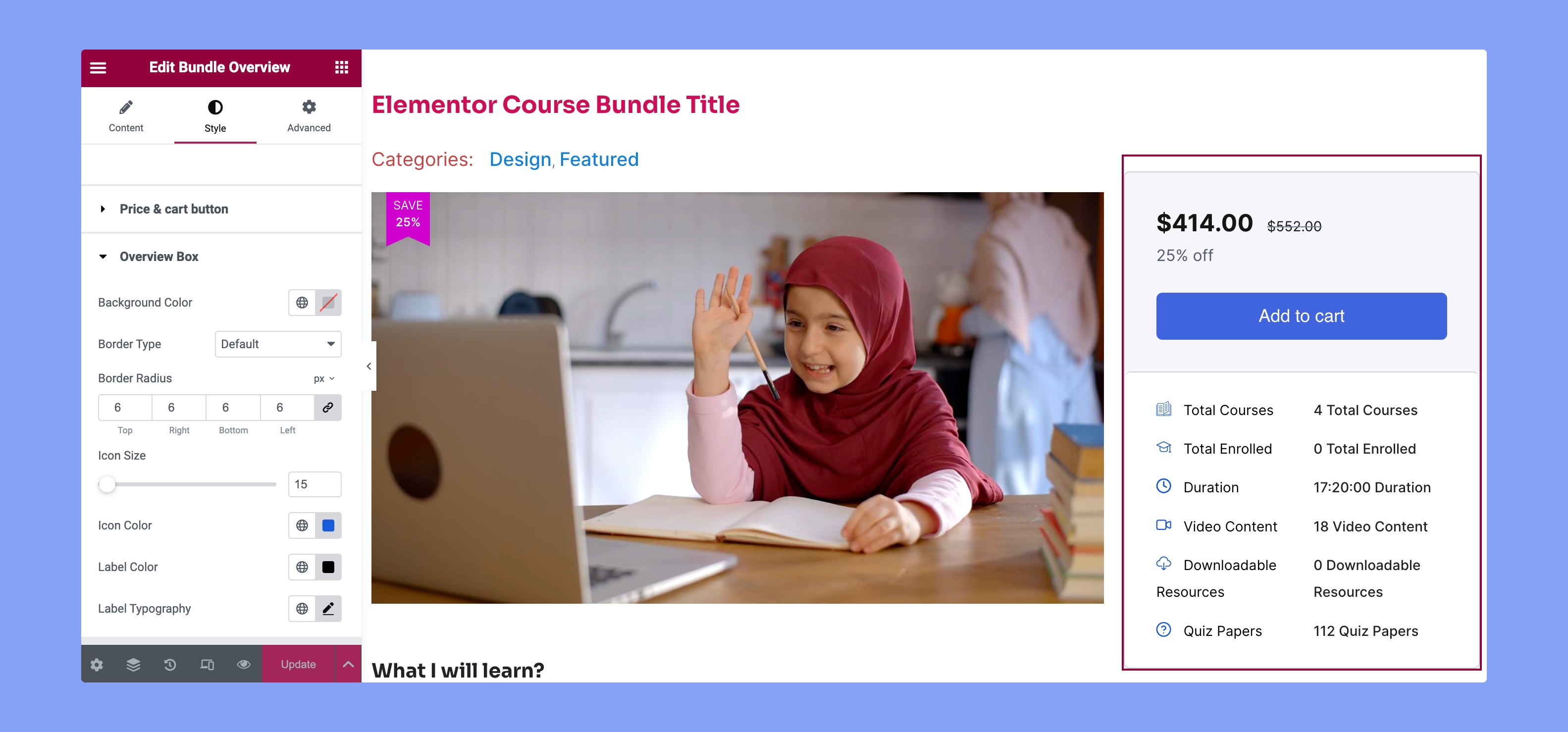
You can customize the design of the overview box from here. You can customize the following options from here:
- Background Color: Choose the background color of the total overview box.
- Border Type: Choose the style of the border that suits your aesthetic.
- Border Radius: Adjust the curvature of corners for a personalized touch.
- Icon Size: Scale the icon size for optimal visual balance.
- Icon Color: Define the color of icons to match your overall palette.
- Label Color: Customize label color for seamless integration.
- Label Typography: Tailor label text style to enhance readability and visual appeal.
