This documentation pertains to the smaller components accessible within the Single Course tab of the Tutor LMS section.
Title
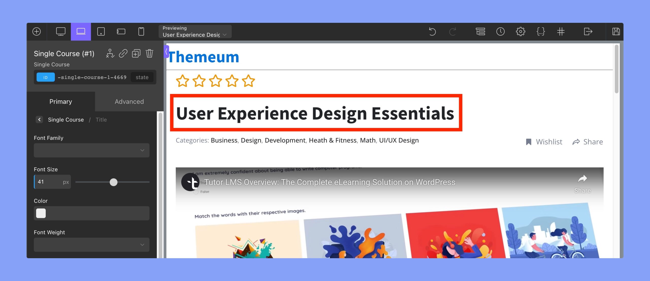
The typography of the title can be modified using the Oxygen Builder text field editor using this tab.
Rating
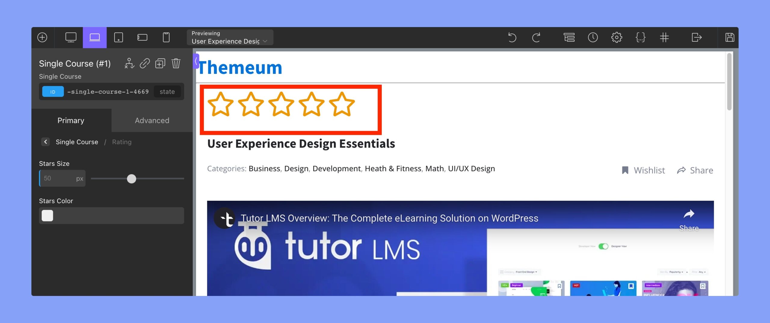
Use this tab to change the appearance of the course rating:
- Stars size: change the size of the star in the rating system. The units are in px (pixels).
- Stars Color: use this RGBA color picker to select the color of the stars in the rating system.
Author
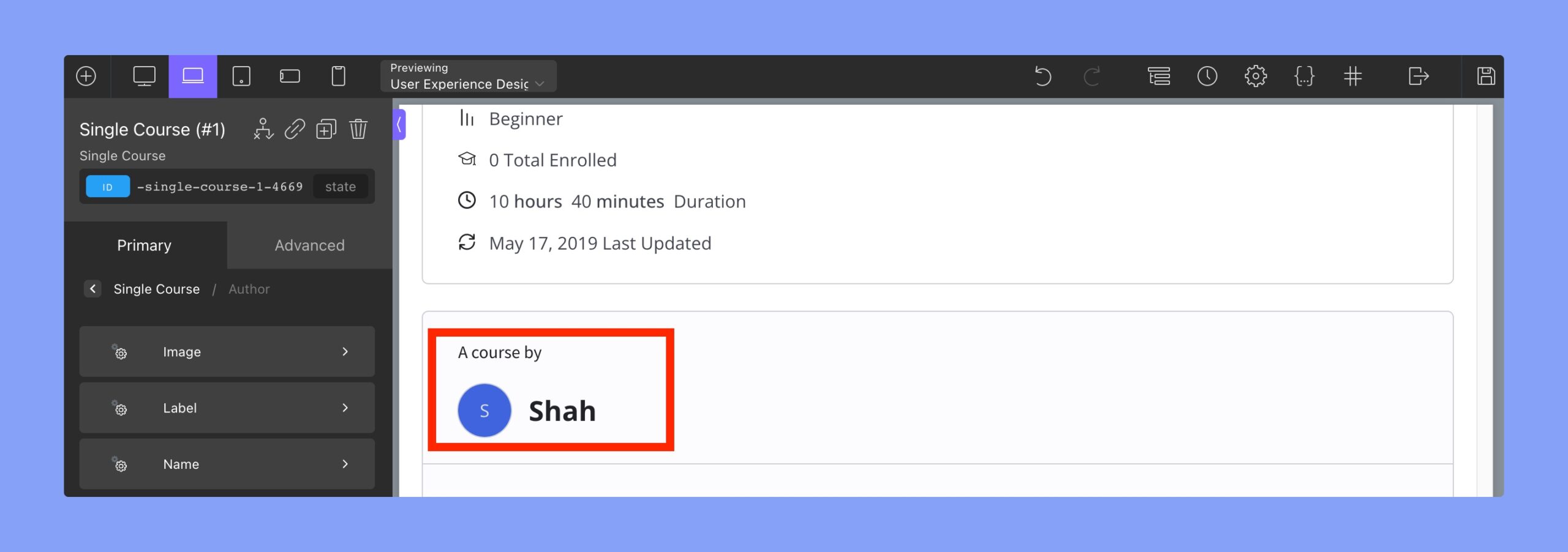
Use this tab to change the attributes for the Course Author field
- Image
- Height: Select image height. The units are in px (pixels)
- Width: Select image width. The units are in px (pixels)
- Font Size: Change the font size of the icon text
- Line Height: Use this to tweak the text position
- Label: You can use the Oxygen Builder text field editor to change the typography of the Author Label.
- Name: You can use the Oxygen Builder text field editor to change the typography of the Author Name.
Social Share
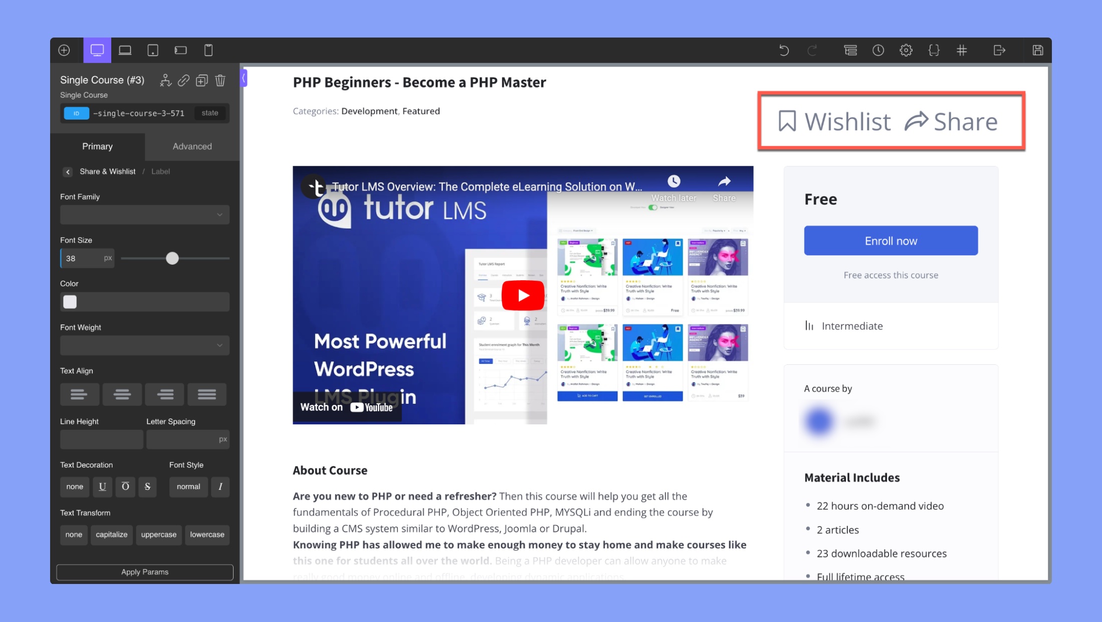
This tab changes the visuals of the social share icons
- Label: You can use the Oxygen Builder text field editor to change the typography of the “Share” label.
- Original Icon: You can use the Oxygen Builder text field editor to change the typography of the Share Icons without hover.
- Hovered Icon: You can use the Oxygen Builder text field editor to change the typography of the Share Icons with hover.
Categories
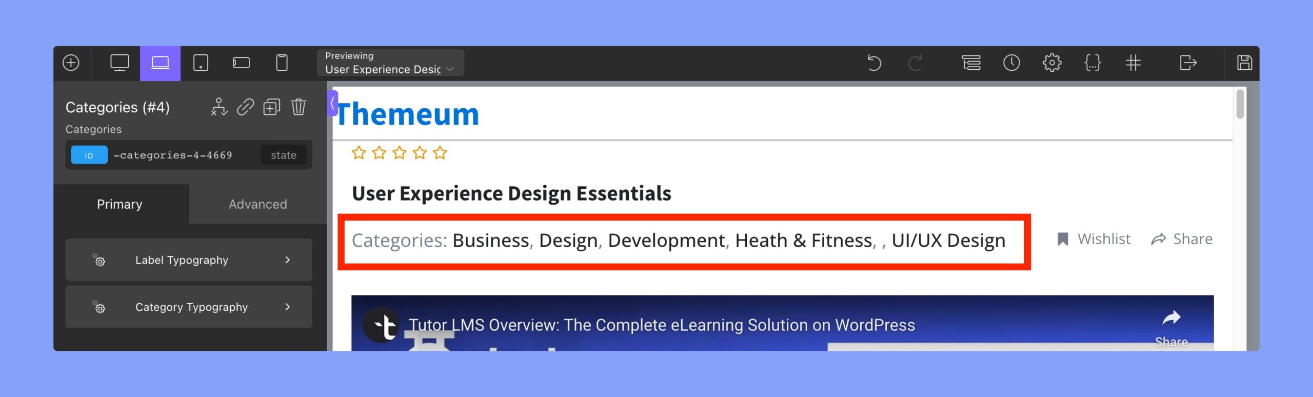
The “Categories” tab in the Oxygen Builder for Tutor LMS allows you to modify the styling of the categories section in your Single Course template. The following are the settings available within this tab:
- Label Typography: Here, you can adjust the typography of the category label, including the font family, font size, font weight, and font color.
- Category Typography: This setting allows you to modify the typography of the category names, including the font family, font size, font weight, and font color.
Course Description
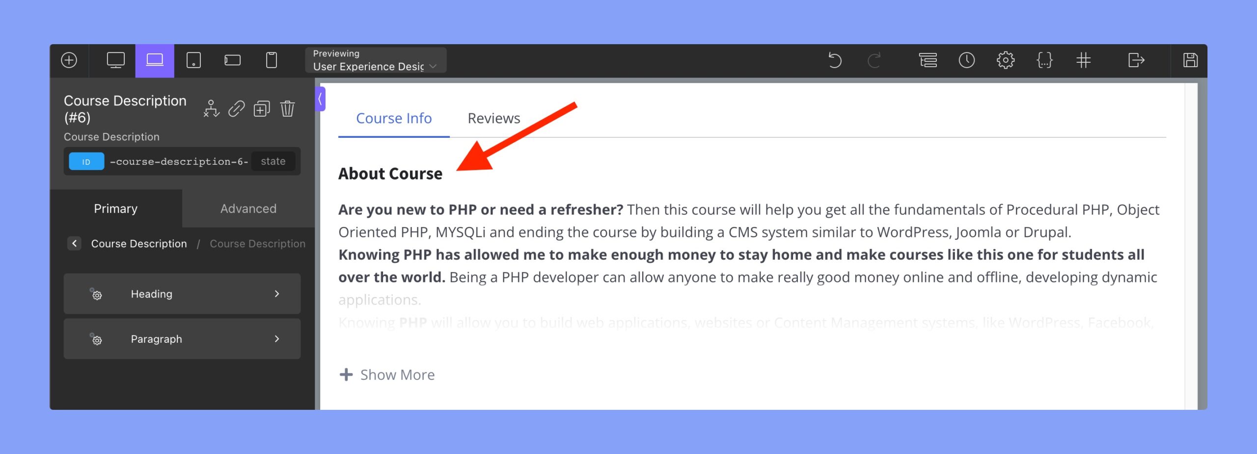
This tab in Oxygen Builder Integration for Tutor LMS is used to edit the Course Description or About section of the course page.
Heading: This tab allows you to change the typography of the heading in the “About” section using the Oxygen Builder text field editor.
Paragraph: To modify the typography of the paragraph in the About section, you can utilize the Oxygen Builder text field editor.
Course Content
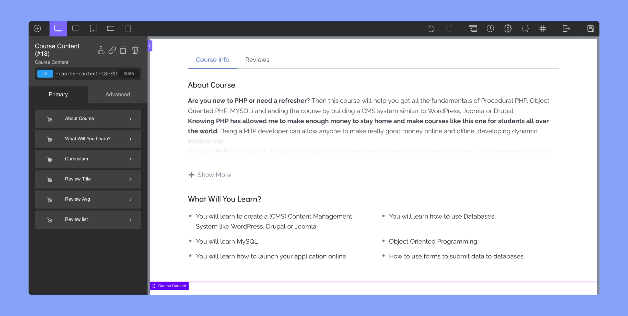
About Course:
- Heading: This tab allows you to change the typography of the heading in the “About” section using the Oxygen Builder text field editor.
- Paragraph: To modify the typography of the paragraph in the About section, you can utilize the Oxygen Builder text field editor.
What Will You Learn?:
- Title: This tab allows you to change the typography of the section’s title. You can edit font family, font size, font weight, text alignment, line height, letter spacing, text decoration, font style, and text transform.
- Icon: This tab allows you to edit the icon for the items in the section. You can customize its size and color.
- Item Typography: This tab allows you to change the typography of the items in the section. You can edit font family, font size, font weight, text alignment, line height, letter spacing, text decoration, font style, and text transform.
- Spacing: This tab allows you to adjust the spacing between the title, icons, and items in the section. You can adjust the margin and padding for each of these elements to create the desired layout.
Curriculum:
- Header Title: This tab allows you to change the typography of the Curriculum section’s main header.
- Topic Title: This tab allows you to edit the typography of the topics in the curriculum.
- Active Topic Title: This tab lets you modify the typography of the active topic in the curriculum.
- Lesson, Quiz & Assignment Title: This tab lets you change the typography of the lesson, quiz, and assignment titles.
- Lesson, Quiz & Assignment Icon: This tab allows you to change the icon for lessons, quizzes, and assignments.
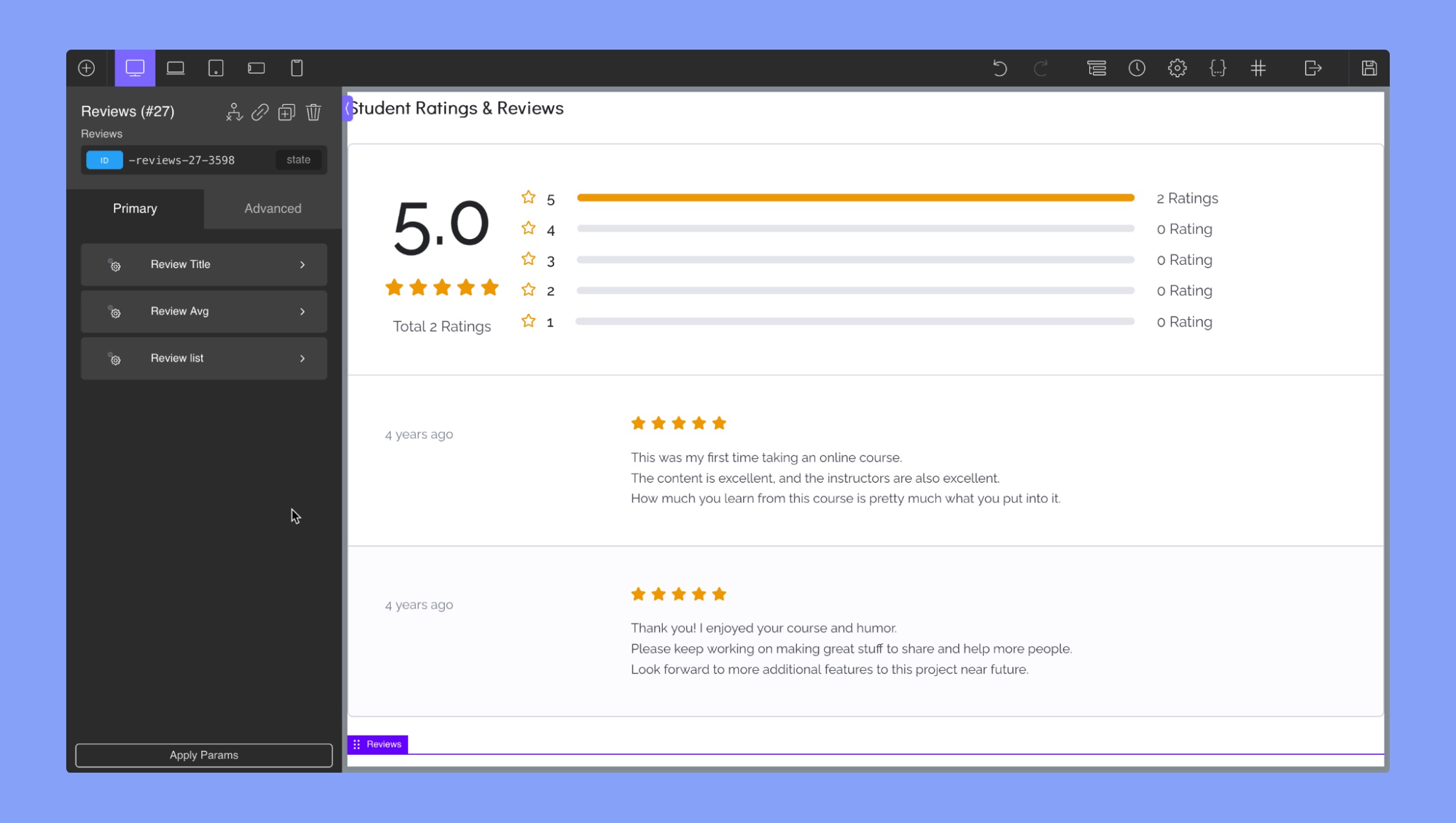
Review Title: The “Review Title” section in Oxygen Builder integration for Tutor LMS allows you to customize the title of the review section for a course. You can use the text field editor to change the typography of the review title, including font family, font size, font weight, color, and text alignment.
Review Avg:
- Rating Numbers: You can use the Oxygen Builder text field editor to change the typography of the review’s rating number (4 out of 5 stars).
- Rating Stars: This allows you to change the size and color of the rating stars.
- Total Count: This allows you to change the typography of the total review count, including font family, font size, font weight, color, and text alignment.
- Right Rating Bar: This allows you to customize the appearance of the rating bar on the right side of the review section, including the color, height, padding, margin, and width of the bar.
- Right Rating Stars: This allows you to customize the appearance of the rating stars on the right side of the review section, including the size and color of the stars.
- Right Rating Text: This allows you to customize the appearance of the rating text on the right side of the review section, including font family, font size, font weight, color, and text alignment.
Review List:
Image:
- Height: Select image height. The units are in px (pixels)
- Width: Select image width. The units are in px (pixels)
- Font Size: Change the font size of the icon text
- Line Height: Use this to tweak the text position
Name: You can use the Oxygen Builder text field editor to change the typography of the reviewer.
Time: You can use the Oxygen Builder text field editor to change the typography of the review’s time.
Stars:
- Color: Select the color of the rating stars
- Size: Select the size of the rating stars
Content: You can use the Oxygen Builder text field editor to change the typography of the review content.
Curriculum
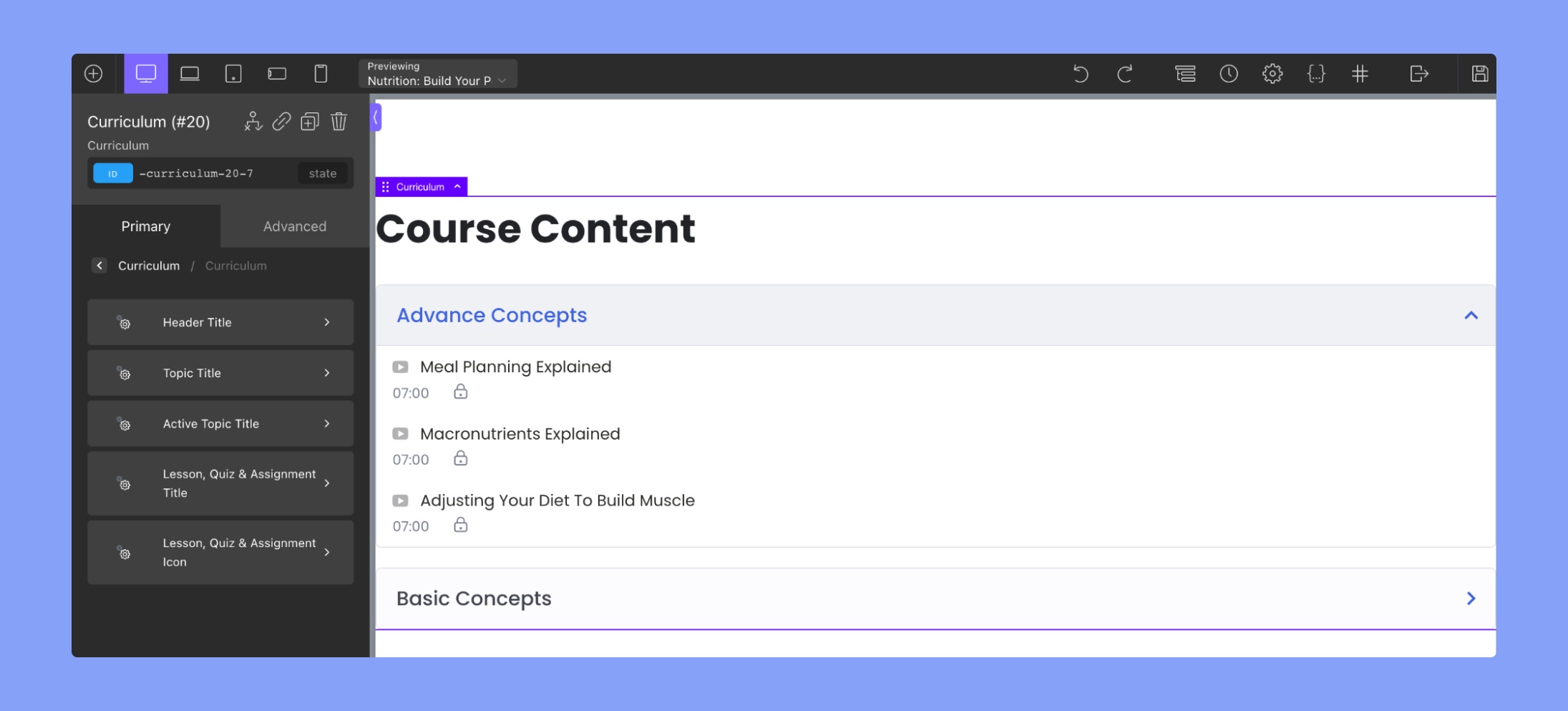
The Curriculum section in Oxygen Builder integration for Tutor LMS allows you to customize the design of the “Course Content.” The settings under “Curriculum” include:
- Header Title: This tab allows you to change the typography of the Curriculum section’s main header.
- Topic Title: This tab allows you to edit the typography of the topics in the curriculum.
- Active Topic Title: This tab lets you modify the typography of the active topic in the curriculum.
- Lesson, Quiz & Assignment Title: This tab lets you change the typography of the lesson, quiz, and assignment titles.
- Lesson, Quiz & Assignment Icon: This tab allows you to change the icon for lessons, quizzes, and assignments.
Benefits
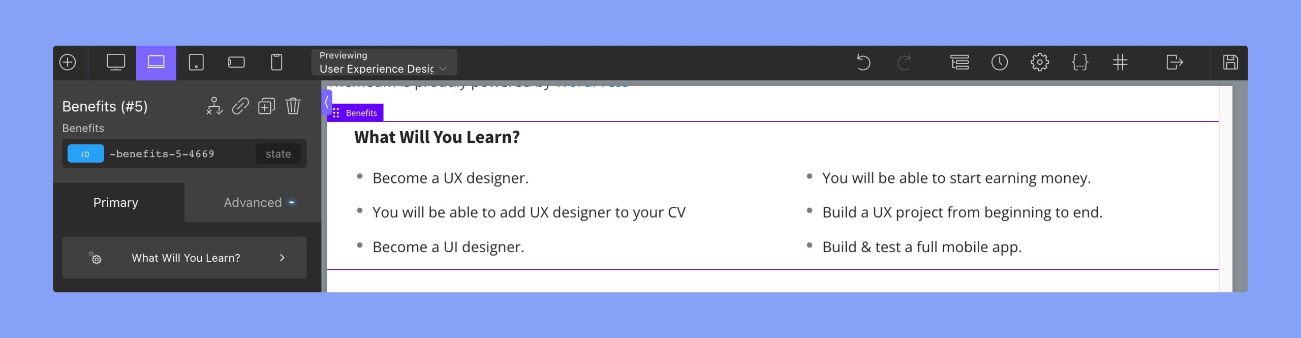
What Will You Learn?:
Title: This tab allows you to change the typography of the section’s title. You can edit font family, font size, font weight, text alignment, line height, letter spacing, text decoration, font style, and text transform.
Item Typography: This tab allows you to change the typography of the items in the section. You can edit font family, font size, font weight, text alignment, line height, letter spacing, text decoration, font style, and text transform.
Icon: This tab allows you to edit the icon for the items in the section. You can customize its size and color.
Spacing: This tab allows you to adjust the spacing between the title, icons, and items in the section. You can adjust the margin and padding for each of these elements to create the desired layout.
Requirements
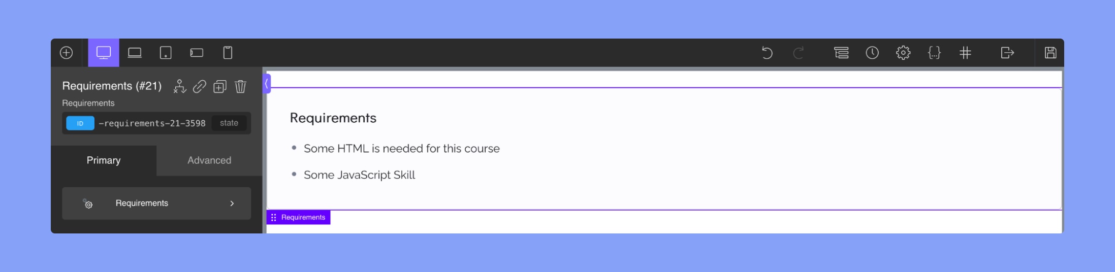
- Title: This section allows you to change the font family, font size, font weight, text alignment, font style, text transform, line height, letter spacing, text decoration, and font color of the materials title.
- Icon: In this section, you can select the color and size of the rating stars displayed for the materials.
- Typography: This section allows you to change the font family, font size, font weight, text alignment, font style, text transform, line height, letter spacing, text decoration, and font color of the materials text.
- Spacing: This section allows you to adjust the padding around the section and the vertical spacing between lines.
Target Audience
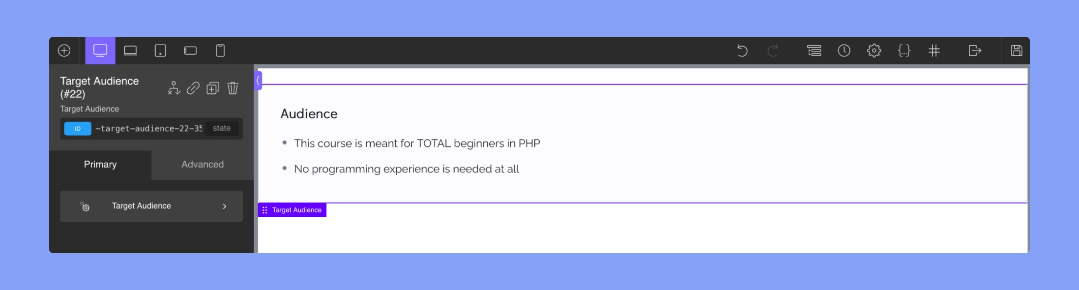
- Title: This section allows you to change the font family, font size, font weight, text alignment, font style, text transform, line height, letter spacing, text decoration, and font color of the materials title.
- Icon: In this section, you can select the color and size of the rating stars displayed for the materials.
- Typography: This section allows you to change the font family, font size, font weight, text alignment, font style, text transform, line height, letter spacing, text decoration, and font color of the materials text.
- Spacing: This section allows you to adjust the padding around the section and the vertical spacing between lines.
Materials
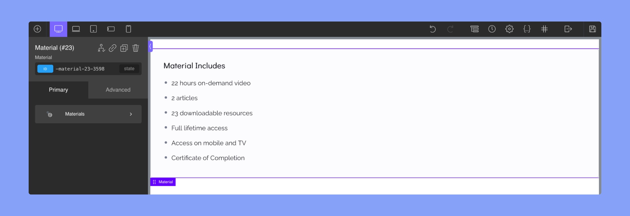
- Title: This section allows you to change the font family, font size, font weight, text alignment, font style, text transform, line height, letter spacing, text decoration, and font color of the materials title.
- Icon: In this section, you can select the color and size of the rating stars displayed for the materials.
- Typography: This section allows you to change the font family, font size, font weight, text alignment, font style, text transform, line height, letter spacing, text decoration, and font color of the materials text.
- Spacing: This section allows you to adjust the padding around the section and the vertical spacing between lines.
Thumbnails
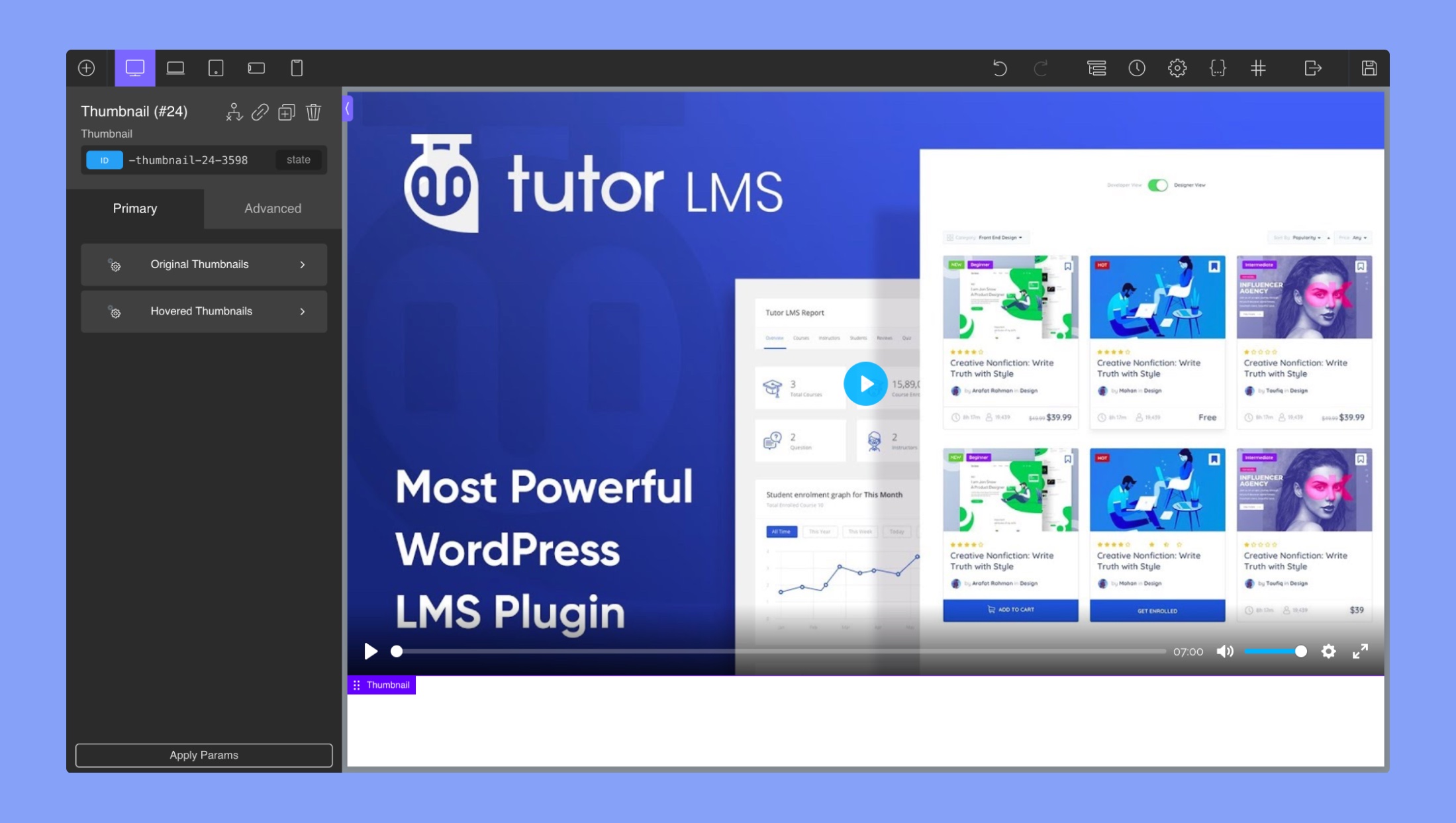
The “Thumbnail” section in the Oxygen Builder allows you to customize the appearance of the video thumbnail for your Tutor LMS course. It contains two different sub-sections; Original Thumbnails and Hovered Thumbnails. Both of these sections contain the following settings:
- Opacity: Change the opacity of the thumbnail
- Background Color: Change the color of the thumbnail background
- Border Color: Change the color of the thumbnail border
- Border Width: Change the border width
- Margin: Add a margin around the video thumbnail
- Box Shadow: Toggle between inset and outset shadow
- Shadow Color: Use this RGBA color picker to choose a shadow color
- Shadow Horizontal Offset: Select the horizontal position of the shadow
- Shadow Vertical Offset: Select the vertical position of the shadow
- Shadow Blur: Select a blur intensity effect
- Shadow Spread: Select how far the shadow spreads
Enrollment Box
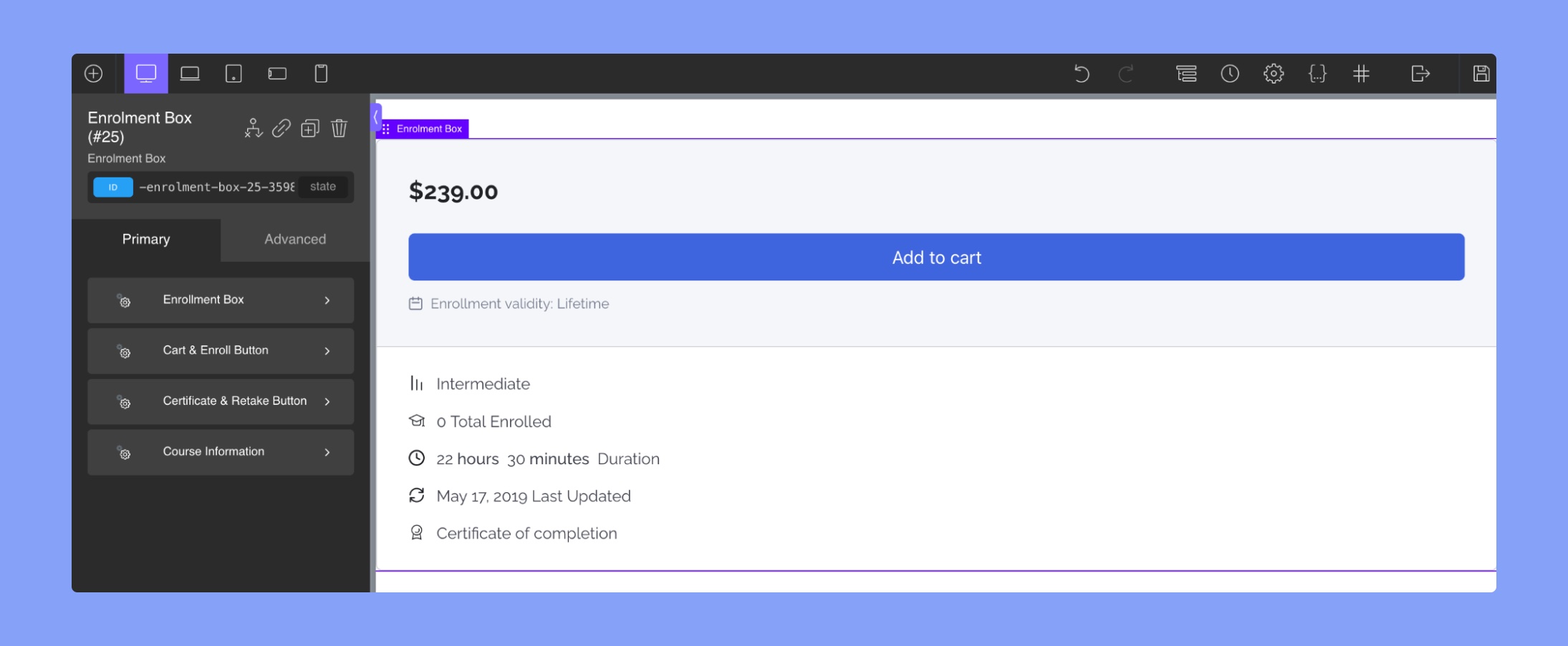
Enrollment Box
Borders: Use this tab to change the borders of the button.
- Currently Editing Border: Choose which border you want to edit
- Border Color: Select the border-color
- Border Width: Select the width of the button’s border
- Border Style: Pick a border Style
- Border Radius: Pick a radius for the curved corners of the button. Use this to create a rounded square effect on the button. You can also click on “edit individual radii” to change each radius separately.
Course Price: This section allows users to set and style the course price. Users can edit the typography of the price and adjust the font size, weight, and color.
Course Progress Title: This section enables users to customize the title of the course progress title. Users can edit the typography of the title and adjust the font size, weight, and color.
Course Progress Text: This section allows users to customize the text displayed in the course progress bar. Users can edit the typography of the text and adjust the font size, weight, and color.
Course Progress Bar: This section provides options to style the course progress bar, including adjusting the height, color, and fill color.
Cart & Enroll Button
- Button Padding: Users can adjust the padding around the enrollment and cart buttons to increase or decrease the spacing between the text and the edge of the button.
- Background Colour: Users can change the background color of the enrollment and cart buttons to any color they desire.
- Color: Users can change the text color of the enrollment and cart buttons to match the background color or any other color they prefer.
- Hover Background Color: Users can set a different background color for the enrollment and cart buttons when a user hovers over the buttons with their mouse.
The editor also provides additional customization options under the following sub-sections:
Typography: You can use this section to change the font family, font size, font weight, text alignment, font style, text transform, line height, letter spacing, text decoration, and font style.
Borders: This section allows you to adjust the border width, color, style, and radius of the button.
Hover Borders: You can use this section to adjust the border width, color, style, and radius of the button when it’s hovered over.
Shadow: In this section, you can add a shadow to the button and adjust the shadow color, opacity, blur, and spread.
Hover Shadow: This section is similar to the Shadow section but applies to the button when it’s hovered over.
Certificate & Retake Button
- Button Padding: This option lets you adjust the padding of the certificate and retake button to ensure it fits perfectly on the page.
- Background Color: You can choose a custom background color for the button to match your course design.
- Color: This option allows you to choose the color of the text in the button.
- Hover Background Color: You can choose a different background color to display when the user hovers over the button to provide visual feedback.
The editor also provides additional customization options under the following sub-sections:
Typography: This section allows you to change the font family, size, weight, alignment, style, transform, line height, letter spacing, decoration, and style of the button’s text.
Borders: You can adjust the border width, color, style, and radius of the button in this section.
Hover Borders: This section allows you to adjust the border width, color, style, and radius of the button when it’s hovered over.
Shadow: In this section, you can add a shadow to the button and adjust the shadow color, opacity, blur, and spread.
Hover Shadow: Similar to the Shadow section, this section applies to the button when it’s hovered over.
Course Information:
- Course Information Text: In this section, you can edit the text of the course information, including the title and description. You can change the font family, font size, font weight, text alignment, font style, text transform, line height, letter spacing, text decoration, and color of the text.
- Course Information Icon: This section allows you to change the icon of the course information. You can change the font family, font size, font weight, text alignment, font style, text transform, line height, letter spacing, text decoration, and color of the text.
Instructors
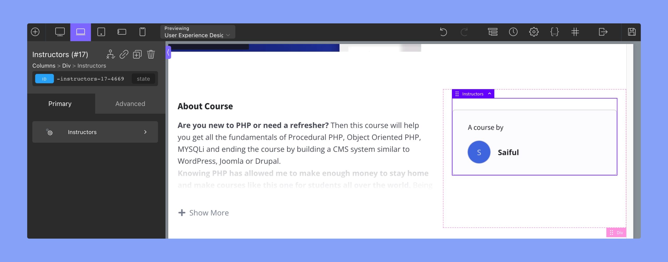
Instructors:
- Border: This subsection lets you edit the border of the instructor’s image. You can choose which border to edit, the color, width, style, and radius of the border. You can also select an individual radius for each corner.
- Title: This subsection lets you change the typography of the instructor’s name. You can adjust the font size, weight, style, color, and alignment.
- Image: This subsection allows you to change the appearance of the instructor’s image. You can adjust the width, height, and alignment of the image. Additionally, you can adjust the border and box-shadow properties of the image.
- Name: This subsection lets you modify the typography of the instructor’s name. You can adjust the font size, weight, style, color, and alignment.
- Designation: This subsection allows you to change the typography of the instructor’s designation. You can adjust the font size, weight, style, color, and alignment.
Review
Review Title: The “Review Title” section in Oxygen Builder integration for Tutor LMS allows you to customize the title of the review section for a course. You can use the text field editor to change the typography of the review title, including font family, font size, font weight, color, and text alignment.
Review Avg: The “Review Average Rating” section in the Tutor LMS integration with Oxygen Builder allows you to customize the display of the course review rating. The sub-sections are:
- Rating Numbers: You can use the Oxygen Builder text field editor to change the typography of the review’s rating number (4 out of 5 stars).
- Rating Stars: This allows you to change the size and color of the rating stars.
- Total Count: This allows you to change the typography of the total review count, including font family, font size, font weight, color, and text alignment.
- Right Rating Bar: This allows you to customize the appearance of the rating bar on the right side of the review section, including the color, height, padding, margin, and width of the bar.
- Right Rating Stars: This allows you to customize the appearance of the rating stars on the right side of the review section, including the size and color of the stars.
- Right Rating Text: This allows you to customize the appearance of the rating text on the right side of the review section, including font family, font size, font weight, color, and text alignment.
Review List
Image:
- Height: Select image height. The units are in px (pixels)
- Width: Select image width. The units are in px (pixels)
- Font Size: Change the font size of the icon text
- Line Height: Use this to tweak the text position
Name: You can use the Oxygen Builder text field editor to change the typography of the reviewer.
Time: You can use the Oxygen Builder text field editor to change the typography of the review’s time.
Stars:
- Color: Select the color of the rating stars
- Size: Select the size of the rating stars
Content: You can use the Oxygen Builder text field editor to change the typography of the review content.