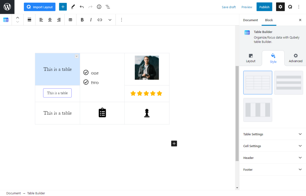
Table builder is a block that can be used to create customizable, responsive, and flexible tables inside WordPress pages or posts. Within each cell, you can further add content such as text, buttons, images, ratings, icons or lists.
Cell Actions
With the Table Builder, you get access to some very neat actions that will help create the best tables on WordPress. In the Context Menu. Here are a list of actions that you can perform to change the cell structure of the Table:
- Add Row Before: Adds an empty row above the selected row
- Add Row After: Adds an empty row below the selected row
- Delete Row: Deletes the selected row
- Add Column Before: Adds an empty column on the left side of the selected column
- Add Column After: Adds an empty column on the right side of the selected column
- Delete Column: Deletes the selected column
- Merge Next Column: Merges selected cell(s) with cells next to it. If a cell’s height is more than 1, then it will merge with the same number of cells next to it.
- Merge Next Row: Merges selected cell(s) with cells below it. if a cell’s width is more than 1, then it will merge with the same number of cells below it.
Layout
Design templates: Design templates are pre-built designs for the table block. These are made to be easily available to use just by the click of a button.
Related Sections: Related sections are multi-block sections that have been pre-designed. This tab contains relevant blocks fetched from the Ready Sections of Qubely.
Style
There are three styles available for each table block: No stripes, Vertical Stripes, and Horizontal Stripes.
Stripe Color:
If you have chosen a style with stripes, the stripe color setting will appear. Use this RGBA color picker to pick a color for the stripes.
Table Settings
Max Width: Use this slider to modify the max width of the entire table. There are three units available, PX, EM, and Percentage. Responsiveness functions are also present.
Fixed width cells: Enable this to keep each cell’s width fixed. Otherwise, each cell will expand if needed.
Background: Choose between fill and gradient background
- Fill: Use this RGBA color picker to pick the color for the table’s background
- Gradient:
- Color picker: Pick two colors for the gradient background. The gradient will be generated between these two colors.
- Gradient Type:
- Linear: Picks a linear gradient model that applies the gradient on an axis.
- Gradient Angle: Pick the angle of the axis on which the gradient will be applied.
- Radial: Picks a radial gradient model, where the gradient will be generated from a certain point.
- Radial Pointer: Pick the point where the color will generate from.
- Linear: Picks a linear gradient model that applies the gradient on an axis.
- Color 1 Stop: Pick the color 1 stop position. The higher it is, the sharper the gradient shift
- Color 2 Start: Pick the color 2 start position. The lower this is, the sharper the gradient shift.
Color: Pick a color for the text of the main cells of the table.
Border: Pick a border type for the table.
Border Color: Use the RGBA color picker to pick a color for the border.
Border Width. Pick a border width for the table. Responsiveness functions are also present.
Border Radius: Use this slider to add a radius around the table.
Horizontal Border: Use this toggle to enable or disable the horizontal borders
Vertical Border: Use this toggle to enable or disable the vertical borders
Outer Border: Use this toggle to enable or disable the vertical borders
Cell Settings
Typography: Enable this tab to change the typography of the text.
- Font: Choose your desired font from the list.
- Weight: Set the font-weight. Normally the font-weight is the thickness of a font.
- Font Size: Define the font size.
- Line Height: It’s the line-height, adjust it the way you want to.
- Letter Spacing: It’s the letter-spacing, defines the gap between letters.
- Text Transform: Use this tab to apply a text transformation on the text. Use auto caps, all caps, and no caps to give the text a different tone.
Padding: Use this slider to change the padding around the content. You can change the padding settings for each side of a cell. There are three units available, PX, EM, and Percentage. Responsiveness functions are also present.
Alignment: Pick an alignment setting for the content inside the cell. Responsiveness functions are also present.
Vertical Position: Use this tab to pick the vertical position for the content.
Header
Table Header: Enable this toggle to add a header row to the table.
Background: Use this tab to change the color of the header tab’s background.
Color: Use this tab to change the color of the header tab’s text content.
Border: Use this slider to add a border between the header and the main section. There are three units available, PX, EM, and Percentage. Responsiveness functions are also present.
Border Color: Use the RGBA color picker to pick a color for the border.
Typography: Enable this tab to change the typography of the text.
- Font: Choose your desired font from the list.
- Weight: Set the font-weight. Normally the font-weight is the thickness of a font.
- Font Size: Define the font size.
- Line Height: It’s the line-height, adjust it the way you want to.
- Letter Spacing: It’s the letter-spacing, defines the gap between letters.
- Text Transform: Use this tab to apply a text transformation on the text. Use auto caps, all caps, and no caps to give the text a different tone.
Footer
Table Footer: Enable this toggle to add a footer row to the table.
Background: Use this tab to change the color of the footer tab’s background.
Color: Use this tab to change the color of the footer tab’s text content.
Border: Use this slider to add a border between the footer and the main section. There are three units available, PX, EM, and Percentage. Responsiveness functions are also present.
Border Color: Use the RGBA color picker to pick a color for the border.
Typography: Enable this tab to change the typography of the text.
- Font: Choose your desired font from the list.
- Weight: Set the font-weight. Normally the font-weight is the thickness of a font.
- Font Size: Define the font size.
- Line Height: It’s the line-height, adjust it the way you want to.
- Letter Spacing: It’s the letter-spacing, defines the gap between letters.
- Text Transform: Use this tab to apply a text transformation on the text. Use auto caps, all caps, and no caps to give the text a different tone.
Cell Type Specific Settings
If you have different kinds of cells with different content such as buttons, ratings, images, etc, then each of them will have different settings.
Sidebar settings will modify all the cells for that specific cell type. If you change image settings from the sidebar, all images will be modified accordingly. Cell specific settings can be found from the in-line controls on the Gutenberg editor.
Text font size: Set the text size using the slider in the inline customization option.
Image
To replace the image or change individual alignment, you can modify from the in-line settings.
Size: Pick a size for the image.
Alignment: Pick a horizontal alignment setting for the image. This is a responsive function.
Padding: Use this slider to set a padding around the image. You can choose to set uniform or individual padding for each side. There are three units available, PX, EM, and Percentage. Responsiveness functions are also present.
Radius: Use this slider to add a radius around the corner of the image. You can choose to set uniform or individual radius for each side. There are three units available, PX, EM, and Percentage. Responsiveness functions are also present.
Button
Buttons placed inside each cell will behave the same as regular Qubely buttons. For more information on them, visit our documentation on Qubely Button here.
To change individual design: To change the design of each button individually, please select the design from the cell’s in-line settings.
To change individual colors: You can also change the color of individual buttons using the color icon in the topbar of the Table Builder block. From there, you can change the text and background color for both normal and hover states.
Icon
Size: Pick a size for the icon.
Color: Use this RGBA color picker to pick a color for the icon.
Padding: Use this slider to set a padding around the image. You can choose to set uniform or individual padding for each side. There are three units available, PX, EM, and Percentage. Responsiveness functions are also present.
Background: Choose between fill and gradient background
- Fill: Use this RGBA color picker to pick the color for the icon’s background
- Gradient:
- Color picker: Pick two colors for the gradient background. The gradient will be generated between these two colors.
- Gradient Type:
- Linear: Picks a linear gradient model that applies the gradient on an axis.
- Gradient Angle: Pick the angle of the axis on which the gradient will be applied.
- Radial: Picks a radial gradient model, where the gradient will be generated from a certain point.
- Radial Pointer: Pick the point where the color will generate from.
- Linear: Picks a linear gradient model that applies the gradient on an axis.
- Color 1 Stop: Pick the color 1 stop position. The higher it is, the sharper the gradient shift
- Color 2 Start: Pick the color 2 start position. The lower this is, the sharper the gradient shift.
Alignment: Pick a horizontal alignment for the cells. This is a responsive function.
List
To change the type of bullets on the list (numbers vs icon), click on the individual cell and then use the in-line settings to modify. You can also add custom icons using the (+) icon given that you are using icon bullets.
Color: Pick a color for the bullet icons or numbers in the list
Icon: Select an icon for the bullet list.
Icon Spacing: Use this slider to set the spacing between the icon and the content. There are three units available, PX, EM, and Percentage. Responsiveness functions are also present.
Alignment: Pick an alignment for the listed items. Responsiveness functions are also present.
Padding: Pick a padding around the content. You can choose to set uniform or individual padding for each side.. There are three units available, PX, EM, and Percentage. Responsiveness functions are also present.
Color: Select a specific color for the icon that you are using in a cell.
Rating
To change the rating star count, click on the individual cell, and a slider will appear which will allow you to change the overall rating.
Size: Pick a size for the star icons. You can also pick custom sizes.
Color: Use the RGBA color picker to pick a size for the stars.
Alignment: Pick an alignment for the rating. Responsiveness functions are also present.
Padding: Use this slider to pick a padding around the stars. You can choose to set uniform or individual padding for each side.. There are three units available, PX, EM, and Percentage. Responsiveness functions are also present.
Color: Select a specific color for the icon that you are using in a cell.
Advanced
Animation
To make the block more interesting, you can add an animation effect. It is disabled by default, to enable this feature, choose an effect from the dropdown list. Once you choose your desired one, then start making modifications as you see fit. The units are in milliseconds. Note: Duration is how long the animation will run and Delay is the waiting time before the animation starts loading. The following effects are currently available.
- Fade: Selecting this will animate your table of contents block with a fading animation.
- Slide: Animate your table of contents block with a sliding animation.
- Bounce: If you want to animate your table of contents block with a bouncing animation then select this.
- Zoom: This option will animate your table of contents block with a Zooming animation.
- Flip: Animate your table of contents block with a Flipping animation using this option.
- Fold: Selecting this will animate your table of contents block with a sliding animation.
- Rotate: This will animate your table of contents block with a rotating animation.
Note: You can control from which direction the animation will start such as from the center, right, left, up or down. Also, control how many times the animation will repeat. You can also select the duration and the starting delay of the animation in milliseconds.
Interaction
Enable Tablet: If you want to enable the interactions for tablet users to enable this to start showing tablet users the image interactions.
Enable Mobile: If you want to enable the interactions for mobile users to enable this to start showing mobile users the image interactions.
Enable Mouse Movement: You can select the way how your interactions work with your mouse movement. There are multiple options once you enable it. You can choose the direction from Direct/Opposite, speed from a scale of 1 to 10, maximum from a scale of 5 to 75.
Live Button: This button will give you “Live experience” on how your interactions work depending on how you set it. Click on it to get an overview.
Advanced
This section lets you override the current styling of this particular block.
Enable Custom Position: If you want to set the block to a custom position then simply enable this option. After enabling you will find the following options
From X-axis: Select from the slider what position you want the image block to be in according to the X-axis. The range limits from -2000 to 2000.
From Y-axis: Select from the slider what position you want the image block to be in according to the X-axis. The range limits from -2000 to 2000.
Z – Index: If any of your blocks override another, then you can set a value here, the one with the higher value will appear before the other.
Hide on Tablet/Phone: Turn it on to hide this block in your desired device. The change will appear on the frontend.
Block Row CSS: In case you need to override current block settings, you can write down your own code followed by {{QUBELY}} to override the current settings.Additional CSS Class: You might need to name a block in order to make custom modifications in the future, this is the field where you define the name.