Headline Control
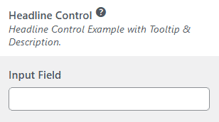
The Headline control is a useful tool to categorize your customizer controls.
new \Kirki\Pro\Field\Headline(
	[
		'settings'    => 'kirki_pro_headline',
		'label'       => esc_html__( 'Content', 'kirki-pro' ),
		'description' => esc_html__( 'Headlines can include descriptions as well.', 'kirki-pro' ),
		'section'     => 'section_id',
		'tooltip'     => 'Headlines also work with tooltips.',
	]
);
Headline Toggle
The Headline Toggle field combines a Headline & a Toggle control. This is useful to display controls conditionally.
new \Kirki\Pro\Field\HeadlineToggle(
	[
		'settings' => 'kirki_pro_headline_toggle',
		'label'    => esc_html__( 'Design Options', 'kirki-pro' ),
		'section'  => 'section_id',
		'default'  => false,
	]
);
Divider Control
The Divider control is another useful tool to group related customizer controls. You can pass a color for the divider using the choices argument. The default divider color is #cccccc.
new \Kirki\Pro\Field\Divider(
	[
		'settings' => 'kirki_pro_divider',
		'section'  => 'section_id',
		'choices'  => [
			'color' => '#000',
		],
	]
);